Feature #20014
closedReskin of Group Library
0%
Files
Related issues
Updated by Boone Gorges about 2 years ago
- Related to Feature #19592: Groups Page Re-Design added
Updated by Boone Gorges about 2 years ago
A first pass at the reskin is available for testing on cdev.
Sara, your comps had a single page for the Library. But it's a pretty dynamic app with a bunch of different types of views. So I made some guesses about how things ought to behave. I'll list some specific notes below, but when testing, be sure to walk through the various views and look at all the various combinations of item type.
- Your comp shows a couple of icons related to videos, images, etc. The various icons are a bit more complex than this. If you upload a file, the app tries to show a different icon based on file extension. If you create an editable doc, it shows a "pencil" icon. If you add an external link, the app tries to show a service-specific icon (like Google Drive or Dropbox). I've left this system in place and haven't swapped out any icons, since any change would require rethinking all the available icons. Here's a list of what's currently in the plugin: https://gist.github.com/boonebgorges/7a0d75b21279fd3a8e1733ccc68051c2
- I added file size, but this is valid only for uploaded files, not for External Links or Editable Docs.
- The existing library shows the "folder" (ie, tag) of the item when viewing the main list. I think users requested this because they wanted a way to see, at a glance, whether an item was in a given folder. (This goes away when you navigate into a folder, since it'd be redundant information.) I've left this information, but I've moved it into the "Details" column. Instead of showing a folder icon, I've changed it to the text "Tagged in".
- The search box in the existing app has some dynamic behavior. For the reskin, I've removed the grow/shrink behavior, but I've kept the click-x-to-reset-search behavior.
- I couldn't remember whether we have an existing example of the "advanced" three-dot submenu, so I wrote my own implementation. If we're doing this elsewhere, we'll want to standardize the markup (for accessibility) and styling.
- For pagination, I've kept the forward/back links from the current app. I also kept the underline under the links, since we use non-underline to indicate the non-clickable current page.
- I've made an initial attempt at mobile. The main two changes are (a) breaking the filters/search/add interface into multiple lines, and (b) dropping the non-sortable "details" section onto its own line. More work will probably be needed here.
- I made some small cleanup on the other views (Add New, Edit) but I didn't spend a lot of effort on it. This may also need some more attention.
Updated by Sara Cannon about 2 years ago
- File Screenshot 2024-04-10 at 11.00.13 PM.png Screenshot 2024-04-10 at 11.00.13 PM.png added
- File Screenshot 2024-04-10 at 11.05.58 PM.png Screenshot 2024-04-10 at 11.05.58 PM.png added
Thank you for all this work! It is looking great.
- I would like to re-work all the icons. I'll get those to you at a later date. It's not a blocker.
- "Tagged In" is great!
- I don't think we've implemented the three-dot menu yet... but maybe Ray can confirm.
- I noticed a few bugs... the way a long-file name is handled and the file drop-down gets cut off when adding new.

Updated by Boone Gorges about 2 years ago
Thanks, Sara! I've pushed up some changes that ought to address the appearance of dropdowns, etc.
Updated by Raymond Hoh about 2 years ago
I couldn't remember whether we have an existing example of the "advanced" three-dot submenu, so I wrote my own implementation. If we're doing this elsewhere, we'll want to standardize the markup (for accessibility) and styling.
I'll need to take a look at what you did, Boone! I also worked on a variation of the ellipsis menu for the single group forum topic page and might re-do it since it doesn't pass all accessibility requirements.
Updated by Colin McDonald about 2 years ago
Just making a note here for Ray and Boone about double-checking the ellipsis menus in the Group Library and Group Forum (topic page), particularly to pass accessibility requirements, and also to achieve reasonable consistency.
Updated by Boone Gorges about 2 years ago
Thanks, Colin. Looking at the two side-by-side, here's my thoughts:
- I like that the forum interface using an inline SVG rather than pulling in an image file
- Can we decide whether we want vertical or horizontal ellipses? Unless there's a principled reason for having both.
- I prefer the way that the forum ellipses popup is styled
- I think we should have a hover effect, like what I've added to the library
- When I built the Library version, I did some research on markup and ARIA attributes to use. Here's what I've got for the button:
<button aria-haspopup="true" aria-controls="group-library-item-menu-5471" class="group-library-item-menu-toggle" aria-expanded="true"><img src="http://commons.gc.cuny.edu/wp-content/plugins/cac-group-library//assets/img/more.png" alt="Click for advanced options"></button>
Our implementation should probably use these attributes, which also requires that the corresponding popup has a unique ID.
Once we've decided on an implementation, perhaps we can build a small PHP helper function that will help us build these in a consistent way.
Ray, happy to hear your thoughts on any of the above.
Updated by Sara Cannon about 2 years ago
I took a deep dive into horizontal vs vertical ellipsis menus. (affectionately known as kebob vs dumpling) and the consensus is that Apple does it horizontally (dumpling) and Android does it vertically (kebob) and there's no reasoning for one vs the other. For consistency's sake, we should make it all horizontal. Dumplings it is.
Updated by Sara Cannon about 2 years ago
- File New Icons.png New Icons.png added
- File old icons.png old icons.png added
- File SVG Icons.zip SVG Icons.zip added
I have looked at the library icons and created new ones. I believe we can re-use some icons in multiple areas to simplify (such as using the same icon for "zip and "zip-attachment")
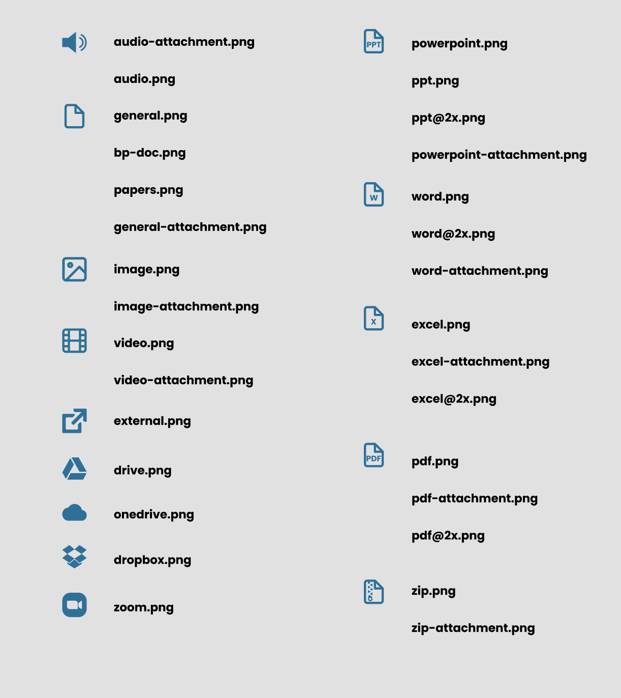
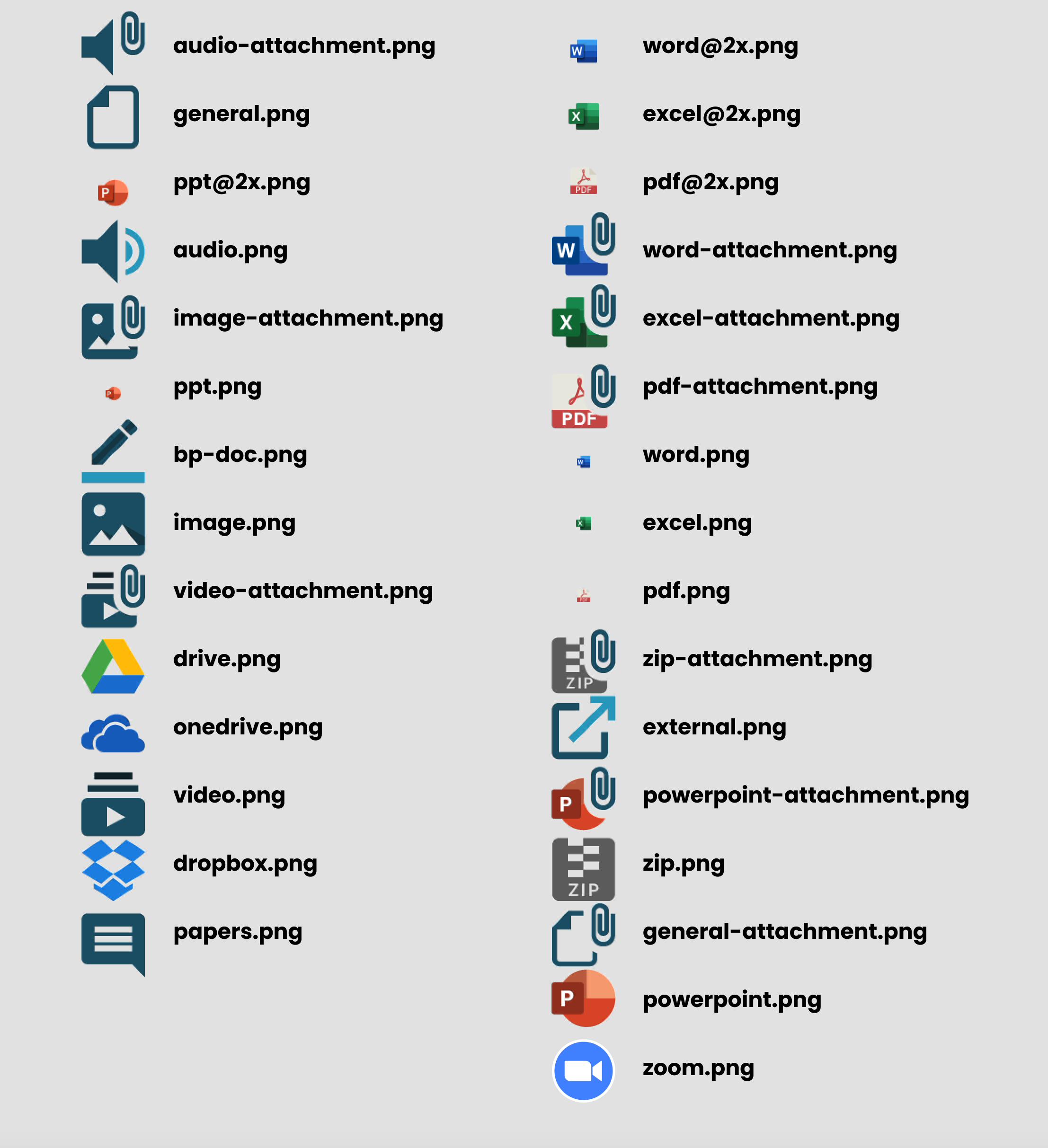
The icons are attached in a zip drive as SVG's
Updated by Boone Gorges about 2 years ago
Thanks, Sara! I've swapped them out https://github.com/cuny-academic-commons/cac-group-library/commit/9dc2d2fa977ec502ab1091ca3ad21d3480d9e628
Updated by Sara Cannon about 2 years ago
Looking great! It looks like maybe one icon was not switched. The page fold is on the other side and filled in.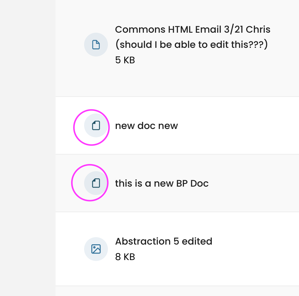
I have not uploaded every type of media to test, so I don't know if this is the only one or not.
Updated by Boone Gorges about 2 years ago
Thanks, Sara. This particular item type had to be handled in a different place, which is why I missed it the first time around. Fixed in https://github.com/cuny-academic-commons/cac-group-library/commit/f23e256f8658db191f327bf97329833ec1435318
Related to #20334, I have also removed user pronouns on the main library listing. https://github.com/cuny-academic-commons/cac-group-library/commit/1c570fdcb63429a1f041ddd0904091dc02d4c9cd
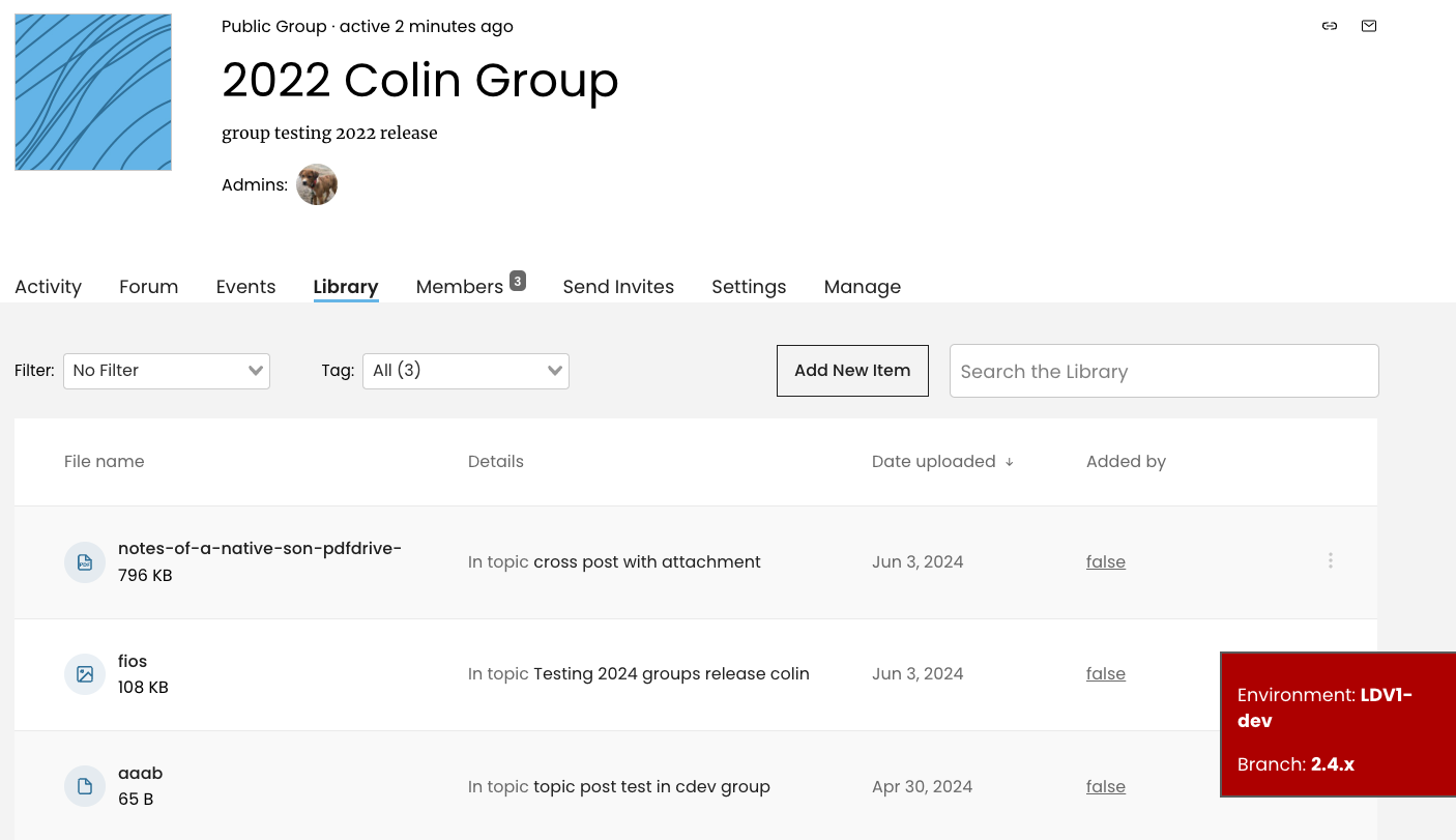
Updated by Colin McDonald almost 2 years ago
- File false-library-added.png false-library-added.png added
There may be a bug when cross posting in the forum, where the secondary group receives the forum post but in the library, the attachment "added by" field comes up as "false." See screenshot attached.
Updated by Boone Gorges almost 2 years ago
Good catch, Colin. This has likely always been a bug. It should be fixed by https://github.com/cuny-academic-commons/cac/commit/5161f46b209b9143a0a5eb48e92947ebb226c27a (will only apply to new attachments, not existing ones)