Feature #404
closedCustomizable user profiles
100%
Description
Allow users to enter RSS feeds that will display content they create outside the Commons. Have a nice display for the most popular feed sources: blogs, Flickr, YouTube, Delicious. Other suggestions are welcome.
Files
Related issues
Updated by Boone Gorges almost 15 years ago
- Target version changed from 1.2 to 1.3
Updated by Boone Gorges over 14 years ago
- Target version changed from 1.3 to 1.4
According to http://roadmap.commons.gc.cuny.edu, this feature is slated for the 1.4 release.
Updated by Boone Gorges over 13 years ago
- Target version changed from 1.4 to 1.5
I would like to do this as part of some CBox work.
Updated by Boone Gorges over 13 years ago
- Assignee changed from Boone Gorges to Dominic Giglio
Updated by Boone Gorges almost 13 years ago
- Subject changed from RSS entry and display on profiles to Customizable user profiles
- Assignee changed from Dominic Giglio to Boone Gorges
- Priority name changed from Normal to High
- Estimated time set to 50.00 h
- Severity set to Critical
This is our main marquee feature for CAC 1.5. Let's use this ticket for general discussion, and we can use separate tickets (eg #405) for smaller issues.
We've had some nice brainstorming around the issue already. Some thoughts from my notes of our team meeting 12-14-2012:
- A better method for identifying with campuses: maybe campus logos, colors, etc
- A plaintext "About Me" field, meant to be a bit more freeform than Academic Interests. Academic Interests, in contrast, would be pushed more as a straight up list of your interests (rather than prose)
- Widgetization. That is, there would be "sidebar" type spaces on the profile, which could be filled in by a number of available widgets. Possible widgets to include:
- Generic RSS feeds
- Specifically formatted RSS feeds (Twitter, etc)
- Plaintext/HTML
- "Vital Stats"/"baseball card" - campus, phone number, department, etc
- previous affiliations
- My Docs, My Groups, My Friends, My Activity
- Improved interface for editing profile. In my imagination: You're viewing your own public profile, and click an Edit button. Something happens visually (dotted lines around the widgets, maybe the widgets circle around, rendered text becomes textareas and inputs) to make it clear that it's time to edit/move things around. Edit, drag, remove, add widgets. Would be nice to have a place to store unused widgets without losing settings, as in the WP dashboard.
- Technical implementation TBA. To what extent does it make sense to attempt to use WP's widget API? What percentage of regular blog widgets would be useful as profile widgets (and vice versa)? Ray, I know you've done some work on this.
- Strike some sort of balance between allowing for flexible layouts and keeping a consistent skeleton. One possibility raised in our brainstorming was to echo the layout of the CAC homepage: profiles may have their own hero slider (avatar and vital stats), the Who's Online would correspond perhaps to the About Me text, and the other areas would be customizable widget sidebars.
- Should be mobile friendly out of the gate. Using widgets, and especially a consistent sidebar skeleton, should help.
- This would be a good time to reconsider the three-layer user navigation, or at least the way it's currently laid out, if we think that's necessary. Would profile sections/tabs work?
PLAN OF ATTACK
Chris has agreed to do a few mockups over the holidays, and report back to the group. Once we've done some back-and-forth and decided on a basic approach, the dev team can start working on the back-end implementation, while the rest of the team can continue with design work.
In the meantime, if you have further ideas - or links to sites that, in your opinion, do profiles really well - please use this space to share.
Updated by Dominic Giglio almost 13 years ago
I wasn't at the meeting so forgive me if this was already brought up.
This sounds like a lot of UI/Design work when we may be upgrading the CAC theme soon, now that CBOX is in beta.
Whats the status of the site wide theme redesign? Shouldn't something this large be rolled into the larger goal of a new theme?
Updated by Boone Gorges almost 13 years ago
Shouldn't something this large be rolled into the larger goal of a new theme?
I think the idea is that the profile stuff will be theme-independent. In any case, I think we should handle it separately for now, as a theme redesign is a whole different beast.
Updated by Raymond Hoh almost 13 years ago
Technical implementation TBA. To what extent does it make sense to attempt to use WP's widget API? What percentage of regular blog widgets would be useful as profile widgets (and vice versa)? Ray, I know you've done some work on this.
Unfortunately, I recently lost the code I was working on for this. Lost about two hours work, but now that I'm more familiar with WP widgets, I can recode that a little faster.
The problem with using WP's widget API is let's say I wanted to port over the default "Text" widget, I'd basically be duplicating everything in the WP_Widget_Text class and changing the first line from:
class WP_Widget_Text extends WP_Widget
to:
class BP_Widget_Text extends BP_Widget
The BP_Widget class would extend WP_Widget, but would allow us to save the widget options to user meta (and potentially other components like group meta) instead of in the WP options table.
You can look at this as both a pro and a con. Pro is it would be relatively easy to port any existing WP widget over. Con is it would require duplicating the widget's code to support BuddyPress.
Maybe there's a better way of implementing the WP widgets API. Boone, could use your feedback here!
It's either use the WP widgets API or build something on our own. As a reference point, imath already implemented his own version of BP profile widgets as I noted here:
https://github.com/cuny-academic-commons/commons-in-a-box/issues/17#issuecomment-5002422
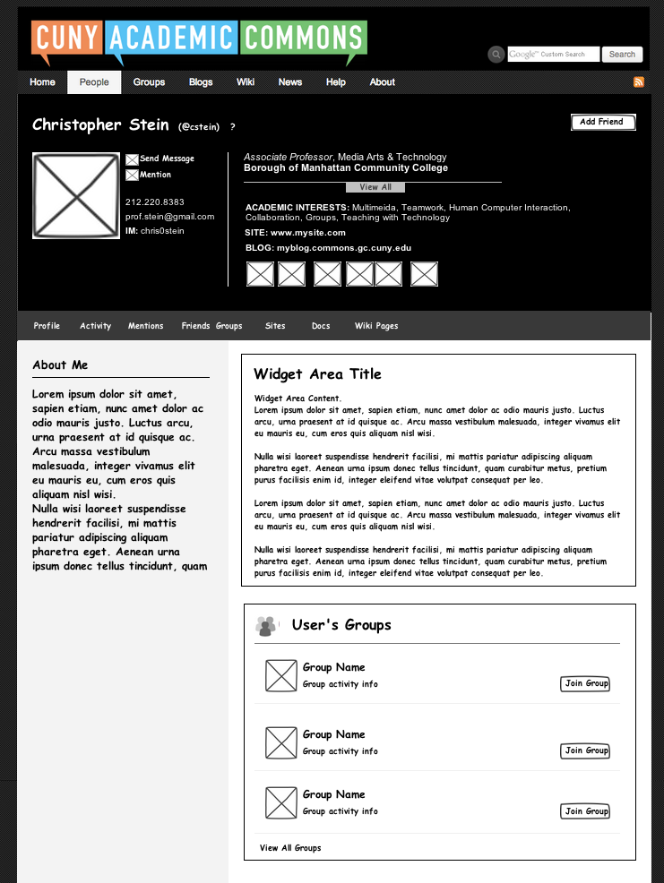
Updated by Chris Stein almost 13 years ago
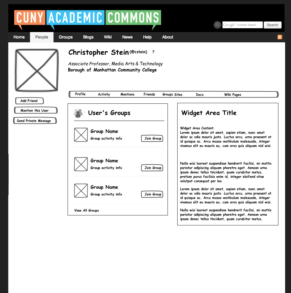
I just sent you all invitations to the mockup site for my first version. Let me know if you don't get the email or have any issues viewing it there. Basic information to know is that there are 4 pages that have any content right now with your profile activity friends in group. On the profile and activity pages I kept the larger header. I'm not sure to put freon the other pages how to profile someone friends in group pages you can see a shorter version of the person's name. There are lot of little details in sugar going to go through I'll try to cover some of the major ones in comments below here. The other thing to know is that you can click on the navigation on the page on the site and you can use the comments to comment about specific pieces of the UI on the justinmind.com site. You can of course just write text comments here too. Let me know if this works or if I should just do everything through redmine.
I looked at other profile pages which I will list what lives to them the about.me site is probably close to what Matt might have been thinking about with large pictures and so forth. However this time I think without of full site redesign that that might be a little bit too much to go for. So at this point I decided to go with some modifications to the existing profile and some layout changes but nothing as major in terms of design as that. Also that would require some more expensive back and changes to allow people to modify your pictures the color behind a text text color it cetera and things like that.Instead I stuck to the idea we came up with of making it look more like the home page. One change there is that I only have two columns of content instead of three on the lower half of the page.
In looking at the kind of content in the hero area and I came up with a few main types of contact so one is CUNY related which is really your title and College. I added department (could be department/area/institute etc) which we don't currently have so that would be something new. I'm not sure if we want to add that right now. I'm not sure if we're going to allow people have multiple positions for this. That may affect how the layout works. I make this now with two positions to see how it would look and tried to make it is such a way that would be able to grow. Another section is your Commons activity and that includes your sites, Friends, groups, etc. Also there is the contact information such as phone email blog I am and the online accounts. I ended up splitting those things up a bit but this is all open to reconfiguration. Another piece of contact information we may or may not want to revisit now is the IM. Right now it doesn't tell you weather is Google Talk, AIM it etc. Do we want to add those in?
The two boxes on the right, About Me and Academic Interests for now could change. We could lock this down where they are all the same and be more sure that the layout will look OK, or we could make it free-form and allow them to put whatever content they wanted to in the box(es).
I put the name and action links (mention, friend, message) at the very top. One thing we may consider adding in the future is a follow button where you can be notified when the person creates a new blog post, or whatever.
I decided on trying out a secondary navigations allows people to view in more detail a full list of friends docs, group, sites come up with the pages. It seems like it might be too much to try to put all of those things in one page and to use a JavaScript overlay or something like that, but we can look into doing this differently if people want to. The Profile, Activity, Friends and Groups links work for now. As we go further in the design I can fill out the others.
The other possible big piece of functionality I added was the "In Common" areas. On the Friends, Groups etc pages I thought it might be nice to be able to show people the friends etc they had in common. This could also appear on the main profile page as well.
I didn't mockup the edit page yet but the basic idea is to have a button somewhere near the top if it is your profile that would turn the edit view on and off. Then you would have little edit buttons in each of the editable sections and some kind of plus button to add new widgets to the lower columns on the profile page. If we decide this is the general direction we want to go in then I'll flesh that out.
OK, I've gone on enough. It's better to let others get the conversation going.
Here are some other profile example sites
http://about.me/matt
had to include him, here is a fuller one
http://about.me/veronica
http://cuny.academia.edu/CarlaBetancourt
BTW, here is list of all cuny people, also interesting to see how people write down their affiliations
http://cuny.academia.edu/
https://www.facebook.com/christopher.k.stein
http://www.linkedin.com/pub/chris-stein/1/20a/4a0
http://www.scoutzie.com/oykun-yilmaz
https://twitter.com/whitehouse
https://plus.google.com/107015394729222475223/about
Updated by Boone Gorges almost 13 years ago
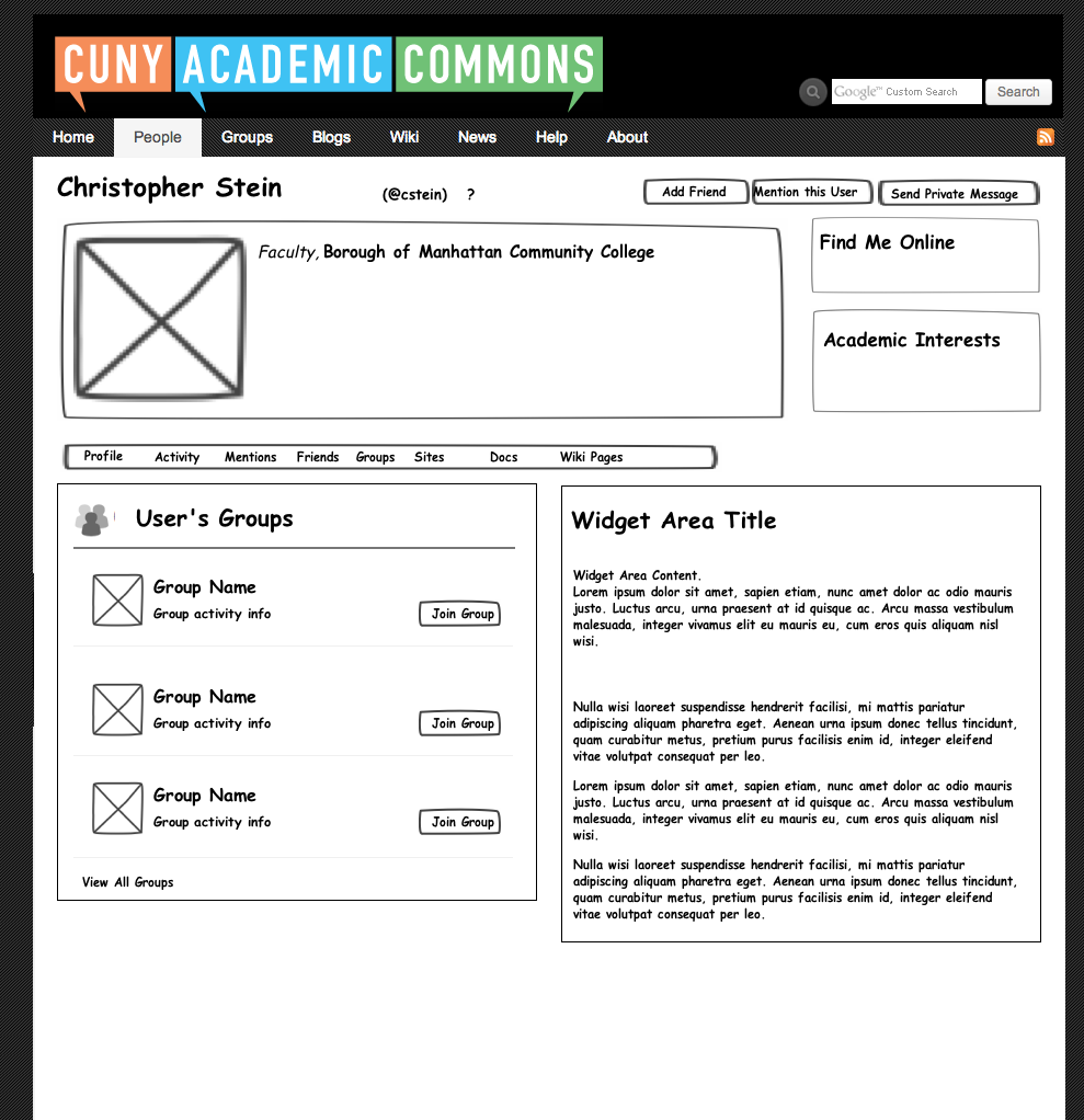
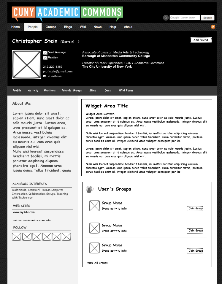
Chris, this is a great start. Thanks so much for your work so far. A few thoughts:
- The "Christopher on the Commons" section largely duplicates the secondary nav. IMO, lose the "on the commons" section in favor of the nav (which is clear enough)
- The "baseball card" contains a couple different kinds of content: phone/email/im; social network buttons; school/dept/title; blog links. As we think about what data goes in this baseball card section (and how it is laid out), let's think about the purpose of this section of the page. It seems to me that there are really two different kinds of visitors to Chris's page: (a) people browsing the Commons to find collaborators, etc, and (b) people who are looking for info about Chris in particular (like his email address). I think a guiding principle should probably be to populate this box with as little information as possible while still serving these two audiences. Phone/email/IM seems good to me now, and serves mainly (b). It might be good to group the stuff meant for (a) together a little more clearly in a visual sense. Eg, is it possible/desirable to convert the blog/website/academia links to icons, so they are more contiguous with the Follow Me Online links?
- Titles/departments. The easiest way to implement this at the moment is to have a freeform text box, which is prepopulated by the structured campus/Role data that we collect at registration, but can be customized to include multiple titles by the user. I think we can and should look into the possibility of allowing for more highly structured multiple affiliations, but it's really outside the scope of this specific project, which is more about presentation.
- I would like to highlight About Me a little more. The chance to describe oneself in a couple sentences seems key to audience (a) described above. What do you think about creating a full-width row above the secondary nav that is devoted to About Me? That'd also create a bit more breathing room in the somewhat crowded top row.
- "Right now it doesn't tell you weather is Google Talk, AIM it etc. Do we want to add those in?" - Yeah. IM all by itself is sorta useless. We should either expand it, or remove the field altogether.
- "One thing we may consider adding in the future is a follow button where you can be notified when the person creates a new blog post" - Agreed, but let's not lump that in with this ticket - it's a separate project.
- "I put the name and action links (mention, friend, message) at the very top" - I'm a fan.
- " The other possible big piece of functionality I added was the "In Common" areas." - Good idea.
- Edit mode - Your description sounds pretty good to me. Unless there are other ideas about how the interface should work, let's go with something like this.
Looking forward to others' thoughts. If we can start to converge on consensus regarding function (at least roughly), Ray and Dom and I can start talking about implementation (eg Ray's WP_Widget questions above).
Updated by Brian Foote almost 13 years ago
Hey All,
Great job on this mock up Chris! I've spent some time with it this morning and just have a few thoughts. I think Boone is right in that we might want to trim the 'On The Commons' data out of the baseball card. It's interesting to list but it's a little cluttered up top. I know it's still early in the process but this profile revamp is a good opportunity to think about design opportunities as well. Would it be possible to let users insert an image behind their baseball card and let the text rest on a field similar to the hero tag? I'm still a big advocate for listing academic interests in the format of a tag cloud as well. Maybe that looks dated? I don't know.
If we're going to let the data under the baseball card work like widgets I think the nav bar under the bbc is a good idea for visitors who are looking to pull up certain kinds of info quickly. I suspect that people are going to visit someone's profile looking specifically for certain articles and may not want to scroll around through however a member has chosen to lay out their widgets to find something specific.
Thanks again!
Updated by Chris Stein almost 13 years ago
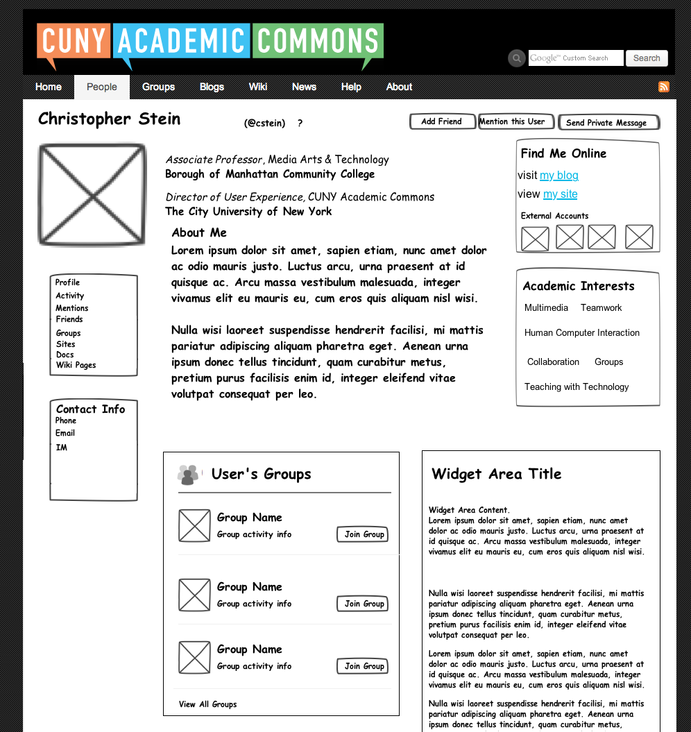
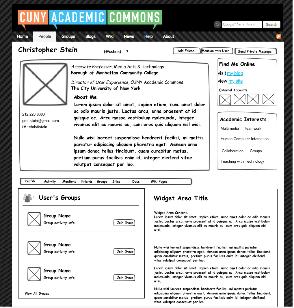
Thanks for the comments Boone and Brian. I just uploaded another version and sent out the invites. For those of you who haven't commented let me know if you'd rather I uploaded images here. I can do it if you prefer.
Boone, I tried to add in your suggested changes. I found the about me got too wide when it was the whole page so I decided to try instead to put it in the card and move the links to their own area.
One concern I have with the about me section, and this is with both designs so far, is how it will look for the people who won't have anything there. I may try to add some alternate examples with information missing to see how it looks.
The second version Profile_v2, doesn't just change the hero area but also changes all pages by moving the nav to the left. I didn't have time to do the inner pages but the name at the top and the left column would stay in place and the other content would change.
I'm still very open for comments. Because this is not a full redesign and we are restricted to keeping the width and other fonts etc. I'm not totally happy with what I have but having a hard time finding other configurations. I should mention that I am more concerned with general layout here than some of the finer points of the visual design which we can work out once the general layout is decided.
Brian, that brings me to your suggestion to make the hero area more like how we do it on the homepage. I like that idea (it's like the about.me profiles) but one concern I have is on doing it in a way that will look right. The text is readable on the homepage because we have the semitransparent background and the text only coveres the bottom third of the image. We have more text on the profile and it would cover most of the image and may not look the same. The alternative is a larger image like about.me profiles but I think that would require more radical restyling I'm not sure would work either. A third option is to make the transparent background more transparent, but I think then you would need to also allow people to change the color of the text and background and that sounds like too much work for Boone with customization. If I'm missing something on this or if someone has a way they think will work, let me know.
I also added a Profile-Edit screen that is a quick version of what the profile page would look like when you view your own profile. The basic idea is that you can turn on or off so you can see it like others see it (minus the friend/message buttons) or you can edit it. Editing in place is easier to say than to actually do so I'm guessing we may have to talk through how the editing will actually work once we get into it.
Best,
Chris
Updated by Dominic Giglio almost 13 years ago
Chris,
I really like both version 1 and 2 of the new profiles page. I think it's really gonna spruce up the site.
My views are pretty much aligned with everyone else's. The only point I'd really like to make is that less really is more. I think this change is gonna be big enough to throw some of our users off when they first see it. We want to make sure to include a little bit of info at first. Keep the page clean and then we can respond to what our users tell us they want, instead of forcing them to see and use and navigate what we tell them they want.
I always use Google as an example. At first they were just a search box on a page. Then they slowly and steadily added features and services so that their users could get used to them at their own pace.
Microsoft would be an example of an anti-pattern in this case. Each new version of windows changes so much that most users never get a chance to become comfortable with the OS before a complete redesign is shoved in their face.
Updated by Matt Gold almost 13 years ago
Hi All --
Sorry to be jumping in late, but a few thoughts:
-- I agree with Dom that we should think about a simplified design
-- At this point, I'd prefer for us to work in wireframes and then hand off to a designer. I don't think we want a wholesale redesign of the page, but we can and should think about small tweaks that could improve readability. Also no reason to replicate things like the gray featured boxes on the homepage -- despite their long duration on our site, they were implemented very quickly by developers, not designers
-- I don't think we need an about.me like photo-heavy profile page, but I think that the overall aesthetic should be spare and clean. The page must be beautiful if we want people to link to it as their primary point of identity.
Updated by Matt Gold almost 13 years ago
Also (should have said this first -- so sorry) -- huge thanks for your work on this so far, Chris, and many thanks to all who have given feedback on this.
Updated by Chris Stein almost 13 years ago
- File Profilev3-Minimal.png Profilev3-Minimal.png added
- File Profilev3-NoContent.png Profilev3-NoContent.png added
- File Profilev3-VerticalNav.png Profilev3-VerticalNav.png added
- File Profilev3.png Profilev3.png added
- Add a Friend
- Send a message
- Mention
- View Activity/Sites/Friends/Groups/Academic Interests/ Contact Info/ Online accounts
- And so on
I quickly made a version that was more wireframes and am sending out the invites on that one. I'll add a couple of screenshots for those who don't want to go through the other site. Only the pages with "Profile" in the front are new for those that view on Usernote. And to be honest they aren't much different. I realized I needed more clarity before making more changes.
As I was changing to wireframes I took a step back and thought about the constraints involved which I thought we were working under and realized I may be mistaken. So, for clarity's sake and my peace of mind, let me lay out the constraints I assumed and then I'm going to give specific parts of the interface that are effected and ask for your feedback on those specifically.
Matt, sorry, this will be long and is probably mostly for you. Everyone else is, of course, welcome to read on and give feedback.
Constraints
Design
There are two major parts to any visual design, layout and styling (colors, fonts, icons etc.)
I was under the impression that while we were doing a gentle redesign we weren't throwing out the styling from the other parts of the site and that the redesign was more in the layout department. So I was surprised, Matt when you mentioned that you wanted to send this out to a designer.
In terms of the layout there are three major areas (as I understood the ideas so far):
- Hero/Baseball Card: this has Name/Photo/Contact Info/Role,Title,College. Online sites (Youtube, flickr etc) and Academic Interests are also in the mix somewhere.
- Navigation to other pages (Docs, Friends etc)
- Free Widget Area: This is a place where the user can add widgets we've created like lists of groups, sites or posts or they can add free text areas. In the future, but not at the moment, we will add more widgets to do specific things like list publications, resume stuff like education or work history, research …
Functionality
As I understand it the major piece of functionality we are going to change is to add customizeability to the profile. This customizeability will come in by essentially widgetizing the profile page. There seemed to be a consensus that users would get this functionality through on-the-page edit buttons and not through separate admin pages.
I also threw in a new group of widgets in the "In Common" widgets which would show Friends/Groups/Sites/Docs/Wiki Pages in commons. I think Friends and Groups would be the most useful at first as people would probably already know the other ones (except for wiki pages maybe).
The other kind of functionality is JavaScript for the interface. I tried to stay away from that for this round. But it could be added.
Content
Here I was working with the assumption that we were going to keep the current content but possibly rearrange and combine it in different ways. And of course give people the ability to add their own content through text fields. This includes keeping the ability to see all of the user's Friends/Groups/Sites/Docs/Wiki Pages (the last two are new to go along with the new Docs and Wiki Pages functionality)
Time
Doing both a major design change, like sending it out to a designer and incorporating new fonts, CSS styles, and adding new functionality will take more time. I was under the impression that we wanted to get a version out there and working and that we would revisit further functional and design changes in the future (and that the design would be tied in with the overall site redesign).
Feedback
Visual Design: Styling
In the latest round I stripped out the visual design to make them wireframes and not what I had before. The reason I didn't do wireframes before was because I thought we were going to use mostly the same styling and thought it might save time. The feedback I'd like are the answers to these questions:
- Do we want to bring in a designer?
- What would be the goal for the designer?
- How much should the profile pages fit with the styling of the rest of the site?
- Other thoughts on Brian's idea of adding in a large image? Is this instead of or in addition to the avatar?
Content and Visual Design: Layout
The feedback I'm looking for here is:
- Do the three main areas make sense: 1)Hero/Baseball Card, 2)Navigation, 3)Widgets?
- if we are to simplify the interface, what content should be kept and what removed from the Hero/Baseball Card Area? Dom, I hear you that we want to respond to what users want, but I'm also concerned that if we totally restyle and remove info, they will get confused as well and just want it back like it was.
- Do you prefer the navigation vertically across the page or horizontally?
- What happens when the user eithe hasn't entered a bunch of info or has chosen to not make it publicly viewable? Also what is the minimal required info. I made Profile-Minimal and Profile-No Content pages to start thinking about that.
- I've been showing the widget area as two columns. Any thoughts on that? If we move to one column then it will feel simpler and less crowded, but people will have to scroll more (not sure if that is a problem).
Functionality
For here my questions are:
- Should we use JavaScript for the interface? I'm thinking here about whether or not to use it to show content, like hiding the contact info and showing it when they click a button. I opted not so we wouldn't have to think about situations like people with no javascript or how it worked on mobile phones.
- Edit Mode. The buttons I show in Profile-Edit are fine for the content I'm wondering how do we deal with a few things not quite accounted for:
1) Settings, 2)Send Invites, 3) Messages and Change Avatar? I'm kind of waiting until I make sure I understand the rest before I move on that, but if you have ideas let me know. One idea is to add icons where the Friend/Message/Mention buttons are now.
Time
- What is the rough timeframe for this?
OK, that's all, finally. Thanks for reading this far.
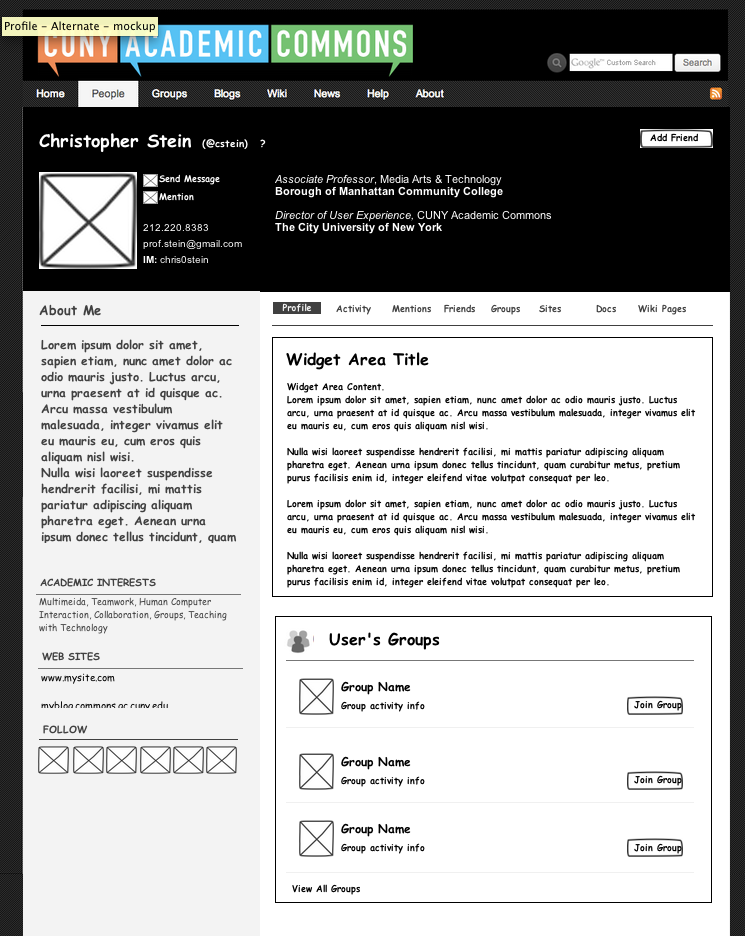
Updated by Chris Stein almost 13 years ago
- File Profile_v4_.png Profile_v4_.png added
- File Profile_v4-Alternate.png Profile_v4-Alternate.png added
- File Profile_v4-Alternate-mockup.png Profile_v4-Alternate-mockup.png added
- File Profile_v4-Alternate-2.png Profile_v4-Alternate-2.png added
- File Profile_v4-NoContent.png Profile_v4-NoContent.png added
OK, I had an idea on how to modify things a bit so I'm posting another set which I'm calling version 4. This version is focused on the profile page. I tried it with the basic information in a header area without so much of a baseball card feel. The area below is split into two areas, both of which would be customizable. On the left has about and allows you to show the other relatively smaller pieces of information.
On the right is the area for the other modules that will be created for them to optionally add.
There are two basic variations. In Profile_v4.png I have the information we currently have: Academic Interests, Web sites and other online accounts in the header area. In the Profile_v4-Alternate.png I moved we currently have: Academic Interests, Web sites and other online accounts (Follow Me) into the left sidebar on the bottom of the page. Profile_v4-Alternate-2.png, adds a change where the sidebar would be static throughout all of the other pages (Friends, Groups, Sites). The Profile_v4-Alternate-mockup.png page is a quick version I did to see how it would look with some more normal fonts and some colors for links and things.
Finally Profile_v4-NoContent.png, is basically just that. How the profile might look if we just have the mandatory content on it. We might think about putting one or two modules in by default so the bottom isn't so barren.
I also have them up on Usernote and an invitation on that too.
Let me know what you think about this direction (and the questions in the previous post too).
Best,
Chris
Updated by Matt Gold almost 13 years ago
Nicely done, Chris -- I think this is really moving in the right direction. I really like what you've done with the layout/design here (dramatic use of space), and I really appreciate the time you are spending on this.
A few thoughts:
-- I think that if we want people to use the Profile page as a home base -- a central site of identity -- we should think about making the profile page a little less Commons-centric. Groups are important, yes, but they're not what I'd necessarily want to appear on a portfolio site. Perhaps we should really think through the place of the Commons and Commons links on this page. Along those lines, we should talk/think about the purpose of these pages -- are they primarily inward-facing, meant to help members of the Commons connect to one another, or are they primarily outward-facing, helping Commons members establish a key academic profile/portfolio site?
-- I think we should get rid of the second horizontal nav bar. I'm not sure how else to signal other sections of the profile, but I think that another nav bar (especially a horizontal one) can make worse something we've already identified as a problem on the site -- the proliferation of nav bar items/menus. I'm reminded of our discussions around CBOX of vertical vs. horizontal menus on Profile pages.
-- I still think we have a way to go in simplifying the interface and rethinking the necessity of certain buttons. I like the Profile_v4_Alternate over Profile_v4 precisely because it has a simpler, more dramatic header area.
Again, great work on all of this, Chris.
Updated by Chris Stein almost 13 years ago
Hi Matt,
Thanks for the comments
-- I think that if we want people to use the Profile page as a home base -- a central site of identity -- we should think about making the profile page a little less Commons-centric. Groups are important, yes, but they're not what I'd necessarily want to appear on a portfolio site. Perhaps we should really think through the place of the Commons and Commons links on this page. Along those lines, we should talk/think about the purpose of these pages -- are they primarily inward-facing, meant to help members of the Commons connect to one another, or are they primarily outward-facing, helping Commons members establish a key academic profile/portfolio site?
I don't think it's a great idea to lose all of the Commons-Centric stuff or relegate it. It's a core part of interacting with people on the Commons and something our users are used to. If you really want to have a full portfolio page now ( I was thinking of this in future iterations), then the only answer I have is to make two pages. One page (I'm calling Commons Profile Page) is your profile on the Commons which includes all of the Commons-related information and links like Friend, Message, Activity, Groups, Docs etc. The second page (I'm calling Portfolio Page) is a new page we would create that is a profile page. This page would be totally customizable and be the page that cuny.is/member links to. The second page wouldn't have any of the Commons-centric links and could even be much more like a mini blog, retaining only the WP bar at the the very top (and not having the commons logo with Home,People,Groups...). There would be a link back to the persons Commons Profile page on the Commons and we could include the Commons logo and maybe other links in the footer or something like that. As it would be more of a blank slate it would be easier to bring in a designer at this point if we chose and even do things that aren't possible right now in the context of the larger site like make it Responsive.
-- I think we should get rid of the second horizontal nav bar. I'm not sure how else to signal other sections of the profile, but I think that another nav bar (especially a horizontal one) can make worse something we've already identified as a problem on the site -- the proliferation of nav bar items/menus. I'm reminded of our discussions around CBOX of vertical vs. horizontal menus on Profile pages.
Creating two pages will eliminate the need for this nav bar on the Portfolio page and there are then some other ways we could approach displaying the various types of user info in the Commons Profile page.
-- I still think we have a way to go in simplifying the interface and rethinking the necessity of certain buttons. I like the Profile_v4_Alternate over Profile_v4 precisely because it has a simpler, more dramatic header area.
I'm going to hold off on actually doing any more wireframes or mockups until after the Friday meeting when we can talk through this stuff and we can also get feedback from more people (including, hopefully, some we haven't heard from yet). I may do a quick diagram of the two pages, but I need to use my time wisely as the semester is starting. This is shaping up to be a pretty big change. Looking forward to getting it into the next phase.
Updated by Chris Stein almost 13 years ago
I said I wasn't going to do anything before Friday's meeting, but I did (wanted to try out a new grid framework). This is a proof-of-concept for the two page strategy we will probably talk about today. http://bit.ly/XFil0T
Updated by Matt Gold almost 13 years ago
Thank you, Chris. Can you update this ticket with a summary of the plan/design we settled on yesterday whenever you have a chance? Many thanks for all of your great work.
Updated by Chris Stein almost 13 years ago
I updated the same page as from the last time, http://bit.ly/XFil0T
The basic consensus among the group was to do two separate pages. One for the portfolio/cv (need to settle the name) that is where cuny.is/name link would go and is how you present yourself to the world. And the other to hold the commons centric profile data. We also decided to keep the general styling of the portfolio/cv page for both pages and then add in the commons-related information by adding in tabs. Also, the portfolio and profile pages would be outside of the general design of the site (more like a separate blog). This was to keep the focus of the portfolio page on the person and less commons-centric. Ideally, this is my addition as we didn't talk much about it, the pages would be responsive as well.
There was another, major, request. That the WP bar at the top be modified so that it displays the Commons logo and also the main navigation of the site: Home/People/Groups/Blogs/Wiki/News/Help/About
This would be a big change to the navigation but the idea is that it would be consistent across blogs and the profile etc so that it would in the end be easier for users to know where to go for the main site navigation.
In the version that is live now, what has changed is that now there is a tab that takes you to the Commons Profile page (that is the only other page that is updated. This page has been styled to look like the portfolio/cv page.On the Commons Profile page it has some more commons-related information showing and the person's activity/sites/docs etc. in accordions at the bottom.
In the interest of saving some development time we may want to make the profile page non-editable (it would just show the same thing for each person) and leave the portfolio/cv page as the editable page.
It doesn't show what that page would look like if it was your own page and editable. I'll do that next. However the two main requests are- Edit in place with edit buttons or something similar
- TinyMCE toolbar when editing the text so it can be easily formatted even in the user doesn't know HTML
I added a linen texture where I has solid black last time as an example of something else we might do to allow people to customize their pages.
There are more little details to work out but let's come to an agreement on the general ideas for the pages first.
The links at the top of the page still work but have not been updated.
Updated by Boone Gorges almost 13 years ago
Thanks for the update, Chris. A couple questions:
That the WP bar at the top be modified so that it displays the Commons logo and also the main navigation of the site
Is the proposal to do this everywhere on the Commons? Or just on the Profile pages? If everywhere, what are we doing with stuff like My Groups and My Blogs? What about WordPress's menus, like 'New Post etc' when users are on blogs where they have posting privileges? Are we adding the large CUNY Academic Commons logo as in the mockup across the entire site? Is that logo no longer going to contain a dropdown menu mirroring sitewide nav (since it'd be duplicating the rest of the admin bar)?
In any case, could we please move discussion of changing the admin bar to a new ticket? We'll need to lay out detailed specs about what the bar will look like in different cases: logged-out visitors, logged-in visitors on the main site, logged-in visitors on sites where they have admin/posting priviliges, etc etc etc.
In the interest of saving some development time we may want to make the profile page non-editable (it would just show the same thing for each person) and leave the portfolio/cv page as the editable page.
If we're going to separate Commons Profiles from Portfolios, then the Profiles should remain un-editable, as they are now. (At least for now.) We don't allow any customization on Profiles at the moment anyway, so there's no loss of functionality.
In this configuration we are losing the ability to see someone's (or your own) Friends Activity (the things the person's friends are doing). Do we care? We are also losing the ability to see the persons Groups Activity.
I'm imagining that the large links on http://teachingmultimedia.com/commons/portfolio_protoype/profile.html go to separate pages, which will share the user header, but will have BP content below the fold. This is similar to the setup that we already have. As before, we'll continue to have the ability to see Friends, Group Activity, etc, by clicking Activity and then the Groups or Friends subnav item. It's just that it'll be hidden one level deeper than it is now.
It wasn't really spelled out in your comments, but I'm assuming that the large header area is not configurable by the user: it's a set layout, and we fill it in with user-provided info (one-sentence description, social media links, etc). Only the area below the header (white background) will be configurable by the user, with each block as a "widget" of some sort. If that's true, then we'll need a mockup of the UI for adding new blocks - are they selected from presets, or what.
Updated by Boone Gorges almost 13 years ago
Email notifications were temporarily broken here on Redmine, so consider this a bump (for Chris's and my latest comments).
Updated by Chris Stein almost 13 years ago
Great questions Boone. I share many of them. I'll answer them in more detail later, but a quick update for now. I'm a bit concerned that we're tackling so much with this but the consensus seems to be "go big or go home." Or at least that for the new profiles/portfolios to work they really need to change the status quo. Which makes sense. It just means it will take a bit longer.
I agree that the navigation needs it's own ticket and created #2396 If we are going to do that change then I think the only way to do it is across the site.
I plan to do a version of the prototype with the edit screens mocked up and probably also make some annotated screenshots to help explain how the interactivity would work. That will be my next update and hopefully start to answer your other questions.
If others have questions or imagined things differently then my prototypes are showing then let us know.
-chris
Updated by Chris Stein almost 13 years ago
I have a new page with the first version of the editable portfolio here:
http://teachingmultimedia.com/commons/portfolio_protoype/portfolio_editable.html
It just prototypes editing the sections in the portfolio. I haven't done the top "hero" part of the page. There are actually some questions I have around that which I'll submit in another update when I have a moment later.
Best,
Chris
Updated by Matt Gold almost 13 years ago
Great work, Chris -- this is looking fantastic.
Updated by Chris Stein over 12 years ago
Updated by Boone Gorges over 12 years ago
The first pass at the new profiles has been put into the master branch, and is ready for preliminary testing on cdev.gc.cuny.edu. Chris, Micki, and I will be working over the upcoming days on a list of items that need to be tested by the rest of the team. In the meantime, you're free to play around with it informally. Here's my profile: http://cdev.gc.cuny.edu/members/boonebgorges/ To see the good stuff, log in and play around with editing your own profile.
A few technical notes for the developers:
- In order to make parallel development a bit easier, the plugin cac-advanced-profiles is currently configured as a submodule of the main CAC repo. That means you'll need to git submodule init and git submodule update, both in the repo root and in wp-content/plugins/cac-advanced-profiles, to make things work. I'll probably change to a different setup once the plugin is stable-ish.
- Note also that cac-advanced-profiles requires the following: BP, bp-social-media-profiles, custom-profile-filters-for-buddypress. At the moment, the plugin will not fail gracefully if any of these are missing - it'll just crash.
I'm going to leave notes on the child tickets of this main issue to mark the progress of the subsidiary tasks. More to come in the upcoming days.
Updated by Matt Gold over 12 years ago
Exciting, Boone.
Just played around with the profiles and found what may be a bug:
-- For Positions, it looks like you can enter only one position per section. So, I added one section for my work at the GC and then another for NYCCT; when I saved, only one of the two sections was saved
-- My Education section disappeared upon save
-- My Publications section disappeared upon save
-- also, upon clicking "save changes" from the bottom of the portfolio page, I was taken back to the edit profile page. Is that expected behavior?
-- descriptive text would be nice for the RSS feed section -- ie., tell people what to post
-- RSS feed is awesome
-- on Commons profile page, padding needed between bottom of profile and footer, at least on edit page
I do think it would be helpful to have some design work done on the editing page. The attached screenshot is pretty busy visually -- hard to focus with so many textual elements and so many text colors. I think we can/should aim for a more focused color palette. Here are some changes I'd suggest:
-- Make the text size on the privacy options smaller
-- Get rid of the red/blue colors on privacy options, using gray for all text, including the intro text (This field can be seen by: ), which is currently white
-- consider making privacy options expandable when clicked rather than showing all the time (like have the word "Privacy" next to each box and have it open to reveal privacy settings when clicked. Though it could be annoying to have to click on fifteen different privacy settings; maybe open them all at once when any one is clicked)
-- Aim for only one line of description to accompany each input box
-- I think we need to make it clearer what info winds up going where -- so, the one-sentence description that appears at the top of the profile page should be clearly signaled as such on the editing screen. A little confusing right now
-- see if we can find a better layout for the role options (ideally, check boxes would appear right next to the words they represent)
Again, fantastic work -- so exciting to see this taking shape!
Updated by Boone Gorges over 12 years ago
Thanks for the feedback, Matt.
I meant to note that I would like to hold back from detailed bug reports at the moment. There are definitely bugs and areas for improvement, but I would like to wait a day or two until Micki and I have had a chance to touch base with Chris before stuff starts pouring uncontrollably into this thread, where items will undoubtedly get lost. So, please do take notes of issues that you've found, but please don't post them here just yet until we have a more systematic way of requesting the info. Thanks.
Updated by Matt Gold over 12 years ago
Darn -- and here I was, so proud to have finally tested something quickly.
Updated by Boone Gorges over 12 years ago
Ha ha, I've taken note of your diligence in my records :)
Updated by Boone Gorges over 12 years ago
- Status changed from Assigned to Resolved
After a number of rounds of feedback and revisions with members of the team, I'm going to mark this ticket Resolved, and ready for the 1.5 release. Any individual issues should go into new tickets.
Many thanks for the hard work that went into conceptualizing and testing this feature.
Updated by Matt Gold over 12 years ago
Hurray! Many thanks to you for your hard work on this, Boone, and to the team for a great all-around effort.