Support #11496
openReplace Twitter Icon on Member Portfolio page
0%
Description
A member noticed that the twitter icon used on the member portfolio page is out of date. Is it possible to switch to the new one? https://about.twitter.com/en_us/company/brand-resources.html
(The old twitter logo looks a bit like the current tumblr icon to him.)
Files
Updated by Boone Gorges about 7 years ago
- File Screenshot_2019-05-29_10-01-17.png Screenshot_2019-05-29_10-01-17.png added
- File Screenshot_2019-05-29_10-04-45.png Screenshot_2019-05-29_10-04-45.png added
- File Screenshot_2019-05-29_10-10-53.png Screenshot_2019-05-29_10-10-53.png added
- Target version set to 1.15.2
Good call. Here's the change for the portfolio: https://github.com/cuny-academic-commons/cac/commit/3523efca7616eeb3e960d863700d54e39da023c9
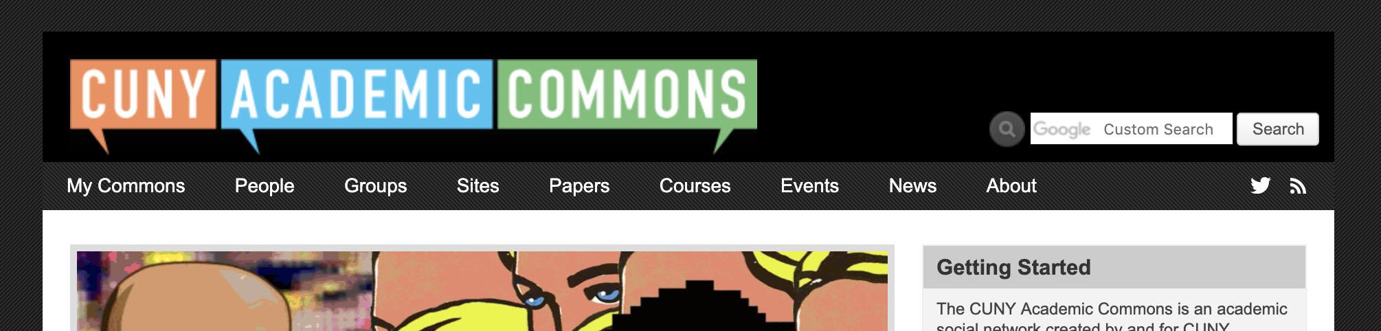
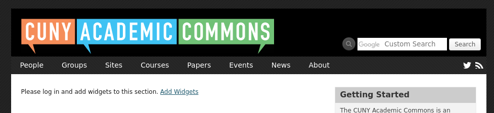
We also use the old logo in the main site nav (to the far right, by the RSS icon). I've made a change locally to see what the new logo looks like. It's pretty small and hard to read. Maybe Sonja could have a quick look at the screenshot to see if it reads properly. I've also attached a screenshot of another version where I increase the size of the icons to take up more of the vertical space in the menu area - this would be an alternative that's easy to implement.
Updated by Sonja Leix about 7 years ago
- File 11496-nav-bar-icons.jpg 11496-nav-bar-icons.jpg added
Boone Gorges wrote:
Good call. Here's the change for the portfolio: https://github.com/cuny-academic-commons/cac/commit/3523efca7616eeb3e960d863700d54e39da023c9
We also use the old logo in the main site nav (to the far right, by the RSS icon). I've made a change locally to see what the new logo looks like. It's pretty small and hard to read. Maybe Sonja could have a quick look at the screenshot to see if it reads properly. I've also attached a screenshot of another version where I increase the size of the icons to take up more of the vertical space in the menu area - this would be an alternative that's easy to implement.
Hi Boone, thanks for sharing the screenshots. The footer icons are looking good as they are. For the header, I would either go with the larger size, as the current icon size is quite small. Or alternatively maybe we'll just use the icons on it's own, not inside a button. See attached mockup.
Updated by Boone Gorges about 7 years ago
The non-button links look good to me. Sonja, can you please provide the images?
Updated by Sonja Leix about 7 years ago
- File social-icon-rss-simple.svg social-icon-rss-simple.svg added
- File social-icon-twitter-simple.svg social-icon-twitter-simple.svg added
Boone Gorges wrote:
The non-button links look good to me. Sonja, can you please provide the images?
Great! Please find attached the SVGs for both icons. I would recommend to implement these icons in white on default, and use the original brand colors on hover:
Twitter: #1da1f2
RSS: #dd7d37
Thanks.
Updated by Boone Gorges about 7 years ago
Thanks, Sonja! I've attached a screenshot that shows the padding/positioning I chose - I tried to make it roughly match what we have now, with some tweaks to allow for breathing room. Let me know if this gets your OK. https://github.com/cuny-academic-commons/cac/commit/81f29c765a8c164536b4db5ed944dbb080173f5c
Updated by Sonja Leix about 7 years ago
Boone Gorges wrote:
Thanks, Sonja! I've attached a screenshot that shows the padding/positioning I chose - I tried to make it roughly match what we have now, with some tweaks to allow for breathing room. Let me know if this gets your OK. https://github.com/cuny-academic-commons/cac/commit/81f29c765a8c164536b4db5ed944dbb080173f5c
Yes that works for me. You could even add a little more padding between the two icons. But otherwise good to go.