Feature #11901
closedImplement new courses archive list style on sites and groups archive pages
0%
Description
For visual consistency and improved visual design of the site and groups archive pages, we should implement the new courses list style on those pages as well.
I'll be mocking these up shortly.
Files
Updated by Sonja Leix almost 7 years ago
- File 11901-sites-v1.pdf 11901-sites-v1.pdf added
- File 11901-groups-v1.pdf 11901-groups-v1.pdf added
Please review attached mockups for the updated Site and Group landing page.
The only update you'll find is in the list grid, applying the new block design from the new Courses landing page.
Please let me know if you have an feedback or if this is good to go.
Thanks.
Updated by Boone Gorges almost 7 years ago
This looks visually good to me if it's good for everyone else.
Sonja, will you be providing some specifics about this box-shadow? I'm not sure whether you built in in CSS and so have the CSS to share. Otherwise I can wing it and you can make corrections after seeing it.
Updated by Sonja Leix almost 7 years ago
Boone Gorges wrote:
This looks visually good to me if it's good for everyone else.
Sonja, will you be providing some specifics about this box-shadow? I'm not sure whether you built in in CSS and so have the CSS to share. Otherwise I can wing it and you can make corrections after seeing it.
I'm happy to share the design file so you can take a look at it. I also put together a rough style on Codepen, feel free to clean it up: https://codepen.io/sonjaleix/pen/NWWKyWd
But basically it's just a simple box-shadow that only extends bottom and has no blur.
Updated by Colin McDonald almost 7 years ago
Looks good to me, too! I'll send it around to the usual Tuesday call participants now, so we can aim for sign-off during tomorrow's call.
Updated by Sonja Leix almost 7 years ago
Based on our conversation during today's call. These new designs look good with one minor change as updated attached (increase font color of Privat/Public Group / XX members) font.
Note: All content within the tiles for groups and sites is the same as currently implemented! I made one minor font color change to increase legibility of body copy and as mentioned above group type / member number text. As Matt noted yellow buttons feel outdated, but those should be part of the bigger redesign changes (so we'll leave them as they are).
Boone, I'll push these designs to Zeplin:
https://zpl.io/2ZXvOpq
https://zpl.io/VkWl9kG
You can start implementing these.
Updated by Sonja Leix almost 7 years ago
- Assignee changed from Sonja Leix to Boone Gorges
Updated by Boone Gorges over 6 years ago
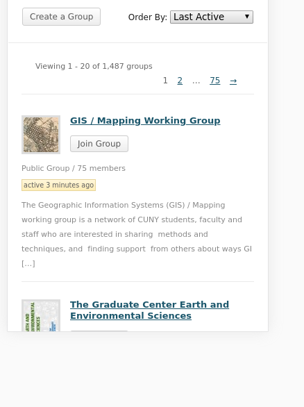
- File Screenshot_2019-11-07_21-10-35.png Screenshot_2019-11-07_21-10-35.png added
- Status changed from New to Testing Required
First pass at this new styling is in https://github.com/cuny-academic-commons/cac/commit/d2d0798ca93d448793128c23772cf7da5634253f, https://github.com/cuny-academic-commons/cac/commit/59f0147a59d32c5a3a2ef4e9d8b187052fb025e4
I departed from the mockups very slightly where necessary to match the Courses design as implemented, especially in the pagination text "Viewing..." and the spacing between items on the list.
Sonja, could you please give some guidance on mobile styling? I can use the Courses mobile design as a starting place https://app.zeplin.io/project/5c92695a14906306965f02d1/screen/5d9cf100c933a31eda9d1ab1, but the Groups and Sites directories have the added complication of the far-right column, which includes the 'join/request' buttons, etc. On the current design, we drop those buttons right below the 'active' label. I've attached a screenshot for your reference. Happy to consider other solutions.
Updated by Sonja Leix over 6 years ago
Boone Gorges wrote:
First pass at this new styling is in https://github.com/cuny-academic-commons/cac/commit/d2d0798ca93d448793128c23772cf7da5634253f, https://github.com/cuny-academic-commons/cac/commit/59f0147a59d32c5a3a2ef4e9d8b187052fb025e4
I departed from the mockups very slightly where necessary to match the Courses design as implemented, especially in the pagination text "Viewing..." and the spacing between items on the list.
Sonja, could you please give some guidance on mobile styling? I can use the Courses mobile design as a starting place https://app.zeplin.io/project/5c92695a14906306965f02d1/screen/5d9cf100c933a31eda9d1ab1, but the Groups and Sites directories have the added complication of the far-right column, which includes the 'join/request' buttons, etc. On the current design, we drop those buttons right below the 'active' label. I've attached a screenshot for your reference. Happy to consider other solutions.
Hi Boone,
Thanks for sharing this. I think this works, unless we want to add the CTA at the bottom, meaning the right column would drop below the left column on a 1-column mobile layout. I think eitheer works, the CTA is prominent enough to not be missed in either layout.
Updated by Boone Gorges over 6 years ago
Thanks, Sonja. I like the idea of putting it at the bottom. It feels clearer visually, and it's also far easier to implement technically. The one potential snag is that, for historical reasons, the CTA section containing the buttons also contains other metadata about items, such as group email subscription info. See the attached screenshot for what this looks like in context. IMHO this is an improvement over the current implementation, but I'd like a second opinion about that.
Updated by Sonja Leix over 6 years ago
Boone Gorges wrote:
Thanks, Sonja. I like the idea of putting it at the bottom. It feels clearer visually, and it's also far easier to implement technically. The one potential snag is that, for historical reasons, the CTA section containing the buttons also contains other metadata about items, such as group email subscription info. See the attached screenshot for what this looks like in context. IMHO this is an improvement over the current implementation, but I'd like a second opinion about that.
Agreed, I like it at the bottom a lot better. It's cleaner.
Updated by Boone Gorges over 6 years ago
Thanks, Sonja! I've made the corresponding change in the Sites directory, which means I think this is ready for team testing. https://github.com/cuny-academic-commons/cac/commit/e65a8bdd86b8293307a97607eac6af717768278d
Ray, FYI: I made some small changes to the way that the 'site role' markup is built, for better compatibility with mobile.
Updated by Sonja Leix over 6 years ago
- File Screenshot 2019-11-19 14.52.08.png Screenshot 2019-11-19 14.52.08.png added
- File Screenshot 2019-11-19 14.46.46.png Screenshot 2019-11-19 14.46.46.png added
Boone Gorges wrote:
Thanks, Sonja! I've made the corresponding change in the Sites directory, which means I think this is ready for team testing. https://github.com/cuny-academic-commons/cac/commit/e65a8bdd86b8293307a97607eac6af717768278d
Ray, FYI: I made some small changes to the way that the 'site role' markup is built, for better compatibility with mobile.
Hi Boone,
I just tested both the new design of Group and Site lists and it seems content doesn't stack in one column on smaller devices. See attached screenshots. Could you double check that. Everything else looks good
Updated by Boone Gorges over 6 years ago
Thanks for having a look, Sonja. I'm looking at the dev site right now and the one-column view is working properly. Could you please ensure that you've flushed your browser cache? Maybe try an Incognito/Private window.
Updated by Sonja Leix over 6 years ago
Boone Gorges wrote:
Thanks for having a look, Sonja. I'm looking at the dev site right now and the one-column view is working properly. Could you please ensure that you've flushed your browser cache? Maybe try an Incognito/Private window.
Thanks Boone, even with flushing browser cache or looking at it in Incognito window the issue remains. But maybe it's my machine. If you and others don't see this then it's me.
Updated by Boone Gorges over 6 years ago
I spent a bit of time looking into this and discovered that there were issues between ~400px and ~600px - I was testing with the browser's device emulation instead of by dragging the window to make it narrower, so I missed these widths. The fix in https://github.com/cuny-academic-commons/cac/commit/bd2dd0f97b51a5e1055f754adc202f62fa1f5286 should address it.
Updated by Sonja Leix over 6 years ago
Boone Gorges wrote:
I spent a bit of time looking into this and discovered that there were issues between ~400px and ~600px - I was testing with the browser's device emulation instead of by dragging the window to make it narrower, so I missed these widths. The fix in https://github.com/cuny-academic-commons/cac/commit/bd2dd0f97b51a5e1055f754adc202f62fa1f5286 should address it.
Thanks for looking further into this, Boone! This is looking great now! Only minor adjustment I'd make is to add some margin between the "Visit Site" and "Follow" buttons on the Site's directory. Otherwise good from my side.
Updated by Sonja Leix over 6 years ago
Boone Gorges wrote:
Thanks, Sonja! I've made the change.
Thanks Boone!
Updated by Boone Gorges over 6 years ago
- Status changed from Testing Required to Resolved