Bug #12140
closedFixing Size/Contrast of "Recently Active Text"
0%
Description
The recently active text on the Commons home and directory pages throws an error on the WAVE Accessibility tool because the text is "very small". If this text could be made slightly larger and increased in contrast (made black instead of gray) this text would be more accessible for users on the Commons.
Files
Updated by Boone Gorges over 6 years ago
- File Screenshot_2019-11-25_14-35-02.png Screenshot_2019-11-25_14-35-02.png added
- File Screenshot_2019-11-25_14-36-21.png Screenshot_2019-11-25_14-36-21.png added
- Category name set to Accessibility
- Assignee set to Sonja Leix
- Target version set to 1.17.0
Thanks, Laurie.
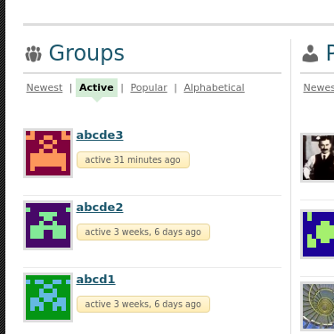
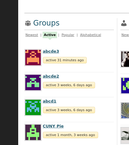
Sonja, the attached screenshots show the current appearance, and the proposed appearance: color changed to #000 and font-size to 11px (the minimum not flagged as "too small" by WAVE). What do you think of this proposal?
Updated by Sonja Leix over 6 years ago
Boone Gorges wrote:
Thanks, Laurie.
Sonja, the attached screenshots show the current appearance, and the proposed appearance: color changed to #000 and font-size to 11px (the minimum not flagged as "too small" by WAVE). What do you think of this proposal?
Thanks Boone, yes that works. Please implement.
For the redesign, we'll look at the accessibility of text and other elements, especially color contrast, since I'm sure there are many such cases where we don't pass.
Updated by Sonja Leix over 6 years ago
- Status changed from New to In Progress
- Assignee changed from Sonja Leix to Boone Gorges
Assigning to you, Boone.
Updated by Laurie Hurson over 6 years ago
For the redesign, we'll look at the accessibility of text and other elements, especially color contrast, since I'm sure there are many such cases where we don't pass.
This sounds good. Thanks to you both!
Updated by Boone Gorges almost 6 years ago
- Status changed from In Progress to Resolved