Design/UX #3559
closedForum Styling
0%
Description
Hi All,
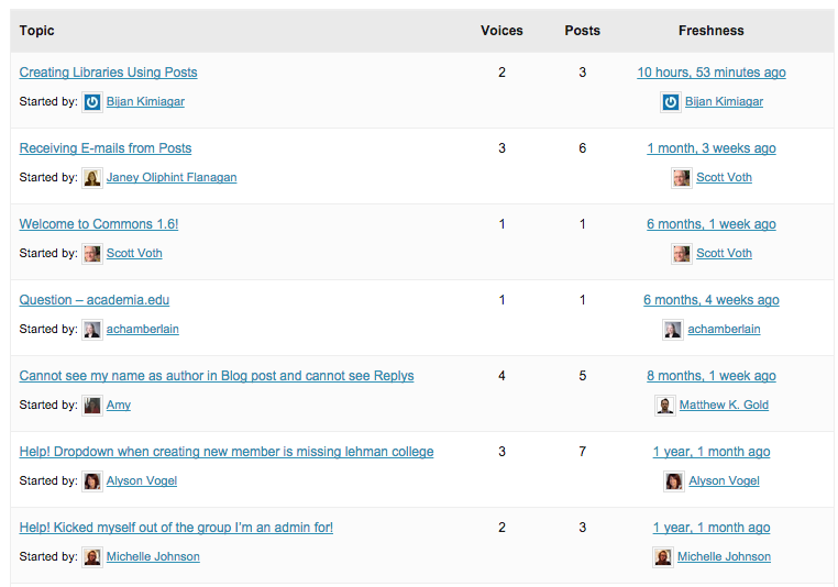
I'm finding the new forums a bit hard on the eyes; the light background and closely clustered links make the readability a bit rough. Chris and Samantha, can you please take a look and let me know whether you have small tweaks? Thanks. Screenshot attached. Also please let me know whether you don't agree that there is a readability issue.
Files
Updated by Samantha Raddatz over 11 years ago
The readability doesn't particularly bother me, but that might be because I look at other forums on a regular basis that have a similar layout and tightness.
Since these are all links around the same font size there isn't much information hierarchy. The easiest fix, I think, would be to remove the 'Started by:' area and allow the post title to stand out. Most forums just include who made the latest post – is there a specific use case why that's included for the Commons?
This is also another area that I could work into user testing if we'd like.
Updated by Matt Gold over 11 years ago
Thanks, Samatha. I like your idea of playing with the "Started by" line. What if, instead of "started by," we just put the icon of the person who started the topic at the beginning or end of the post title? Would that look strange?
Updated by Samantha Raddatz over 11 years ago
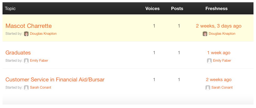
- File Pratt Commons Forum.png Pratt Commons Forum.png added
What if, instead of "started by," we just put the icon of the person who started the topic at the beginning or end of the post title?
I think that would be unclear to the users.
Unless there's a design standard that says we shouldn't, or a mobile reason we can't, increasing the font size of the first line could help.
Pratt Commons has done this. Screenshot attached.
Updated by Matt Gold over 11 years ago
- Assignee changed from Chris Stein to Boone Gorges
Yes -- that looks so much better. Boone, can you please experiment a bit to try to reproduce the look of the Pratt screenshot?
And Chris, if you have comments on mobile styling, please let us know.
Updated by Boone Gorges over 11 years ago
- Category name set to Group Forums
- Status changed from Assigned to Resolved
- Target version set to 1.7.2
I've changed the styling as requested in https://github.com/cuny-academic-commons/cac/commit/6d946aaf9d3f5b7ec1d76c6d43145d2d825ff47d. In the interest of keeping the milestone clear, I'm going to close the ticket. If you have more specific suggestions, please feel free to open a separate one.