Design/UX #19604
closedCV Mobile Refinement
0%
Description
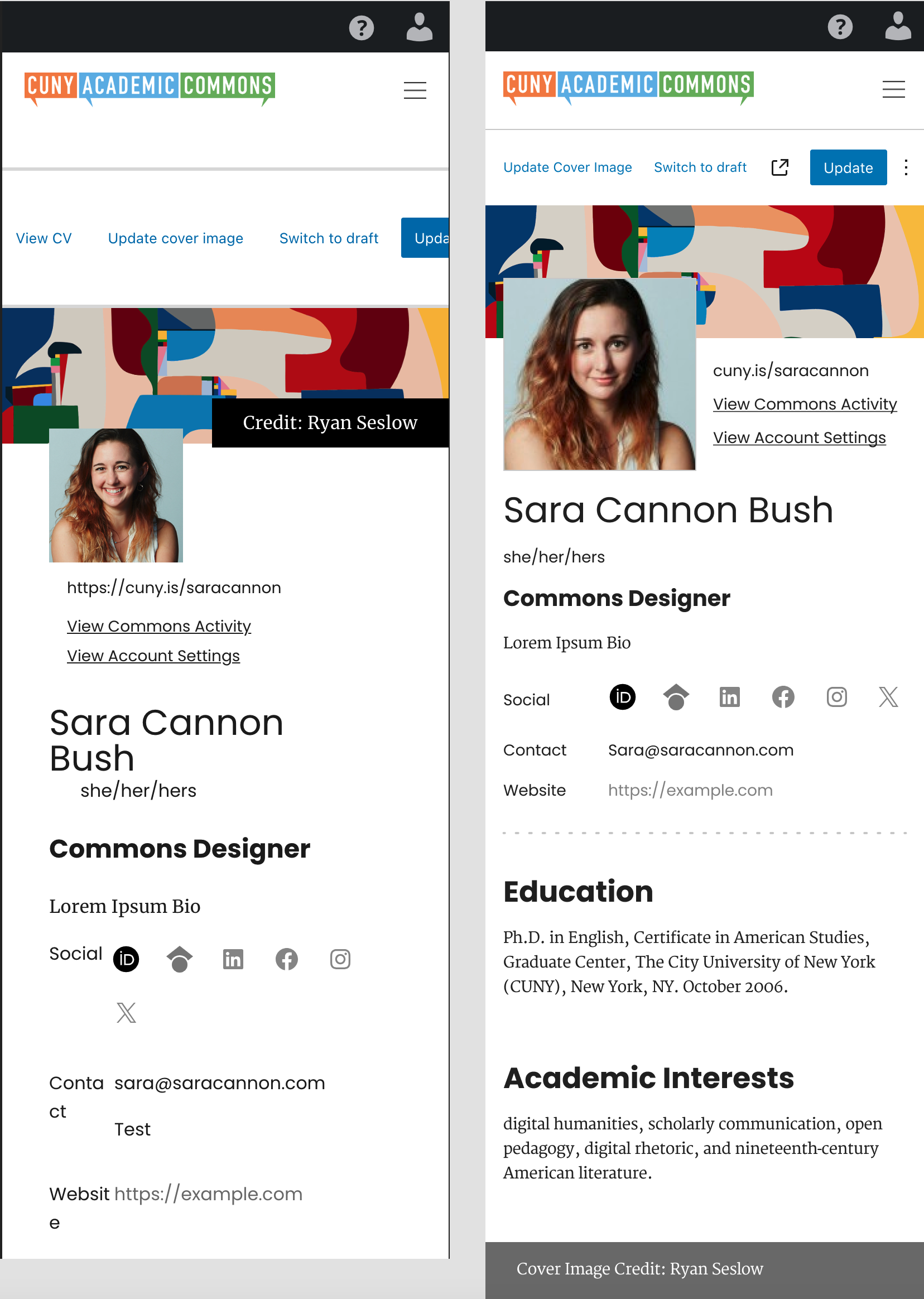
The Current CV Mobile view can use some design refinement. The current view has some alignment issues where the CV menu creates a scroll-to-the right situation.
I did a mobile comp that cleaned up the layout. Note the CV edit menu turns the "View CV" text into an Icon. This is used in WordPress Core.
The image credit is way too prominent, so I moved it down to the footer.
See the below Screenshot that shows what the mobile view is like currently, and what it could look like with a bit of cleaning up.
The content gutters are 16px - 4 col. See Grid Guide Below: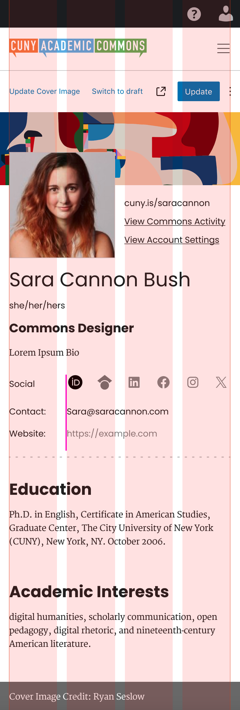
Files
Updated by Boone Gorges over 2 years ago
- Category name changed from Design to CV
- Target version set to 2.4.0
I'm putting this into the 2.4.0 release, though I'll leave it up to Jeremy's judgment whether some of the styling-only changes can or should be put into earlier maintenance releases.
Updated by Sara Cannon about 2 years ago
Bump! Has there been any progress here? As we start to think about expanding some of the functionality, it would be great if the mobile layout is buttoned up
Updated by Jeremy Felt about 2 years ago
Getting close! I spent some time with this yesterday while dealing with some updates to the latest version of the Isolated Block Editor. I'll have some major improvements ready before next week.
Updated by Boone Gorges about 2 years ago
- Status changed from New to Resolved
Looks like these changes went out with the 2.4.0 release.