Actions
Design/UX #19604
closedCV Mobile Refinement
Start date:
2024-01-25
Due date:
% Done:
0%
Estimated time:
Deployment actions:
Description
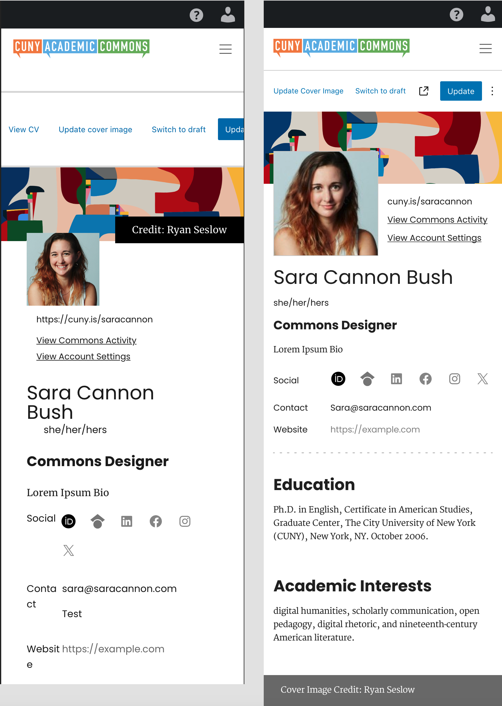
The Current CV Mobile view can use some design refinement. The current view has some alignment issues where the CV menu creates a scroll-to-the right situation.
I did a mobile comp that cleaned up the layout. Note the CV edit menu turns the "View CV" text into an Icon. This is used in WordPress Core.
The image credit is way too prominent, so I moved it down to the footer.
See the below Screenshot that shows what the mobile view is like currently, and what it could look like with a bit of cleaning up.

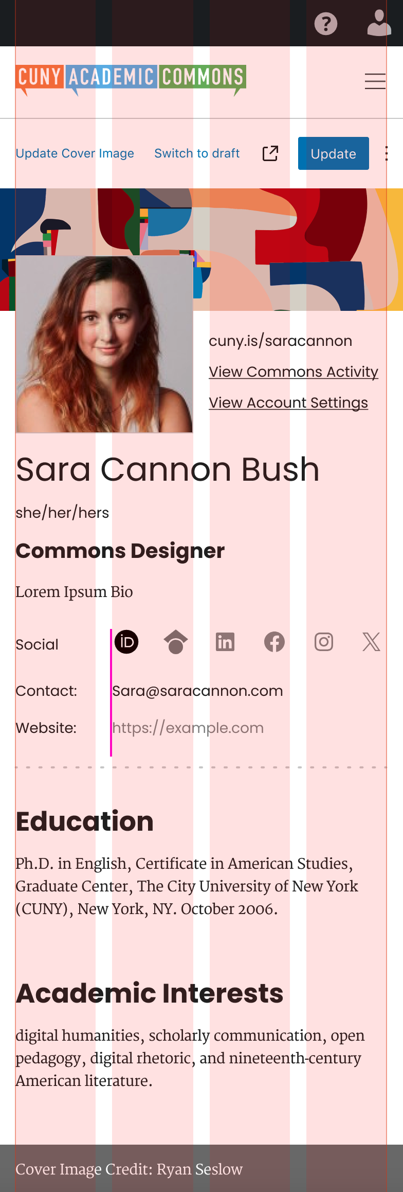
The content gutters are 16px - 4 col. See Grid Guide Below:
Files
Actions