Feature #19861
openHelp redesign Feedback
0%
Description
Hi Scott and All,
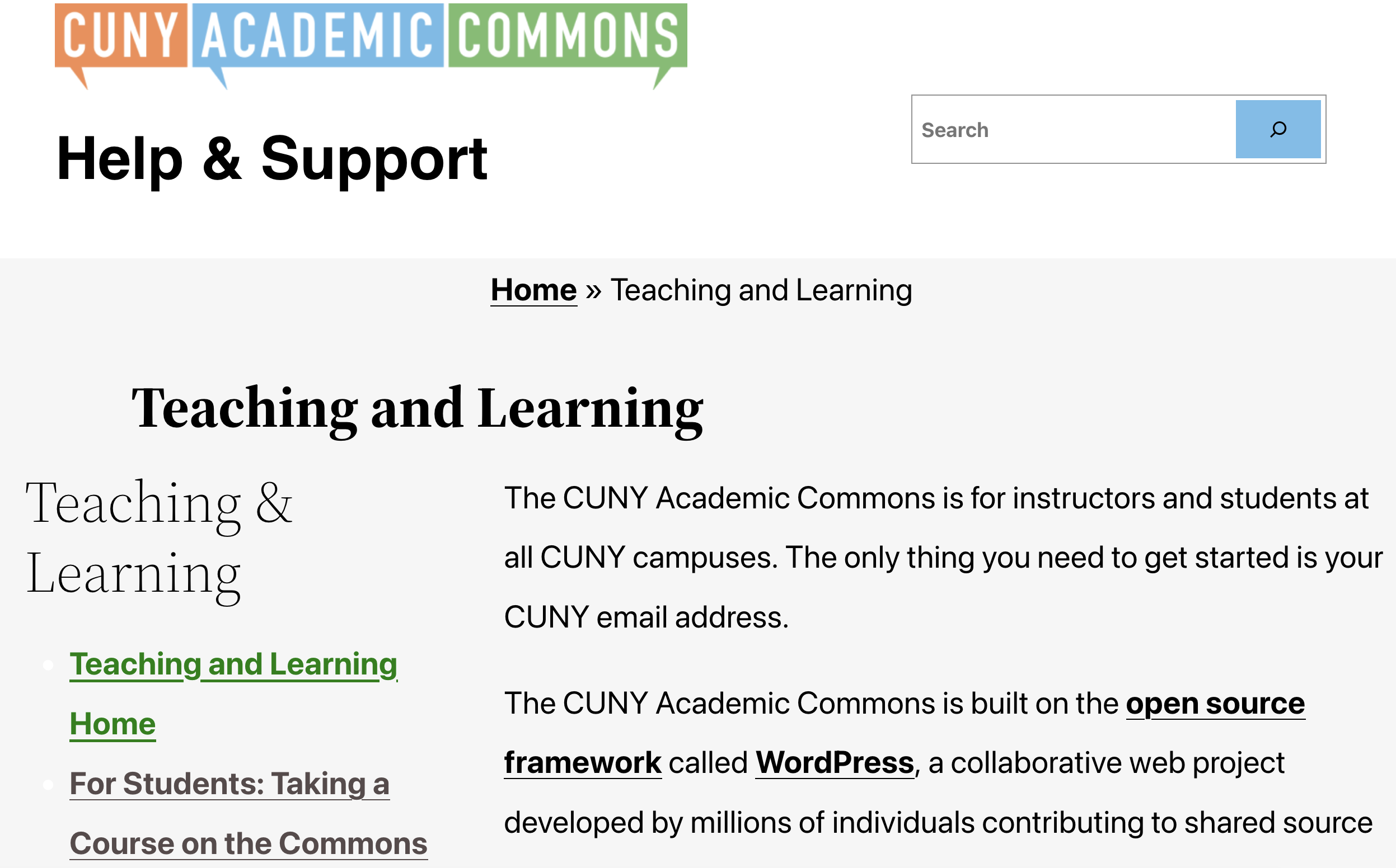
I wanted to provide some feedback on our shiny and new help redesign. Overall it looks great! The main issue I am experiencing is the font size is so large, I really feel the site looks cramped and I can only find a little bit of information at one time.
In the screenshot attached, the header is taking up ~1/3 of the page, the title and first sentence is another 1/3 of the page, and I can only see 1-2 menu items in the left sidebar, whereas in the past design I could see about 10+ menu items so it was clear that the menu on the left was the "main nav" for each help section.
Could we consider changing the font size and spacing to make it so help site visitors can see more information on the page? Do others feel this would be helpful?
Files
Updated by Laurie Hurson over 2 years ago
Updated by Laurie Hurson over 2 years ago
I am also noticing that some links still have a strike-through - see "plugins director" here:
Updated by scott voth over 2 years ago
- File help site.png help site.png added
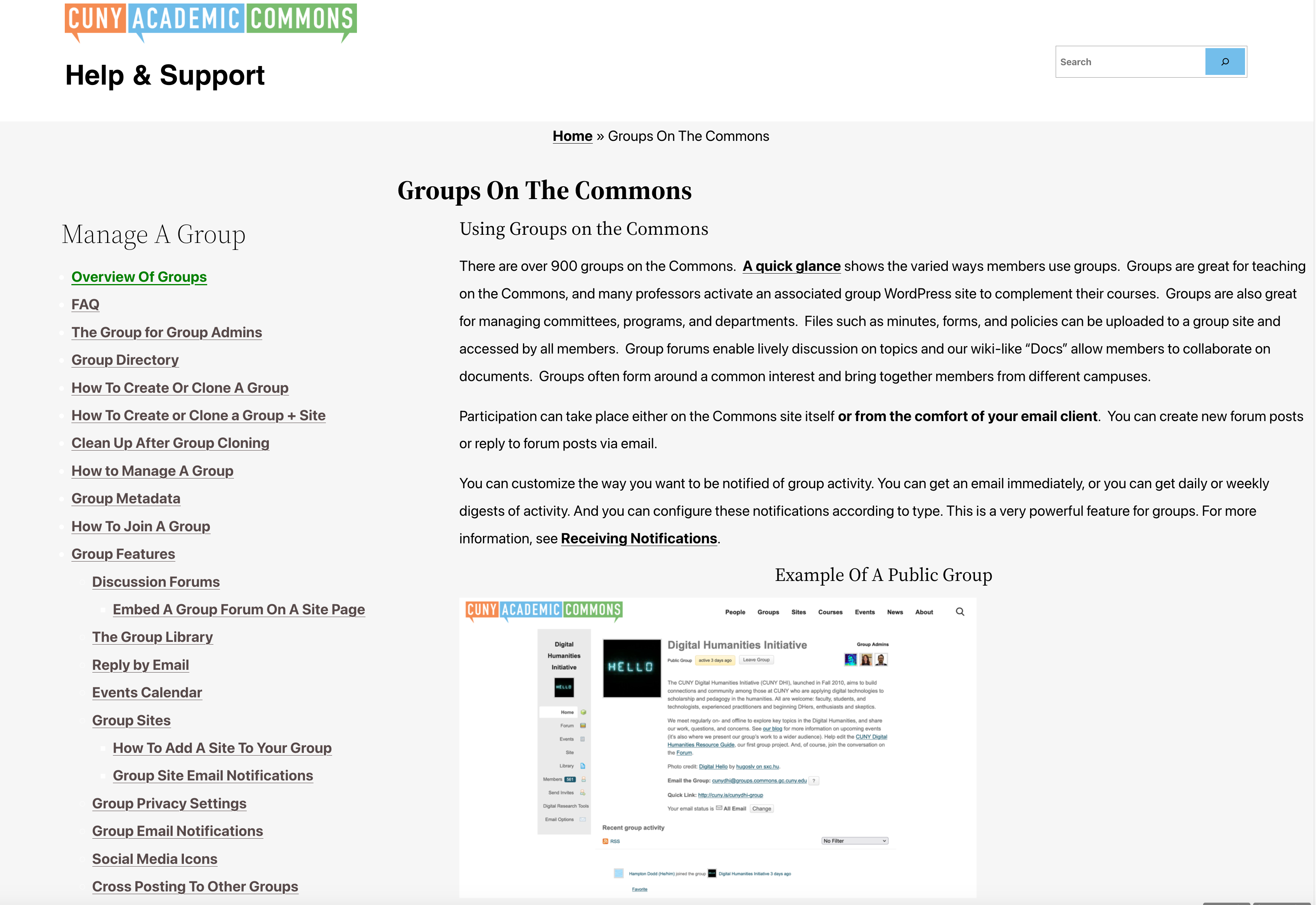
Hi Laurie - On your keyboard, have you tried to do CMD plus or CMD minus? Using this, my font-size adjusts so that the page is more readable. See attached. I don't know if this is a good answer or not. I am using the default font-size for the Twenty Twenty Two theme. The presets are:
--wp--preset--font-size--small: 1rem;
--wp--preset--font-size--medium: 1.125rem;
--wp--preset--font-size--large: 1.75rem;
--wp--preset--font-size--x-large: clamp(1.75rem,
The "body" font-size is set to large. I think 1rem is usually 16px, so large is 16 times 1.75, which is indeed very large. For the time being, I'm setting the font-size to 16px. Let's see how that works out.
I'll check out the strike throughs.
Updated by Colin McDonald over 2 years ago
- File new-home-title.png new-home-title.png added
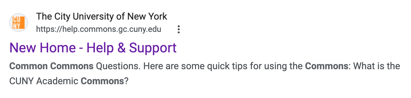
Hi Scott, I noticed that the homepage of the new site comes up as "New Home" in Google results (see attached). Maybe we need to alter the title of the page in Wordpress now that it's live?
Updated by Colin McDonald over 2 years ago
- File header-combine.png header-combine.png added
- File homepage-columns.png homepage-columns.png added
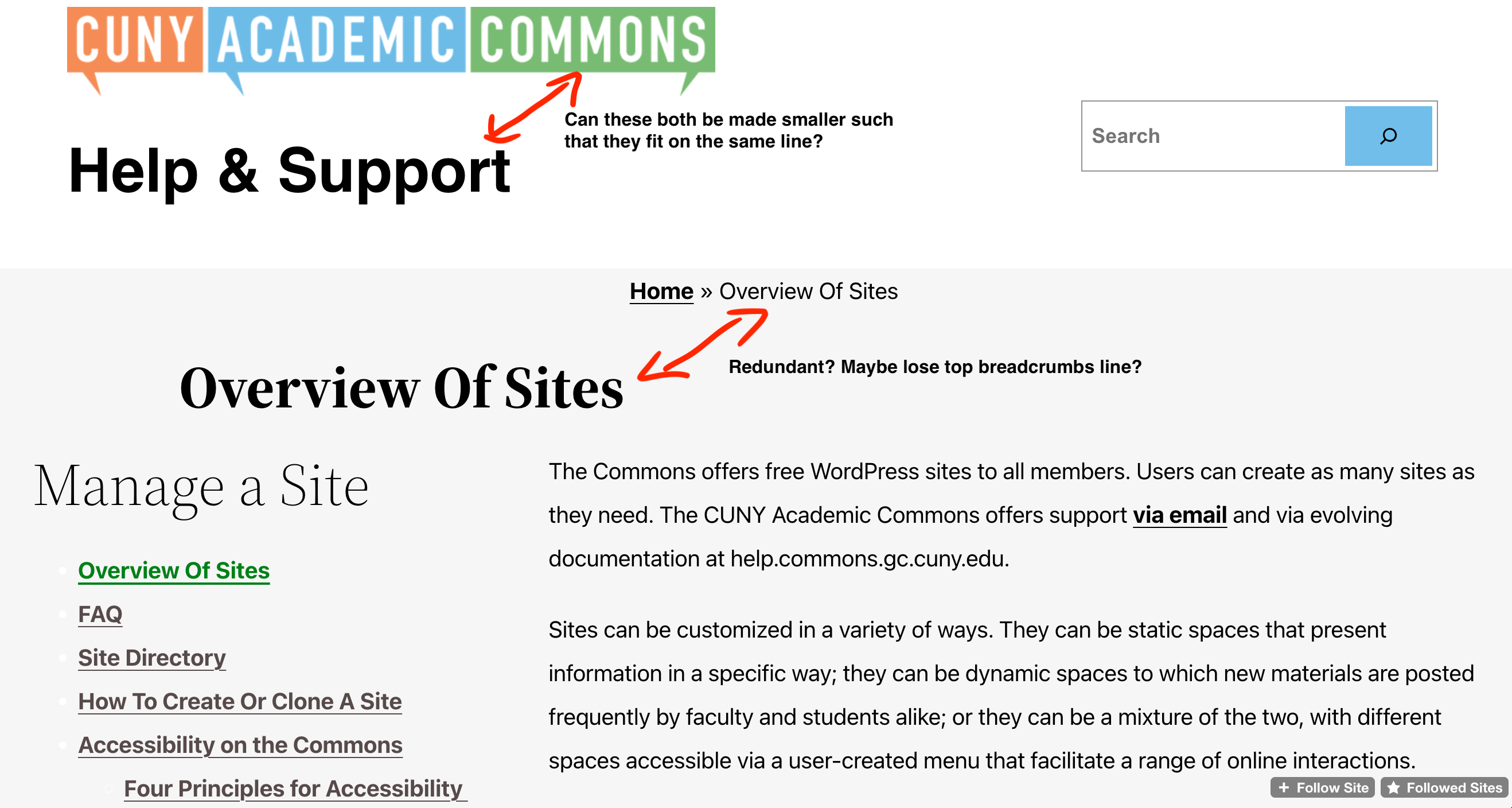
I also see what Laurie's saying about the header space on internal pages. See my "header combine" screenshot with notes attached. Might we be able to consolidate some of those elements?
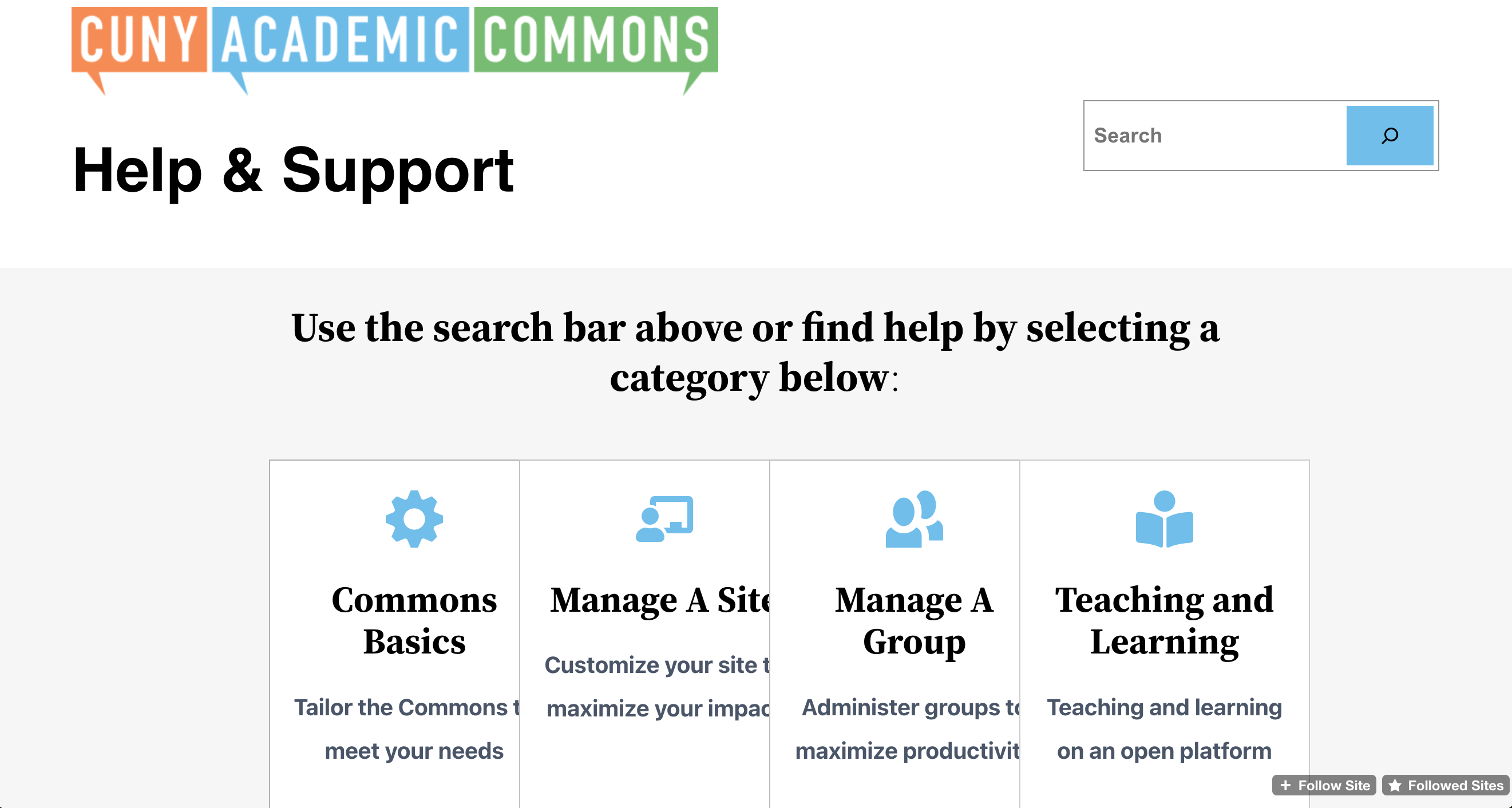
I also noticed on the site's homepage that the four highlight columns get cut off and crunched on a laptop-size browser window. Maybe they just need to be made more responsive, if the font isn't reduced?
Updated by scott voth over 2 years ago
I made some changes for these issues. Let me know what you think.
Updated by Colin McDonald over 2 years ago
The overall header spacing looks a lot better to me, thanks!