Feature #2182
closedChange "People" in the main nav and WP Bar nav to "Members"
0%
Description
Except for in the main navigation and in the blue part of the WP bar navigation at the top of the screen, we use the word "members" to refer to the registered users of the site. In those two places the word "People" is used.
Opening this ticket to discuss whether or not to change People to Members in those places (and in any other place I might have missed).
Files
Updated by Matt Gold over 13 years ago
Interesting. I'm fine with our team discussing this here, but I'd like this to be discussed at the CAT Subcommittee meeting, as I think that the reason we went with "People" had to do with input from that committee (I remember Maura Smale having input there. Have added her here as a watcher).
Part of me likes "People" because it makes the site seem less like a member-only affair and more open -- here are the people who make up the CUNY academic commons.
Updated by Matt Gold over 13 years ago
- Category name set to WordPress (misc)
- Status changed from New to Assigned
- Assignee set to Chris Stein
- Target version set to 1.5
- Severity set to High impact
Updated by Maura Smale over 13 years ago
Thanks Matt and Chris. Thinking on this more, I'm on the fence -- like Matt, I feel that "people" is friendlier and more real. But the aura of exclusivity that "members" carries could go either way -- some folks might like the feeling that comes with being a member. Hmmm... I guess I'm looking forward to discussing this at our next meeting.
Updated by Boone Gorges almost 13 years ago
- Target version changed from 1.5 to 1.6
Updated by Chris Stein about 12 years ago
- File MembersPeople-Homepage-5.png MembersPeople-Homepage-5.png added
- File MembersPeople-ActivityPage.png MembersPeople-ActivityPage.png added
- File MembersPeople-MembersPage-5.png MembersPeople-MembersPage-5.png added
- Status changed from Assigned to Reporter Feedback
- Assignee changed from Chris Stein to Matt Gold
I'm going to recommend using People as the default. The exception is in groups where Members should still apply.
The places to change are:
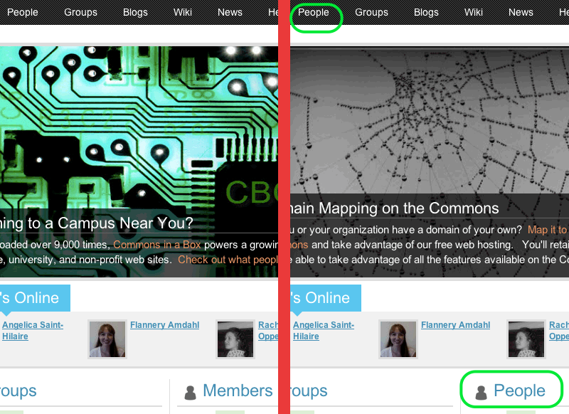
- Homepage: Change Members to People in the list under Who's online (the main navigation already has People). See MembersPeople-Homepage screenshot
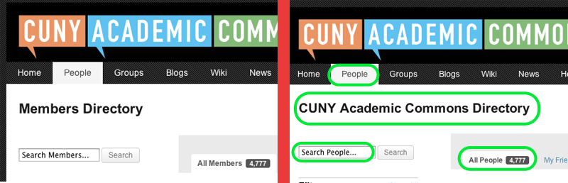
- People Page: People Directory sounds awkward so I'm recommending "CUNY Academic Commons Directory", also change the placeholder search text to Search People (or Search Directory, people is in the attached image), And change All Members to All People. See MembersPeople-MembersPage screenshot.
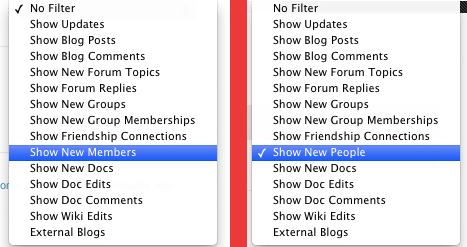
- Activity Page: In the filter change Show New Members to Show New People. See MembersPeople-ActivityPage screenshot.
There may be some other dropdowns I missed. If so and changing Members to People makes sense then I say go ahead and make the change. If not it can be kicked back here for discussion.
Changing to Matt for your blessing before sending this to dev team.
Updated by Matt Gold about 12 years ago
- Status changed from Reporter Feedback to Assigned
Looks great. Thank you, Chris!
Updated by Boone Gorges about 12 years ago
- Status changed from Assigned to Testing Required
- Assignee changed from Matt Gold to Chris Stein
These changes are ready to test on cdev.
Updated by Maura Smale about 12 years ago
Thanks Boone and Chris! I think People is a good way to go.
Updated by Matt Gold about 12 years ago
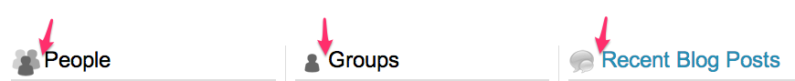
Thanks for your work on this, Boone. On the homepage, can you regularize the spacing between the icon and the word People? Annotated screenshot attached
Updated by Chris Stein about 12 years ago
- Assignee changed from Chris Stein to Boone Gorges
Looks Good Boone.
On my Mac in Chrome I'm finding that the third column, recent blog posts, is breaking down to the next line. I think it has something to do with Chrome doing sub-pixel rendering or something. I found that when I looked at what chrome saw for the box model on the middle #box2 column instead of
border (left/right) 1px
padding (left/right) 10px
width 278px
the numbers were
border (left/right) 1.11px
padding (left/right) 10px
width 277.986px
If you decrease the width of #box2 to 277 instead of 278px then the problem is solved.
I don't have time to create a ticket but we might think about moving these widths to percentage-based and using the border-box box model in future repsonsive mods.
Updated by Boone Gorges about 12 years ago
- Status changed from Testing Required to Resolved
On the homepage, can you regularize the spacing between the icon and the word People?
Fixed in https://github.com/castiron/cac/commit/140ac63daccd72b36c6fb03464cf8d16136f649a
If you decrease the width of #box2 to 277 instead of 278px then the problem is solved.
Fixed in https://github.com/castiron/cac/commit/e10170ad96d429e35966151d30e53778ab32e03f
I'm going to mark this one resolved. Thanks for the feedback