Design/UX #2768
closedChange UX for when in Edit Mode
0%
Description
Right now when you are in Edit mode if you click the Commons Profile tab it will take you out of edit mode and you will lose any unsaved changes.
Two possible solutions- Remove the tabs in edit mode
- When the user clicks Commons Profile tab in edit mode a warning appears that they will lose any unsaved changes and allows them to cancel.
For either option, but especially if we go with option 1, it would help to implement a Cancel Changes button that would be next to the Save Changes button. Right now there is no obvious way to get out of edit mode if you don't want to save your changes.
Files
Updated by Boone Gorges almost 13 years ago
- Assignee changed from Boone Gorges to Chris Stein
Reassigning to Chris to get feedback on which of the options we should go with.
Updated by Chris Stein almost 13 years ago
- remove the tabs in edit mode and
- add a cancel button
Updated by Chris Stein almost 13 years ago
Sorry, one more change if it's not too difficult. To go along with one edit screen we might add an edit button to the black area under the Change Avatar link. Comments welcome on that. This would be more consistent with the Save Changes button that is also in the top and bottom halves.
For the cancel button I will try to get a visual option later this evening. I looked to see if we had a similar button elsewhere but we don't. I'm thinking it should be a different color like red or something.
Updated by Boone Gorges almost 13 years ago
- Target version set to 1.5.3
Chris, if you could give a concept for the cancel button (even just in words), it'd be helpful. Thanks.
Updated by Boone Gorges almost 13 years ago
- Target version changed from 1.5.3 to 1.5.4
Updated by Boone Gorges almost 13 years ago
- Target version changed from 1.5.4 to 1.5.5
Updated by Boone Gorges over 12 years ago
- Target version changed from 1.5.5 to 1.5.6
Updated by Boone Gorges over 12 years ago
- Target version changed from 1.5.6 to 1.5.7
Updated by Boone Gorges over 12 years ago
- Target version changed from 1.5.7 to 1.5.8
Updated by Boone Gorges over 12 years ago
- Target version changed from 1.5.8 to 1.5.9
Updated by Boone Gorges over 12 years ago
- Target version changed from 1.5.9 to 1.5.10
Updated by Boone Gorges over 12 years ago
- Target version changed from 1.5.10 to 1.5.11
Updated by Boone Gorges over 12 years ago
- Target version changed from 1.5.11 to 1.5.12
Updated by Boone Gorges over 12 years ago
- Target version changed from 1.5.12 to 1.5.13
Updated by Boone Gorges over 12 years ago
- Target version changed from 1.5.13 to 1.5.14
Updated by Boone Gorges over 12 years ago
- Target version changed from 1.5.14 to 1.5.15
Updated by Boone Gorges over 12 years ago
- Target version changed from 1.5.15 to 1.5.16
Updated by Boone Gorges over 12 years ago
- Target version changed from 1.5.16 to 1.5.17
Updated by Boone Gorges over 12 years ago
- Tracker changed from Feature to Design/UX
- Category name changed from 65 to Public Portfolio
This keeps getting bumped, so I'm moving it to 1.6.
Updated by Boone Gorges over 12 years ago
- Target version changed from 1.5.17 to 1.6
Updated by Chris Stein over 12 years ago
- File save-cancel.html save-cancel.html added
- File red-bg-cancel.png red-bg-cancel.png added
- File red-green-text.png red-green-text.png added
- Status changed from Assigned to Reporter Feedback
The basic idea is to put the save/cancel next to each other to save a bit of space and for touch screens I think it's harder to click the wrong one side/by side than one on top of the other if they are close together.
Removing Commons profile tab in edit mode still stands as a suggestion but I didn't think that needed visualization.
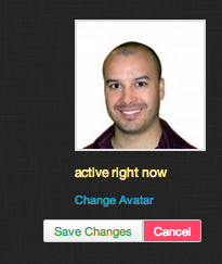
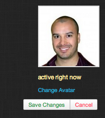
Attaching two possible images of the cancel button. Both basically the same with one where save is green and cancel is red and the other where cancel has red background with white text.
I'm also attaching a file with the HTML/CSS I made for it.
Put the two buttons side-by-side in a new div. Then basically just removed the left border radius on cancel and right border radius on save. Just suggestions of course.
This is another place where it would have been nice to have a styleguide.
Updated by Matt Gold over 12 years ago
Hi Chris,
Many thanks for this. A few questions:
-- is right under the avatar image the right place to put these buttons?
-- I get the red (stop))/green (go) coloring but think it adds to many colors to our scheme, making the page look a bit chaotic. Took a look at the twitter profile editing screen and didn't see that kind of coloration there; can you perhaps put together a different version without the red/green coloring?
Updated by Chris Stein over 12 years ago
-- is right under the avatar image the right place to put these buttons?
I'm open to other suggestions. If you'd like something different, let me know.
I added the button at the top so that you could make quick changes to the top part of your profile and click save.
I just realized that I didn't also change the Save Changes button that is at the bottom of the page. That should be changed too so it is save/cancel
-- I get the red (stop))/green (go) coloring but think it adds to many colors to our scheme, making the page look a bit chaotic. Took a look at the twitter profile editing screen and didn't see that kind of coloration there; can you perhaps put together a different version without the red/green coloring?
If you don't like the coloring then let's just leave it out. As you point out, we don't really have a system, so in the absence of one, I'm fine with just leaving the colors out. Attaching a screen shot with dark grey color for the text (777) like we have on other buttons.
Updated by Matt Gold over 12 years ago
Great - thanks, Chris.
One note: it looks to me, based on what I see on my own profile, that the save changes button is aligned with the bottom of the header div rather than being right under the profile photo. Chris: which position seems better to you?
I do think this looks better without colors, at least for now. Thanks for reworking it.
Updated by Chris Stein over 12 years ago
- File avatar-cover-save-changes.png avatar-cover-save-changes.png added
- Status changed from Reporter Feedback to Assigned
- Assignee changed from Chris Stein to Boone Gorges
By "bottom of the header div" do you mean right above the white line that comes just before the edit form? That position is fine for me.
I'm losing track of where I wrote what, so I'll put it here at the risk of repeating. The following should be in place
- Add a cancel button by the Save Changes button: both aligned to the white line.
- The buttons may need to be placed in a separate div and CSS fiddled with. I found that in some resolutions the Save Changes button is covered by the avatar. It's when the page is scrolled but wide enough that the avatar is showing. (attached image)
- Remove Commons Profile Tab in edit mode
- One final part I haven't added yet is to add an edit button in the same place as the save/cancel button will be. I think this will intuitive, click Edit and then in it's place the save/cancel buttons appear.
Boone, I think my part is done so moving to you. Move it back and let me know you disagree.
Updated by Matt Gold over 12 years ago
By "bottom of the header div" do you mean right above the white line that comes just before the edit form? That position is fine for me.
I meant the location where the "save changes" button appears on the screenshot I uploaded here: http://redmine.gc.cuny.edu/attachments/download/1231/Screen%20Shot%202014-03-30%20at%201.15.35%20PM.png
I'm okay with keeping that location moving forward -- just wanted to clarify.
Updated by Boone Gorges over 12 years ago
- Status changed from Assigned to Testing Required
- Assignee changed from Boone Gorges to Chris Stein
Add a cancel button by the Save Changes button: both aligned to the white line.
The buttons may need to be placed in a separate div and CSS fiddled with. I found that in some resolutions the Save Changes button is covered by the avatar. It's when the page is scrolled but wide enough that the avatar is showing. (attached image)
Remove Commons Profile Tab in edit mode
One final part I haven't added yet is to add an edit button in the same place as the save/cancel button will be. I think this will intuitive, click Edit and then in it's place the save/cancel buttons appear.
These are all ready to test on cdev.
Updated by Matt Gold over 12 years ago
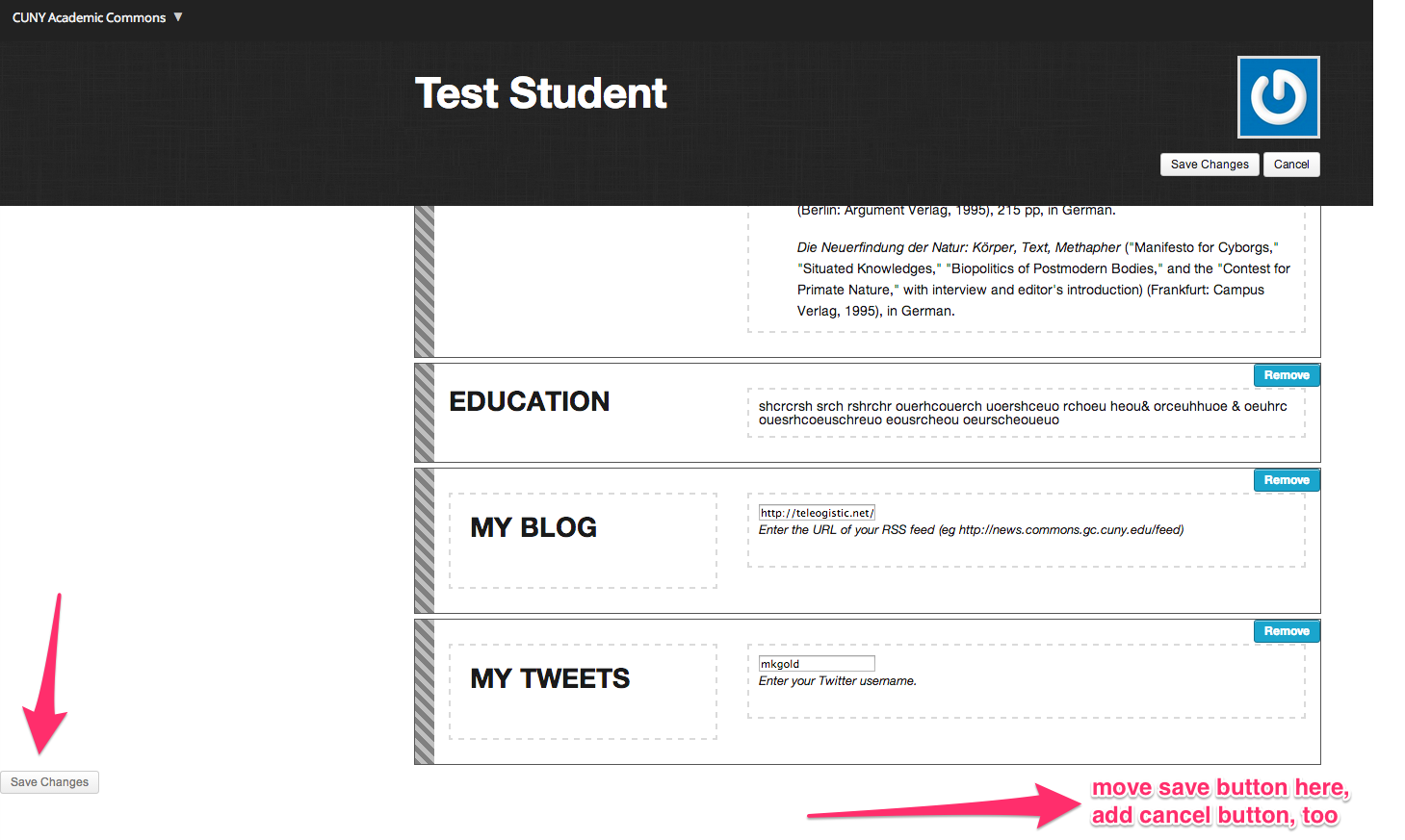
Much improved. One more suggested change. At the bottom of the page, there is a "save changes" button all by itself in the left corner. I would suggest moving it to the right so that it is parallel to the save/cancel buttons above, and adding a "cancel" button there, too. Annotated screenshot attached.
Like the short header on these pages. Much better.
Updated by Boone Gorges over 12 years ago
- Status changed from Testing Required to Resolved
I've mirrored the buttons at the bottom of the page in https://github.com/cuny-academic-commons/cac-advanced-profiles/commit/ffed075494db3c9a547bc16ff04bce4ba7aaee91. Marking resolved.