Publicity #3508
closedCreate 1.7/'My Commons' overlay/interstitial notification
0%
Description
My Commons is so revolutionary, we may need a new <span> tag just to gush.
Discuss!
Files
Related issues
Updated by Micki Kaufman almost 12 years ago
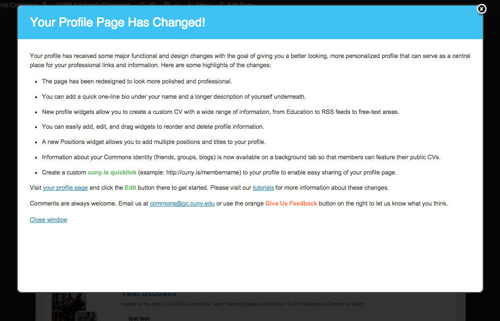
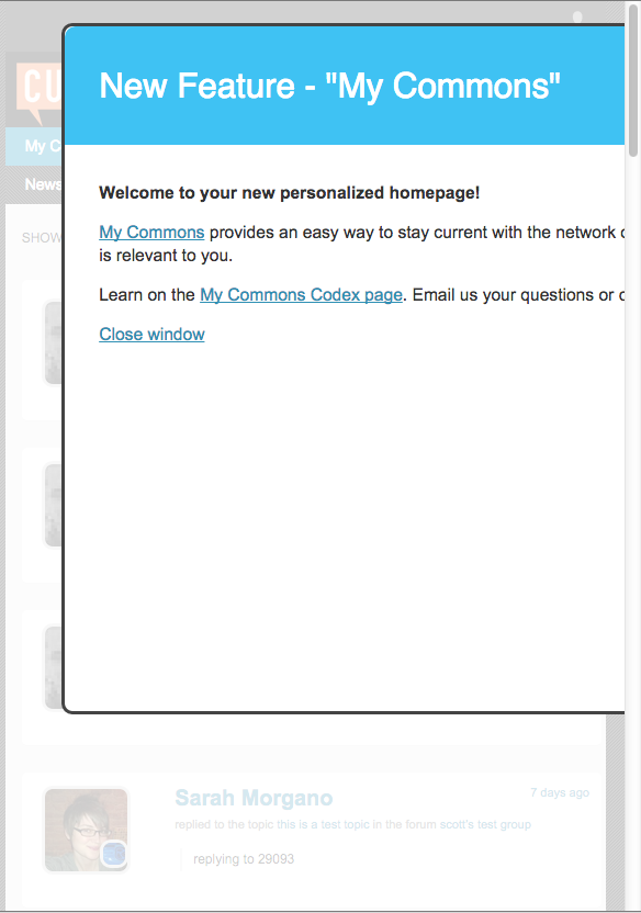
As discussed in Tuesday's dev meeting, we're going with an overlay/interstitial like the one implemented on Net Neutrality Day - users going to the home page will be presented with the overlay informing them of the new feature.
This overlay should contain a screenshot, brief descriptive text, and a link to a 'More About My Commons' support page (perhaps one of the Codex pages), as utilized elsewhere.
Updated by Boone Gorges almost 12 years ago
Can I get some more details?
- Is someone preparing the screenshot, etc?
- Will styling be the same as Net Neutrality?
- What's the "dismiss" behavior going to be? Show one time to each user?
Updated by Micki Kaufman almost 12 years ago
Boone - we talked about it in yesterday's Dev meeting, very briefly it's a single page containing an image, very brief text and a link (as its been conceived thus far), and it should be quite easily executed. More details as to who, what and when will be available after the noon Comm team call.
You're welcome to join!
Updated by Micki Kaufman almost 12 years ago
I think dismiss-wise, it's a once-per-customer proposition, but there's always the UX/IA issue about how to bring the user back if they want to see it again. That came up and will very likely come up again in today's call.
Updated by Micki Kaufman almost 12 years ago
Please see #3534 for the persistent link.
Updated by Samantha Raddatz almost 12 years ago
- Assignee changed from Micki Kaufman to scott voth
Update from yesterday's comm call:
As I understood it, we decided that this overlay would appear only on a user's first time landing on the My Commons tab. It will contain a brief explanation of what My Commons is and a link to the codex to learn more.
Reassigning to Scott – I believe creating a rough design of this was assigned to you. Thanks!
Updated by Boone Gorges over 11 years ago
Hi Scott - As you think about the way this page will look, let me point you to http://cdev.gc.cuny.edu/my-commons/?show_overlay=1 - I'd like to reuse the popup from when we implemented the new profiles. Maybe we could use the same color scheme, etc.
Please let me know as soon as you've got something, so that the dev team can begin implementation. Even if the wording is not final, we want to make sure we have plenty of time to do any necessary work on images, etc.
Updated by Matt Gold over 11 years ago
Thanks, Boone. If we are going to reuse that, I think we should rethink the color scheme a bit. In the main part of the window, I'd like to see dark text on a white background for one thing for reasons of readability, usability, and aesthetics.
Updated by Boone Gorges over 11 years ago
OK. But time is ticking, so if we need changes at the design level, let's please get them as soon as possible. This stuff is not always trivial to implement, and I very much want to avoid leaving this until the last minute.
Updated by Chris Stein over 11 years ago
- File overlay-whiteBG-1.1em.png overlay-whiteBG-1.1em.png added
- File overlay-whiteBG-1.3em.png overlay-whiteBG-1.3em.png added
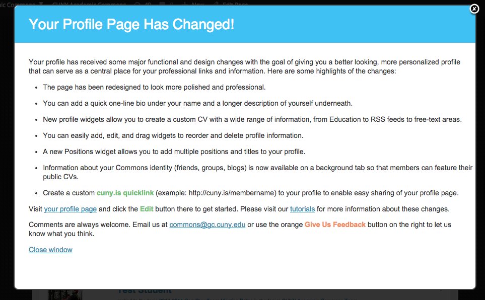
I think reusing the previous overlay is the best option given time and everything. A white BG is a bit more readable, I'm OK with that change and would add changing the font-size to 1.3em from 1.1em. The screenshots shown have white bg and both font sizes ( .simplemodal-data {font-size: 1.3em; color: #333;} and #simplemodal-container {background-color: #333;} ).
I'm open to the idea of adding a button somewhere to show this overlay again but don't want it to get in the way of the release so if adding the functionality and choosing a position is too difficult then it's OK without it (especially with all of the other info we will add about it).
Right now on cdev it's the old text. Scott are you writing the new text?
Updated by Matt Gold over 11 years ago
- Status changed from New to Assigned
- Assignee changed from scott voth to Boone Gorges
Boone, I am finding that the overlay pops up on almost every page load. Assuming that this is because the Dev team hasn't really moved forward with implementation, but I wanted to note this if that is not the case.
At any rate, I do think we are ready for the Dev team to begin implementation
Updated by Boone Gorges over 11 years ago
The overlay on cdev is just there so people can see what the old one looks like. No actual implementation has taken place yet. I'll do it tonight or tomorrow.
Updated by Boone Gorges over 11 years ago
- Status changed from Assigned to Testing Required
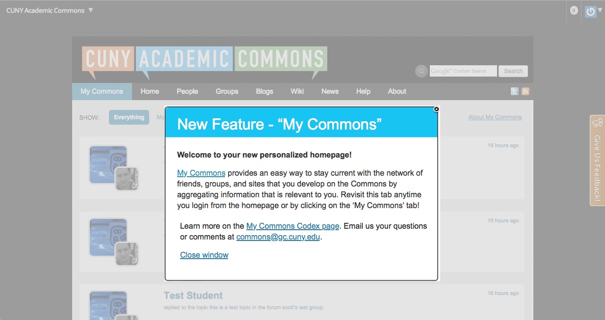
Close and display logic fixed in https://github.com/cuny-academic-commons/cac/commit/6d4d63f8a69b818fba982b13ed3bd5483a1b9fc2. You should now only see the overlay when you visit My Commons. After clicking 'Close Window' or the X at the upper right of the overlay, you'll never see it again. For testing, you can override this logic by going to http://cdev.gc.cuny.edu/my-commons?show-overlay=my-commons.
In https://github.com/cuny-academic-commons/cac/commit/9aec44cce3f815b73a85c2eb63b10910aeacd03a I changed the styling as per Chris's screenshots, and I added a bit of text as suggested by Matt here http://commons.gc.cuny.edu/groups/cac-community-team-project-planning/forum/topic/1-7-publicity-push-for-tuesday/#post-19921. Please test on cdev and let me know about any necessary changes to the text.
Updated by Micki Kaufman over 11 years ago
Hi Boone n pals -
I think it looks very good. Two issues I see:
1. Size of box v size of text - I'm seeing a lot of whitespace on Chrome below the 'close window' so we may want to put a different width or height on the box. Let's discuss in our call.
2. the link to 'My Commons' has no '/#' following '/my-commons,' resulting in a page not found. Might be something related to the temporary test version so if so, no worries.
Thanks!
Updated by Boone Gorges over 11 years ago
the link to 'My Commons' has no '/#' following '/my-commons,' resulting in a page not found. Might be something related to the temporary test version so if so, no worries.
The link goes to commons.gc.cuny.edu/my-commons. The production URL is hardcoded, and the feature is not yet live on the production site.
Updated by Micki Kaufman over 11 years ago
- Assignee changed from Boone Gorges to Samantha Raddatz
Please update w/condensed language, use of fonts. Dev team will examine suppressing image display on mobile devices.
Updated by Samantha Raddatz over 11 years ago
- File Large_MyCommons_Overlay.jpg Large_MyCommons_Overlay.jpg added
- File Small_MyCommons_Overlay.jpg Small_MyCommons_Overlay.jpg added
- Assignee changed from Samantha Raddatz to Matt Gold
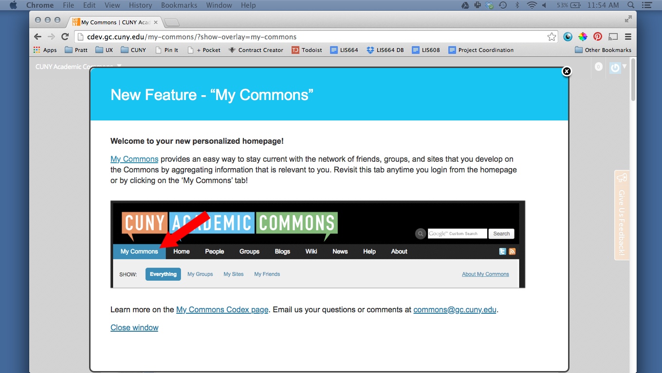
Attached are two options for the overlay.
"Large_MyCommons_Overlay.jpg" is the current size with text adjustments and an image highlighting the tab location based on our conversation today.
"Small_MyCommons_Overlay.jpg" is an example of what I was trying to describe it could look like without images. This allows the 'My Commons' screen to be more obvious behind the overlay. This may be too many changes in code.
Assigning to Matt for feedback. For efficiency, it's probably fastest for you to call me if there are small changes you'd like me to make to the mock-up, Matt.
Updated by Matt Gold over 11 years ago
- Status changed from Testing Required to Assigned
- Assignee changed from Matt Gold to Boone Gorges
Thanks, Samantha, for the quick work on this. I think it looks great and would just suggest removing the second sentence ("Revisit this tab"), since the red arrow makes that point visually and we'd be better off having less text here.
Many thanks! Boone, can you implement?
Updated by Boone Gorges over 11 years ago
- Status changed from Assigned to Testing Required
I've made the changes in https://github.com/cuny-academic-commons/cac/commit/7406f691d1077153b62690ab33f633d52b06445b. Last call for additional changes before tonight's release. http://cdev.gc.cuny.edu/my-commons/?show-overlay=my-commons
Updated by Matt Gold over 11 years ago
Looks good. Is it supposed to resize when the browser window is resized? I see the picture disappear but the overlay itself doesn't appear to shrink enough. Screenshot attached
Updated by Boone Gorges over 11 years ago
No. The overlay is not written to resize - it determines window size at load time, and does not adjust. The image is hidden with a proper media query, so it does disappear when resizing. To test at various widths, please refresh.
Updated by Matt Gold over 11 years ago
- Status changed from Testing Required to Resolved
Okay. As long as it detects size and will look proper on loading on a mobile device, we are good. Thanks!
Updated by Matt Gold over 11 years ago
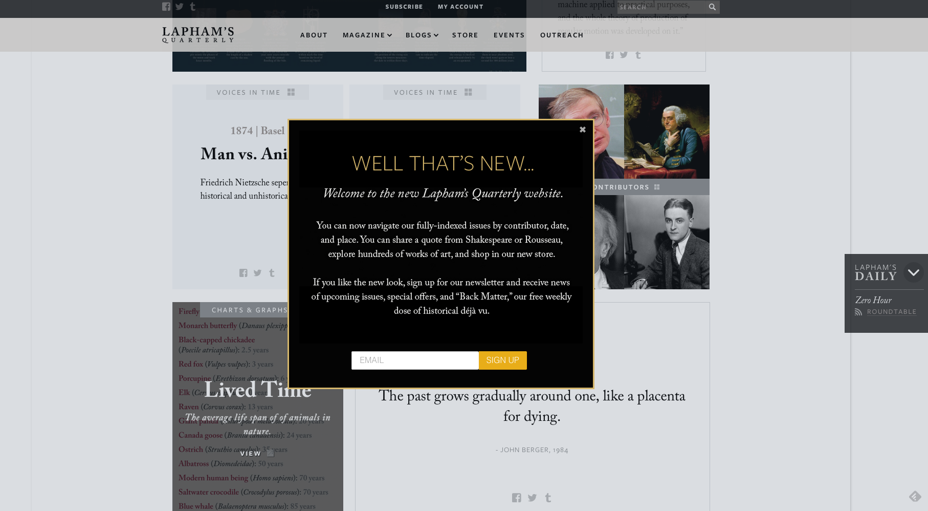
Noting the attached overlay from Lapham's Quarterly as a design alternative the next time we do this.