Bug #3540
closedMy Commons Mobile size Responsive Layout issues
0%
Description
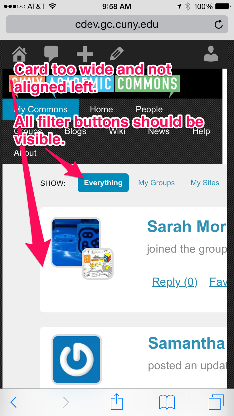
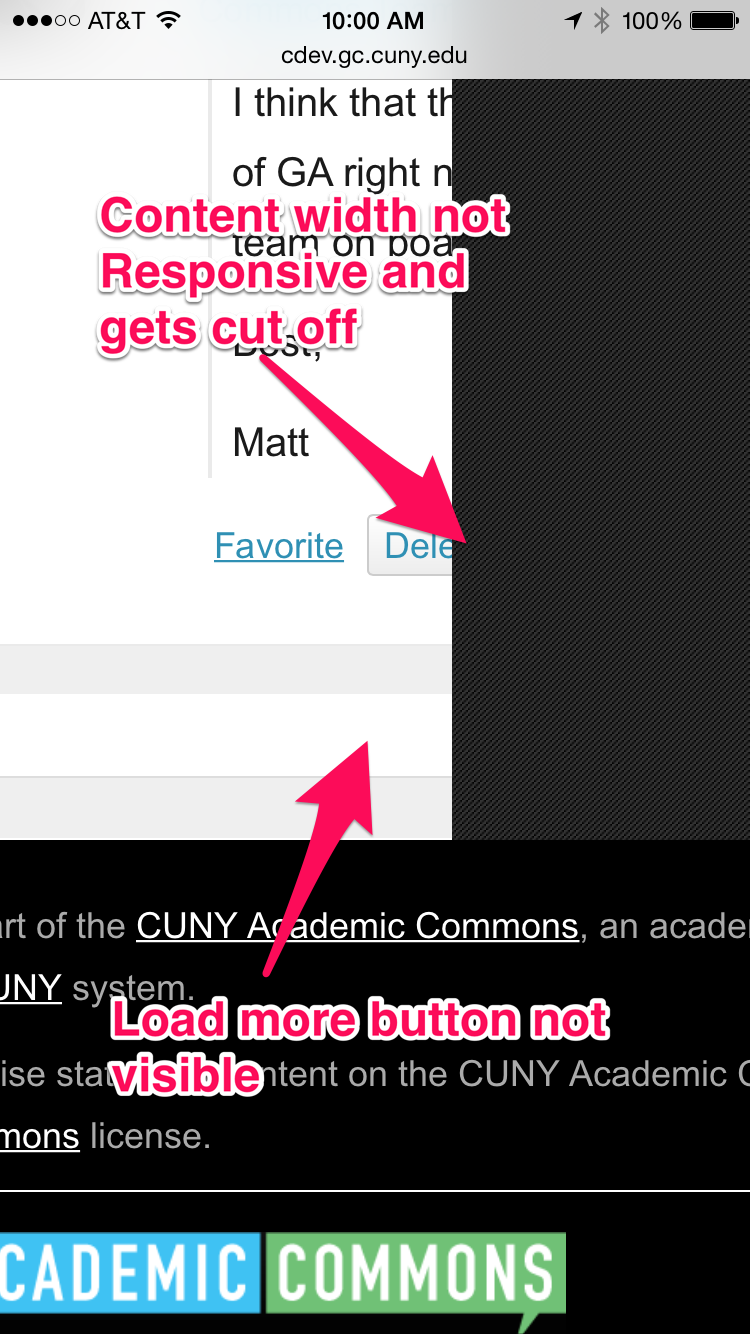
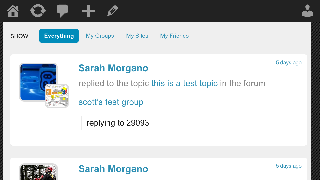
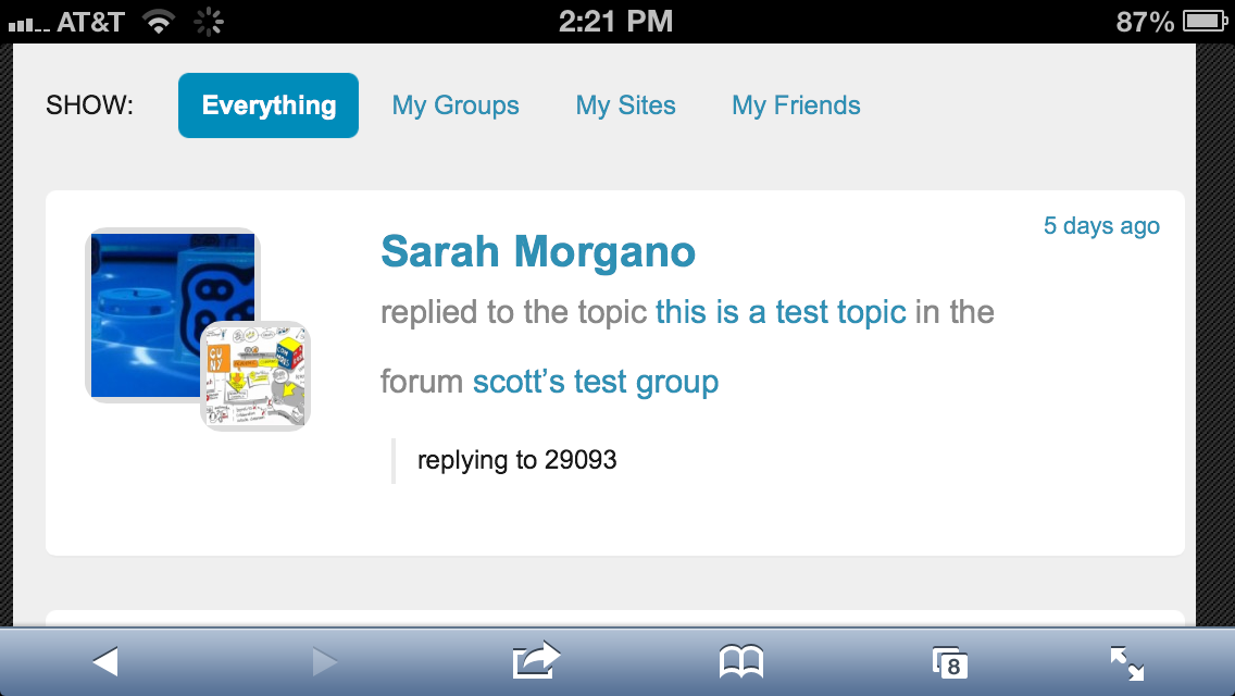
I did some testing of the UI on a mobile device and there are some issues with the layout.
I believe the main issue is how the width of some items are set and the padding/margins around them.
Two screenshots are attached showing the issues. I will comment more specifically in updates below.
Files
Updated by Chris Stein almost 12 years ago
This is the kind of thing I could do a branch and work on but I won't be able to get to it until Friday at the earliest.
.item-body has a padding-left of 160px which is causing the left alignment problem on mobile
.bp-blog-page #content.my-commons has a width of 910px which is causing problems for screens smaller than that. Ideally this would be set in %
The secondary avatar is positioned absolutely which not by itself a problem but because of where it is in the HTML it becomes a problem if you make the change above to percent instead of pixels for the width. I think that the HTML order needs to change to properly address this and keep CSS simple but a quick fix with media queries and some more CSS may work too.
The name and time also suffer when the width is percent. I don't have time to look into that now but, like avatar may be fixable through styling and best fixed in long run with some HTML changes.
Updated by Raymond Hoh almost 12 years ago
I'm working through a few of these issues now.
Will update this ticket later with my progress. I've got most of it under control locally. More to come.
I think that the HTML order needs to change to properly address this and keep CSS simple but a quick fix with media queries and some more CSS may work too.
Right, I tried not to touch the current activity loop template, but work through the layout changes in CSS exclusively. It might be better to use a new activity loop template, but I decided not to do this initially.
Updated by Raymond Hoh almost 12 years ago
- Status changed from New to Reporter Feedback
Okay, this should be fixed on cdev and 1.7.x branch in commit 1e7ea0d. Please do a hard refresh or purge your cache to see it in action.
When the width is at 470px, it's a little tight, but worked during my testing on mobile Firefox.
Let me know if it needs more tweaking.
Updated by Chris Stein almost 12 years ago
- Assignee changed from Boone Gorges to Raymond Hoh
Thanks Ray, I meant to add you as the Assignee to begin with. Fixing that now.
Definitely better, busy day so I will not be able to get a good look until tomorrow. If anyone else wants to look and comment please do so.
Updated by Samantha Raddatz almost 12 years ago
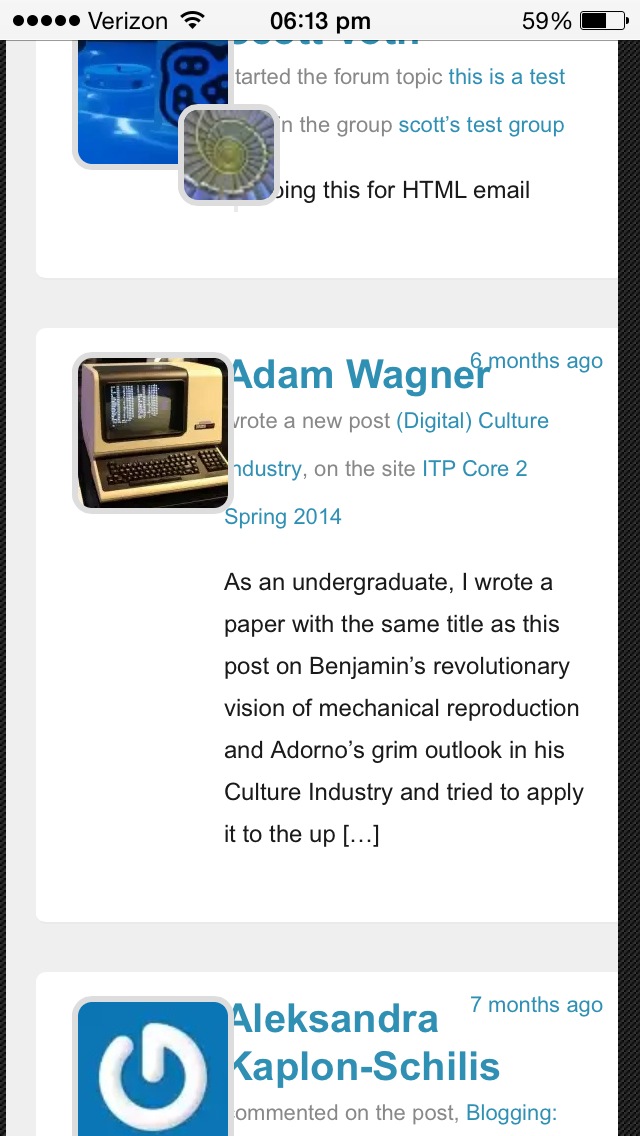
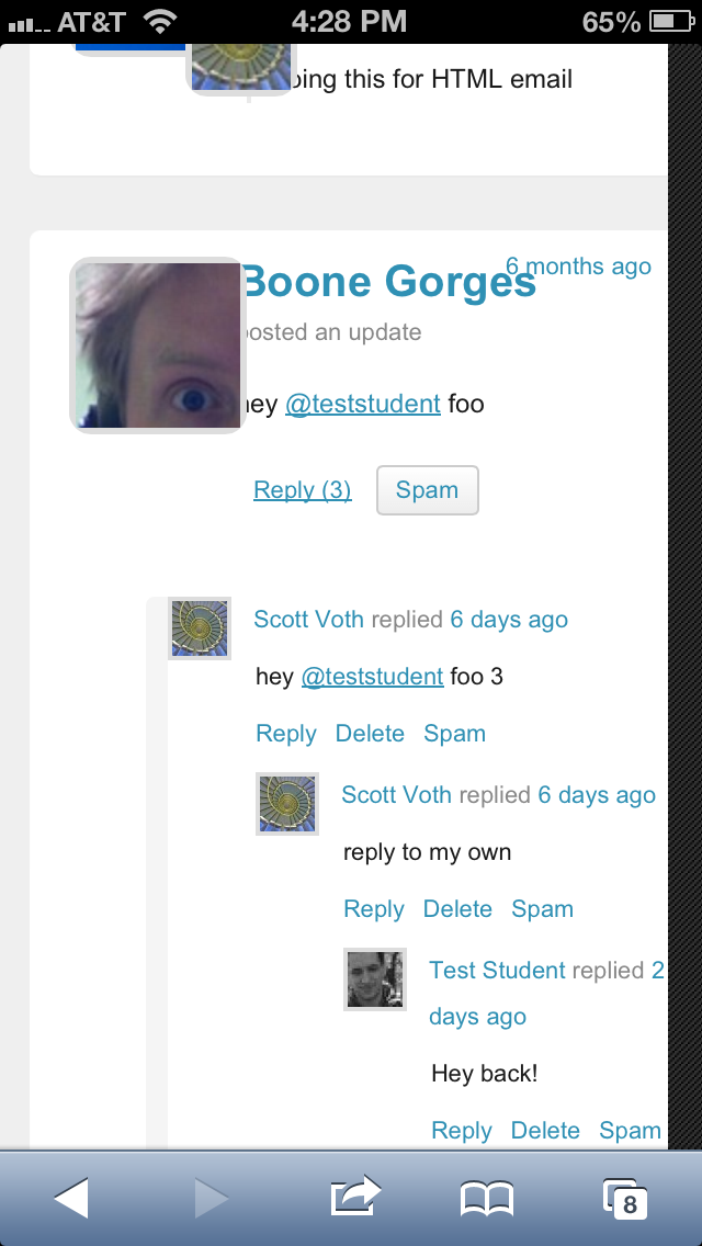
Took a look at it on Chrome/Safari on mobile, and it's close, but the avatars are overlapping the text a fair amount now. Can they scale down at all?
Picture attached for reference.
Updated by Chris Stein over 11 years ago
- File possible-change-results.png possible-change-results.png added
- File iphone5-nestedcomments.PNG iphone5-nestedcomments.PNG added
- File iphone5portrait.PNG iphone5portrait.PNG added
I'm getting similar results on smaller mobile devices (iphone5-... images). I'm going to paste in some quick things I did to try to fix. Depending on what you do Ray are you OK with adding a ticket to work on the template after 1.7 to make this kind of thing easier to address?
sorry, but these are quick and some things got lost in pasting so some are commented out and some have strikethrough some have sass style comments. Generally I tried to removes some overall padding and margin to fill the space, some changes to try to get navigation on one line and the avatars.
I couldn't get percent to work quickly with the inspector so tried moving avatar size down on both. they both get smaller (end up more similar in size) You would have to pick the breakpoint for when to make the change.
attaching a possible-change-results.png for what it might look like.
sorry I didn't have more time to do this properly
Changes to get the overall shape better
.bp-blog-page #content.my-commons {
background: #efefef;
margin-bottom: 0;padding: 0.9375rem;
width: 96.5%;
padding: .5rem;
//change padding to .5rem on smaller screens
}
Navigation
remove show text
.show-text{
Submitdisplay: none;
}
div.item-list-tabs ul li:first-child {
margin-left: 20px;
//remove this
}
div.item-list-tabs ul li a, div.item-list-tabs ul li span {
display: block;padding: 5px 10px;
text-decoration: none;
padding: 8px;
//change padding to 8px
}
Avatar
//make the main avatar smaller
.my-commons .activity-avatar img.avatar {width: 75px;
height: 75px;
width: 50px;
height: 50px;
}
//small image reduce left and top and set explicit width
.my-commons .activity-header img:first-child {
position: absolute;left: 6.5em;
top: 5.5em;
left: 3em;
top: 4.5em;
width: 35px;
height: 35px;
}
//make activity-content wider on small screens
@media screen and (max-width: 570px)
.my-commons .activity-content {
width: 70%;
}
//remove margin in activity header or reduce to 5px
.activity-header{
/*margin-right: 20px;*/
}
//Some had this css applied
.my-commons .activity-list li.mini .activity-avatar img.avatar, .my-commons .activity-list li.mini .activity-avatar img.FB_profile_pic {
height: 75px;
     width: 75px;
     margin-left: 0;
// change to
width: 50px;
height: 50px;
}
Time
//just remove the absolute positioning and let it flow as it was before
.my-commons .time-since {
/*position: absolute;*/
/*right: 1em;*/
/*top: 0.5em;*/
}
Updated by Raymond Hoh over 11 years ago
I'm working on some updates as we speak, Chris.
Here's a screenshot at 480px width. You can test this on cdev at the moment. I've made it so we only use the primary avatar at 480px width or less and have removed the secondary avatar altogether. What is the smallest width that this should occur at? 570px? Is the iPhone 5's portrait width 320px?
I'll incorporate some of your suggestions like positioning the time since back to relative into the stylesheet.
Updated by Raymond Hoh over 11 years ago
Updated screenshot on mobile Firefox.
Available for testing on cdev.
Updated by Raymond Hoh over 11 years ago
Last call for any UX feedback and follow-up changes for mobile devices :)
Please test portrait mode on smaller devices if possible.
Thanks!
Updated by Chris Stein over 11 years ago
- File ihpone6-landscape.PNG ihpone6-landscape.PNG added
- File iphone6-portrait.PNG iphone6-portrait.PNG added
- File iphone5-portrait1.PNG iphone5-portrait1.PNG added
- File iphone5-portrait2.PNG iphone5-portrait2.PNG added
- File iphone5-landscape.PNG iphone5-landscape.PNG added
Hi Ray, this is looking good. I think that reducing to 1 avatar is sensible in this case. Yes, the iPhone 5 effective resolution is 320 in portrait. For all intents and purposes I think 320 is the narrowest most people will see the site (older iPhones are also 320). In landscape mode the older models are 480px wide while the 5 goes up to 568. Right now in landscape on a 5 I tested the changes are not there but it looks fine (screenshot attached). I would say keep the changes for "small" screens up to 500. That means older phones (like iPhone3 or4) will see it in either orientation and most newer phones (including non apple) will see smaller in portrait and the normal layout in landscape.
I'm comfortable with all of that. If you are too then go ahead and mark resolved when you're ready. If you have anything else you want me to look at, let me know.
Updated by Matt Gold over 11 years ago
These look good. Thanks to you both for your work on this.
Updated by Raymond Hoh over 11 years ago
- Status changed from Reporter Feedback to Resolved
I would say keep the changes for "small" screens up to 500.
I've set the small screen layout to 500px from 470px in commit 38d8a86.
Going to mark this as resolved. Thanks for all the feedback and testing, Chris and Samantha!