Design/UX #3564
closedConsider repositioning Forum link in group nav
0%
Description
In my groups, I find the forum link to be the single most important link in the group, as it is where group discussions take place. Right now, we have it second from the top in the group sidebar nav, just below home. I find that my eye goes to the middle of that list of links, so that Files and Docs are the most visible to me; I would suggest that we move the forum link down to make it more visible.
Chris, Samantha: your take?
Files
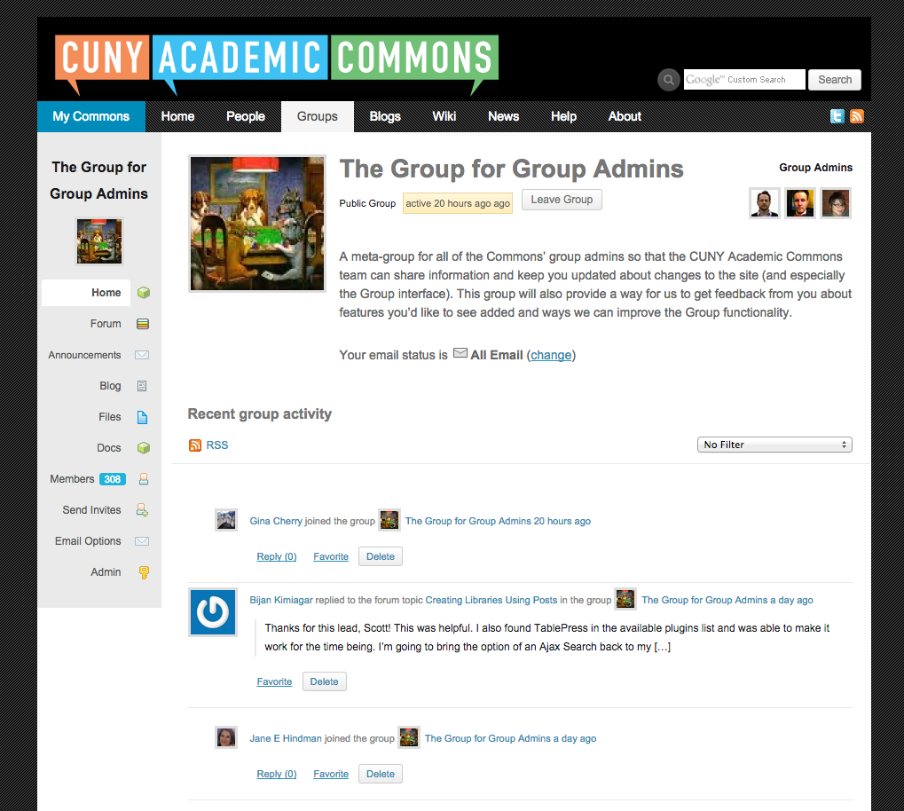
Related issues
Updated by Matt Gold over 11 years ago
screenshot attached
Updated by Boone Gorges over 11 years ago
- Target version set to 1.8
The idea of putting the most important link in the middle of the nav so that it'll be more visible strikes me as odd. But I'm happy to go with whatever the group thinks.
Updated by Samantha Raddatz over 11 years ago
- Assignee changed from Samantha Raddatz to Chris Stein
The standard is for the links to go in order of most importance from top to bottom, but I can see that the eye might go to the middle of the list in this case. My biggest hesitance is that we don't know if this is the case for many people, or if this is a big deal since forum postings are in the group activity feed too.
This could be a good candidate for testing. Assigning to Chris to see if he has input.
Updated by Matt Gold over 11 years ago
I think that at the very, very least, we should switch Announcements and Forums. This makes sense to me as a hierarchy, as Announcements are a kind of admin-level executive function of the group, while Forums is more properly grouped with other interactive group functions like Blog, Files, and Docs. I think that this change might improve visibility.
And, though I take the point about most important links being in top, I think that the differently font-sized/long word "Announcements" messes with the visual logic of the list and effectively hides the word above it.
Updated by Matt Gold over 11 years ago
I'm just realizing that another reason one's eye may be drawn to the middle of the list is that the Members line typically has a bright blue square next to it showing the number of members. I think that that, combined with the short words above it (Files and Docs) helps explains why my eye, at least, immediately goes towards the middle of the list.
Updated by Samantha Raddatz over 11 years ago
All good points, Chris.
I think that at the very, very least, we should switch Announcements and Forums.
This is a fair compromise, though I wonder if a decision needs to be made regarding ticket #3175 first. If we are going to be removing 'Announcements' anyway, it could solve this problem as well.
Updated by Matt Gold over 11 years ago
Good point. I've added it as a related issue.
Updated by Boone Gorges about 11 years ago
- Status changed from Assigned to Rejected
- Target version deleted (
1.8)
Closing this in favor of #3175.