Actions
Bug #9772
closedOverlap between group subscription level text and Positions text in group member listing
Status:
Resolved
Priority name:
Normal
Assignee:
Category name:
Groups (misc)
Target version:
Start date:
2018-05-11
Due date:
% Done:
0%
Estimated time:
Deployment actions:
Description
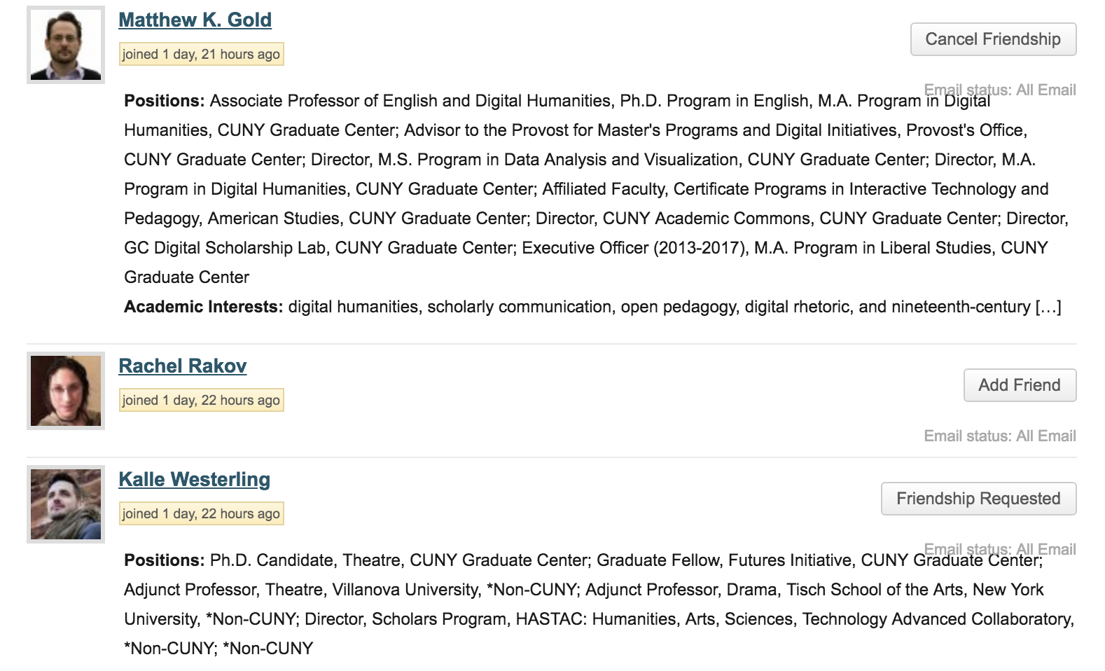
In the Groups Membership panel, for those people with many "positions" listed, the text frequently overlaps with the "email status" message. Perhaps reduce padding between the "friendship" button and the email status notification so they stay even with the bottom of the thumbnail profile picture?
Best, Lisa
Files
Related issues
Updated by Matt Gold almost 8 years ago
- Status changed from New to Assigned
- Assignee set to Boone Gorges
Thanks for reporting!
Updated by Boone Gorges almost 8 years ago
- Has duplicate Bug #9771: minor styling problem added
Updated by Boone Gorges almost 8 years ago
- File Screenshot_2018-05-11_14-02-08.png Screenshot_2018-05-11_14-02-08.png added
- Subject changed from minor styling problem to Overlap between group subscription level text and Positions text in group member listing
- Category name set to Groups (misc)
- Status changed from Assigned to Resolved
- Target version set to 1.13.2
Thanks, Lisa. I've made an adjustment. The attached screenshot is what you'll see after the next release.
https://github.com/cuny-academic-commons/cac/commit/21f9454f786576b0948a0ccaf13749dbdb645be6
Actions