Design/UX #10658
closedCondense sitewide footer
0%
Description
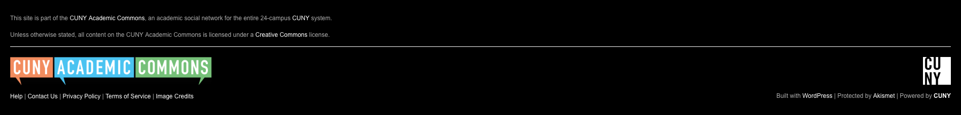
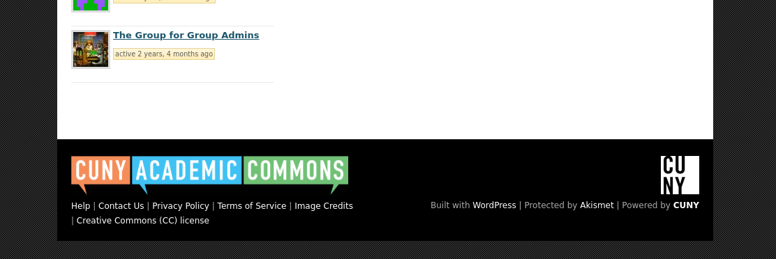
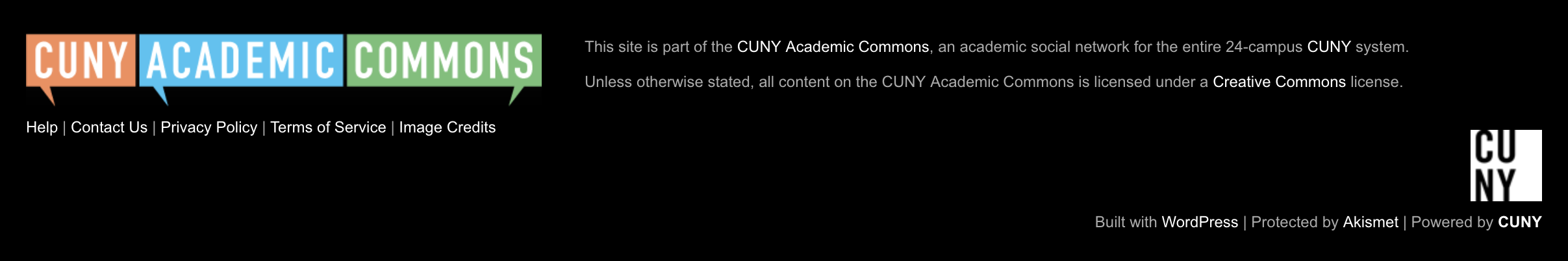
Perhaps this should wait for our redesign, but in the interest of improving the site in the meantime, I wonder if there are things we can do to condense the sitewide footer that shows up on all Commons blogs. I think it would be better if it took up less vertical space. Screenshot attached and a live version here on a page without much content -- https://academic-portfolio-template.commons.gc.cuny.edu/research/
Files
Related issues
Updated by Sonja Leix over 7 years ago
I'll take a stab at this to make sure the condensed footer looks good on smaller devices too.
Updated by Boone Gorges over 7 years ago
- Target version set to 1.15
Tentatively putting into 1.15 but we may consider moving back, depending on implementation details.
Updated by Sonja Leix over 7 years ago
- File cuny-footer-option-1_size-1.png cuny-footer-option-1_size-1.png added
- File cuny-footer-option-1_size-2.png cuny-footer-option-1_size-2.png added
- File cuny-footer-option-1_size-3.png cuny-footer-option-1_size-3.png added
- File cuny-footer-option-1_size-4.png cuny-footer-option-1_size-4.png added
- File cuny-footer-option-2_size-1.png cuny-footer-option-2_size-1.png added
- File cuny-footer-option-2_size-2.png cuny-footer-option-2_size-2.png added
- File cuny-footer-option-2_size-3.png cuny-footer-option-2_size-3.png added
- File cuny-footer-option-2_size-4.png cuny-footer-option-2_size-4.png added
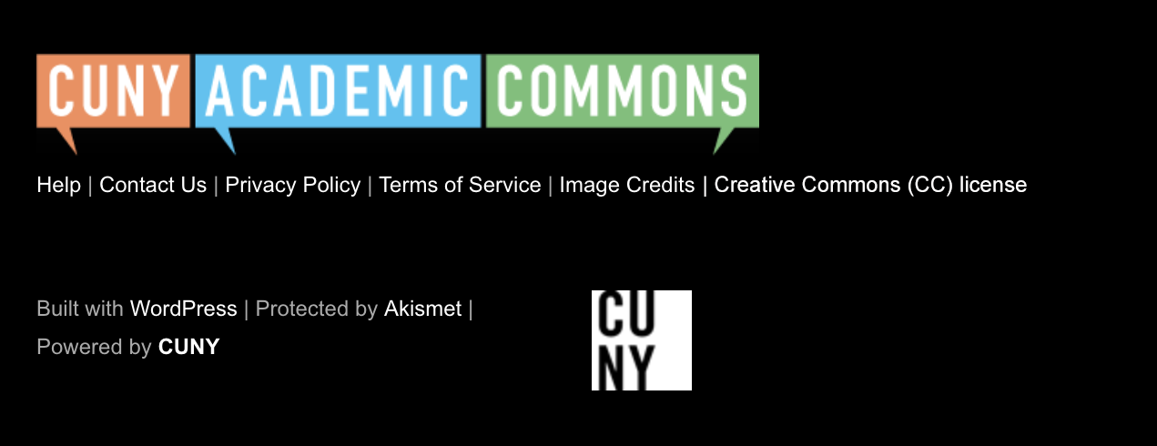
Matt and team,
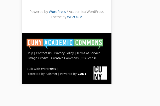
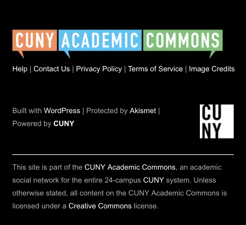
I took a stab at the condensed footer and came up with two versions. They don't vary much in height, but they help incorporate the footnote better into the footer. Let me know your thoughts and which one works better in your opinion.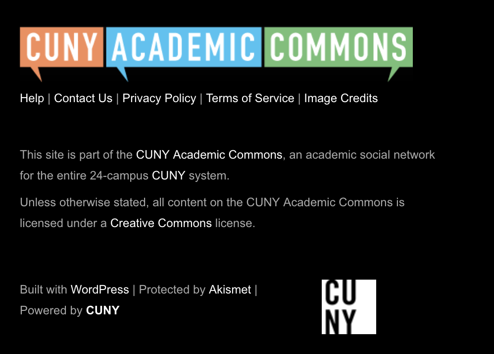


Updated by Matt Gold over 7 years ago
Thanks for your work on this, Sonja. I think your versions definitely look better than what we have, but I wonder whether we can do more to condense it further. For instance, do we need the "This site is part of . . . " text if we have the CAC logo there and it links to the homepage? Can we add a licensing image to the Help | Contact Us | etc list so that we don't have to have that CC license statement? If you could give another shot at condensing this, I would appreciate it.
Updated by Sonja Leix over 7 years ago
Thanks for your feedback, Matt! Absolutely, I'm in favor for removing or consolidating anything that is not necessary in the footer. I'll work on a new option for this.
Updated by Sonja Leix over 7 years ago
- File cuny-footer-rev1_size-2.png cuny-footer-rev1_size-2.png added
- File cuny-footer-rev1_size-3.png cuny-footer-rev1_size-3.png added
- File cuny-footer-rev1_size-1.psd added
- File cuny-footer-rev1_size-4.png cuny-footer-rev1_size-4.png added
- File cuny-footer-rev1-v2_size-1.png cuny-footer-rev1-v2_size-1.png added
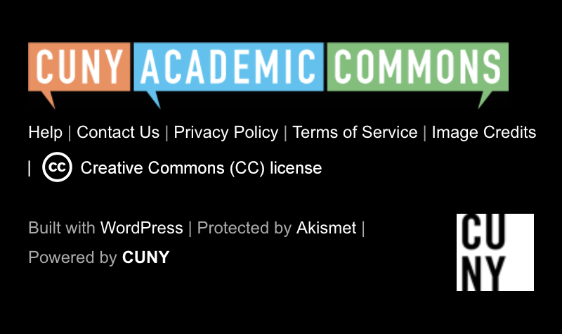
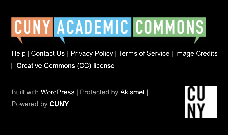
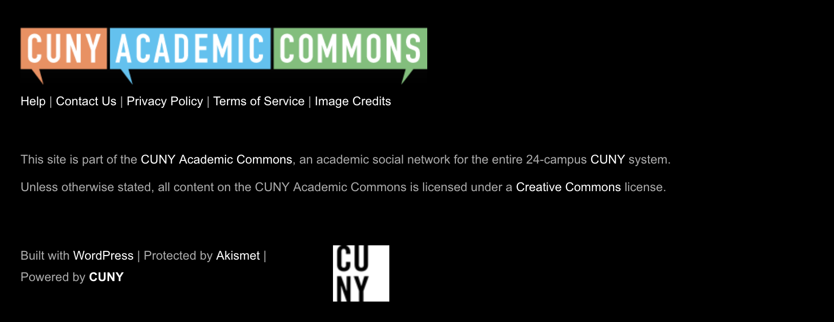
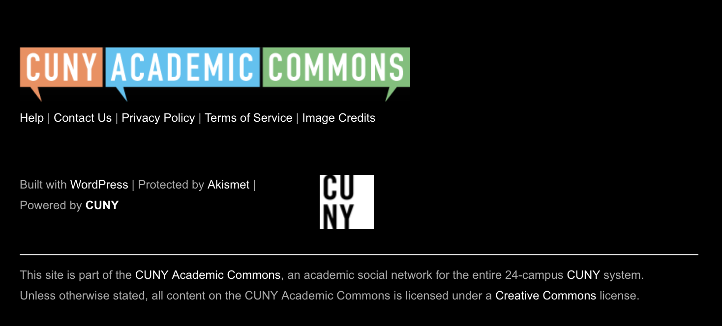
I've worked on an updated version. Removed the copy and added a link for the license. One version has the CC icon in it too. I'd suggest to go with this if we're looking to add more emphasis on the license. Thoughts?
Updated by Matt Gold over 7 years ago
Thanks, Sonja! I like the two most compact versions -- 3 and 4
Updated by Sonja Leix over 7 years ago
- File deleted (
cuny-footer-rev1_size-1.psd)
Updated by Sonja Leix over 7 years ago
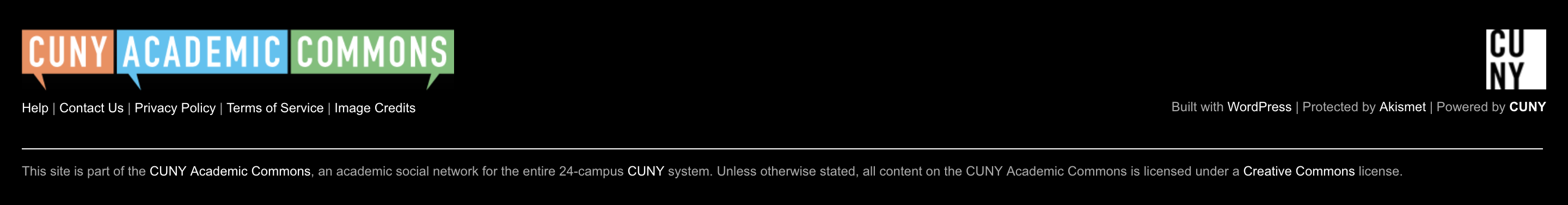
Decision made by Matt during today's dev meeting: We'll go with implementing the CC license link without the CC icon. See mockup attached and also these screen sizes:
https://redmine.gc.cuny.edu/attachments/9936/cuny-footer-rev1_size-2.png
https://redmine.gc.cuny.edu/attachments/9937/cuny-footer-rev1_size-3.png
https://redmine.gc.cuny.edu/attachments/9938/cuny-footer-rev1_size-4.png
Boone please implement.
Updated by Sonja Leix over 7 years ago
- Assignee changed from Sonja Leix to Boone Gorges
Updated by Boone Gorges over 7 years ago
- Target version changed from 1.15 to 1.14.3
Thanks! I may have to push this off to 1.14.4, depending on time constraints.
Updated by Boone Gorges over 7 years ago
- Target version changed from 1.14.3 to 1.14.4
Updated by Boone Gorges over 7 years ago
- File Screenshot_2019-01-08_15-40-25.png Screenshot_2019-01-08_15-40-25.png added
- File Screenshot_2019-01-08_15-42-39.png Screenshot_2019-01-08_15-42-39.png added
- Status changed from Assigned to Testing Required
- Target version changed from 1.14.4 to 1.14.5
Hi all - With apologies, I'm going to push this to the next release. I just managed to put together a first implementation, and I have some questions that should be addressed before shipping.
First, the addition of the CC link under the logo means that the left-hand side becomes considerably wider. Depending on browser, it starts to break into a second row around a 1080px viewport, which is quite wide. Notably, the container on the main site only has 940px of horizontal space. Sonja's mockups suggest that we should bump the right-hand CUNY box under the left-hand CAC box as soon as the CAC links start to break into a second line, but IMO this is very jarring on large screens, especially on the main site. I suggest that, at widths > 885px, we instead allow the CAC links to break to a second line, but keep the left-right orientation of the CAC-CUNY containers. I've attached a screenshot of what this looks like on the main site footer.
Second, the relative sizes of logos and fonts on my current machine don't quite match what's in Sonja's mockups. You can't notice this at large widths, but it becomes apparent when the viewport is narrow. I've attached a screenshot of a 375px view (iPhone 6) and you can see that the CAC links break differently from what Sonja suggests (though note that I've bundled each link with its preceding separator, ensuring that there won't be a line-break in the middle of a link), and that the browser decides to insert a line-break into the CUNY links at a different place than on Sonja's mockups. Much of this is probably due to differences in OS/browser/system fonts. My question is: how much effort should we put into enforcing an identical look across all platforms? IMO these cross-platform differences are native to the web and are acceptable, but happy to discuss.
After this morning's release, I'll push these changes to cdev so that you can play with widths in a live environment.
Sonja, could you please review?
Updated by Boone Gorges over 7 years ago
- Target version changed from 1.14.5 to 1.14.6
This is about to be shipped as part of the 1.14.5 release. As I think it's generally a good improvement, I'm going to keep it in. But I'll bump the ticket to the next release in case there are clean-up design tasks we'd like to perform before then.
Updated by Sonja Leix over 7 years ago
Boone Gorges wrote:
First, the addition of the CC link under the logo means that the left-hand side becomes considerably wider. Depending on browser, it starts to break into a second row around a 1080px viewport, which is quite wide. Notably, the container on the main site only has 940px of horizontal space. Sonja's mockups suggest that we should bump the right-hand CUNY box under the left-hand CAC box as soon as the CAC links start to break into a second line, but IMO this is very jarring on large screens, especially on the main site. I suggest that, at widths > 885px, we instead allow the CAC links to break to a second line, but keep the left-right orientation of the CAC-CUNY containers. I've attached a screenshot of what this looks like on the main site footer.
That works for me!
Second, the relative sizes of logos and fonts on my current machine don't quite match what's in Sonja's mockups. You can't notice this at large widths, but it becomes apparent when the viewport is narrow. I've attached a screenshot of a 375px view (iPhone 6) and you can see that the CAC links break differently from what Sonja suggests (though note that I've bundled each link with its preceding separator, ensuring that there won't be a line-break in the middle of a link), and that the browser decides to insert a line-break into the CUNY links at a different place than on Sonja's mockups. Much of this is probably due to differences in OS/browser/system fonts. My question is: how much effort should we put into enforcing an identical look across all platforms? IMO these cross-platform differences are native to the web and are acceptable, but happy to discuss.
Thanks for bringing this up. As long as the fonts within the footer are the same that works for me. Those are the usual browser related realities, no worries there from my side.
Thanks for this Boone!
Updated by Boone Gorges over 7 years ago
Thanks, Sonja! If it's not too much trouble, would you mind having a look at the footer as it's currently implemented on the production site? Given your feedback here, I think we can probably close the ticket, but it would be great to get your signoff on the actual implementation first.
Updated by Boone Gorges over 7 years ago
- Assignee changed from Boone Gorges to Sonja Leix
- Target version changed from 1.14.6 to 1.14.7
I think there are two outstanding issues here:
1. Matt and team were going to review the language around the CC license, to see whether we needed to be more verbose about "defaults" or whatever.
2. Sonja was going to take a look at the footer as implemented on production, to be sure I haven't missed anything huge with regard to styling.
Updated by Sonja Leix over 7 years ago
Boone Gorges wrote:
I think there are two outstanding issues here:
1. Matt and team were going to review the language around the CC license, to see whether we needed to be more verbose about "defaults" or whatever.
Matt, will there be any design implications for the footer in regards to the CC license review?
Reviewed in production (I think you mentioned it's already pushed to the live site). Everything is looking good except for one small change:2. Sonja was going to take a look at the footer as implemented on production, to be sure I haven't missed anything huge with regard to styling.
- Please adjust text-align for
#wrapper .sitewide-footer divto left aligned.
Also note: in production we have a duplicate footer on the my-commons page (https://commons.gc.cuny.edu/my-commons/)
Updated by Boone Gorges over 7 years ago
Thanks for having a look, Sonja.
Please adjust text-align for #wrapper .sitewide-footer div to left aligned.
Can you please share a screenshot or a link that shows what effect this will have? I'm not seeing anything at a glance, but I may be looking in the wrong place.
Also note: in production we have a duplicate footer on the my-commons page (https://commons.gc.cuny.edu/my-commons/)
I'm not seeing this. Can you share a screenshot, and steps to reproduce? Does it happen only after clicking Load More or something like that?
Updated by Boone Gorges about 7 years ago
- Target version changed from 1.14.7 to 1.14.8
Updated by Sonja Leix about 7 years ago
- File duplicate-footer.png duplicate-footer.png added
- File footer-center-aligned.png footer-center-aligned.png added
Boone Gorges wrote:
Can you please share a screenshot or a link that shows what effect this will have? I'm not seeing anything at a glance, but I may be looking in the wrong place.
See screenshot attached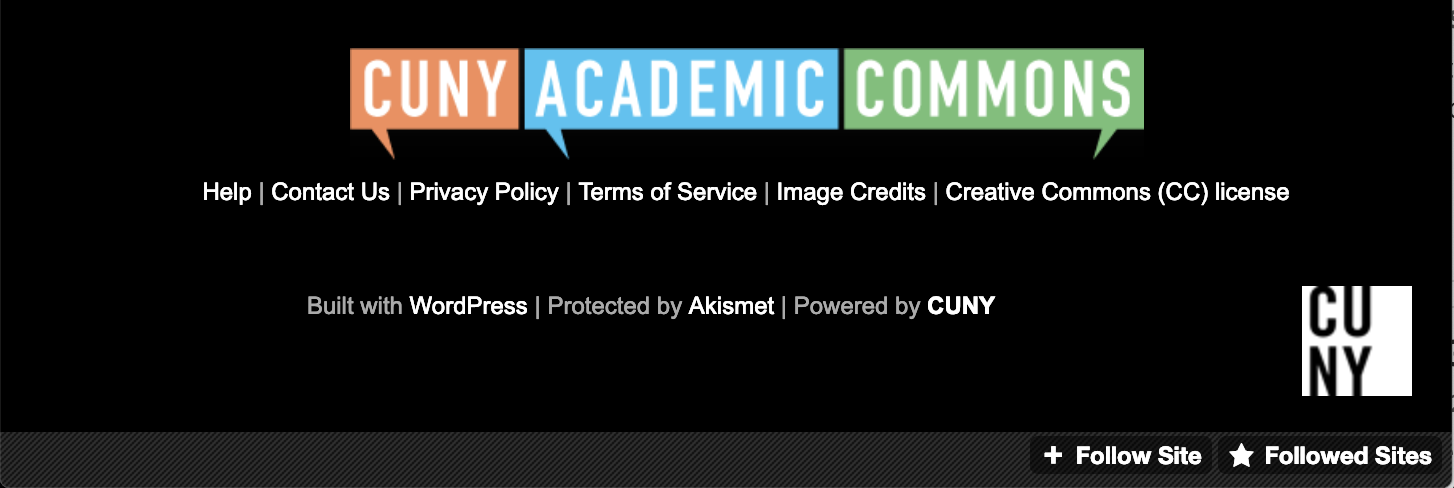
Also note: in production we have a duplicate footer on the my-commons page (https://commons.gc.cuny.edu/my-commons/)
I'm not seeing this. Can you share a screenshot, and steps to reproduce? Does it happen only after clicking Load More or something like that?
See screenshot attached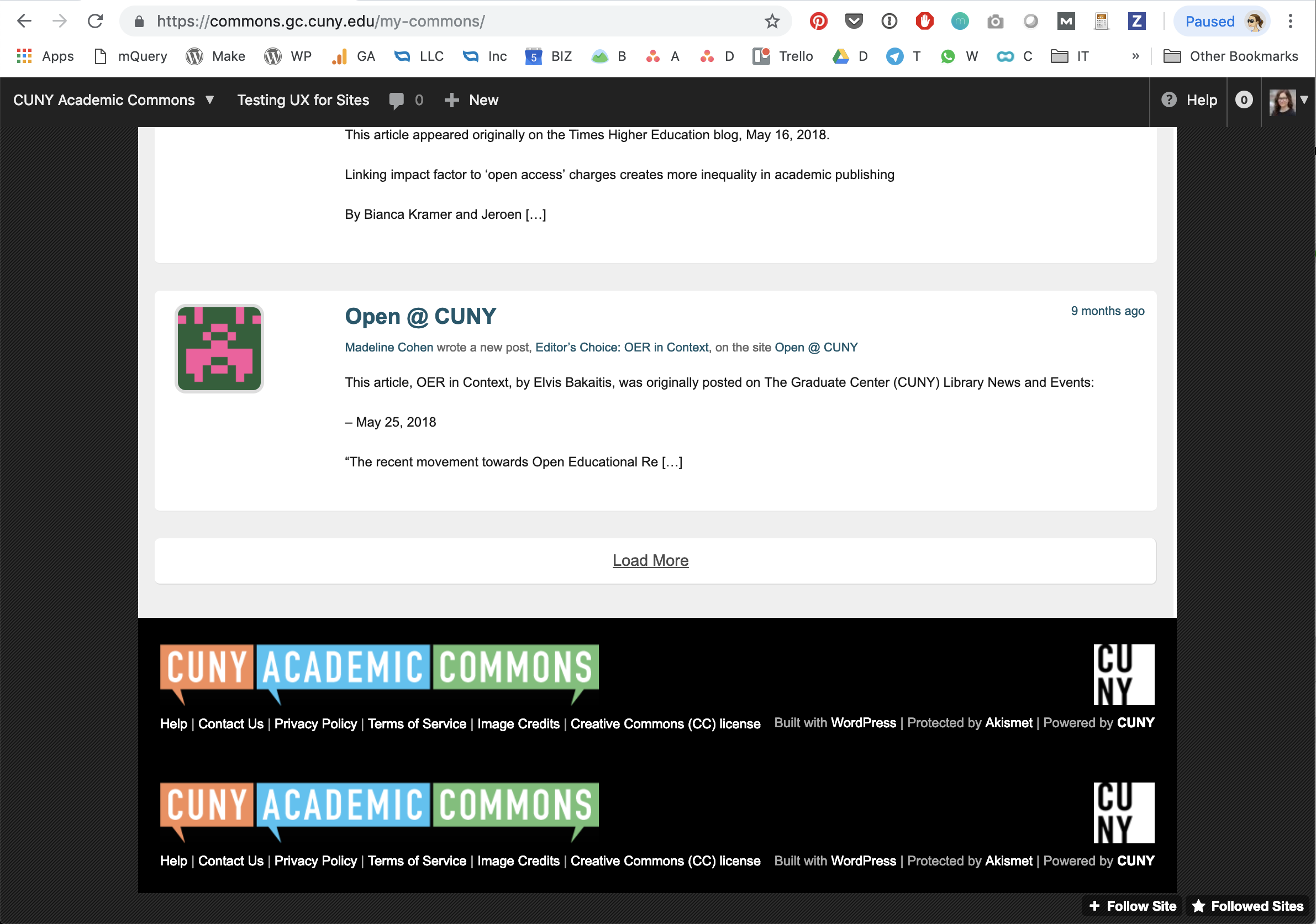
Updated by Boone Gorges about 7 years ago
- Status changed from Testing Required to Staged for Production Release
Thanks, Sonja. The left-justify issue only came up on the main site, and only on mobile, which is why I wasn't seeing it. Fixed in https://github.com/cuny-academic-commons/cac/commit/d3d2bca95211db694425853ed62cfcf67226455b
I finally managed to reproduce the double-footer issue after much experimentation. I tracked it down to a bug in the bp-mpo-activity-filter plugin, which is fixed in https://github.com/cuny-academic-commons/cac/commit/8b74e2c24deca4fdb60ade2b986bbb4e547be3e7
Updated by Boone Gorges about 7 years ago
- Status changed from Staged for Production Release to Resolved
Updated by Raymond Hoh over 5 years ago
- Related to Bug #13859: Reset current blog in BP MPO Activity Filter plugin added