Design/UX #11557
closed"Site names can only contain lowercase letters (a-z) and numbers" warning on Create Site page
0%
Description
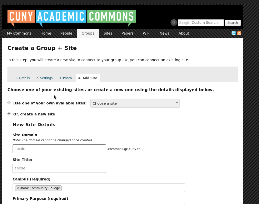
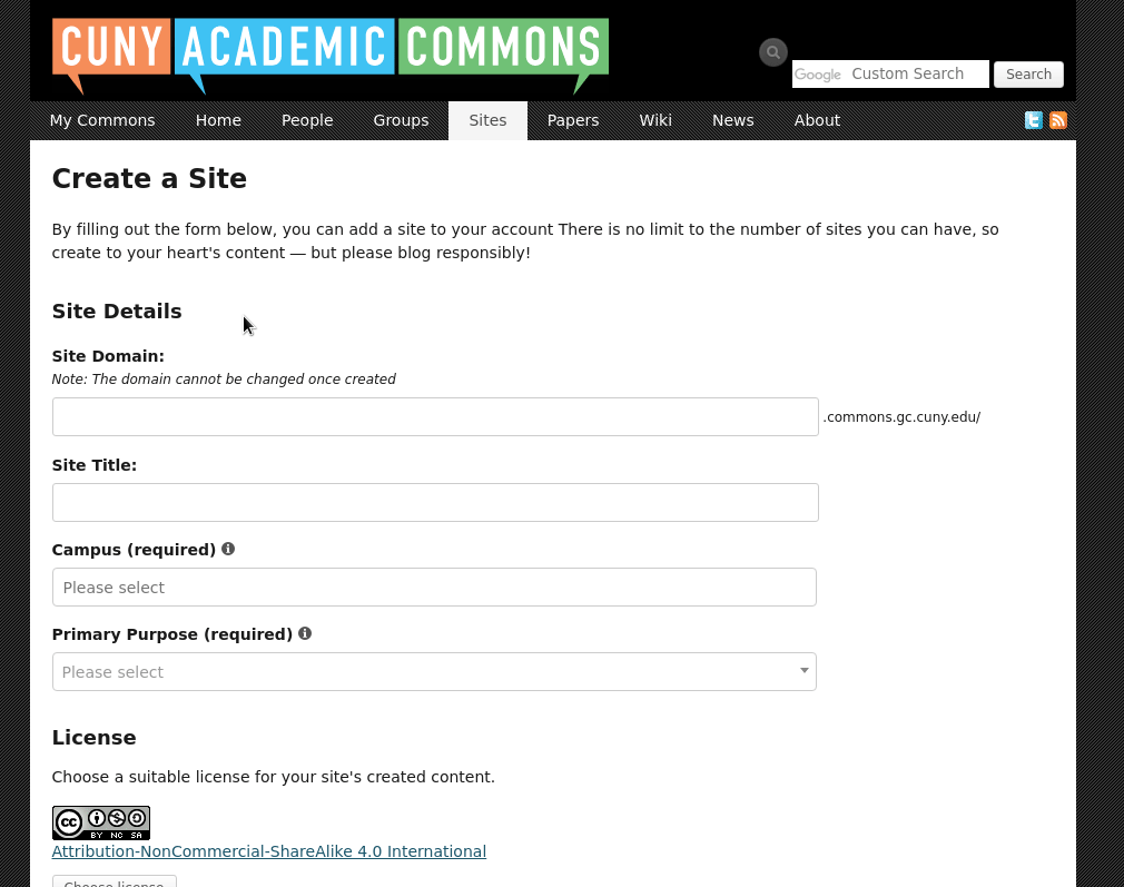
One the Create a Site page, is there a way to flag a site domain that fails to meet requirements before the user clicks the "Create Site" button? I ask because Gina and I are sitting with an instructor who is launching a site, and we didn't catch his mistake of using capital letters in the Site Domain field until after he had spent a few minutes filling out the rest of the page. Perhaps something akin to the warning that says in red letters "This blog name is over 15 characters" could display if problematic characters are detected? Or maybe an additional note that goes beyond that permanently above the text box ("Note: The domain cannot be changed once created," saying that "Site names can only contain lowercase letters (a-z) and numbers." Otherwise, I don't think the message that "Site names can only contain lowercase letters (a-z) and numbers" gets displayed to the user until attempting to submit and then the page reloads losing some of what they've filled out.
Files
Updated by Boone Gorges almost 7 years ago
- File Peek 2019-06-13 13-31.gif Peek 2019-06-13 13-31.gif added
- File Peek 2019-06-13 13-30.gif Peek 2019-06-13 13-30.gif added
- Assignee set to Boone Gorges
- Target version set to 1.15.4
Thanks, Tom. This is a good idea.
As you note, there's some existing error messages here for too-long domain names. But these messages are not applied in a way that's visually consistent, especially when comparing standalone site creation (/sites/create) and Group+Site. So I've done some more extensive work to unify the treatment, and I've added the character-validity check.
Sonja, it would be great to get your feedback on this. I tried for a visual treatment that was simple enough that it could be consistent between /sites/create and 'Add Site'. There are three parts:
1. When there's an error, show a red outline on the input
2. When there's an error, show the notice just under the input
3. When there's an error that will block creation (as opposed to a "suggestion"), disable the form and show a notice by the submit button
See attached gifs. We don't really have a set standard for this kind of inline validation on the Commons, but I don't want to go overboard with inventing one at this point, so I've aimed for simplicity :)
Updated by Sonja Leix almost 7 years ago
Boone Gorges wrote:
Thanks, Tom. This is a good idea.
As you note, there's some existing error messages here for too-long domain names. But these messages are not applied in a way that's visually consistent, especially when comparing standalone site creation (/sites/create) and Group+Site. So I've done some more extensive work to unify the treatment, and I've added the character-validity check.
Sonja, it would be great to get your feedback on this. I tried for a visual treatment that was simple enough that it could be consistent between /sites/create and 'Add Site'. There are three parts:
1. When there's an error, show a red outline on the input
2. When there's an error, show the notice just under the input
3. When there's an error that will block creation (as opposed to a "suggestion"), disable the form and show a notice by the submit buttonSee attached gifs. We don't really have a set standard for this kind of inline validation on the Commons, but I don't want to go overboard with inventing one at this point, so I've aimed for simplicity :)
Thanks for exploring this Boone!
I really like the inline error message right below the input field as you're typing and breaking the "rules" of the input field, as well as the red outline.
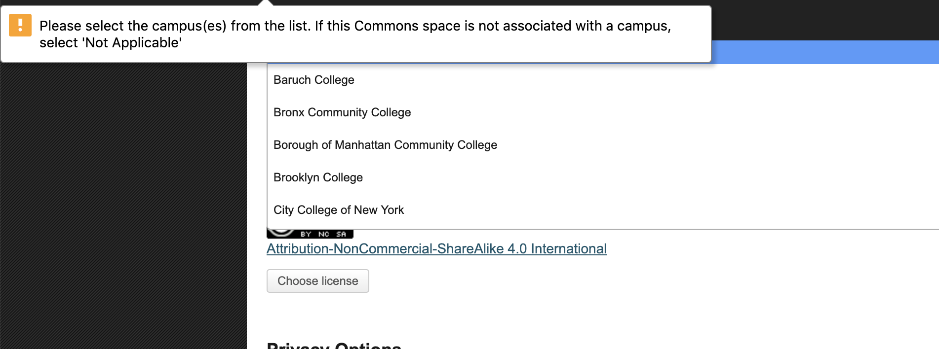
I'm not sure we necessarily need the error message at the bottom of the page since the inline message is very prominent. If a user tries to submit the form while ignoring the inline error message, we have the validation error message, see screen shot, which currently is a little odd in presentation and seems to disappear after a certain number of seconds. The validation errors would be better if they could display the same way they display inline: red outline and red error message below field.
Can we see another pass for this, Boone?
Updated by Boone Gorges almost 7 years ago
Thanks, Sonja. The validation message from your screenshot comes from the use of the HTML5 `required` flag on some of the elements. It was added during #11253 because of some feedback from Scott and others. See https://commons.gc.cuny.edu/groups/cac-community-team-project-planning/forum/topic/testing-for-commons-1-15-reelease/, https://redmine.gc.cuny.edu/issues/11253#note-4. The appearance of these messages is controlled by the browser, and is not customizable. Our only option would be to remove it and to roll our own, but then we lose some a11y benefits as well as cross-device compatibility.
If we set these messages to one side, it sounds like the second pass you're looking for simply involves removing the error message at the bottom of the page. Is that correct?
Updated by Sonja Leix almost 7 years ago
Boone Gorges wrote:
Thanks, Sonja. The validation message from your screenshot comes from the use of the HTML5 `required` flag on some of the elements. It was added during #11253 because of some feedback from Scott and others. See https://commons.gc.cuny.edu/groups/cac-community-team-project-planning/forum/topic/testing-for-commons-1-15-reelease/, https://redmine.gc.cuny.edu/issues/11253#note-4. The appearance of these messages is controlled by the browser, and is not customizable. Our only option would be to remove it and to roll our own, but then we lose some a11y benefits as well as cross-device compatibility.
I would recommend to keep the HTML5 browser-controlled error messages for required fields, especially in order to keep them accessible.
If we set these messages to one side, it sounds like the second pass you're looking for simply involves removing the error message at the bottom of the page. Is that correct?
Kind of. Yes, I'm in favor of removing the redundant message at the bottom, but if others feel strongly about keeping it, redundancy isn't a fault. But what about the current error message implementation (see screenshot: https://redmine.gc.cuny.edu/attachments/11813/Screenshot%202019-06-21%2017.40.15.png). Would the HTML5 error handling overwrite / remove those? Those are odd because they don't really focus on the input, the input (at least on my browser) is just out of sight at the top of the browser.
Updated by Boone Gorges almost 7 years ago
But what about the current error message implementation (see screenshot: https://redmine.gc.cuny.edu/attachments/11813/Screenshot%202019-06-21%2017.40.15.png). Would the HTML5 error handling overwrite / remove those? Those are odd because they don't really focus on the input, the input (at least on my browser) is just out of sight at the top of the browser.
That is the HTML5 error. It's styled by the browser.
Updated by Boone Gorges almost 7 years ago
- Target version changed from 1.15.4 to 1.15.5
I'm going to ship this as-is for the current release, and bump to the next milestone in case we want to make adjustments based on the discussion above.
Updated by Sonja Leix almost 7 years ago
Boone Gorges wrote:
I'm going to ship this as-is for the current release, and bump to the next milestone in case we want to make adjustments based on the discussion above.
Thanks Boone!
Updated by Raymond Hoh almost 7 years ago
- Target version changed from 1.15.5 to 1.15.6
Sonja, did we want to make any additional changes?
Updated by Boone Gorges almost 7 years ago
- Target version changed from 1.15.6 to 1.15.7
Updated by Sonja Leix almost 7 years ago
Raymond Hoh wrote:
Sonja, did we want to make any additional changes?
No, good to go.