Feature #14018
closedForum design improvements
0%
Description
Hi All,
I know we have limited dev bandwidth this semester but I wanted to share/catalog a faculty member's suggestion for forum design improvements. She suggests that the forum would be easier and more appealing for teaching if there were some font/visual customization options and the ability to see which posts are most recent.
She writes:
"It would be easier on the eyes if there was some text personalization options on the group forum posts: different font types, colors, size. I know it already has bold, ital, underline, and strikethrough. But color/type/size makes a huge difference.
I would read 30+ students’ 300-500 word posts per week.. and it was often hard on the eyes/visually boring in the standard font. Looked like a sea of text to wade through—overwhelming for me, I can imagine even more so for students who were expected to read each other’s posts and engage. So would be a good addition and also enhance accessibility."
Would this be possible by adding something like tinyMCE to forum post editor? I know this is a site plugin but would it be possible to make this functionality a standard part of the forum?
"having some kind of visual cue on each forum page to see the “most recent” posts made “since last time you viewed this page” would be helpful too. It’s easy enough to find new posts at the bottom of a forum, but if students post in response to another post (rather than respond to the forum topic) these get nested under individual posts and can be hard to find.
I think there is a way to change the default forum layout - threaded vs. most recent/chronological because I remember working through a bug where the views kept changing. I think most faculty do not know they can toggle the forum view. Would it be possible to make this more obviously, possible by moving this toggle somewhere more prominent? I realize its probably a lot more dev list to be adding some way to sort posts since last views and might rely on cookies, etc. so perhaps making the toggle more obviously would be an easy workaround.
Thanks,
Laurie
Files
Related issues
Updated by Boone Gorges about 5 years ago
- File Screenshot_2021-02-22_10-28-18.png Screenshot_2021-02-22_10-28-18.png added
- File Screenshot_2021-02-22_10-27-33.png Screenshot_2021-02-22_10-27-33.png added
I'm skeptical of adding a feature that allows users to change the size and color of their forum posts when they're creating them. I'm not confident that it would help with the problem at hand, since it would require the post author to make the appropriate changes at the time they're writing the posts. Seems to me that students are highly unlikely to do this, and are just as likely to make changes that will make it even harder to read.
I think what the user is asking for is, instead, things that the reader can do to make reading easier. On this topic, I think it's important to note that in the forums, as elsewhere on the Commons, it's always possible to increase the zoom level in the browser (usually Ctrl-+), which will increase font size.
As for accessibility more general, my tools tell me that the display of text on forum posts (font size, colors, contrast) are sufficient for WCAG AAA level compliance. But if there were a general feeling that the default font size was hard on the eyes, we could consider bumping it up. I've attached a screenshot of the current font size, and a mockup of a slightly increased size. I'm wary of making these changes in a piecemeal way, though, as these changes would ideally be part of a broader rethink of our typography, perhaps in the context of a broader redesign.
So, for the time being, my recommendation would be for the member to use local tools (browser zoom) to ease the reading process. In the longer term, we will definitely be looking more closely at legibility and accessibility as we move toward more global design changes.
For the other feature request, I can see the benefit of some sort of tool that allows a user to easily see those posts that have not been read. But this is technically a bit complex, since there may not be a reliable way to know whether a user has read a given post. (All we know is whether the URL was visited.) There used to be a plugin for this but it's closed. https://wordpress.org/plugins/bbpress-go-to-first-unread-post/ Ray, have you come across other solutions?
Updated by Raymond Hoh about 5 years ago
+1 to bumping the font size up a bit for everything.
As part of the redesign, perhaps the forum layout can be looked at as well.
I think there is a way to change the default forum layout - threaded vs. most recent/chronological because I remember working through a bug where the views kept changing. I think most faculty do not know they can toggle the forum view. Would it be possible to make this more obviously, possible by moving this toggle somewhere more prominent?
Right now, you can change threaded vs. linear display on your "My Settings > Forums" page. For enhancements, we have an existing ticket -- #13358.
We can also add some documentation to the help site. I couldn't find a dedicated section about configuring forum settings there.
For the other feature request, I can see the benefit of some sort of tool that allows a user to easily see those posts that have not been read.
Something could be done with cookies, but it wouldn't be very accurate. We can determine the last post in a thread and mark that as the last seen one. Then subsequent visits to the thread can check the current thread against the last seen marker and do some styling based on that.
I wouldn't really do this though. Changing the background color can be jarring and isn't really good for usability. We already have a notifications system that does "mark as read/unread" functionality via BuddyPress. We can probably piggyback on that somehow and make this more prominent or easier to use. Edit - this idea wouldn't really work well based on the OP's use-case.
Updated by Raymond Hoh about 5 years ago
- Related to Feature #13358: Improved UI for group forum threading settings added
Updated by Sonja Leix about 5 years ago
- File forum-font-size.png forum-font-size.png added
Thanks Laurie for sharing this request with us. I agree with Boone, that the solution/ask within the request to be able to change fonts and colors isn't aligned with the actual underlying issue. Font legibility will in most cases not increase with introducing more colors and picking good legible fonts is a science in itself.
I however hear the issue that reading/scanning the forum posts are a strain on the eyes. The easiest fix perhaps would be, as already mentioned, increasing the font size. I've put together a before/after mockup. I'd propose to increase the font-size to 14px. We could probably ship this with the next release.
Updated by Sonja Leix about 5 years ago
I forgot to mention that we can revisit the specific issues mentioned and see how we could solve those during the Redesign of the Forum.
Updated by Boone Gorges about 5 years ago
- Category name set to Group Forums
- Assignee set to Boone Gorges
- Target version set to 1.18.6
Thanks for chiming in, Sonja. Your mockups show increased font size on the group activity stream (see https://commons.gc.cuny.edu/groups/cunydhi/) The original report, as I understood it, was around forum posts (see https://commons.gc.cuny.edu/groups/cunydhi/forum/topic/coded-bias-film-screening-and-conversation-7/). Laurie, am I understanding this correctly? Sonja, do you recommend a similar change here?
(Sonja, sorry to bog you down with these questions - I added you as a watcher mainly so that you were aware of questions about readability when we talk about broader upcoming design decisions.)
I'm putting this into the 1.18.6 milestone with the understanding that we're focused here on minor typographical changes. As Ray notes, we've already got a ticket for an improved "threaded" toggle. If there are other features we want to consider, they should get their own tickets.
Updated by Laurie Hurson about 5 years ago
Hi All,
Yes, increased font size/readability on forum posts was the request; I think increasing font size in the forum is a good place to begin and other options could be discussed as part of the larger redesign.
I think working through the other ticket for the improved "threaded" toggle would be one way to address the other half of this request for some type of flagging of previously unseen forum posts.
Updated by Sonja Leix about 5 years ago
Boone Gorges wrote:
Thanks for chiming in, Sonja. Your mockups show increased font size on the group activity stream (see https://commons.gc.cuny.edu/groups/cunydhi/) The original report, as I understood it, was around forum posts (see https://commons.gc.cuny.edu/groups/cunydhi/forum/topic/coded-bias-film-screening-and-conversation-7/). Laurie, am I understanding this correctly? Sonja, do you recommend a similar change here?
Thanks, Boone for clarifying what was referenced. Yes I'd recommend increasing the font size for the reply content to 14px for body copy and adjust the line height to about 1.2rem. Appreciate you looping me in.
Updated by Raymond Hoh about 5 years ago
For the other feature request, I can see the benefit of some sort of tool that allows a user to easily see those posts that have not been read.
I'm going to go back to my idea of utilizing the BuddyPress notifications system to highlight unread forum posts in a thread.
It's technically very efficient and utilizes existing frameworks without reinventing the wheel.
Currently, when a topic author or reply author receives a reply to their forum post, bbPress creates a BuddyPress screen notification, which is visible from the admin bar or on your "My Notifications > Unread" page. When you click on the notification link, it takes you to the forum post and marks the notification as read. bbPress doesn't do anything special after that.
My idea is to hijack the unread notification link to add a URL marker like bbp-unread with the first unread post ID. From there, we can highlight any unread posts in the thread. Whether we want to change the background color of unread posts or do something else design-wise is up for discussion, but I feel that this would be a decent way to tackle unread forum posts while using the existing BuddyPress Notifications component.
Updated by Laurie Hurson about 5 years ago
Hi Ray,
Thanks for this! It sounds like exactly what this prof was hoping for.
The font size changes suggested by Boone and Sonja changes sound good too.
Updated by Boone Gorges about 5 years ago
Thanks, Ray. I agree that the notifications table is a good technical tool for this job.
I'm a bit worried about how noisy this will be. Will there be one notification per thread? Will they be collapsed in the context of the toolbar dropdown? If I'm a member of a couple different active groups, this could very quickly become a pretty long list.
Updated by Raymond Hoh about 5 years ago
The only thing I'm adding at the moment is a marker to the unread notification URL so we can highlight the unread posts before bbPress marks those notifications as read. I'm not changing the way bbPress records or formats notifications.
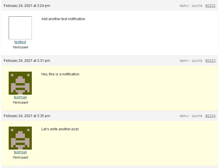
I have some code ready to go for my approach. Here's a screenshot:

I've just highlighted the background to light yellow, but any other suggestions would be great.
Will there be one notification per thread? Will they be collapsed in the context of the toolbar dropdown? If I'm a member of a couple different active groups, this could very quickly become a pretty long list.
In the toolbar, if you have multiple forum reply notifications, bbPress will group together all these notifications into one with the text, "You have X replies". See:
https://github.com/bbpress/bbPress/blob/f3271446ee389a3ddc1dec3579759d15de9fb7ec/src/includes/extend/buddypress/notifications.php#L86-L97
However, when you click on this link, it links to the first unread forum thread, which is wrong to me:
https://github.com/bbpress/bbPress/blob/f3271446ee389a3ddc1dec3579759d15de9fb7ec/src/includes/extend/buddypress/notifications.php#L69-L81
This link should preferably change to the "My Notifications > Unread" page filtered by unread forum replies. I'll work on fixing this.
The "My Notifications" page could also be designed better. It's been awhile since anyone has touched BuddyPress notifications, so we could definitely make some improvements here.
Just to further note, only the topic author and the reply author receives screen notifications. Not the whole group:
https://github.com/bbpress/bbPress/blob/289ecc0c7dc565935bbf5e856e4187b0d3296586/src/includes/extend/buddypress/notifications.php#L155-L168
Notifications for the reply author only work if the previous forum poster either clicked on the "Reply" or "Quote" link before composing their reply:

Updated by Boone Gorges about 5 years ago
Awesome - thank you for clarifying this. Somehow I missed that this was a bbPress feature. Your improvements seem right to me, especially the one about the link that goes to the first unread thread.
IMO the yellow is not too bad, as long as it still passes AA contrast levels (note that we will also be bumping up the font size, which also helps with contrast).
Updated by Raymond Hoh about 5 years ago
I've made some changes in a separate try/unread-forum-notifications branch. (Commits)
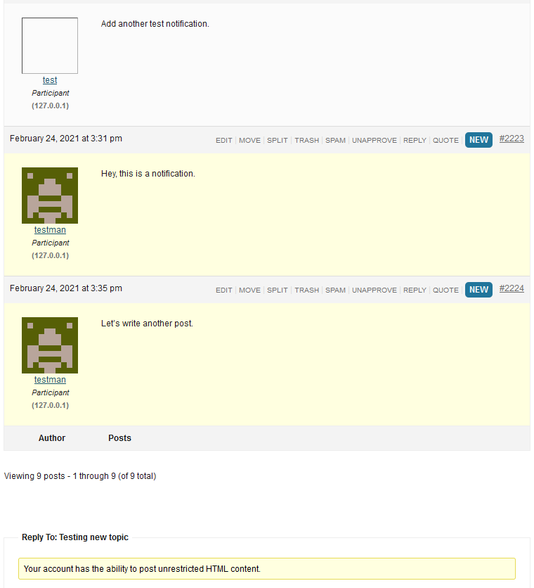
Here are some updated screenshots:

I've added a "New" badge for unread posts in addition to the background color change. The yellow background color uses the same color as the one bbPress uses and it passes contrast accessibility. The badge background color uses the same one as the blue notification from the admin bar.
In the dev chat, we also threw around the idea of fading out the background color. I decided not to do this for now since this would require targeting the scrollbar and seeing if unread posts are in the current viewport. I can add this as an enhancement in a later revision if we feel it is needed.

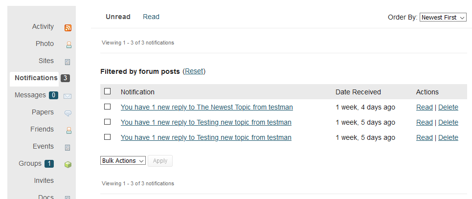
I've also taken the time to improve the "My Notifications" page. You can now manage notifications in bulk. I've also added a "Filtered by forum posts" heading when you click on the You have X new replies notification from the admin bar.
Let me know if there is anything else we want to do here.
Updated by Colin McDonald about 5 years ago
Agreed, thanks so much Ray! Let's try to touch on this during the dev call today before proceeding, especially with Sonja if she can't weigh in before then.
Updated by Laurie Hurson about 5 years ago
Hi Ray,
Thanks so much for this it looks great!
Just a question -- does this mean you will get a notification for every forum post, so a professor could potentially have 30+ notifications per class session? Or are all replies to a single topic collected into one notification and when the user clicks, they are taken to forum and new posts are highlighted and tagged as 'new'?
I just want to make sure I understand how bbpress is working here and how this update will function so I can explain to faculty. Maybe we can revisit briefly on the call today.
Thanks!
Updated by Boone Gorges about 5 years ago
- Target version changed from 1.18.6 to 1.18.7
Updated by Sonja Leix about 5 years ago
Thanks Ray for being proactive to solve this. Looks good to me. Really like the bulk edit feature for notifications – that's something that we received a comment about in our user survey.
Updated by Raymond Hoh about 5 years ago
- Status changed from New to Staged for Production Release
Okay, I've added these changes for the next release, scheduled for tomorrow: https://github.com/cuny-academic-commons/cac/commit/bff22e1f392aa6136917ae9e425994ba665bedc4
Updated by Boone Gorges about 5 years ago
- Status changed from Staged for Production Release to Resolved