Feature #1456
openInvite to Group Button from Profile Field
0%
Description
It would be neat if, while looking at someone's profile page or at a list of members, I could invite people to groups. So, I'd like to mouse over someone's profile image, than click "invite to a group," then have a list pop up that would allow me to select which group(s) I'd like to invite people to.
Files
Updated by Boone Gorges over 14 years ago
- Status changed from Assigned to Reporter Feedback
Would like some UX input before going forward with this. Adding dropdowns on the member directory seems like it will add a lot of clutter. Adding something on a single member page seems like it would be fine, but the member header is already kind of a mess. Maybe the action buttons (private message, mention, add/remove friend) could be rearranged, so that Invite To Group is another one of them. I could make it so that, eg, clicking the button would show a popup, or slide down to expose a new page section, where an autocomplete interface, or a list of groups with checkmarks, or a dropdown, would appear. In any case, it will mean introducing some more visual metaphors, and I want to make sure that the new metaphor chosen can then be used for other parts of the site, lest we end up with another UX singleton.
Updated by Boone Gorges over 14 years ago
- Assignee changed from Boone Gorges to Raymond Hoh
- Priority name changed from Normal to Low
Any ideas for how this might look, Ray? I'm sorta thinking the way that TweetDeck pops up actions when you hover over an avatar. That would be neat, but it doesn't really match anything else we do in the BP interface.
Updated by Chris Stein over 14 years ago
Boone, I think that you are right to worry about UX singletons with this. I think in general the idea of having forms or other interface elements that can dynamically appear on the page is a good idea. For example when you click to send a message to someone on their profile it might do something similar. That might benefit from some thought and a bit of research like the buttons.
In the short term here is another possible way to do it that fits in with what we are currently doing.- Add another button next to Friend, Mention, Message buttons for Invite to Group
- That button would take them to the Groups section of the clicker's profile (in a similar way that clicking message takes you to the messages section) where you would complete the invite process.
To illustrate some possible ideas around this I made some screenshots with notes you can see here:
http://profstein.clarify-it.com/d/kwl2y4
I'm open and interested to hear what others think. The new page I propose is in line with other ui we have on the Commons, and could potentially allow a way to invite someone to multiple groups at once, but it also has more coding and UI work. The inline quick form to do the invite is a simpler UI with potentially less coding but it adds a new UI element we haven't used or thought much about yet.
Updated by Boone Gorges about 14 years ago
- Target version changed from 1.4 to Future release
Moving to Future Release pending more UI conclusions.
Updated by Raymond Hoh about 14 years ago
- File 2012-07-07_120845.png 2012-07-07_120845.png added
I just saw this.
Boone: Are you talking about something like Gravatar's hovercards? If so, there's already a plugin with functionality similar to that:
http://wordpress.org/extend/plugins/cd-bp-avatar-bubble/screenshots/
I made some stylistic modifications to that plugin to resemble Gravatar's hovercards for a client.
The problem with this UI is the possibility of having too many buttons inside this hovercard, which would conflict with the original idea of simplifying the interface to begin with!
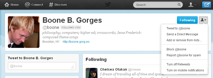
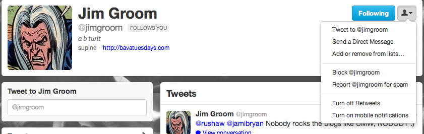
Chris' mockup is indeed closer to the BP interface. Though, it might be better to combine all BP buttons so it's only visible from a dropdown interface. For an example, check out how Twitter does it when you're on a profile page or in a member loop.
Updated by Boone Gorges about 14 years ago
Ray - Yeah, that plugin looks pretty good. Chris/Matt, check it out in action (click on a user name): http://gtm.ovirium.com/ or check out this demo https://www.youtube.com/watch?v=cMmjt_Rpz9E
Updated by Matt Gold about 14 years ago
Looks good to me. Think the setting should be on hover rather than click.
Updated by Chris Stein about 14 years ago
- File Screen_Shot_2012-07-09_at_11.04.44_AM.png Screen_Shot_2012-07-09_at_11.04.44_AM.png added
- File Screen_Shot_2012-07-09_at_11.03.47_AM.png Screen_Shot_2012-07-09_at_11.03.47_AM.png added
I like the direction that this is going. There are a few things I would change to make it a bit more user friendly.
- I wouldn't set it to hover unless it is smart enough to know to change to click on a touch-screen device (not sure that is reliably possible across touch devices).
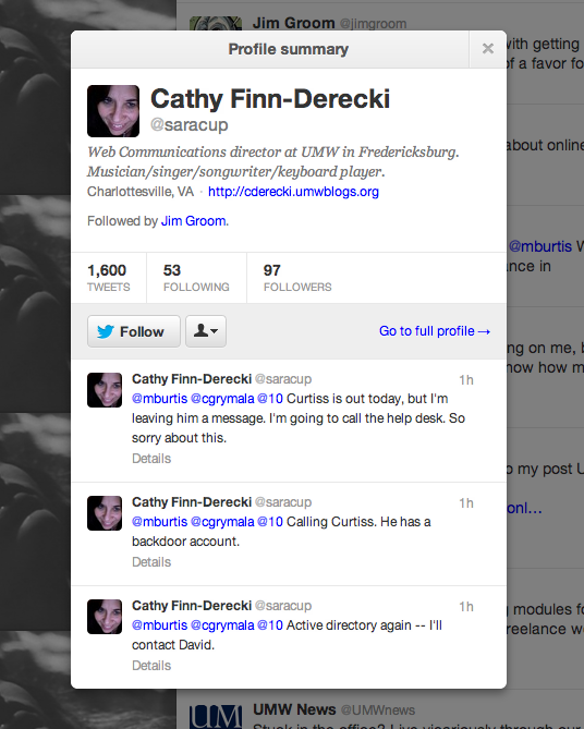
- Both clicking the gravatar/icon or the name should result in the same action. To use Ray's Twitter example (thanks), the attached image with Cathy is what you see if you click on her name or avatar. Note there is a link to see the full profile in that. Right now in the plugin the avatar gives the bubble and the name goes to the profile page.
- I'd like a quick discussion on what information to include in the bubble if that is possible. Using Twitter again, the aforementioned image has a different set of information than when you click the person dropdown in someone's profile (Raymond's image, I accidentally added one too, not sure how to remove it). The dropdown is more action oriented and the popup is more information oriented. Also the "#" is a bit confusing as a link to the full profile.
Updated by Boone Gorges about 14 years ago
I wouldn't set it to hover unless it is smart enough to know to change to click on a touch-screen device (not sure that is reliably possible across touch devices).
+1. Also hover popups are annoying, unless accompanied by a reasonable delay, in which case they may as well have been clicks.
Both clicking the gravatar/icon or the name should result in the same action.
Maybe, but then we have to decide where and when to implement this throughout the system. Does every single text link with my name turn into one of these? Put another way: I don't like the idea of inserting an extra click into the process every time you want to visit someone's profile.
the popup is more information oriented
This popup is, IMO, a failure of UX on Twitter's part. The information available in this popup is essentially a reproduction of what's available on the profile, so they should just let you go to the profile. If we're going to provide some sort of "hovercard", it should provide action items - 'visit my profile', 'add me as a friend', etc - and not be a wholesale reproduction of data available elsewhere.
Updated by Chris Stein about 14 years ago
Good question about whether every link turns into the popup as I think that is essentially what the plugin does or am I wrong?
It got me thinking we should perhaps add the popup shown in the plugin as a separate feature and debate the merits of that separately. I think to address the issue originally brought up here the dropdown example from Twitter does that better. It is essentially moving actions related to a user to a single button that might appear where the "Cancel Friendship | Mention User | Send Private Message" buttons appear now. Other actions like inviting to group could be added to that. It's a consolidation of user related actions under one UI element.
The popup, which could be done anywhere the person's avatar and name appear is a slightly different matter. I think the reason that Twitter reproduces the profile information in this way is so that as you're looking through a stream you can quickly check out people without going to their full profile and having to navigate back to the stream. It assumes that you're primarily interested in the main content on the page but want to take a quick dip into the other information without going away from your primary interest. As Twitter is more anonymous and likely to have tons of people you don't know I can see the sense in this.
The question is whether that is appropriate on the Commons and if changes can be made to make it fit. Again, perhaps better as a second feature request?
Updated by Raymond Hoh about 14 years ago
Chris: Thanks for the screenshots. I would disregard the Cathy idea. My intention was not to include a profile summary when you click on a name / avatar.
The question is whether that is appropriate on the Commons and if changes can be made to make it fit. Again, perhaps better as a second feature request?
I would agree that for the purposes of this ticket that it should be a separate feature request. Although, like Boone, I have my reservations about this.
About hover vs. click for the hovercard:
I wouldn't set it to hover unless it is smart enough to know to change to click on a touch-screen device (not sure that is reliably possible across touch devices).
+1. Also hover popups are annoying, unless accompanied by a reasonable delay, in which case they may as well have been clicks.
I actually don't mind hover with a delay because if I decide to click on something, I expect it to go straight to the page I want to view, not to provide me with a prompt to do something else.
Here's a summary of all the UI improvements listed above:
- Hovercards - When you hover over an avatar, you'll see some additional info about the person that includes some action links depending if you're logged in or not. Positives are it allows you to perform actions without navigating to the user's full profile. Negatives are having too many items / action links in the hovercard that may complicate the UI.
- Profile dropdown menu - To consolidate all the profile buttons into one area. Positives are you'll see less call to actions and a simpler interface. Negatives are you'll need to educate users about the dropdown.
- Quick profile summary on click - Shows a quick profile of the user via AJAX. Positives are it avoids loading the full page (less load on the server). Negatives are it's basically a reproduction of a user's profile and could be considered an interstitual.
I know this is quickly turning into a discussion about UI, so let's make some decisions.
For this ticket, I would recommend the "Invite to Group" button approach that Chris mentioned here:
http://profstein.clarify-it.com/d/kwl2y4
Later, we can explore the UI enhancements in new, separate tickets. Although it might be worth looking at the "profile dropdown menu" option either before or after this ticket.
Let me know what everyone thinks!
Updated by Boone Gorges about 14 years ago
it might be worth looking at the "profile dropdown menu" option either before or after this ticket.
I think that this (more than the hovercards, etc) is the best medium-to-long-term solution for the too-many-buttons problem. But you're right that it doesn't matter for right now, at least not for the first rev of this feature.
More than "Invite" button placement, I'm curious about the UI for the invitation composer itself. There'll have to be an interface for selecting the group(s) that you want to invite the user to. Do we open a lightbox?
Updated by Chris Stein about 14 years ago
I think it's fine to move some of the UI discussions to separate tickets. As inelegant as the Invite-to-Group button is, it is simple and straightfoward for this round.
Boone, my gut is telling me that for now it would be better to have a separate page devoted to the invite much as it is with our other invitations (and could probably reuse the code) and not do a lightbox. As we move to add other changes and refinements to the UI that could be revisited.
If we do have more time this round or move quickly to the next, adding the dropdown to the profile is what I would vote for pursuing next.
Updated by Boone Gorges over 10 years ago
- Category name changed from BuddyPress (misc) to Group Invitations
- Assignee changed from Raymond Hoh to Samantha Raddatz
This is an interesting, relatively standalone project that we might think about reviving from its dormancy.