Actions
Bug #15135
closedHeader design spacing
Start date:
2022-01-04
Due date:
% Done:
0%
Estimated time:
Deployment actions:
Description
I'm seeing a few things off on the homepage when I look at the header:
-- the top black admin bar (what we used to call the BP-admin bar) is overlapping "Open Educational" and "Project," each of which is too far away from the main nav bar headings they are supposed to be paired with
-- there should be more horizontal space between the right edge of the CAC logo and the word "People"
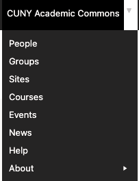
-- separately, I'm wondering whether we meant to have all of those terms on the main nav bar? I think we had slimmed that down a bit, no? And that it should match the simplified nav in the top drop-down (see attached screenshot)
People
Groups
Sites
Courses
Events
News
Twitter
Publications
Open Educational Resources
Conferences
Project Staff
Files
Actions