Design/UX #18746
closedTop Navigation Bar changes
0%
Description
- My Activity
- My Profile
- My Sites
- My Notifications
- My Events
- My Messages
- My Friends
- My Groups
- My Invites
- My Docs
- My Settings
- Send Invites
- Log Out
- My Activity
- * Personal
- * Mentions
- * Friends
- * Followed Sites
- * Papers
- * Groups
- My Profile
- * Edit
- * Change Profile Photo
- My Sites
- * Followed Sites
- * Create A Site
- * (List of Sites)
- My Notifications
- * Unread
- * Read
- My Events
- * Calendar
- * New Event
- My Messages
- * Inbox
- * Sent
- * Compose
- My Friends
- * Friendships
- * (y/n) Pending Requests
- My Groups
- * Memberships
- * (y/n) Pending Invites
- * Create a Group
- * (List of groups)
- My Invites
- * Invitations Received
- * Invitations Sent
- My Docs
- * Started By Me
- * Edited By Me
- My Settings
- * Security
- * Notifications
- * Export Data
- * Profile Visibility
- * Forums
- * Delete Account
- Send Invites
- Log Out
- Account Settings
- Messages
- Notifications
- Public CV
- My Activity
- My Sites
- My Groups
- My Friends
- My Events
- Log Out
- Account Settings
- Messages
- Notifications
- * All
- * Action Center
- * Send Invites
- Public CV
- My Activity
- My Sites
- * My Sites
- * Create a Site
- * (List of Sites)
- My Friends
- My Groups
- * My Groups
- * Create a Group
- * (List of groups)
- My Events
- Log Out
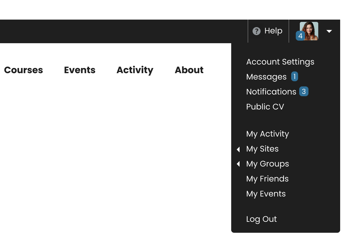
The look of the new drop down:
Note that the number indicator combines the messages and notification numbers.
More States Attached
Files
Related issues
Updated by Boone Gorges over 2 years ago
- Assignee changed from Raymond Hoh to Boone Gorges
I'll get a start on this, as I've primarily been responsible over the years for this part of the site.
Updated by Boone Gorges over 2 years ago
I've started working on this (https://github.com/cuny-academic-commons/cac/commit/0af0437df02036754944e187dcd789f1bed49c41) and I have a couple questions:
1. Your mockup and your annotated lists have the 'My' items in a different order. I've built it to match the mockup. Let me know if this seems right to you.
2. Your 'Proposed Drop Down (expanded)' has 'My Groups' and 'My Sites' links underneath 'My Groups' and 'My Sites'. Did you intend these redundant links?
3. The My Sites submenu has arrows on the individual site links, and site logos. I assume we want to get rid of these in order to standardize?
4. For the moment, 'My Public CV' points to a user's profile URL (eg https://commons.gc.cuny.edu/boonebgorges). We'll have to be sure this aligns with whatever URL schema we decide on.
5. If a user has not yet created a CV, what should that menu item say/do?
6. Your 'expanded' list has subitems for 'Notifications', but it's not indicated by the mockup. Erring on the side of simplicity, I assume we don't want to have a submenu here - users will simply click through to their Notifications subpage of the action center, and navigate from there.
I haven't touched the My Groups or My Sites submenus pending the discussion above.
This is available to play with on cdev if you'd like.
Updated by Sara Cannon over 2 years ago
This looks great!
1. Menu order looks great - matches the order of the submenu
2. Nope - thanks for the catch
3. yes please - can we clean it up and remove both?
5. What do we think about "Create Public CV"?
6. sounds great!
Updated by Boone Gorges over 2 years ago
I've implemented the My Sites and My Groups submenu fixes, and also the change to the CV language when users don't have a CV. Let's keep the ticket open to cover other necessary changes as the release draws closer.
Updated by Sara Cannon over 2 years ago
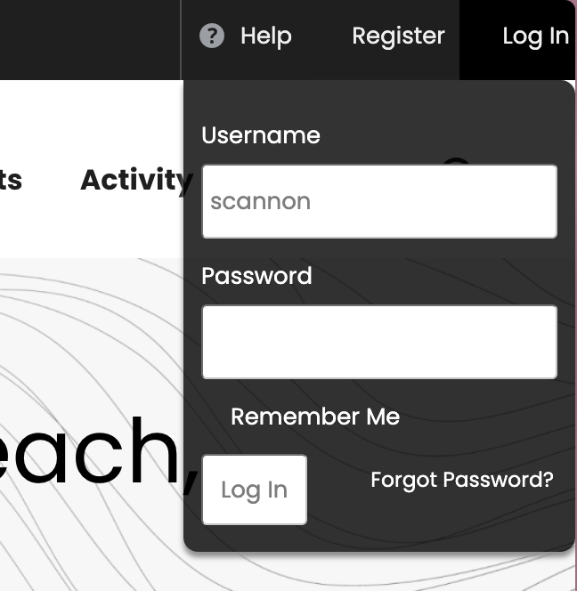
A few tweaks here:
- Could we get some right margin on the top menu bar when logged out? maybe 16px?
- When logging in, I don't see the checkbox for "remember me" 
- could we vertically align the "forgot password" with the button?
Updated by Raymond Hoh over 2 years ago
Thanks Sara. I've tweaked the admin bar login with your recommendations. I've also removed the border radius as well. This is available for testing on cdev.
Updated by Raymond Hoh over 2 years ago
Scott reported that the 'Account Settings' menu was linking to the 'Account Settings > Security' page instead of the 'Account Settings > Profile Photo' page. I've just addressed this here - https://github.com/cuny-academic-commons/cac/commit/9345550694b4251b83227b7daf9aeb2f2f0915a1. This is available for testing on cdev.
Updated by Colin McDonald over 2 years ago
- Related to Feature #17769: Account Settings Tab added
Updated by Colin McDonald over 2 years ago
Scott asked in the forum whether the "My Activity" option in the new top nav makes more sense as "Commons Profile," and I see his point. See the attached screenshot.
I think it might actually be better as "My Profile" to match the other "My" options in the second part of the drop-down. I'm including Sara here for any thoughts she may have, and Scott as well. If there are no objections right away though, I think we can make this change.
Updated by Raymond Hoh over 2 years ago
"My Activity" is now renamed to "My Profile" in the top navigation bar. This is available for testing on cdev.
Updated by Boone Gorges over 2 years ago
- Status changed from New to Staged for Production Release
Updated by Boone Gorges over 2 years ago
- Status changed from Staged for Production Release to Resolved