Design/UX #20578
closedDesign/UX #20575: Registration and Login Redesign
Registration confirmation email
0%
Description
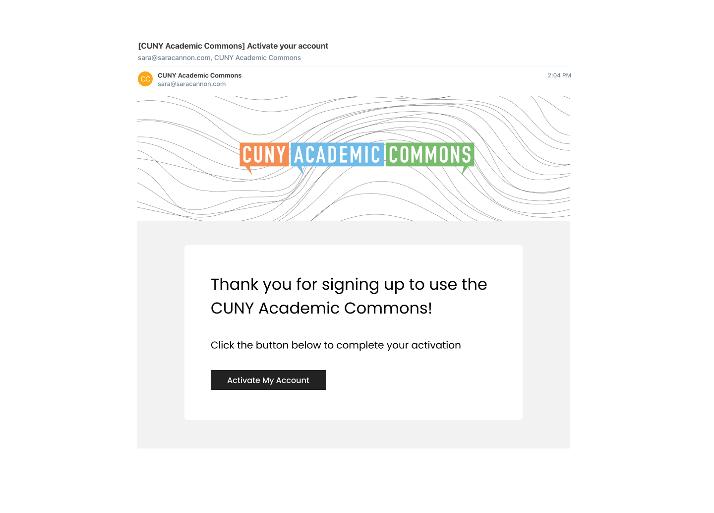
This is for the email one receives right after successfully registering, which contains the activation link. See attached screenshot for its current state. We've already discussed possibilities for custom HTML or skins for this email.
Files
Updated by Colin McDonald almost 2 years ago
- Tracker changed from Feature to Design/UX
Updated by Sara Cannon almost 2 years ago
- File Email - Register.png Email - Register.png added

Attached is an email design for the registration confirmation email. I understand if we are limited in how we can style it
Updated by Boone Gorges over 1 year ago
Sara, could you please provide a rendered version of the header? On a web page, I might have a big "squiggle" image that expands with the parent container, and position a transparent logo in the middle. But for the purposes of email, I think we need a single fixed-dimension image that combines the squiggle with the overlaid logo. In emails, we'll probably limit its width to 800px or so, but perhaps you could give me one 1000 or 1200px wide.
Updated by Sara Cannon over 1 year ago
- File CUNY-Email-Header.png CUNY-Email-Header.png added
here's a 800px wide header
Updated by Boone Gorges over 1 year ago
- File Screenshot_2024-10-16_13-23-49.png Screenshot_2024-10-16_13-23-49.png added
- File Screenshot_2024-10-16_13-20-57.png Screenshot_2024-10-16_13-20-57.png added
- File Screenshot_2024-10-16_13-27-46.png Screenshot_2024-10-16_13-27-46.png added
- File 2024-10-16 13.21.54.jpg 2024-10-16 13.21.54.jpg added
- File Screenshot_2024-10-16_13-30-39.png Screenshot_2024-10-16_13-30-39.png added
Hi all - I've got a first pass at this email ready to test on cdev. Some of the links might not be 100% accurate, but this should be enough for us to gauge design.
I've attached a few screenshots to show you behavior across a couple different platforms and scenarios. Note that, in particular, email clients can't reliably load custom fonts. We are also using a fixed table width across devices because there's not reliable support for media queries across clients. IMO this looks pretty readable on narrow screens, but it would be helpful for Sara to take a look.
There are still lots of parts of the email flow that have to be looked at. One that jumps out for me, which is closely linked to this ticket, is that two emails are in fact sent on activation: the 'Welcome' email described here, and one from WPMU called "New CUNY Academic Commons User". I was going to disable the latter, but then I thought it might be worth reconsidering, since it includes information about the chosen username. Do we want to keep both? Or should we fold that information into the other email somehow?
Updated by Boone Gorges over 1 year ago
I realize now that this specific ticket may be about the email you get just prior to registration. Oops :-D That one is also available to test, though note that I haven't yet made the changes to the /activate/ page described in #20579.
Updated by Boone Gorges over 1 year ago
- Status changed from New to Staged for Production Release
Updated by Boone Gorges over 1 year ago
- Status changed from Staged for Production Release to Resolved