Design/UX #20579
closedDesign/UX #20575: Registration and Login Redesign
Account activation page
0%
Description
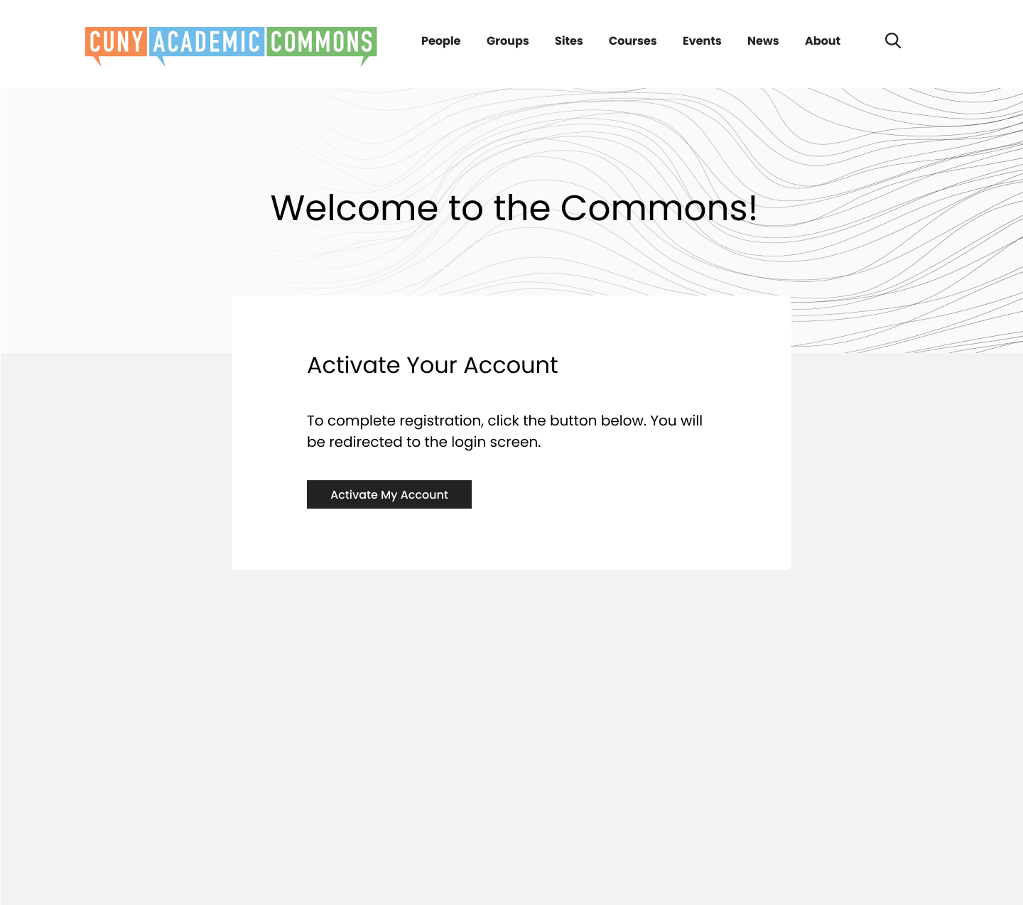
This is for the screen you see after clicking the activation link emailed in #20578. We talked about potentially removing the Key field, since that will be recorded when you click the link, and just having an Activate button or similar. Attaching a current screenshot.
Files
Updated by Colin McDonald almost 2 years ago
- Tracker changed from Feature to Design/UX
Updated by Sara Cannon over 1 year ago
- File Register-activate.png Register-activate.png added
When clicking the email link, we will auto-populate the button with the "key" so that the user does not have to see the field that they are submitting to register their account

Updated by Colin McDonald over 1 year ago
This looks good to me. I think we could simplify the text to this: "To complete registration, click the button below. You will be redirected to the login screen." Just making sure, the screen that comes next is #20581 correct?
Updated by Sara Cannon over 1 year ago
- File Register-activate.png Register-activate.png added
Correct. Here is the design with the updated wording
Updated by Boone Gorges over 1 year ago
- Status changed from New to Staged for Production Release
Updated by Boone Gorges over 1 year ago
- Status changed from Staged for Production Release to Resolved