Feature #2945
closedMy Commons
80%
Description
A user-focused dashboard area where users will see information about the Commons that is relevant for them. Scope for the first iteration:
- A layout with three main sections: "Push", "Friends", "Groups"
- "Push" is an area where members of the Commons team will be able to push out info to Commons members. (We need a better name for it.) This will likely be implemented as a new post type or a new blog, which Editors on the Commons main site will have access to. Exact details are forthcoming, but it'll probably consists of the dashboard box itself (which will display between 1 and 3 recent messages and a "see more" link) and a page where users can scroll through old messages.
- "Friends" is an area that (i) shows 3-5 of the most recent activity items from among the user's friends (with a link to see more at http://commons.gc.cuny.edu/members/[username]/friends), and (ii) a Recommendations area, where we suggest users that a person may want to become friends with. (See below for more on this.)
- "Groups" is just like friends, except about groups.
- A rudimentary recommendation engine for Friends and Groups. My rough idea is as follows:
- Friends: Get a list of all of a user's second-level friends (friends of friends). Get a list of all of a user's groups, along with the members of those groups. Then create an ordered tally: Joe will be high on Sally's list if he has many friends and groups in common with Sally. On each page load, select roughly 3 items from the list to display to the member. These items should be weighted random: chosen at random (to ensure variety) with a preference to those with a high match-score.
- Groups: Get alist of all of a user's friends, and the groups they are a member of. Get a list of all of a user's groups, and see what other groups those groups' members are also members of. Then create an ordered tally, and display roughly 3 items, quasi-randomly selected from the list.
- The feature should be toggleable for Friends and for Groups, in case users think it's creepy.
- There should be some way of explaining why the recommendations were made (maybe a "Why?" tooltip)
- Groups recs should account for private/hidden groups somehow. It's OK to use information from private/hidden groups of which the user is a member, but not OK to use info from second-level private groups.
- Should it be possible to reject individual recommendations? I think Facebook has/had something like this (an x that will force this user not to be shown again)
- Feature will have a top-level URL. Something like commons.gc.cuny.edu/me
- By default, user will be directed to the page after logging in from the home page. It should be possible to turn this behavior off in a setting somewhere.
- There should be some way in the global nav to reach this page. My initial suggestion: the avatar at the upper-right of the toolbar (which currently goes to the Profile Edit page) should go to My Commons.
Plan: Chris is going to provide a set of wireframes, while I work on some of the recommendations backend.
Files
Updated by Matt Gold over 12 years ago
Thanks, Boone, for getting this started. A few thoughts:
1a. Maybe something like "Notification Center" instead of "Push"? Thought perhaps that sound too CUNYFirstish
2d. I'm in favor of a tooltip that explains who we arrived at these recommendations, but as we discussed in the meeting, the title of this could go a long way towards reducing creepiness -- ie., instead of "People You May Know," something like "Users Who Have Listed Similar Interests"
Updated by Boone Gorges over 12 years ago
1a. Maybe something like "Notification Center" instead of "Push"? Thought perhaps that sound too CUNYFirstish
Yup, "Push" is just a convenient term internally. Personally I don't think it really needs a public name at all (in the same way that, say, we call them "hero slides" but no one else would have a name for it - there's no public title)
instead of "People You May Know," something like "Users Who Have Listed Similar Interests"
I'm not certain that this is any less creepy (but I'm not a good judge of this kind of creepiness, I guess). But we can't say "...Similar Interests" because that's not actually what we're going to do. The recommendations will be based on shared friendships/group memberships. This doesn't map onto academic interests, or any other aspect of the profile.
Updated by Chris Stein over 12 years ago
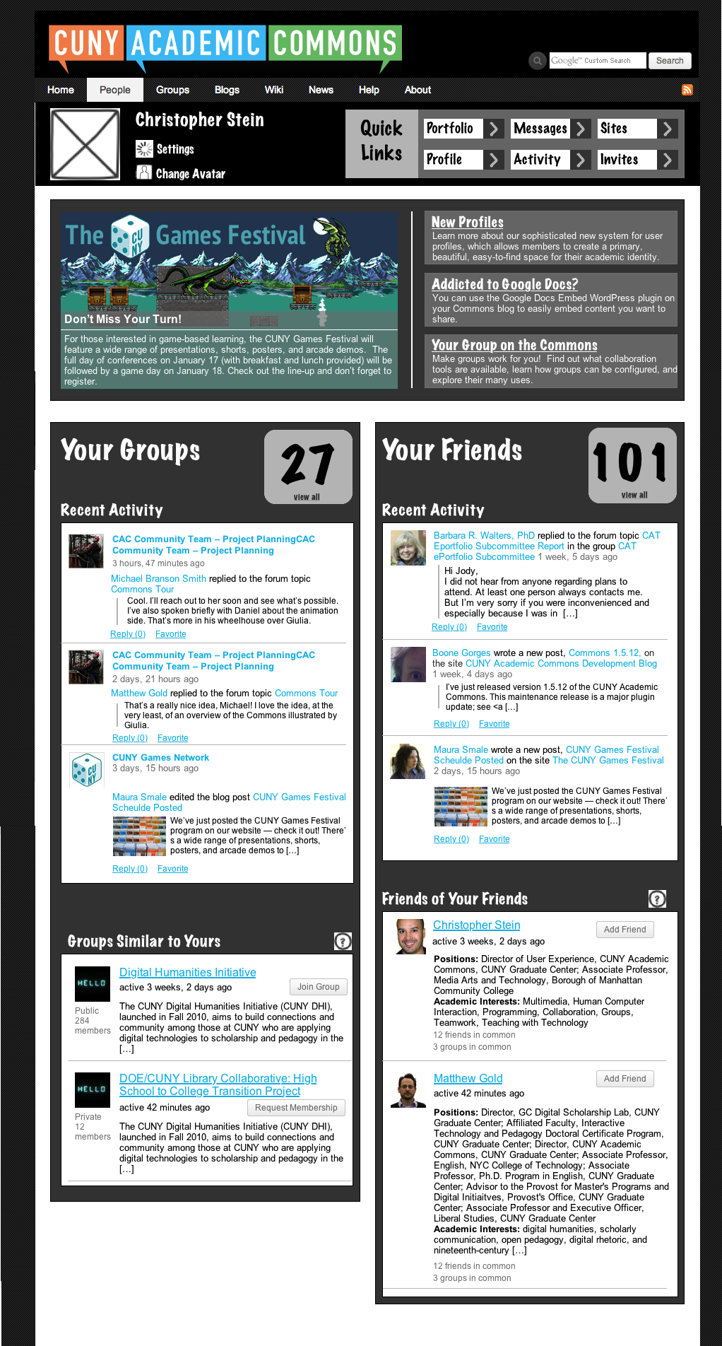
- File PersonalDashboard-V2.png PersonalDashboard-V2.png added
- Added links to settings and change avatar by your name (icons not right). I also added q Quick Links area to get to the other personal areas. I put it here to differentiate it from the left nav that is on the pages you will get to if you follow those links (so it is clear this is not in the same space as discussed in the last meeting).
The top part is the "Push" area which I didn't name. I can try adding one if we think it's needed. Right now it has one feature with a picture and three without. I am assuming those are custom posts and we can use featured images and excerpts or whatever for the text. To start I would recommend that we don't put too many of them. Maybe stick to just four as shown here and then rotate them.
The groups and friends are as I understood from the conversations. I chose names for the recommendations that hopefully don't sound too creepy. Also the ? should link to something that explains how they got there.
Updated by Chris Stein over 12 years ago
I should also mention that the content for the friends activity is pretty much how it is now on the site (in the News feed) and the the list of friends is like the People list. I do think that for Positions we could add some typography so that it is easier to differentiate Position, Department and School. For the Group information I tried to keep the same content but I did reorder it a bit to put the group name first and change a couple of things around.
OverallI didn't do much design and I'm open to feedback on which direction to take. The font is definitely not the one I think we should use, but I did think that we could consider using he dark backgrounds like here to help differentiate this layout from other pages on the site. I was also thinking about adding in some color to areas like the group and friend count and the Quick Links title.
Updated by Boone Gorges over 12 years ago
Thanks for this, Chris.
I like the "3 groups in common" "12 friends in common" glosses on suggestions. These could potentially be expanded to show the specific groups/friends.
A thought: since this is going to be a landing page for many users, it's likely to be used fairly frequently on mobile devices, and it's worth thinking up front about how it's going to behave on phone-sized screens.
Updated by Chris Stein over 12 years ago
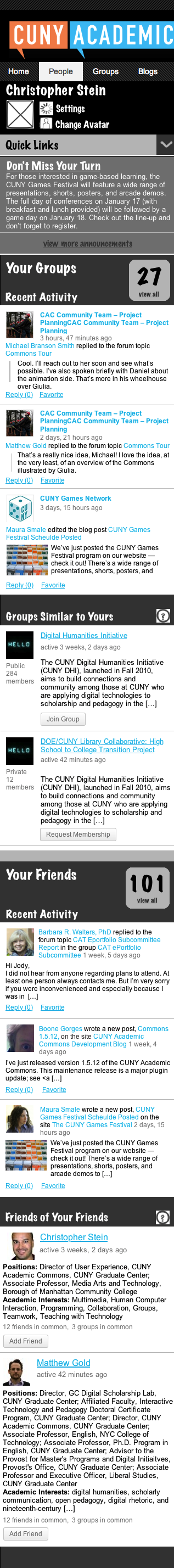
Yes Boone, I was thinking that as well. Here is my first version. It could use some discussion. I tried as much as possible to keep the content the same. The only big differences are that the Quick Links are changed to show only when you click the name and what we were calling Push, I've named it Announcements here, only shows the first one and optionally shows the others.
You will notice that I didn't do anything with the main logo and navigation. That would be a change that affects the whole site and I don't know if Dom is working on it and if this is the appropriate ticket to discuss those changes.
Updated by Boone Gorges over 12 years ago
- Target version changed from 1.6 to 1.7
Updated by Boone Gorges about 12 years ago
- File Commons-PersonalHomepage-Options-v3.pdf Commons-PersonalHomepage-Options-v3.pdf added
- Subject changed from "My Commons" dashboard to Personal Home Page
Changing the title of this post to reflect the new concept. See attachment for some details. I'll be opening specific subtask tickets momentarily.
Updated by Raymond Hoh almost 12 years ago
First rough pass of the Personal Homepage (PH) is up on cdev.
- Profile pages (as well as single group pages) now use the right sidebar. The right sidebar uses the old styling for now. Also, the "Commons Information" block that Dan worked on is integrated into the sidebar.
- Profile page headers now use circular avatars and have the quick links to "Change Avatar" and "View Portfolio".
- For now, I have transformed the "News" tab to the PH when a user is logged in. I intentionally made this change because there is a bit of an overlap between the current "News" tab and the proposed location to have the PH situated at the "Home" tab. This is not set in stone! Just want to get you guys thinking about the UX here.
What isn't completed:
- Finalization of sidebar contents on the PH and single user / group pages (see below)
- Custom "Filter My Activity By" dropdown activity filter for the PH
- Avatar bundling (#3332)
About the sidebar contents, after looking at Chris' mockups, I think a distinction needs to be made between what sidebar links are shown in the PH and what sidebar links are shown when you visit a single user / single group page. Do we keep the existing sidebar contents the same on single user / group pages, but change the contents for the PH only and when you're viewing your own profile?
Updated by Matt Gold almost 12 years ago
Excellent to see this taking shape, Ray -- thanks so much!
Profile pages (as well as single group pages) now use the right sidebar.
I don't think we had talked about changing group navigation, and my instinct is that we should not -- that it will be confusing to members. Wondering if I missed a discussion about this?
I think a distinction needs to be made between what sidebar links are shown in the PH and what sidebar links are shown when you visit a single user / single group page.
I think that all mockups are about the PH, not groups, no? And by "single user," do you mean the PH?
Updated by Boone Gorges almost 12 years ago
Awesome - thanks, Ray!
I don't think we had talked about changing group navigation, and my instinct is that we should not -- that it will be confusing to members.
Agreed. I don't think we're going to touch groups at this time.
For now, I have transformed the "News" tab to the PH when a user is logged in. I intentionally made this change because there is a bit of an overlap between the current "News" tab and the proposed location to have the PH situated at the "Home" tab. This is not set in stone! Just want to get you guys thinking about the UX here.
The general consensus, I believe, is that this is the content that should appear when a logged-in user is looking at the home page.
On a related note, as I understand the wireframes, there should be no Sitewide option on the PH (or, at least, it should not be the default). The default stream should be a unified view of user group activity + user friend activity + user site activity. In this way, the News page (/activity/) still has a separate role to play, as the non-personalized sitewide stream.
I will also note that this is all less than clear from the multiple documents that we've passed around. Ray, apologies for places where the requirements were not clear.
Let's talk this over during today's dev chat to clear up any of these details before asking for revisions.
Updated by Raymond Hoh almost 12 years ago
I don't think we had talked about changing group navigation, and my instinct is that we should not -- that it will be confusing to members. Wondering if I missed a discussion about this?
There wasn't a discussion about this, but I went ahead and did this to provoke one :) I think there are both pros and cons to either approach. This is easily revertible.
I think that all mockups are about the PH, not groups, no? And by "single user," do you mean the PH?
By PH, I mean the main PH and your own profile. By "single user" in this instance, I mean when a logged-in user views another user's profile page.
The default stream should be a unified view of user group activity + user friend activity + user site activity. In this way, the News page (/activity/) still has a separate role to play, as the non-personalized sitewide stream.
Right, but on the production site, if you're logged-in and you click on the "News" tab right now, this gets you halfway to what the PH is supposed to be. So let's say the PH is completed and resides at the root, when you go to the "News" tab, you will still get these filtering options (My Friends, Favorites, etc.), which is why I mention the overlap.
Let's definitely discuss these things as it's worth talking about.
Updated by Raymond Hoh almost 12 years ago
For those following along, I've moved my experiments for the PH from the "News" tab to the homepage. So when you login from the homepage, the homepage is now replaced with the PH.
This is available for testing on cdev. Still quite a bit of work to do, but we'll get there!
Updated by Matt Gold almost 12 years ago
Great progress, Ray! If there are specific things you want feedback on, please let us know -- I'm not sure what is waiting for feedback and what is simply work-in-progress. Huge thanks for your work on this.
Updated by Raymond Hoh almost 12 years ago
If there are specific things you want feedback on, please let us know -- I'm not sure what is waiting for feedback and what is simply work-in-progress.
Here are my UX things that I could use feedback on:
Sidebar contents
In the mockups that Chris did, he divided the links into various sections (Commons Activity, Settings & Notification, Communication). My original question was whether these sections applied to other user pages. My answer to this question can be found in this thread, specifically on one of Chris' mockups.
I want to know if we've finalized the sidebar links as well as including the call-to-action buttons there. We have to be careful not to put too much in the sidebar. We already have the "Commons Information" block there as well, which takes up some vertical space.
I also want to know if the group sidebar will have similar sectional changes.
Placement of group sidebar
I know I kind of brought up this issue, but this is something that could use some internal discussion about whether we want to keep the sidebar to the left or move it like I proposed on cdev to keep the layout consistent. There are both pros and cons to each side.
Redundancy between PH and News tab
If you're logged-in and you click on the "News" tab right now, this gets you halfway to what the PH is supposed to be. So let's say the PH is completed and resides at the root, when you go to the "News" tab, you will still get similar activity filtering options (My Friends, My Groups, Favorites, etc.).
I would probably recommend removing the filtering options from the "News" tab to prevent any duplication of features.
Updated by Chris Stein almost 12 years ago
In commenting on http://redmine.gc.cuny.edu/issues/3411#note-3 I give some reasoning behind some of the suggestions I'm making below. First I'll try to explain how I see the homepage working and then address Ray's questions.
My proposal is that we keep home.php with the is_user_logged_in() separation so that when someone goes to commons.gc.cuny.edu they get shuttled to the appropriate page. I'm also suggesting that we add a page template that is essentially the old home.php (say commons-home.php). A static page would be added that uses this template and this page is what we link to in the two Home nav items (in the main navigation and the Home on the left side of the WP Admin Bar). Perhaps the code to show the Commons homepage could be put in a separate file that can be get_template_part()ed in to both places to avoid too much duplication?
From the user's perspective this keeps the Home links working as they were while adding in the personal homepage when they're logged in.
Ray's UX questions
We haven't finalized the sidebar links. The consensus is towards not using the sections as shown on that mockup. I would like to suggest the following be used in both the sidebar and the WP Admin bar (for the right nav under the avatar):Sidebar contents
In the mockups that Chris did, he divided the links into various sections (Commons Activity, Settings & Notification, Communication). My original question was whether these sections applied to other user pages. My answer to this question can be found in this thread, specifically on one of Chris' mockups.
I want to know if we've finalized the sidebar links as well as including the call-to-action buttons there. We have to be careful not to put too much in the sidebar. We already have the "Commons Information" block there as well, which takes up some vertical space.
I also want to know if the group sidebar will have similar sectional changes.
- My Homepage
- My Activity
- My Groups
- My Sites
- My Friends
- My Messages
- My Notifications
- My Settings
- Send Invites
Don't make those changes yet though Ray. These need to be discussed. I will update the discussion you pointed to , and we will discuss on Friday 8/29 meeting.
Placement of group sidebar
I know I kind of brought up this issue, but this is something that could use some internal discussion about whether we want to keep the sidebar to the left or move it like I proposed on cdev to keep the layout consistent. There are both pros and cons to each side.
I do see pros and cons to both sides. In this case I'm leaning towards keeping it how it is. I think it's important to let people know that they are in a different navigational space than the Personal Pages and having the navigation on another side helps keep them separate. This is something we might revisit when doing the site redesign.
Redundancy between PH and News tab
If you're logged-in and you click on the "News" tab right now, this gets you halfway to what the PH is supposed to be. So let's say the PH is completed and resides at the root, when you go to the "News" tab, you will still get similar activity filtering options (My Friends, My Groups, Favorites, etc.).
I would probably recommend removing the filtering options from the "News" tab to prevent any duplication of features.
I see what you're saying. Your idea is also in line with mine that we have a better separation between Commons pages and Personal pages. If we do this perhaps we should also follow with removing the "My" filters in Groups and Blogs/Sites pages. This might also push people to move more towards using/seeing the personal pages and that navigation as how to get to their stuff. I'm assuming those can be commented out easily. Can we do that on CDEV and see what the rest of the group thinks?
Updated by Raymond Hoh almost 12 years ago
I've updated cdev with a new draft of the Personal Homepage.
Login from the homepage and you'll see the one-column and activity filters at the top of the page. This is similar to what Chris has on his mockup page.
The avatar logic in #3334 should be implemented for the most part as well.
I know there are some things that still need to be decided (final styling, URL where the PH should reside, etc.), but I thought I'd go ahead and get another draft up.
Updated by Boone Gorges almost 12 years ago
- Subject changed from Personal Home Page to My Commons
I'm changing the name of this ticket (and its category) to My Commons, to reflect recent changes.
Updated by Boone Gorges almost 12 years ago
- Assignee changed from Boone Gorges to Raymond Hoh
Ray - Given that we're so close to being complete here, would you mind merging into the 1.7.x branch? I've got some other things I want people to test on cdev, but I don't want that to prevent them from testing this too. Thanks!
Updated by Raymond Hoh almost 12 years ago
Given that we're so close to being complete here, would you mind merging into the 1.7.x branch?
Done!
Updated by Boone Gorges almost 12 years ago
- Status changed from Assigned to Resolved
All the child tickets of this one are now marked resolved, so I'm going to close this one too. For issues that arise during testing, please open new and detailed tickets.
Many thanks to Ray for taking the lead on this cool new feature!
Updated by Matt Gold almost 12 years ago
Excellent - thank you, Ray! And as always, thank you, Boone!