Feature #3112
closedMinor responsive modifications
Added by Boone Gorges over 12 years ago. Updated over 12 years ago.
0%
Description
I could swear we already had a ticket for this, but I couldn't find it.
I'm going to start introducing some styles to make the site usable on mobile devices. The breakpoints I've chosen are based primarily on the nature of our theme, which has a static width of 980px and some sub-element with specific widths, but I've also tried to make sure that we're catching most standard cases (tablet portrait, phone landscape, phone portrait). 980, 650, 470.
This can be an ongoing project, but I'm putting it in the 1.6 milestone to cover some of the worst problem spots.
Files
| width-of-person-info-7.png (38.2 KB) width-of-person-info-7.png | Chris Stein, 2014-04-01 11:37 AM |
Updated by Boone Gorges over 12 years ago
- Status changed from Assigned to Testing Required
I've got some fixes in place for the home page and the directories (Groups, People, Blogs, News). I haven't touched the single item pages yet. Relevant changesets: https://github.com/castiron/cac/commit/07fda1fb4572d348c803f4636c4169b76d7baa8e https://github.com/castiron/cac/commit/21e0f8e7b15aad64d1b378377741c71174b696c6 https://github.com/castiron/cac/commit/13f318167c92a3e5eaf1fe89236d713e18059cae
These changes are ready to test with various devices on cdev.
In a few places (particularly the home page) I had to make decisions about what to eliminate/collapse at various widths. Feel free to disagree with my choices in this thread.
I'll post here when some single items are ready for testing as well.
Updated by Boone Gorges over 12 years ago
I've taken a sweep through single groups: https://github.com/castiron/cac/commit/f68b87930e49768ea9c62070b9cf61517b04fca0
Updated by Matt Gold over 12 years ago
- Assignee changed from Boone Gorges to Chris Stein
Assigning to Chris for testing. Thanks!
Updated by Matt Gold over 12 years ago
Testing protocol - visit a bunch of different pages on a bunch of different mobile devices and tables, and look for anything that might be off.
Look at home page, group directory, individual group page
You'll see that a few things disappear (ie., on homepage, slider disappears on smallest screen size settings)
Please report any glaring issues.
Updated by Chris Stein over 12 years ago
This is a good start with making some quick changes. For the next release, or some time in the future, it would be good to revisit this and do some more changes that might be more time consuming.
Some quick ideas (implement if/how you see fit):
GROUPS- Group Directory: If possible, move the Join/Leave/Request button to bottom so it's further from link to the group page and not so easy to accidentally click one by accident.
- Individual Group Page: Move list of admins on its own line under the avatar and name. It will be awkward in that small space with a bunch of admins
PEOPLE
One change here would be to change the width of the items. It is set to 70% now and I think can be 100% to show more on a line:
/* custom.css:1704 */
ul.item-list .item {
width: 70%;
width: 100%;
}
On phone size the positions etc should break down to own line so they have the full width of the screen to show.
BLOGSI'm not sure how hard this is but if it's not too hard I think it would be better, especially on mobile sizes, if :
- Latest Post was moved to before the Visit Site button (so Visit Site is last thing).
- Latest Post and Author had the same text color
USERVOICE
I think this is causing some problems on mobile. Will mention in other issues, but for now my recommendation would be to remove it on tablet and smaller.
TWITTER, RSS FEED ICONS
I would suggest removing these on the phone sizes.
FOOTER
This wasn't fully responsive on the phone. I can attach a screenshot if you want. This would take making the description at the top have a percent width, making the commons logo resize responsively, modifying the subnav so it is more responsive. There might be more pressing things at this release. Can push off. Or I can work on it in next week if people think it's important for 9th.
Updated by Chris Stein over 12 years ago
- Assignee changed from Chris Stein to Boone Gorges
Boone, moving to you. It seems like it's time to lock down any feature requests and let you decide what's possible in this release. We can always reopen or make another ticket moving forward.
Updated by Boone Gorges over 12 years ago
- Assignee changed from Boone Gorges to Chris Stein
Thanks a lot for the valuable feedback, Chris.
Group Directory: If possible, move the Join/Leave/Request button to bottom so it's further from link to the group page and not so easy to accidentally click one by accident.
This is a good idea, but unfortunately the markup is pretty convoluted here, and it'll be impossible to bust the button out of the flow without rewriting it. As a compromise, I've added a bit more breathing room around the buttons at small sizes. Hopefully that'll help. https://github.com/castiron/cac/commit/9be8c1c17f48519b117665ca588be0593ba48e93
Individual Group Page: Move list of admins on its own line under the avatar and name. It will be awkward in that small space with a bunch of admins
Yup, I agree that it's awkward. Again, sadly, the markup is pretty entangled. I decided that at <470px I'd just remove it altogether. I don't think too much is lost. This prompted a little more miscellaneous cleanup of the group header, which you can see on cdev. https://github.com/castiron/cac/commit/18436cb845ebc803458442ebdc66e80474b4dd27
PEOPLE
One change here would be to change the width of the items.
Can you be more specific about the widths you're looking at? The people directory changes pretty dramatically depending on width, and I'm not sure which view you mean. The width of this particular element already does break to 95% at certain breakpoints.
On phone size the positions etc should break down to own line so they have the full width of the screen to show.
Done in https://github.com/castiron/cac/commit/a0c8770bbd29ae4a8bca690413d346e2e82b66a7
Latest Post was moved to before the Visit Site button (so Visit Site is last thing).
Latest Post and Author had the same text color
Done in https://github.com/castiron/cac/commit/90f1d663df5f84722e471011544d378f76e1f37d
USERVOICE
I think this is causing some problems on mobile. Will mention in other issues, but for now my recommendation would be to remove it on tablet and smaller.
There's not a straightforward way to do this simply by looking at the viewport width, so instead I'm disabling it when a mobile user-agent is detected. This is probably more relevant to the touchscreen issues anyway. https://github.com/castiron/cac/commit/032d8eb62df0c68780919cef903a2d09b93c07c5
TWITTER, RSS FEED ICONS
I would suggest removing these on the phone sizes.
Removed in https://github.com/castiron/cac/commit/7f7c955a1fc201ce25970dd6b47189421966cb69
FOOTER
This wasn't fully responsive on the phone.
Yeah. The markup/styling was largely rewritten to be more responsive for all other sites on the network, but the main site uses its own version of the markup, so it didn't inherit it. Ideally, I'd switch it over to use the networkwide footer, but this is beyond what should wisely be done for this milestone. Perhaps we can have a separate ticket for this.
Updated by Chris Stein over 12 years ago
- File width-of-person-info-7.png width-of-person-info-7.png added
- Assignee changed from Chris Stein to Boone Gorges
Boone, the changes look good.
PEOPLE
One change here would be to change the width of the items.
Can you be more specific about the widths you're looking at? The people directory changes pretty dramatically depending on width, and I'm not sure which view you mean. The width of this particular element already does break to 95% at certain breakpoints.>
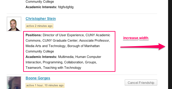
On my screen the info under each person(positions etc) only fills about 70% of available width. Now it's fine on mobile but still showing on larger screens. Attaching screenshot.
That's not a dealbreaker. Moving it to you, but I'm OK marking resolved.
Updated by Boone Gorges over 12 years ago
- Status changed from Testing Required to Resolved
Thanks for the screenshot, Chris. I've made that element wider at the relevant breakpoint in https://github.com/castiron/cac/commit/ab5fa82093c11981450285db59d24d717cdf862a.
Going to mark this issue resolved. Let's handle separate suggestions for improvements in different tickets against future milestones.