Design/UX #4903
openImproving visual appearance of event calendars
0%
Description
Hi Sam,
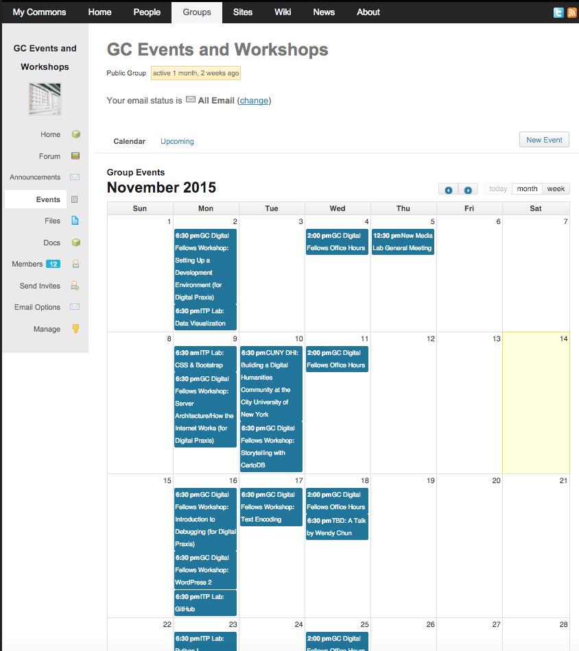
Are there changes in layout/color/design/alignment/sizing that you can suggest to improve the appearance of events calendars that contain multiple events on a single day? Please see the attached screenshot and this link - http://commons.gc.cuny.edu/groups/gc-events-and-workshops/events/ - for an example. It looks pretty crowded to me and also hard to even tell that there are multiple events in a single box. We might look to how GCal handles this for guidance
Files
Updated by Boone Gorges over 10 years ago
- Category name changed from User Experience to 136
- Target version set to 1.10
Updated by Samantha Raddatz over 10 years ago
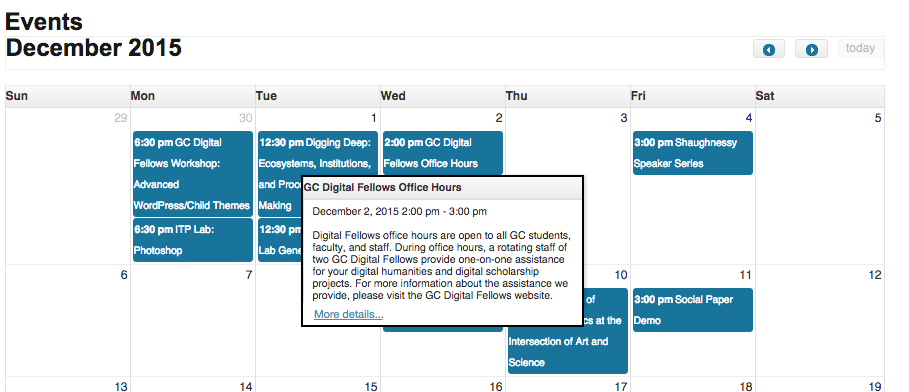
- File More Details_Mockup.jpg More Details_Mockup.jpg added
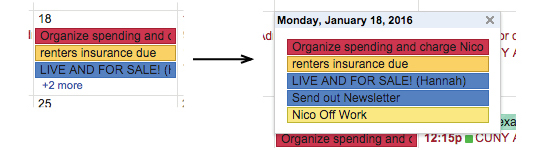
- File 2 more_Google.jpg 2 more_Google.jpg added
I think the following two conventions, borrowed from Google Cal and Apple Calendar would make the Commons calendars more appealing without losing usability:
- Only allow a max of two lines for each event time/title (this is normally only one line, but our calendar is more narrow than most and only one line wouldn't allow for much title-space). Any text that is too long is cut off by an ellipses. To see the full title, users can hover over the event to see the existing pop-up with more details.
- Choose a standard height and max number events for each day in month-view. If the day contains more events than that, put a "+2 more" (or however many more there are) link at the bottom of that field. Clicking the link reveals a larger overlay that contains the full-days events (see attached '2 more' example from Google).
From your screenshot, Matt, it looks like events get squished into each other when the day gets too full, but are sometimes fine, like on Nov 16 in the screenshot. I think the standard white space that we have between the events now is good as long as it can be ensured that it's maintained between all events. The 2nd suggestion above should help make heights and spacing more standard. In addition, each blue box could be edged with a very thin darker-blue (maybe #09394E) border to help visually separate them more.
Since we're already looking at this, I'd also love to add a 'more details' link at the end of the event description in the pop-up that appears on hover (see attached mockup). I'm not sure it's clear that clicking on the pop-up will bring the user to the full event page.
Updated by Boone Gorges over 10 years ago
- Category name changed from 136 to Events
Updated by Boone Gorges almost 10 years ago
- Assignee changed from Samantha Raddatz to Boone Gorges
- Target version changed from 1.10 to Future release
This is another item that will require a good deal of work, either within the context of the existing EO calendar tool, or by forking and building our own.
I'm going to reassign to myself for assessment, but before technical work, we should have a more general talk about the future of the Events tool and how we want to allocate resources for it. (It's a possible locus of synergy for the NEH grant, since the OL uses the same plugin for events.)