Feature #652
closedImproved filters, search, and sort on Members directory
0%
Description
The idea, in a nutshell, is to have real faceted search for the Members directory - so you can search by college, by department, etc. We'll need to have a discussion about what are the most logical fields to provide in such a search. I'd prefer to keep it fairly simple for now, and add additional features if we see a need. Here's one set of criteria we might start with:
Name: [text box]
Campus: [dropdown]
Role (see #642): [dropdown]
Academic Interests: [text box]
==
or Search [text box, searches all fields, just like the current "Search Anything..." box]
I'd also like to consider making the search results more tabular, so that you can sort by different fields. Here's a sample layout (the starred fields would be sortable)
Name* | Campus* | Role* | Title | Academic Interests | Last active*
Files
Related issues
Updated by Matt Gold over 15 years ago
Sounds cool. It would be neat if one could add and subtract individual filters. So, for instance, if I've searched first for a college and then for a department and then for an interest, I might see, above the tabular data, something that looks like this:
College [x] > Department [x] > Interest [x]
And then clicking X would remove that filter from the search.
Not a huge necessity, but maybe something to consider.
Updated by Boone Gorges over 14 years ago
- File directories.tiff directories.tiff added
I've built a plugin that manages the filters, etc, but I need some help with UI. Can I ask one of our UX gurus to make some suggestions about how to make the filter mechanism a natural part of the page? See attached screenshot.
Updated by Michael Smith over 14 years ago
Is there a reason that your labeling the name field "full name" will partial name searches work? And I'll take a stab at the UI.
Updated by Boone Gorges over 14 years ago
Is there a reason that your labeling the name field "full name"
Because that's what it's called when you register or edit your profile. Could change that if you think it makes sense.
will partial name searches work?
Yes.
And I'll take a stab at the UI.
Danke schön!
Updated by Michael Smith over 14 years ago
- File CUNY-Member-Filter-UI.png CUNY-Member-Filter-UI.png added
- File BH-Photo-Video-Filter-UI.png BH-Photo-Video-Filter-UI.png added
- File Home-Depot-Filter-UI.png Home-Depot-Filter-UI.png added
Here's a stab at a Member Filter UI based on a couple of product filter UIs used by online sales companies. My example and the two commercial examples are attached. I hope it makes sense, but it seemed to me that the "Search Members" and "Full Name" filter seemed redundant. Also, I'm picturing the academic interest search being an active search field with a drop down of results as a user types.
Updated by Boone Gorges over 14 years ago
Thanks for this, Michael.
"Search Members" and "Full Name" filter seemed redundant
Sounds good to me. Simpler is better.
The way you have written this up is a bit more complex than what I have currently built, in that it allows you to select and deselect multiple criteria for each item. That said, I like what you have, so I'm going to see if I can make some modifications to make it work. I'll try to make some ajaxy fun as well so that you don't have to do ugly refreshes. More to come.
If others have input in the meantime, please feel free to jump in.
Updated by Matt Gold over 14 years ago
This is getting exciting (but, then, I'm a nerd). Thanks for your work on this, guys.
Updated by Chris Stein over 14 years ago
- File facebook_findFriends.png facebook_findFriends.png added
- File facebook_schools.png facebook_schools.png added
- File flickr_advancedSearchLink.png flickr_advancedSearchLink.png added
- File Flickr_advancedSearchPage.png Flickr_advancedSearchPage.png added
Hi all, just getting some time to look at this. Good work on this Boone and Michael. A couple of thoughts:
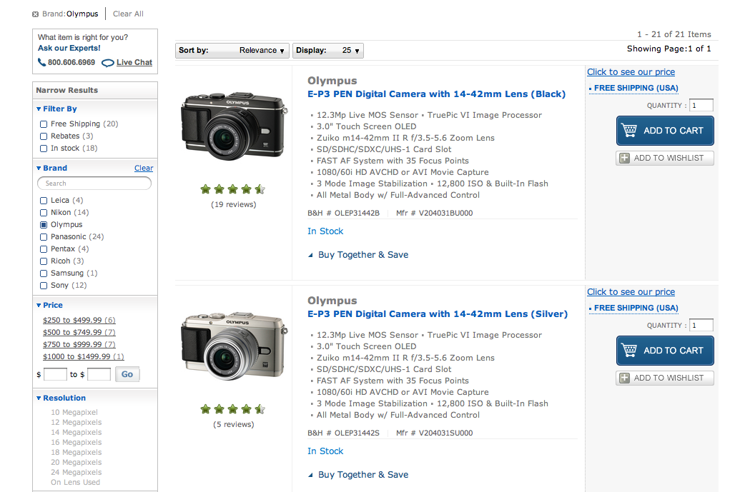
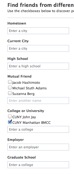
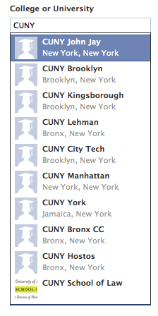
Another interface for narrowing/filtering results is Facebook. I've attached a couple of images. They just have single search boxes under a number of categories and as you start typing it offers suggestions. This eliminates the need for long lists on screen. If there is a short well know number of options then it's probably not a problem to show checks on screen to start. If there is more then just letting people type may be easier. That is of course more work with the JavaScript. One potential political problem it addresses is doing things like showing just some of the campuses under College, how do you choose which are shown and which are in more.
The immediate thing that is missing here which is not currently part of the profile is department. I think if I had all of the other options I'd want to be able to search by department too. It's a known entity and if there isn't already a list somewhere we can split it up and compile the list. Of course we can't add that until we redo the profile and add department as a category.
That also reminds me. With the new profile we planning to convert College to checkboxes to allow more than one college per person (adjuncts and others could use that)?
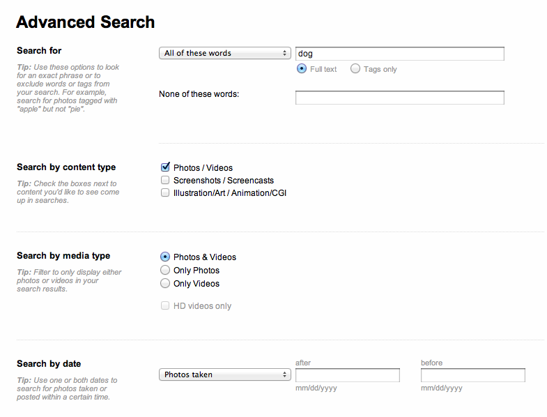
Another idea to think about is how you start the search. Right now it just says "Search Members" which I think is fine. The assumption there is that you type what you want. However with this more sophisticated search someone might want to start searching right away for BMCC faculty with an interest in Plato. So I think next to the search button we might add an "advanced search" link that goes to a page with advanced search options. I'm attaching a couple of photos from Flickr as an example. The advanced search page would allow more detailed descriptions of what the search options mean if we think that's appropriate.
Finally, looking at this functionality makes me think of the larger search we're working on and how they fit together. It's a bit late so I'll collect my thoughts on that another time.
Updated by Boone Gorges over 14 years ago
Thanks for the feedback, Chris.
One potential political problem it addresses is doing things like showing just some of the campuses under College, how do you choose which are shown and which are in more
Meh, alphabetical order. I don't see this as a serious issue.
The thing about auto-suggestion is that it requires a preexisting set of choices. This would for School. It would work less well for Role, where people probably don't really know what they're searching for. And it wouldn't work at all for Academic Interests, because that information doesn't exist in a structured way anywhere in our database.
The immediate thing that is missing here which is not currently part of the profile is department.
Agreed in theory, but this isn't currently a known entity - we don't have a "department" field. We could implement one (and maybe we should) but that should probably be a different discussion, because it will raise all sorts of different issues (do we make it required; do we allow multiple options; do we provide predefined fields or just a text box or both; etc).
So I think next to the search button we might add an "advanced search" link
I kinda like the idea of having a simple search, and then an Advanced Search toggle leading you to something akin to Michael's mockup. I'll leave it to the experts to determine whether that simplifies things or makes them more complex.
FWIW, I have a mostly working version of something akin to Michael's mockup on my local machine right now. No easy way to show it to you, because we're currently without a shared staging environment. But it's kinda neat - all ajaxy, so you just check boxes or enter new search terms, and the list refreshes automatically. One issue with the way that it currently works, however, is that there is some confusion (at least to me) about how the various filters work together. Right now I'm using 'or', so that checking boxes gives you more results, but perhaps it would make more sense for them to be linked with 'and', so that you can drill down more. Or maybe a toggle? How much logic do we want to introduce here?
Updated by Matt Gold over 14 years ago
Let's keep http://redmine.gc.cuny.edu/issues/1294 in mind as we move forward on this.
Updated by Boone Gorges over 14 years ago
- Status changed from Assigned to Reporter Feedback
Now that Commons 1.2.5 has been released, I've been able to switch cdev to the master branch that will become 1.3. That means you can start to have a look at what I have so far: http://cdev.gc.cuny.edu/members/
Play around with it a bit and let me know what you think. Keep in mind that Role won't do much, since no users on cdev have Role data yet.
I have some specific questions for the group about the implementation as it stands, but I'd rather get your gut reaction before tainting it with leading questions. Thanks!
Updated by Matt Gold over 14 years ago
Looks good, Boone!
Here are a few initial thoughts:
1. I think that the layout needs to be reworked with feedback from Chris; right now, I don't like that the member listing is scrunched into half of the page. I think that what I'd prefer to see, if possible, is the following layout:
-- the members listings stretch across the full horizontal width of the page;
-- the filtering functions are hidden at first, except for a link of that appears parallel to the "Order By" field but aligned to the left side and that says something like "Filter these results"
-- When clicked, "filter these results" would result in a nice ajaxy drop-down that would push the rest of the content down the page
Just some ideas, of course -- looking forward to hearing what others think.
2.Bug -- clicking "clear all" when first coming to the page leads to a grayed out "Loading" process; page needs to be reloaded to interrupt
3. "Order By" should be integrated into this filter, I think. Doesn't make sense to have them separate
4. "Narrow Results" needs some explanation, like "See only members from:" or something that provides an explanation of what clicking "College" does
5. The handling of the code here is really cool! I love the automatic filtering when one clicks a checkbox and the way that you show the academic field description below the text box once it has been entered. Great work.
6. Filtering for NYCCT and English didn't bring up my profile, I guess because "English" appears in my Title field but not my "Academic Interests" field. I wonder whether "Academic Interests" should search the entire profile, since people may list their broad discipline in the title (Prof. of History) and special fields of interest in the "academic interests" field.
Great work overall. Exciting.
Updated by Boone Gorges over 14 years ago
The problem with making the filters horizontal is that some of our lists are long. That means that the content will get pushed way, way down the page when the filters are enabled.
That said, it would be nice to get UX help, and soon, so that this can go into the next release. For a project like this, the UI is about 80% of the work, so building it over and over again will take a long time.
I can't reproduce your bug (2). Can you give more details on your setup?
Updated by Matt Gold over 14 years ago
My setup: Chrome 15.0.874.120 on Mac OS X 10.7.2
Updated by Chris Stein over 14 years ago
Boone, I'll get you some comments related to the UI soon. Just wanted to mention a functional issue I encountered. When I typed something into the Academic Interest box and then clicked search it didn't filter on that. It only filtered when I typed in the word and pressed the enter key.
Also, it seemed like when I clicked the (x) by the Academic Interest filter it didn't really remove the filter. Clicking Clear link did clear (as well as clicking clear all).
Updated by Boone Gorges over 14 years ago
Chris - I fixed the 'Submit' issue by removing the Submit button altogether (when JS is enabled). There's no need for it if you're using the JavaScript interface.
I couldn't reproduce your Academic Interest (x) issue. It's possible that the item you removed didn't really add many items to the results, so that when you removed it, you didn't really notice a change.
Matt, I'm afraid I still can't reproduce your Clear All issue. Could you try a hard refresh?
Updated by Chris Stein over 14 years ago
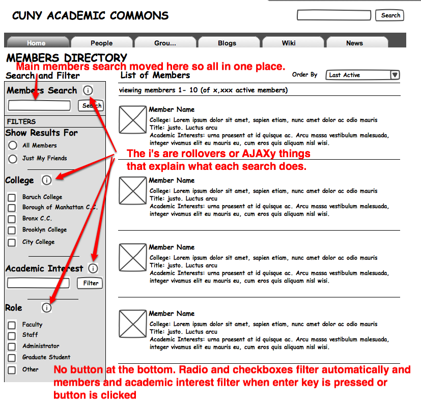
I have an attached image with a wireframe for a possible redesign with the search/filters. Some of my thinking that went into it:
I agree with Matt that it would be nice to make the filters narrower. I've reduced some of the names, like putting C.C. at the end of community colleges, and generally made the area narrower.
I moved the general members search into the same area as the filter. It puts everything together and makes it clear that it is separate from the site search.
I added titles for each filter type and information buttons so people could see what each filter does if they aren't sure (probably most helpful for the general members search so people know which fields it searches).
There is also a background color behind the search/filter area to separate it from the results list.
I just noticed I left out a couple of things that are there now by accident. The clear links by the filters should be there and the pagination links above and below the results should still be there too.
Let me know what you think.
Updated by Boone Gorges over 14 years ago
Looks great - thanks so much, Chris. Matt, before I get started on implementing some of Chris's suggestions, I want to get the nod from you, so I don't sink time into something that you're not happy with.
(Side note - Chris, what is the name of the program you used for wireframing? I recognize the typeface from a project I've done in the past, and I remember wanting the software, but I can't remember the name. Maybe Matt/CAC can swing a license for me.)
Updated by Matt Gold over 14 years ago
Did a hard refresh; clear all issue still occurring . . .
Updated by Boone Gorges over 14 years ago
Did a hard refresh; clear all issue still occurring . . .
Hm, no idea. If you can do some JS troubleshooting with the console, it would help, otherwise we'll just have to wait until I get steps to reproduce.
Updated by Chris Stein over 14 years ago
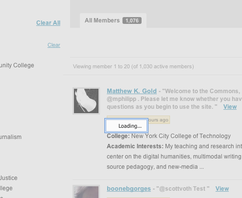
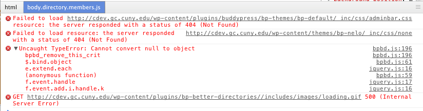
- File ClearAllLoadingImageError.png ClearAllLoadingImageError.png added
- File ClearAllError.png ClearAllError.png added
Boone, the software I used is Just In Mind Prototyper. It was my first try with it. I think I may recommend this to Matt for purchase for us. It's a bit expensive but it does have some fancy features like allowing you to make interactive prototypes where you can put data in dropdowns and things like that. Haven't really had the time to see all of the features yet. You can download a free trial version at:
http://www.justinmind.com/
To get the handdrawn look I was using you have to go to their extras page:
http://www.justinmind.com/extras
and load the Sketching Widgets extra (about halfway down the page).
===
On another note I was able to reproduce Matt's Error.
1. Click on People
2. Click on Clear All
I've attached a screenshot of what you see and a screenshot of the JSConsole
Looks like it's just an issue because nothing is selected when clear all is clicked. Probably just needs an if to check for null.
Updated by Boone Gorges over 14 years ago
Thanks for the info on the software, Chris. That name doesn't sound familiar to me, but if you like it, then I want it too :)
Thanks also for the console screenshot. For some reason, Firebug wasn't giving me the error. Fixed in https://github.com/castiron/cac/commit/c0f38c2aacbbac3171259f612dcb9c99c39d82c9
Updated by Matt Gold over 14 years ago
Thanks for your mock-up, Chris. A few thoughts/questions:
-- Do you think that "Order By" should remain over on the top left? Should it not be integrated into the filter menu? I think I can see the argument for why it shouldn't be -- it allows one to change the order of the results of the filtering -- but I do want to get your take on this.
-- What do you think about the space issue I brought up above? Right now, the page looks pretty congested to me. I thought that a horizontal menu might work, but Boone is concerned about space.
-- One way to resolve the space issue would be to put the menu in an ajax drop-down. What do you think of that?
Please let me know what you think, and thanks.
Updated by Boone Gorges over 14 years ago
One way to resolve the space issue would be to put the menu in an ajax drop-down. What do you think of that?
Using a jquery slider would solve some of the horizontal issues on page load, but with a long vertical list, it would push all the content way down the page when the options were expanded. On some resolutions, this could mean that users have to scroll up and down whenever they want to use filters.
Updated by Matt Gold over 14 years ago
but with a long vertical list, it would push all the content way down the page when the options were expanded.
And the long vertical list is the list of colleges? What if we created four columns of six colleges each?
I really do think we need Chris's take on this from a design/UX perspective here.
Updated by Boone Gorges over 14 years ago
And the long vertical list is the list of colleges? What if we created four columns of six colleges each?
Yes, the list of colleges. Creating multiple columns will be quite hard technically, as there's no native way in CSS to make columns spill like this. I can do
a  b  c  d
e  f  g  h
but not
a  c  e  g
b  d  f  h
Updated by Chris Stein over 14 years ago
I've been thinking on this a bit and don't have a definitive solution. First, in terms of the "Order By", I see that as a separate action of sorting/ordering vs the other stuff which is filtering. Separating them to me says these tools over here change what you will see (filtering now on left) and this other tool changes the order you will see those results.
In terms of the horizontal vs vertical nav that is a bit more tricky. The vertical style in the current version and in my wireframe is pretty common. It's probably the most common when there are a lot of items in the filter options. This is pretty much for the reasons Boone outlined the main one being that it's simpler. However there is also a usability argument in the vertical view which is that people can see all of the options without having to click on anything to reveal them (as they would have to do with any jQuery horizontal version). So it's also a simple way to see what's checked and unchecked.
I do hear your concerns about space though Matt. If we keep the vertical list there are a few things we can do. One suggestion I have that we narrow the filter list from it's current width as I mentioned before. Also giving it a different background, like the background in the navigation options on profile and group pages in BuddyPress, will also help to separate it from the results side. Another solution would have to wait until an overall redesign which is to make the page wider in general. Right now the overall page width for our site is on the narrow side.
If we move to a horizontal list then I would want to do more thinking about the implementation. One idea is to use a mega menu style (http://etnies.com/ roll over shop). This has some advantages and disadvantages and would need some more thought. Like the menu on the example there it would probably work best if the dropdown just covered what was underneath it and then disappeared. I have some other ideas but would want to think about it more if I know we're going in this direction.
BTW Boone, there is a way to do auto flow of text into columns in the CSS3 spec but browser support isn't all there requiring javascript to ensure it works (well, IE isn't supporting it but the rest do).
Updated by Boone Gorges over 14 years ago
Updated by Boone Gorges over 14 years ago
Hi everyone,
This ticket is holding up the 1.3 timeline, so I'd like for us to come to some sort of consensus on what to do about it.
My view: If we're going to include these new features in the 1.3 release, we must go with an implementation that is close to the current one (with some modifications, along the lines of what Chris suggests in his recent wireframe http://redmine.gc.cuny.edu/issues/652#note-17 More substantial modifications to the current implementation will take a long time (both to code, and to vet between the team, as we are all busy at this time of the semester); IMO they would introduce an unacceptable delay, and would mean putting the filters into the 1.4 release instead.
Given that it's built, it seems wasteful to me not to just go ahead and release it with 1.3. We can iterate in future versions, based on feedback. The only reason why we may not want to do this is if we thought that, in the future, we were going to overhaul the filter UI in a massive way, and we were nervous about doing a radical overhaul to an already-introduced piece of functionality. (That's stack of ifs: my own view is that even if we do overhaul down the road, it still shouldn't be an impediment from current release. The current implementation is not that bad.)
Anyway, this largely hinges on what Matt wants, as he's been the vocal dissenter from the current implementation. Matt, would you mind chiming in with your thoughts?
Updated by Matt Gold over 14 years ago
Sure. I don't think we should hold up development. Let's get it out there and then, as you say, improve future versions based on feedback. Thanks for your work on this, Boone.
Updated by Boone Gorges over 14 years ago
I've implemented some of Chris's suggestions, and done some general style cleanup to make it more presentable. Functionality is unchanged. http://cdev.gc.cuny.edu/members
I think that, at this point, it'll be possible to do only very small tweaks until after the 1.3 release. IMO it works well and looks pretty good right now, so I hope this is OK with everyone else.
Updated by Matt Gold over 14 years ago
Let's talk about this tomorrow when we meet as a group.
Updated by Boone Gorges over 14 years ago
As per community meeting:
- Only show first 8 colleges, with More link that shows all
- Put 'fewer' button at the bottom if it's easy
- If you come back to the page and have one of the colleges checked, don't collapse the menu
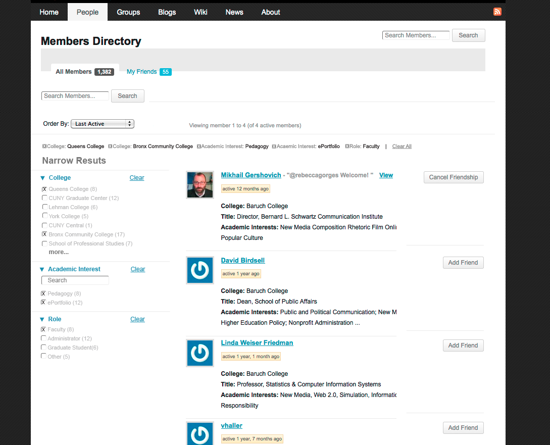
Updated by Boone Gorges over 14 years ago
The 'More' functionality is implemented in https://github.com/castiron/cac/commit/1dc766603f005c36f2dd40ae1a6ac6943dde39d7, and is on cdev at http://cdev.gc.cuny.edu/members. Here's how I went with it.
- You see the first 8 colleges.
- If you have any colleges checked, leave the page, and then return to the page, the links will not be collapsed (you'll see them all)
- Instead of a Fewer or Less button, I only collapse when you click Clear (or Clear All). That way there is no worry about someone checking a box, collapsing the list, and forgetting about it. I think it's intuitive enough.
Updated by Matt Gold over 14 years ago
Hi Boone -- I tried to view this on three different browsers (Chrome, Firefox, Safari), and I emptied cache on each, but I still can't see the new "more" functionality. Just me?
Updated by Boone Gorges over 14 years ago
Click the 'Clear All' button. You probably have a rogue cookie.
Updated by Matt Gold over 14 years ago
That did the trick. Many thanks. Looks and works great!
Updated by Boone Gorges over 14 years ago
- Status changed from Reporter Feedback to Resolved
Cool, I'm marking this Resolved.