Feature #665
closedBuddyPress Docs: Make the Save button more prominent
0%
Description
Can I have some more feedback on this? I would rather not do it by making the button bigger (right now I'm using our theme's default button style, and it's not good to be inconsistent). Scott or Michael, can one of you have a look to see if you have any ideas? Size, color, spacing, border, etc.
Files
Related issues
Updated by Michael Smith over 15 years ago
- File BuddyPress-Doc-Edit.gif BuddyPress-Doc-Edit.gif added
- File BuddyPress-Doc-Save.gif BuddyPress-Doc-Save.gif added
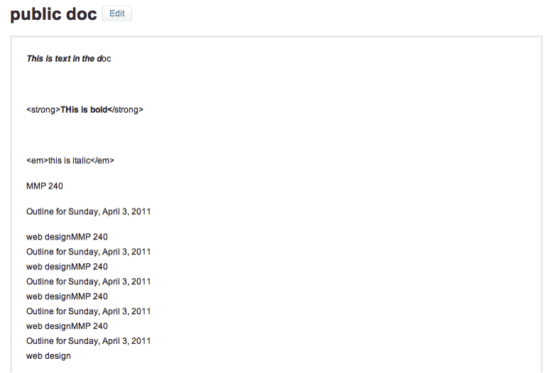
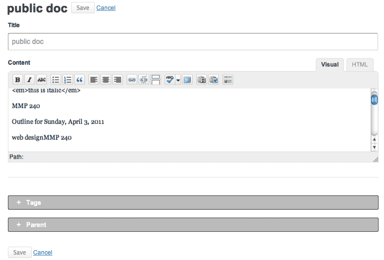
I suggest that the Doc title maintain the same font size in edit mode as in preview mode. Also add a "Save, Canel" links where the edit button was.
See attached gifs to illustrate this idea
Updated by Boone Gorges about 15 years ago
Michael, now that I've moved the Docs interface around a little bit (with top level tabs that make the navigation a bit clearer), would you mind taking another look to see if you have suggestions that are more in keeping with the new design?
Updated by scott voth about 15 years ago
Hi Boone - Now that I've used Buddy Docs for awhile, I'm kind of used to the Save button now. I like Michael's suggestion of putting an additional save button at the top of the screen - not sure how difficult that would be. But maybe the simplest solution would be to make it bold so it stands out a little. What do others think?
Updated by Chris Stein about 15 years ago
- File blueSubmit.png blueSubmit.png added
I have to admit that I haven't really spent a lot of time thinking about this. The save button wasn't a big problem for me. If we're going to do something to make it more prominent then maybe do it with color? Here's a quick example with blue similar to the submit button for a post in WP.
Updated by Matt Gold about 15 years ago
I really like that solution, Chris. The blue makes the button much more prominent. Nice work!
Updated by Boone Gorges about 15 years ago
I like it too, but it's inconsistent. While it's true that the blue matches the color of primary buttons in the WP dashboard, most Commons users don't use the WP dashboard. IMO we should think carefully about how to roll out these kinds of style changes consistently, or not at all.
Thoughts?
Updated by Chris Stein about 15 years ago
Boone, I agree with you. It is inconsistent. I started looking around the site and realized that there are some inconsistencies in other places as well.
I agree that things should be as consistent as possible and so it seems like this merits a larger look at the buttons on the site.
I'm going to look around some more tomorrow and take some screenshots and create a new ticket for button changes. I may also see if it makes sense to have any kinds of categories for buttons (probably not) an for highlighting things with background color in a way that is different from buttons (probably so).
Most likely that new ticket will also take care of this once it's resolved.
Updated by Matt Gold about 15 years ago
Thanks, all. I agree that consistency is important, and Chris, I appreciate your work on this.
Boone, Chris recently agreed to the title of "User Experience Designer" for the Commons, so this work will be right in line with that and will produce some nice benefits for the site.
Looking forward to your report, Chris.
Updated by Boone Gorges almost 15 years ago
- Status changed from Assigned to Duplicate
Closing in favor of #860.