Feature #14394
openCommons News Site - redesign
0%
Description
I cloned the News site and redesigned it using a newer theme. Let me know what you think - https://newnews.commons.gc.cuny.edu/
Files
Updated by Colin McDonald about 5 years ago
Hi Scott, thanks for setting this up. Maybe it would be good to have a tagline and a couple of category/archives links, just to give people a little introduction and a way to dive in from the homepage. And the search bar is working a little strange for me in Chrome. Otherwise, looks great!
Updated by Matt Gold about 5 years ago
Hi Scott -- a few comments
I can see some benefits of the new direction, but also a few problems:
-- the placement of the search icon is a bit wonky depending on the size of the browser (too close to one of the photos in the content areas)
-- I miss the chance to provide more detail about the Commons. are there options for a sidebar? Or maybe Colin's suggestion will help with this?
-- because the photos are different sizes, the design is hard to parse, visually, for me. Maybe take a look at this site -- http://cuny.is/gcdi to get a sense of how uniformally sized photos can increase usability
are there any other themes you considered for this?
Updated by Matt Gold about 5 years ago
edited to add: it's not just the size of the images that are inconsistent, but the amount of text that differs from news item to news item and that makes it all look a bit jumbled. even if we stay with a theme that displays news items like this (thumbnail, metadata, text description, link), I'm hoping we can do so with a theme that enforces CRAP principles - http://blogs.quovantis.com/crap-design-principles/
Updated by scott voth about 5 years ago
Hi Matt - I agree the search icon sucks - I took it out for now. I think the cache in my browser needed to be cleared out. I intentionally did not include a sidebar or navigation because I wanted to display as many news items as possible and didn't see the need to filter by category. I felt that when people want to see the news, they are interested in the latest news (not especially the old news - there is an infinite scroll to see older posts). When you drill down to a single item, there is a sidebar (showing "In Commons" latest posts). I personally like the "masonry" style, where items have different sized images and texts. To me, this appears more like newspaper columns and is more visually appealing. But I can understand how a more symmetrical design could be more accessible. Various community members post to this site - some might not use featured images, some might not know the rules of image sizing, some posts may not have a lot of text - but that can be resolved easily enough with some curation.
If we added a sidebar, what would we display?
If we added navigation, what would we show?
Updated by scott voth about 5 years ago
I made some changes to include navigation and a sidebar that is optionally displayed. Colin - I think your idea of a tagline is a good one, but I haven't thought up one yet. Any ideas?
Updated by Colin McDonald about 5 years ago
Hi Scott, I think this is definitely coming along. Maybe for a tagline: "New projects, features, and other updates from the Commons team."
Updated by scott voth about 5 years ago
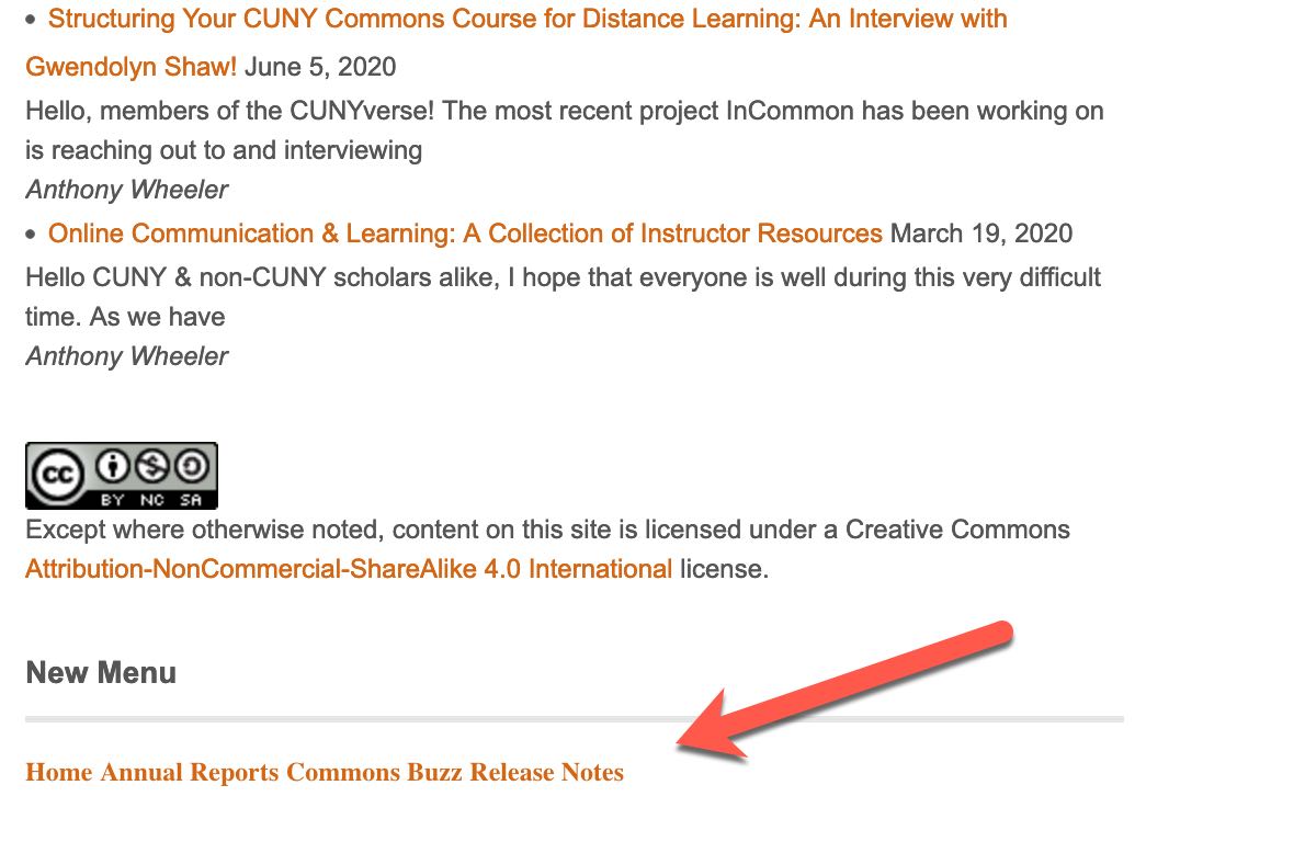
- File new menu.jpg new menu.jpg added
Hi Everyone - instead of switching themes (which we may want to do in the future) I have continued to use the old theme to make changes according to your feedback. So now we have the original News site and the Improved News site both available, so we can switch back and forth to compare. This is done by simply switching menus. I will leave the old menu active, but in the sidebar, there is, at the very bottom, the new menu (see attached screenshot)
Improvements:- regenerated thumbnails so that featured image display symetrically (via Atomic blocks)
- change Media settings so that thumbnail will consistently be 300px by 500px (thumbnails are set to display on menu pages). This will ensure future posts will fit in correctly.
- cleanup of missing/unsized featured images (still more to go) - this was a bigger task than expected
- addition of rotating Twitter feed in sidebar
- added menu icons to new main menu
- weeded out some posts - more needed
- removed Analytics from new main menu - as you may or not recall, we had a Google Analytics specialist on the team, and he published reports weekly. I feel we should get rid of them now, since they are dated
- changed the site's tag line description
- added "Annual Reports" to both Main Menus
Some questions/judgement calls:
Currently the Home tab displays everything. Is this what we want?
The Commons Buzz category seems loose and arbitrary - should we set rules about what this should consist of? Awhile back, it used to contain excerpts from journals that mentioned the Commons.
Should we weed out Analytics posts?
Let me know if you want me to simply switch the menu to the new one to make it easier to view.
Attached is an image of the new menu in the sidebar that you can use to see the new look and feel of the site.
Updated by Colin McDonald about 5 years ago
Belated thanks for your work on this, Scott! I think the improvements on the new/test site are great. If it helps anyone else review, I think you can go to this link to see it, in addition to the sidebar menu Scott mentioned:
https://news.commons.gc.cuny.edu/home/
I like displaying everything on Home, to keep it as fresh as possible since we're not posting too often here. I don't think we're posting anything unless it's of decent importance, either. Commons Buzz does seem kind of loose to me as well. Perhaps we can discuss this further. It seems only worth including categories we're using often - though Release Notes and Annual Reports are very specific, and perhaps it's good to have a category that's more of an "everything else."
I've never read one of those analytics posts -- when did we stop doing them? If they're very old, I could see just leaving them, as they'll be so far down the long tail anyway as to be pretty irrelevant to almost any user. And who knows, maybe someone will get some use out of them...
Updated by Matt Gold about 5 years ago
Hi Scott -- this is looking great -- thanks so much for your work on it!! I would say that, yes, we should keep the homepage current, so if there is content that is over a year old, that's fine to leave/weed out, especially analytics numbers that are now outdated.
For the tagline, how would you feel about something like "Reporting on new releases, announcements and info for the CUNY Academic Commons community"
Updated by Boone Gorges almost 5 years ago
- Assignee set to scott voth
- Target version set to Not tracked