Feature #15629
closedRegistration Page Design
0%
Description
Streamlining the Registration page to include all current content but putting much of it into hints. We also need to move the terms of service to its own page (if it doesn't have one already) and link to the TOS from a radio checkbox.
Files
Updated by Boone Gorges over 4 years ago
Tentatively planning to assign this to Jeremy when we're ready for implementation, so adding him as a watcher now.
On today's call, we talked a bit about the avatar field, perhaps nudging the user toward adding a photo in various ways. I wanted to note that, if it seemed good from a UX point of view, we could have an interface along the lines of:
Your profile will be listed in site directories using the following avatar:

xxxxxx
xxxxxx
xxxxxx
xxxxxx

[Upload a different image]
where the x block is the default random avatar. Then, when you click the button, you'd see the 'Upload' interface that's currently in the mockup. This is just an idea - I wanted to throw it out there just to say that this kind of thing would be technically possible.
Updated by Colin McDonald over 4 years ago
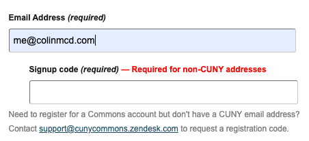
- File non-cuny-email.png non-cuny-email.png added
Thanks for that idea Boone, I think that's pretty close to what we should do. I'm inclined to make the language a bit more encouraging, and the avatar gets used on the homepage and other places outside of directories, right? So maybe something like:
"Liven up your profile (and the Commons!) with a unique photo. Drop or upload one here (you can change it later), or this will be your default avatar:"
Too threatening? Too lame? Suggestions welcome.
One other thing -- do we need to mock up or account for the registration code interface for non-CUNY emails? We could do it the same way as present, with the drop down that shows up if you enter a non-CUNY address (see screenshot attached), or not sure if there are any UX tweaks worth making.
Updated by Boone Gorges over 4 years ago
- Status changed from New to Assigned
- Assignee changed from Sara Cannon to Jeremy Felt
- Target version set to 2.0.0
"Liven up your profile (and the Commons!) with a unique photo. Drop or upload one here (you can change it later), or this will be your default avatar:"
If we're generally happy with my idea for showing the default avatar, then I think we can workshop the language as implementation begins. The specifics will depend in part on how we build the interface - your "drag" language suggests that there's a unified interface for the default avatar and the upload flow. I think this will probably work (it'll mean showing a default avatar in BP's upload interface) but I'd like to see if there are technical obstacles before committing to this specific language.
One other thing -- do we need to mock up or account for the registration code interface for non-CUNY emails? We could do it the same way as present, with the drop down that shows up if you enter a non-CUNY address (see screenshot attached), or not sure if there are any UX tweaks worth making.
I was imagining the same thing, though we probably don't need the left-indent.
On the basis of the above, I'm going to assign to Jeremy to begin the implementation process. Jeremy, most of this work should be a pretty straightforward reskinning of the existing interface. Feel free to modify the cac-non-cuny-signup plugin if you need to (this is the "signup code" bit). And registration avatars are handled by a custom plugin bp-avatar-on-register; I can't imagine you'll need to modify the server-side logic, but you might need to change the way that the UI is hooked into the existing registration process.
Updated by Colin McDonald over 4 years ago
All sounds good to me, Boone (and Jeremy). It'll definitely be good to see the early tech implementation before finalizing the language.
Updated by Jeremy Felt over 4 years ago
Some thoughts / questions on how we're handling CSS organization for the redesign. Apologies if this has been covered elsewhere!
The current structure (via bp-nelo/functions.php) is:
Home page- assets/redesign-bridge.css // Parts of the redesign that should apply globally, even to existing pages.
- assets/home.css // Styles specific to the home page
- assets/shared.css // Styles shared by redesigned pages
- assets/css/redesign-bridge.css
- assets/css/shared.css
- assets/css/redesign-bridge.css
- _inc/css/default.css
- _inc/css/custom.css
As I look at the home page styles and what is necessary on the registration page, I'm wondering if the cascade should change a bit to account for more "natural" overrides.
- assets/css/redesign-bridge.css // Global styles that apply to new and existing views
- assets/css/shared.css // Patterns that exist on multiple redesigned pages (e.g. .intro-banner)
- assets/css/{view-specific.css} // View-specific overrides for more complex pages (e.g. home.css for home)
- assets/css/custom.css // Styles for specific views that don't necessarily account for enough to require a view-specific file.
And then, I see room for something like a `bp_dtheme_should_load_shared()` that returns true for redesigned pages and false for others that can be used to toggle the files that should be enqueued. (I see Boone has done this inline for directory styling, but that could (?) get complex after a few rounds)
Updated by Boone Gorges over 4 years ago
Thanks for these thoughts, Jeremy. For some background, _inc/css is where we keep legacy styles. The goal is to prevent them from being loaded on any newly designed page, as you've noted I've done at https://github.com/cuny-academic-commons/cac/blob/7d0e87cafec7b0906a59bbf80dc6dfd252ef7d3e/wp-content/themes/bp-nelo/functions.php#L118. The current setup of 'shared', 'redesign-bridge', and 'home' was not carefully planned out - it was just my off-the-cuff effort to do the following:
a. In cases where a specific part of the interface needs a lot of specific styling, like on the homepage, have a standalone stylesheet with just those styles, and load it only when needed (home.css)
b. Separate out those parts of the globally shared styles that need to be loaded even on non-redesigned pages, like nav and footer styling (redesign-bridge.css). It's a "bridge" because eventually we'll cross it, and these styles will move to shared.css
c. Everything else will be in shared.css.
Anyway, that's the thought process.
assets/css/redesign-bridge.css // Global styles that apply to new and existing views
assets/css/shared.css // Patterns that exist on multiple redesigned pages (e.g. .intro-banner)
assets/css/{view-specific.css} // View-specific overrides for more complex pages (e.g. home.css for home)
assets/css/custom.css // Styles for specific views that don't necessarily account for enough to require a view-specific file.
The first three definitely sound correct. I'm not sure I understand the role of custom.css - if we're talking just a couple CSS declarations, it seems like these could probably just live in shared.css.
I see room for something like a `bp_dtheme_should_load_shared()` that returns true for redesigned pages and false for others that can be used to toggle the files that should be enqueued
If you have an idea about how this should be structured, please go ahead and implement it. What you see in the current functions.php is the result of 12 years of accumulation, and I implemented the fix that would create the smallest possible changeset, out of laziness and conservatism :-D But if you have an idea for making it systematic, please feel free.
Updated by Jeremy Felt about 4 years ago
Okay, this is up on a feature branch now.
I think things are looking good, but it will be nice to get Sara's eyes on it.
A few items of note:
- I went with CUNY blue for checked checkboxes.
- I think the tooltips are as accessible as they can get. Screen reader text is wrapped in an anchor, and that anchor exposes the information text.
- A few tweaks need to be made to field titles/descriptions in the network admin, but I think that's all open to text wrangling anyway.
I'm not sure I understand the role of custom.css
I'm not sure if I do anymore either. :) I'll chalk that up to something.
If you have an idea about how this should be structured, please go ahead and implement it.
I went ahead and added this as `bp_dtheme_should_load_shared()`. I don't think it matters too much one way or the other, but it feels a little cleaner to read it this way.
Updated by Boone Gorges about 4 years ago
Thanks, Jeremy!
I've merged the latest 2.0.x changes into your feature branch, and put the feature branch on cdev so that Sara and others can take a look.
I have a few questions about the avatar upload flow:
1. Before uploading an avatar, is it possible to show a preview of the default "blue" avatar that the user will have if they don't have an avatar? I'm not sure how difficult this is without rebuilding the avatar upload interface.
2. After you finish cropping, the avatar upload interface disappears, and you see a green success message. Is it feasible to instead show the image itself? Again, I don't know whether the upload UI (from BP, I think?) will allow this without a great deal of customization.
Updated by Boone Gorges about 4 years ago
A quick follow-up - We noticed in #15261, once merging these changes with 2.0.x changes, that the new global form styles were affecting work done on the directories. I think this is okay in the case of directories - these are newly-designed spaces, and it absolutely makes sense to standardize on markup and styling process. We aren't loading the new shared.css on non-redesigned pages, so we shouldn't need to make more adjustments beyond this. But I wanted to flag it here so that we're collectively aware of the potential effects when we modify global styles.
I made the necessary modifications on the directories to match the checkbox markup and styling to what Jeremy did on the registration page. I think that this brings us a little bit away from Sara's mockup for checkboxes - see https://www.figma.com/proto/FKqQL0DlAC4iOT9tDjvCC2/CUNY-Design---Spring-2022?node-id=1601%3A3929&scaling=min-zoom&page-id=1452%3A7472. But I'm also not sure off the top of my head whether Jeremy's :after approach will allow us to do the kind of blue-in-the-middle thing that Sara has suggested. (My previous implementation had some nested spans, which is an absolute mess and far less elegant than Jeremy's method, but it allowed more styling flexibility). Jeremy, can you think about whether it's possible to match these mockups? If not, we'll have to go with a simpler blue fill color, as you've done on the registration page.
Updated by Jeremy Felt about 4 years ago
Jeremy, can you think about whether it's possible to match these mockups?
Challenge accepted! I just pushed a change to feature/15629-registration that I think gets us there/close again on the checkboxes.
Noted on the global changes. I should have spent a bit more time comparing last week, especially with my confident lack of specificity in the CSS. :)
I'll take a look at the avatar flow in the next day or two. I do think we have some flexibility there because we're already overriding some of the uploader template.
Updated by Raymond Hoh about 4 years ago
Jeremy, about the default wavy avatar, you should be able to use the cac_get_default_avatar() function:
https://github.com/cuny-academic-commons/cac/blob/56fdd255c1ab6e7faeff619aefd9807fce671175/wp-content/plugins/bp-custom.php#L326
Just pass the email address to the function.
Updated by Boone Gorges about 4 years ago
Challenge accepted! I just pushed a change to feature/15629-registration that I think gets us there/close again on the checkboxes.
Teh hotness! Good thing we don't need a third overlay, we'd run out of pseudo-classes.
Updated by Sara Cannon about 4 years ago
I took a peek here! Looking fabulous. When someone types in the input or makes a selection, make the text CUNY Black like: https://capture.dropbox.com/4rMK2HO73LwYLJFn
Also, when hovering over the drop down, the add photo, and the complete button: make the cursor into a hand.
Thanks!
Updated by Sara Cannon about 4 years ago
@boone took a look here and see a few things to tweak.
- Strange hover state on the tabs once something is selected with a big black block below the tab. Also hover state on the radio on the inside once the radio button is selected but no hover state when not selected: https://share.getcloudapp.com/JruOZ2gr
- the cards now don't have "visit site/group/profile" bold and underlined
Updated by Boone Gorges about 4 years ago
Jeremy and others, because this is close, I've merged the feature/15629-registration branch into 2.0.x. This makes it easier to test multiple things on cdev.
Sara, I've responded to your comments on the directory redesign ticket: https://redmine.gc.cuny.edu/issues/15261?issue_count=27&issue_position=10&next_issue_id=10439&prev_issue_id=11243#note-30
Updated by Jeremy Felt about 4 years ago
I pushed a handful of changes to the 2.0.x branch: (I hope pushing directly is okay!) :)
- Make input text CUNY black (and placeholder text ally grey)
- Display cursor as a hand over any .cac-button instance (This is a global change, but I think a good one)
- Apply sans-serif font to the avatar upload interface
- Use CUNY green for the avatar upload progress bar
- Use CUNY orange for the avatar upload error message
- Show a default avatar on initial load with a button to "upload a different image"
- Once the image is uploaded/cropped, display that image rather than a success message
- Allow for "upload a different image" to be used again
Updated by Boone Gorges about 4 years ago
I pushed a handful of changes to the 2.0.x branch: (I hope pushing directly is okay!) :)
Yes, it's okay - can you tell we don't run a very tight ship around here? :)
The avatar changes are awesome! One small request - is there something we can do to make the Crop Image button clearer? It jumps around a bit depending on the size of the crop. Maybe give it button styling and fix it to the bottom of the avatar interface?
Updated by Colin McDonald about 4 years ago
For some reason I'm having trouble getting the avatar upload updates to appear for me on CDEV, tried an incognito window. Just wanted to make sure it's on my end and not something that needs to be pushed/combined on the code side.
Updated by Boone Gorges about 4 years ago
The changes had not been deployed to cdev. I've just done it.
Updated by Jeremy Felt about 4 years ago
I've added button classes to the "Crop Image" button, so it should be a bit more obvious.
I also noticed that the class names / positioning was changing based on the size of the image I uploaded. I tweaked that a bit more so that the interface (original, cropped, button) is stacked and centered.
We could fight with jcrop a bit more to bring the cropped version and button up alongside the original, but it may not be worth it if this looks good to everyone.
Updated by Boone Gorges about 4 years ago
Thanks, Jeremy! The button styling for 'Crop Image', and the forced stacking of button/preview/crop UIs, does the trick for me.
I think the last thing here, as noted in yesterday's meeting, is a "cancel" link that allows you to bail out of avatar changes.
Latest changes are on cdev.
Updated by Jeremy Felt about 4 years ago
Changes pushed to 2.0.x:
- Cancel link added under the Upload Photo button
- Cancel link added under the Crop Image button
I think we're looking good!
Updated by Boone Gorges about 4 years ago
Thanks, Jeremy! These changes are pulled to cdev for testing.
Updated by Colin McDonald about 4 years ago
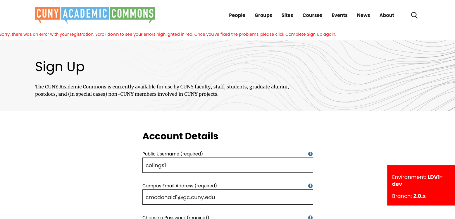
- File reg-error.png reg-error.png added
No matter what I've tried in testing, I can't get the final Complete Sign Up button to take my form info. I get the attached screenshot (with the error text also looking a little misaligned, and nothing actually highlighted in red below it).
I'm pretty sure I'm using a cache-cleared latest version of this. Browser data/history emptied, incognito windows in Chrome and Safari. The problem I mentioned on the call yesterday with the photo upload Cancel link not working is resolved now after my latest browser efforts, so that seems a good sign on this front but I could still be missing something on the version.
Updated by Jeremy Felt about 4 years ago
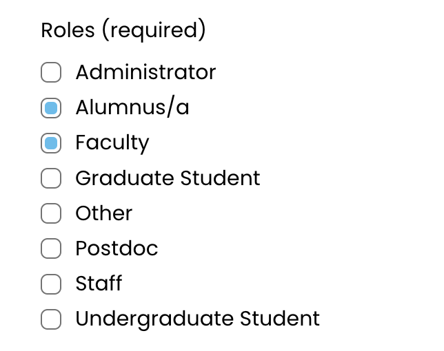
The required "Roles" section is missing on CDEV right now, which is then causing the error on the back end.
Boone/Ray may have a faster answer than me, but it may be that we just need to configure that field to appear properly. I'll poke at that now and see what I come up with.
I also think we can do better with that error message formatting. I'll adjust the position and formatting a bit.
Updated by Jeremy Felt about 4 years ago
Boone/Ray - I don't have access to the network admin on CDEV, but I'd like to verify that "Roles" is configured there as a profile field to be used on the registration page. Can one of you check that? Thanks!
Updated by Raymond Hoh about 4 years ago
Hi Jeremy,
I just checked CDEV and production and we do have a Roles profile field, but it is named "Role", not "Roles".
Can I get confirmation that we want to rename the profile field to "Roles" instead? If so, I'll make the change. We'll also need to document this before deploying 2.0.0 on production and also check other places in the codebase referencing "Role".
Updated by Boone Gorges about 4 years ago
Thanks for looking into this, Ray. I see in http://github.com/cuny-academic-commons/cac/commit/2862ada8b7ed99c34b1133044d52dec0d6f3c8d0 that Jeremy swapped 'Role' for 'Roles'. 'Role' is the correct name. Jeremy, was there a reason for making this switch?
Updated by Jeremy Felt about 4 years ago
Ahhh, yes thanks for flagging that, Ray. "Roles" was used in the designs and I thought it made sense as a thing to change because one or more could be selected. I neglected to add that to the "I changed this list".
I'm okay with either. It may make sense to just flip the code back to "Role" rather than tempt fate with another screen breaking due to the change.
Updated by Raymond Hoh about 4 years ago
"Roles" was used in the designs and I thought it made sense as a thing to change because one or more could be selected.
That makes sense, Jeremy. Let's revert the change for now. If we want to change the display name of the "Role" profile field to "Roles", we could potentially use the 'bp_get_the_profile_field_name' filter to do that.
Updated by Boone Gorges about 4 years ago
Thanks, gents!
That makes sense, Jeremy. Let's revert the change for now. If we want to change the display name of the "Role" profile field to "Roles", we could potentially use the 'bp_get_the_profile_field_name' filter to do that.
Or just hardcode an exception in the template for this specific field.
Updated by Jeremy Felt about 4 years ago
Changes pushed to 2.0.x:
- Reverted to "Role" for the profile section, but hardcoded "Roles" on output.
- Moved the error message to below the intro banner and restricted the width.
Updated by Raymond Hoh about 4 years ago
Thanks Jeremy! New changes are up on CDEV.
Updated by Colin McDonald about 4 years ago
Just confirming I was able to move through registration now. The error messages are appearing now also, and with the formatting improvements. This is all looking good to me, thanks all!
Updated by Boone Gorges about 4 years ago
- Status changed from Assigned to Staged for Production Release
Updated by Boone Gorges about 4 years ago
- Status changed from Staged for Production Release to Resolved