Feature #1867
closedHomepage redesign join/login/tour space
0%
Description
Hi Guys,
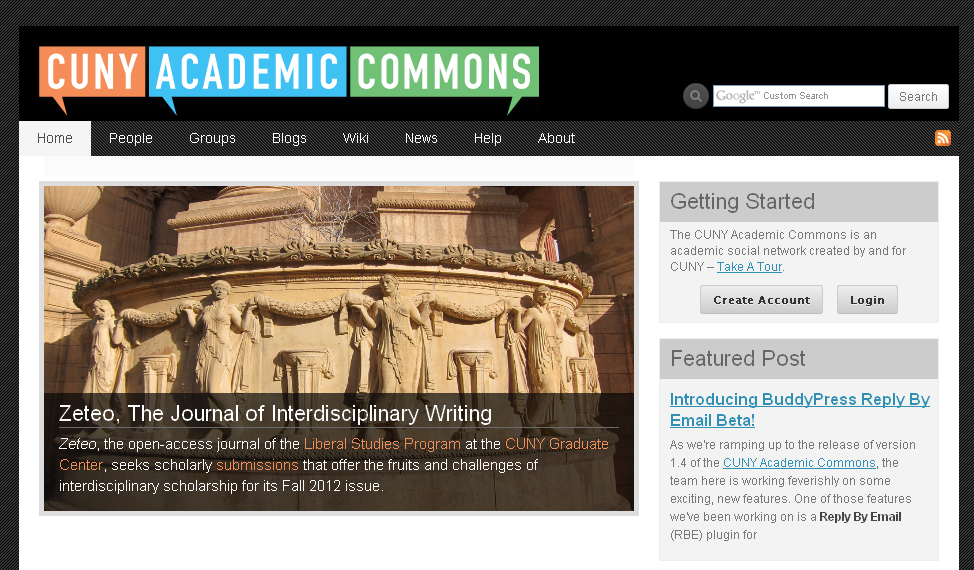
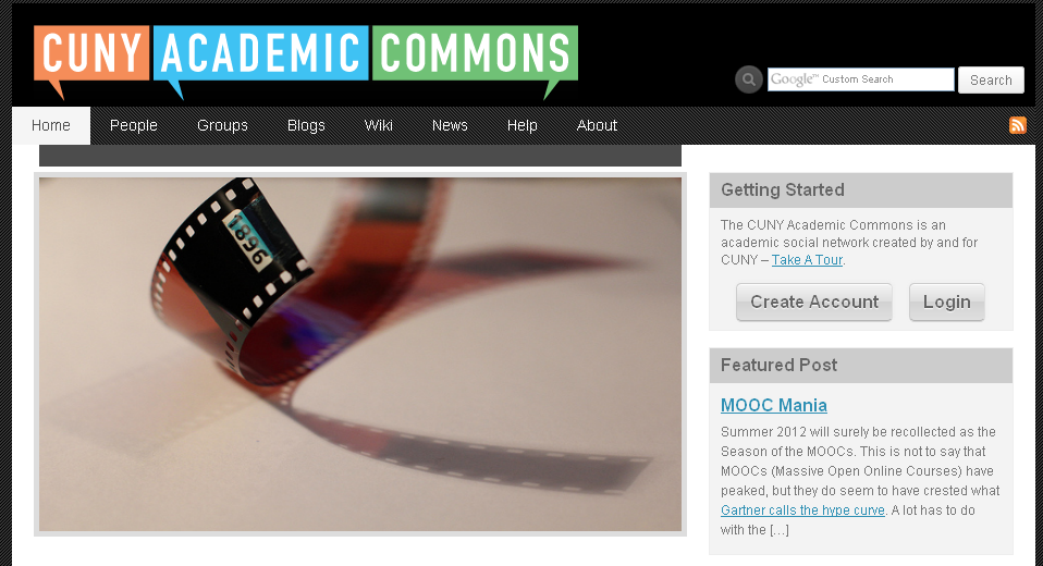
I'm wondering if we can do a very minor redeisgn on top right box on the homepage that shows the join/login/take a tour buttons. If we could decrease the size of those three buttons or somehow put them all on a single line, we could decrease the vertical size of the page, thus allowing for longer featured blog/group text that wouldn't push the rest of the content down the page. I think that this is a minor fix that we could make in the short term that would improve the look of the homepage. Please let me know what you think.
Files
Updated by Boone Gorges about 14 years ago
Last call for this milestone. Chris, any chance you can create something by, say, the end of this week? I want to prepare for a 1.4 release.
Updated by Matt Gold about 14 years ago
I'd really love to see us do something with this -- Michael, Chris, it would be great to hear your thoughts. Many thanks.
Updated by Michael Smith about 14 years ago
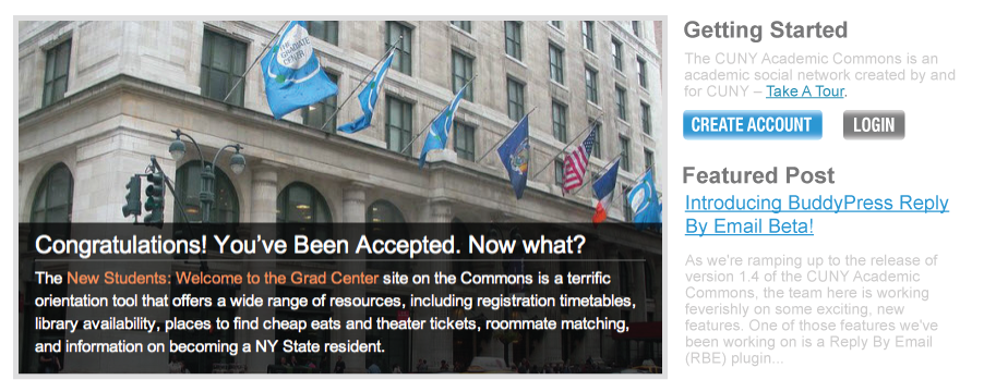
I took a quick stab at it, but admittedly took a different perspective. I was inspired by Pinterest's prompt when a user isn't logged-in, which gives a quick description of the site. I thought it might make sense to have a single sentence that describes the Commons, so I took the first line from the Commons email, modified it, and added the Take a Tour as hyperlinked text:
"The CUNY Academic Commons is an academic social network created by and for CUNY – Take A Tour."
I also tried out "CREATE ACCOUNT" vs. "JOIN" which seems to be fairly common on many sites and changed the color of that button to create a contrast with the "LOGIN" button. I thought the color difference would allow the elimination of the word "or" between the two buttons.
I was picturing that once logged-in the user would not see the two buttons, but the statement would remain. These changes don't save any space as Chris was suggesting, so they might not be worthwhile presently. These happened to be ideas that made sense as I started tinkering.
- Michael
Updated by Matt Gold about 14 years ago
Thanks for this, Michael. I like the pinterest-inspired idea of including a site blurb there. A few thoughts:
1. I had been thinking we could rethink/redesign those gray boxes, which were originally put together by a developer at the last minute. They should be lighter (in feel) and more Web 3.0-ey.
2. Wondering if you could rework that new button a bit -- looks a bit off to me (maybe the color, maybe just try exploring a different concept)
Thanks for your work on this.
Updated by Boone Gorges almost 14 years ago
Where do we stand on this? Time's a-tickin' for this release.
Updated by Raymond Hoh almost 14 years ago
What do you guys think about using one of these CSS3 buttons for the "Getting Started" block?
http://hellohappy.org/css3-buttons/
Updated by Dominic Giglio almost 14 years ago
I really like the red one, but not red. Maybe the green from our header logo?
Updated by Raymond Hoh almost 14 years ago
- File 2012-08-01_144823.png 2012-08-01_144823.png added
Based on Dominic's comments, I've used the red button from here and changed it to green. See the attached screenshot.
Note: I know that Matt wanted to decrease the vertical size of the "Getting Started" block, but the attached screenshot is about the same size as it is now.
Updated by Matt Gold almost 14 years ago
- Assignee changed from Chris Stein to Raymond Hoh
Thanks so much for picking this up, Ray.
I like the idea of using these buttons but I'm not a fan of the one Dom mentioned -- I think it looks a little garish (sorry, Dom). Ray, can you show us what the "clean gray" would look like?
Updated by Dominic Giglio almost 14 years ago
I guess with nothing else jumping off the page the "web 2.0" buttons are a little outa place. The clean grey will prob look a lot better.
Updated by Raymond Hoh almost 14 years ago
- File 2012-08-01_153934.png 2012-08-01_153934.png added
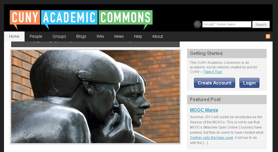
Clean gray button screenshot is up!
Updated by Dominic Giglio almost 14 years ago
Dammit, that does look better. :-)
Updated by Matt Gold almost 14 years ago
Thanks so much, Ray. If you don't mind playing with this a bit more, can you please put together screenshots showing the following buttons in gray?
Skip
Minimal Indent
many thanks.
Updated by Michael Smith almost 14 years ago
I took another stab at this one as well. Hopefully there's something that will work between the various ideas presented.
Updated by Raymond Hoh almost 14 years ago
- File 2012-08-01_171700.png 2012-08-01_171700.png added
In this screenshot, I use the already-existing BuddyPress button styles; this might actually gel better with the existing site.
I can incorporate aspects of Michael's screenshot as well by removing the gray background boxes, etc. Let me know!
Updated by Matt Gold almost 14 years ago
Thanks, guys. One question before we move forward/comment: should we consider embedding the login/password fields directly onto the page? You can see an example of that on the OpenLab
Updated by Matt Gold almost 14 years ago
Somehow, we didn't have Chris as a watcher on this. Just added him. Chris, please let us know your thoughts.
Updated by Boone Gorges almost 14 years ago
should we consider embedding the login/password fields directly onto the page?
Out of scope for 1.4. It's too late to be making big functionality changes to the front page. If we want to change something functional, let's move it out of this milestone.
Updated by Matt Gold almost 14 years ago
If we want to change something functional, let's move it out of this milestone.
Fair enough.
It looks to me like Michael's proposal would change the look of the page significantly. Michael, can you do a quick mock-up showing what the entire page would look like with the section changed as you've proposed here? Thanks.
Updated by Sarah Morgano almost 14 years ago
What about incorporating Micheal's buttons into Ray's screenshot? I like the idea of keeping the grey boxes, I think it helps breaks up the white space.
I also on board with Matt's suggestion to incorporate the login/password fields in this area, perhaps in a later release.
Updated by Michael Smith almost 14 years ago
- File Gettign-Started3.png Gettign-Started3.png added
- File Getting-Started2.png Getting-Started2.png added
- File Getting-Started1.png Getting-Started1.png added
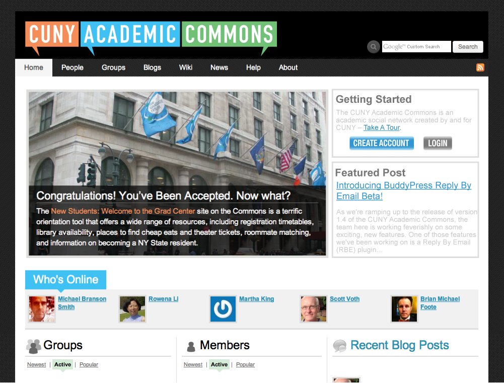
Here are three versions incorporating the entire homepage.
Updated by Michael Smith almost 14 years ago
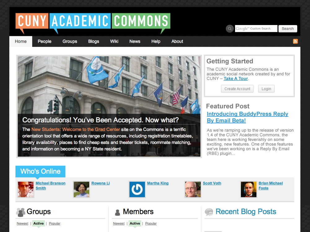
- File Getting-Started4.png Getting-Started4.png added
Here's one more using Raymond's buttons with some additional font styling work. I looked to me in the context of the full page that links needed to be bold, as are the active users just below. I also was a bit worried that the lighter grey text wasn't readable, so I used the darker gray of the header to match.
Updated by Matt Gold almost 14 years ago
Michael -- I agree that the text needs to be darker to be readable (thus, only Getting-Started4.png is a realistic alternative). I'll give these another look tomorrow with fresh eyes, but I have to say that right now, the all-white background isn't working for me. As much as I think the gray boxes are a bit leaden, they are effective in delineating sections of the page pretty cleanly. The versions you've done with a white background make the page as a whole look a bit jumbled -- and we have to remember that with the featured widget being revamped, we'll be using photos more in that space, too., which will only add to the visual cacophony. I'm still open to alternatives, but for now, I'm thinking that we should keep at least some version of the gray boxes.
Ray, if you show prototypes of the page with the Skip & Minimal Indent buttons, I'd appreciate it. Many thanks.
Updated by Chris Stein almost 14 years ago
Sorry, I wasn't getting the updates on this before. Overall, I do think that buttons are something we need to address overall on the Commons (http://teachingmultimedia.com/commons/buttons/buttons.html) but that will need to wait for the redesign. In the meantime I agree that the grey buttons fit in more with what we currently have and also having some kind of lines or darker areas to separate the 'Getting Started' and 'Featured Post' as their own sections. I would hesitate to use any kind of 3d effect or heavy gradient as it would be inconsistent with the rest of the design.
Updated by Raymond Hoh almost 14 years ago
- File button-minimal-indent.png button-minimal-indent.png added
- File button-skip.png button-skip.png added
Matt: Here are the screenshots you requested.
Buttons are unaltered, so if you want me to adjust the font-size let me know. Also I have taken the liberty of making the "Getting Started" and "Featured Post" headers slightly smaller and using less padding.
Updated by Matt Gold almost 14 years ago
Thanks very much, Ray. The minimal indent implementation looks good to me, and I like having less padding on the gray headers -- good idea. Chris, the minimal header does contain a bit of a 3D effect; do you think it's incongruous?
Updated by Chris Stein almost 14 years ago
The small 3d is fine, as I look at my button page we do some things like that elsewhere in the site. For now I think it's fine to use the good work that's been done and worry about a more general plan for buttons later (and at that point we can look into 3d, gradients etc).
Also, I'm assuming that if you're logged in then it would just show the tour information and link?
Updated by Matt Gold almost 14 years ago
Ray, our goal is to finish up this ticket today, so can you implement the minimal indent button and reduced header padding as soon as you can? Many thanks.
Updated by Raymond Hoh almost 14 years ago
- File ie6-8_users.png ie6-8_users.png added
Check out cdev for the implementation.
Just to note that IE6-8 users will not see the proper button because those browsers do not have good CSS support (see screenshot).
If you want me to add IE support, I can add some javascript that will give IE the proper CSS capability.
Updated by Matt Gold almost 14 years ago
Thanks, Ray. Brian, can you tell us how many people visit the Commons with IE6-8? Thanks.
Updated by Chris Stein almost 14 years ago
It might not be a bad idea to use the CSS3 Pie anyway. There are probably still a few IE 6/7/8 users out there and as we incorporate more things into the site we'll need that kind of solution anyway. Ray, did you have any thought on the .htc vs the .js implementation? I haven't really looked at it but I'm guessing the .js will be simpler at first but the .htc would be more seamlessly integrated. If they have the .js hosted on one of the Google or Microsoft CDNs then that might help with the download.
Updated by Raymond Hoh almost 14 years ago
Ray, did you have any thought on the .htc vs the .js implementation? I haven't really looked at it but I'm guessing the .js will be simpler at first but the .htc would be more seamlessly integrated.
The advantages and disadvantages for using the JS version are listed here.
If we wanted to use a CDN-hosted version, we would have to go with JS since the .htc method requires the file to be located on the same server.
Updated by Chris Stein almost 14 years ago
Thanks for the link. It seems like the .htc solution is better if we can meet the requirements. I didn't realize that you had to reference the behavior in each rule you needed it used. It seems like that would be a good place to use something like SASS as well so you could define the styling for a button with the CSSPie as a mixin and then use it where you needed it without worrying about remembering the behavior reference. Maybe not for now but something to remember when we do an overall redesign.
If we have problems with the .htc then yes a CDN .js version.
Updated by Raymond Hoh almost 14 years ago
Good to hear you prefer the .htc version, Chris, as that was my preferred choice as well!
I've implemented the .htc version on cdev. The great thing about using the .htc version is we can add the IE-specific references n the already-existing ie.css stylesheet! No unnecessary markup in the main stylesheet.
I've tested in IE7 and IE8 and it works.
As for SASS, SASS sounds great but it requires Ruby and I don't believe we should be using such a script. Better to stick to CSS3 conventions when possible.
If there are no problems with the implementation, I will commit these changes.
Updated by Chris Stein almost 14 years ago
Great, doing it in the ie style sheet is the way to go. I probably shouldn't have mentioned sass. There are some programs you. An run that will compile it for you and you can have a local terminal run the ruby so that all the server sees is the compiled CSS. But in general I think that is something we can tackle later as part of an overall redesign and reconfiguring of the CSS.
Everything sounds fine onmy end I haven't had a chance to test in ie <9 but I trust you're right.
Updated by Raymond Hoh almost 14 years ago
- Status changed from Assigned to Resolved