Design/UX #18919
closedDesign/UX #17385: Profile CV & Account Settings
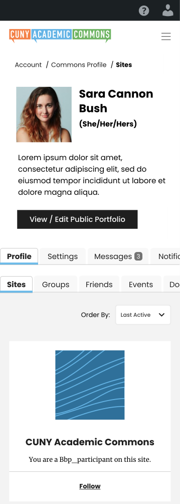
Settings and Inbox Mobile Testing
0%
Description
As per the call yesterday, I'm setting up this ticket specifically for mobile testing feedback and tweaks on the Settings and Inbox tabs for the upcoming intermediate release. I have this as a subtask of the joint CV / Settings ticket #17385 which maybe isn't the cleanest but seemed close enough.
We talked briefly about looking at how the Settings and Inbox tabs and subtasks stack in a mobile view and if we can adjust the spacing, improve the use of screen real estate, etc.
Sara and Ray, I'll leave this to your updates for now, and perhaps we can circle back on this with the other testers later this week.
Files
Updated by Raymond Hoh almost 3 years ago
I've improved the responsive CSS styles a bit across the Settings and Inbox pages. This is ready for testing on cdev. Remember to clear your browser cache or do a hard refresh to test.
I could use some design feedback from Sara on how to style the main nav items for widths smaller than 600px. Do we want to do one column when the width of the page is <= 400px?
Updated by Sara Cannon almost 3 years ago
- File Screenshot 2023-10-05 at 12.14.08 AM.png Screenshot 2023-10-05 at 12.14.08 AM.png added
- File Mobile-horizontal-scroll.png Mobile-horizontal-scroll.png added
- File Mobile - dots.png Mobile - dots.png added
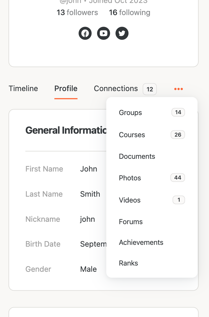
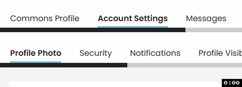
I took a look at the mobile menu and because of the amount of items, stacking will get cumbersome for a "Tab" interface. I looked up how another Buddypress instance called BuddyBoss addresses this, and they truncate the menu and use three dots to access the rest of the items (see screenshot). I also looked up how material design addresses tab menus on mobile. They recommend a horizontal scroll to get to the further menu items (see: https://m3.material.io/components/tabs/guidelines#b0e3794c-059f-41e2-87a6-fe2498fc7fe8) Below is a screenshot that cleans up the top area by left aligning and making some things smaller and then adding in the tabs with the scroll-effect. 
Does anyone have any strong thoughts here? I am leaning towards the horizontal scrolling.
Updated by Raymond Hoh almost 3 years ago
Thanks for the feedback, Sara. I've implemented the horizontal scroll for the profile nav menu on cdev. Let me know if you spot any bugs.
I'll work on the left-alignment stuff in the profile header tomorrow.
Updated by Boone Gorges almost 3 years ago
I like the horizontal scroll. One small suggestion. In Sara's mockups, a nav item is always divided by the right edge of the screen. This gives a good indication that there's more content that needs scrolling. But this won't be the case for all subnavs, or for all screen widths. If the edge of the screen falls naturally between nav items, it won't be clear that there's anything more to see. I suggest that we use some sort of gradient semi-transparent overlay when there's content off the edge of the screen. I don't know of a straightforward way to build this such that it'll appear only when there's content to show (thus, for instance, appearing at the left when you're scrolled to the right). You'd need to use some JS with a 'scroll' listener, I guess. Maybe Sara has an idea for another way that it can be indicated visually.
Updated by Sara Cannon almost 3 years ago
- File Mobile-scroll1.png Mobile-scroll1.png added
- File Mobile-scroll2.png Mobile-scroll2.png added
- File Mobile-scroll3.png Mobile-scroll3.png added
- File Mobile-scroll5.png Mobile-scroll5.png added


Here are some screenshots where I have played around with gradients and arrows. However, putting "tabs" into an actual tab interface might make the most sense as it naturally indicates scrollability. But that does make it visually less simple so it's a trade-off
Updated by Raymond Hoh almost 3 years ago
- File nav-menu-mobile.gif nav-menu-mobile.gif added
Would a scroll line at the bottom of the nav menu to denote additional items work?
See attached GIF:

The two colors for the scroll line, as well as the thickness of the line can be changed if desired.
Updated by Sara Cannon almost 3 years ago
- File Mobile-scroll6.png Mobile-scroll6.png added
I like that better than tabs. We could round the edge of the scrollbar and make it more grey.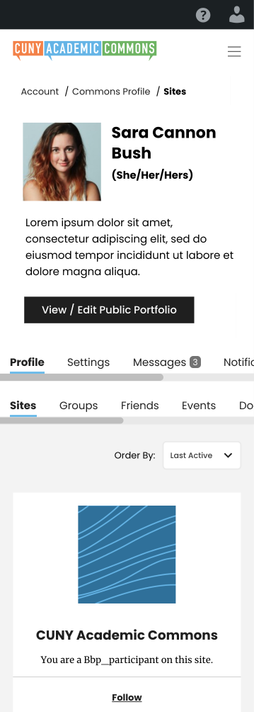
Updated by Raymond Hoh almost 3 years ago
I've implemented the horizontal scroll bar changes on cdev. Also if the selected nav menu item is not the first menu item, the scrollbar will scroll to the position of that menu item when the page loads. See attached GIF.