Actions
Design/UX #19624
closedMobile Menu Tweaks
Added by Sara Cannon over 2 years ago. Updated 10 months ago.
Status:
Rejected
Priority name:
Normal
Assignee:
Category name:
Design
Target version:
Start date:
2024-01-29
Due date:
% Done:
0%
Estimated time:
Deployment actions:
Description
The Mobile menu can use a few tweaks. We can use the User Avatar instead of the User Icon and adjust the carats' alignment. (they seem to be at an awkward spot/angle right now)
Designs:
The current menu with the weird carats alignment: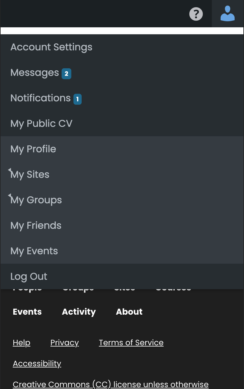
Files
| Screenshot 2024-01-29 at 3.50.13 PM.png (138 KB) Screenshot 2024-01-29 at 3.50.13 PM.png | Sara Cannon, 2024-01-29 04:50 PM | ||
| Current Menu.png (99.3 KB) Current Menu.png | Sara Cannon, 2024-01-29 04:50 PM |
Related issues
Updated by Boone Gorges over 2 years ago
- Target version set to 2.3.2
I've put some changes in place to address these, which are available on cdev.
Updated by Sara Cannon over 2 years ago
This looks so much better. Could we eliminate the white space under the menu bar?
Updated by Boone Gorges over 2 years ago
Sure. I've made the change in https://github.com/cuny-academic-commons/cac/commit/0d5d22b757a323a4684eb86da4f555afe56e15b4.
Updated by Boone Gorges over 2 years ago
- Target version changed from 2.3.2 to 2.3.3
Updated by Boone Gorges over 2 years ago
- Target version changed from 2.3.3 to 2.3.4
Updated by Boone Gorges over 2 years ago
- Target version changed from 2.3.4 to 2.3.5
Updated by Boone Gorges over 2 years ago
- Target version changed from 2.3.5 to 2.3.6
Updated by Boone Gorges about 2 years ago
- Target version changed from 2.3.6 to 2.3.7
Updated by Boone Gorges about 2 years ago
- Target version changed from 2.3.7 to 2.3.8
Updated by Boone Gorges about 2 years ago
- Target version changed from 2.3.8 to 589
Updated by Boone Gorges about 2 years ago
- Target version changed from 589 to 2.4.1
Updated by Boone Gorges about 2 years ago
- Target version changed from 2.4.1 to 2.4.2
Updated by Boone Gorges almost 2 years ago
- Target version changed from 2.4.2 to 2.4.3
Updated by Boone Gorges almost 2 years ago
- Target version changed from 2.4.3 to 2.4.4
Updated by Boone Gorges almost 2 years ago
- Target version changed from 2.4.4 to 2.4.5
Updated by Boone Gorges almost 2 years ago
- Target version changed from 2.4.5 to 2.4.6
Updated by Boone Gorges almost 2 years ago
- Target version changed from 2.4.6 to 2.4.7
Updated by Boone Gorges almost 2 years ago
- Target version changed from 2.4.7 to 2.4.8
Updated by Boone Gorges over 1 year ago
- Target version changed from 2.4.8 to 2.4.9
Updated by Boone Gorges over 1 year ago
- Target version changed from 2.4.9 to 2.4.10
Updated by Boone Gorges over 1 year ago
- Target version changed from 2.4.10 to 601
Updated by Boone Gorges over 1 year ago
- Target version changed from 601 to 2.5.1
Updated by Boone Gorges over 1 year ago
- Target version changed from 2.5.1 to 2.5.2
Updated by Boone Gorges over 1 year ago
- Target version changed from 2.5.2 to 2.5.3
Updated by Boone Gorges over 1 year ago
- Target version changed from 2.5.3 to 2.5.4
Updated by Boone Gorges over 1 year ago
- Target version changed from 2.5.4 to 2.5.5
Updated by Boone Gorges over 1 year ago
- Target version changed from 2.5.5 to 2.5.6
Updated by Boone Gorges about 1 year ago
- Target version changed from 2.5.6 to 2.5.7
Updated by Boone Gorges about 1 year ago
- Target version changed from 2.5.7 to 2.5.8
Updated by Boone Gorges about 1 year ago
- Target version changed from 2.5.8 to 2.5.9
Updated by Boone Gorges about 1 year ago
- Target version changed from 2.5.9 to 2.5.10
Updated by Boone Gorges 12 months ago
- Target version changed from 2.5.10 to 2.5.11
Updated by Boone Gorges 12 months ago
- Target version changed from 2.5.11 to 2.5.12
Updated by Boone Gorges 11 months ago
- Target version changed from 2.5.12 to 2.5.13
Updated by Boone Gorges 11 months ago
- Target version changed from 2.5.13 to 2.5.14
Updated by Boone Gorges 10 months ago
- Target version changed from 2.5.14 to 2.5.15
Updated by Raymond Hoh 10 months ago
- Status changed from New to Rejected
- Target version changed from 2.5.15 to Not tracked
#22941 has updated designs for the admin bar, so I'm going to close this in favor for that ticket.
Updated by Raymond Hoh 10 months ago
- Related to Design/UX #22941: Admin Bar Refresh added
Actions