Design/UX #22941
closedAdmin Bar Refresh
0%
Run:
wp eval-file ~/wp-cli-scripts/blog_public-sync.php
Description
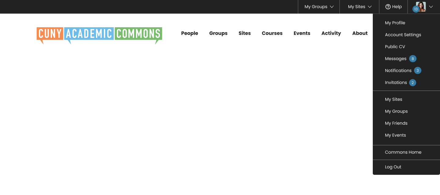
In giving the admin bar a refresh, we will be changing the following:
- remove the CUNY Academic Commons Name and drop down from the top left (this to be confirmed after analytics check)
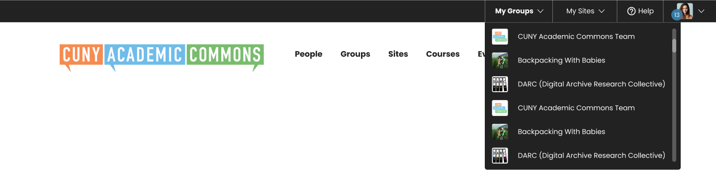
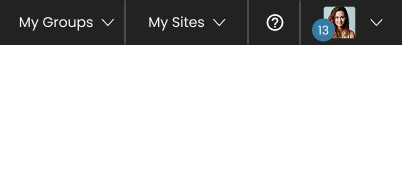
- Adding My Groups and My Sites to the top Admin Bar
- Add groups and sites into a drop down with a scroll bar
- Refresh the Help Icon
- Refresh the Down carrot by the avatar
- Segment and add new sections to the drop down
- Remove the "fly out" of the groups and sites
- Add: Invitations (with number count)
- Move "My Profile" to the top
- Add "Commons Home" above log out
- Make the notification numbers round with 1-2 numbers and expand like a pill
- make the font Poppins
- Mobile screens curated to designs that show sites, groups, help icon (no text), avatar & notification count
- Mobile screens when on a site simplified even further to leave room for site tools
I'm still thinking about mobile when there are too many icons. A ••• menu might work here
Files
Related issues
Updated by Sara Cannon about 1 year ago
- Tracker changed from Bug to Design/UX
Updated by Boone Gorges 12 months ago
- Target version set to 2.6.0
Sara, are you going to be building this as a Figma document for the dev team?
Updated by Sara Cannon 12 months ago
Here you go! https://www.figma.com/design/ePPpJucc02oge8kFA9duFc/CUNY-Navigation?node-id=14251-656&t=3wbeWptHMLQQWRvP-1 I've also added boone and Ray's email to the file
Updated by Boone Gorges 11 months ago
- Category name set to Toolbar
- Assignee changed from Boone Gorges to Raymond Hoh
- Target version changed from 2.6.0 to 2.7.0
Updated by Raymond Hoh 10 months ago
- Related to Design/UX #19624: Mobile Menu Tweaks added
Updated by Raymond Hoh 8 months ago
Hi Sara,
Do you have an updated Figma link? Or if you do not have access to Figma, can you post screenshots of the "My Groups" and "My Sites" dropdown menus when expanded and other assets that haven't already been attached to this ticket such as the Help icon SVG?
Updated by Sara Cannon 7 months ago
Updated by Raymond Hoh 7 months ago
Hi Sara, when I attempt to open the link, I get a message saying that there is an issue with the file sharing options:
Unable to open file
It looks like there’s an issue with this Design file’s sharing settings. We’ve emailed the owner to let them know.
Can you check the Figma permissions?
Updated by Sara Cannon 7 months ago
Updated by Raymond Hoh 7 months ago
I've committed a first pass of the new admin bar refresh design in https://github.com/cuny-academic-commons/cac/commit/0a46a9b216. This is available for testing on cdev. You might need to refresh your browser cache to see the new design.
There's still some work to do for the mobile view, specifically the More overflow menu and the various menu icons that get displayed when the screen width is < 400px, but I'll get to that in later revisions. In the meantime, let me know if you encounter any visual bugs.
Updated by Sara Cannon 7 months ago
- File Screen Recording 2025-12-11 at 10.00.04 PM.mov Screen Recording 2025-12-11 at 10.00.04 PM.mov added
This is looking so great! Can we have the hover states bold like you have it but not make the size of the box it's in expand? hovering moves the vertical lines a bit and it feels better when they stay still. Attaching screen recording that shows the slight movement when the text bolds on hover. All in all though I'm super excited about this change and improvement!!! great work here
Updated by Sara Cannon 7 months ago

I've added to the figma file a slightly refreshed login dropdown
Updated by Sara Cannon 7 months ago

Updated by Raymond Hoh 7 months ago
- File cac-logo-top-left.gif cac-logo-top-left.gif added
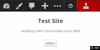
From the team meeting on Friday, we talked a tiny bit about adding back a CUNY Academic Commons icon to the admin bar when you are on a sub-site and logged out.
I've mocked up something with the smaller CAC logo with a little hover popup explaining that the current sub-site is part of the CUNY Academic Commons network. The "Learn more about us" button in the GIF links to the main Commons About page. Let me know what you think.
Updated by Raymond Hoh 7 months ago
Hi Sara,
This is where I grabbed the smaller CAC logo: https://gcdi.commons.gc.cuny.edu/cac-logo/. The letters look a little jagged due to some compression though.
Updated by Sara Cannon 7 months ago

I played around with different options, and I like the first one personally. I would love to hear the group's thoughts
Updated by Colin McDonald 6 months ago
- File menu-chrome.png menu-chrome.png added
- File menu-firefox.png menu-firefox.png added
Updates on two fronts here, logo choice and testing feedback.
For the logo, we agreed to go with Option 1 from Sara's choices on desktop and to explore Options 6 and 7 on mobile (slight preference for 6 because of the full written Commons wording, but not sure if the text will be too small to read).
Regarding testing, Scott and I have done a pass through and have a few pieces of feedback below. Sara, have you taken a look yet?
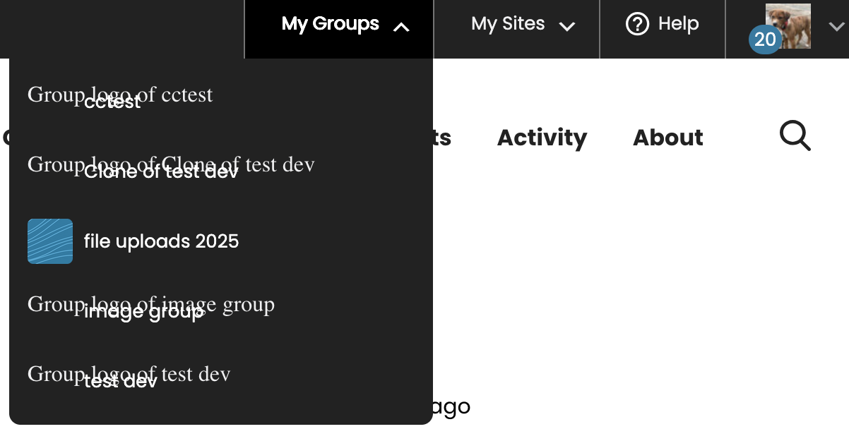
- When you add a logo to a site or group, the logo image seems to appear twice in the corresponding admin bar drop-down item.
- Maybe this is a dev site thing, but there are broken images for the group logos in the drop-down, rather than the placeholder image. And on Firefox, the broken image message obscures the menu text. See screenshots for Firefox and Chrome.
- Maybe it's just us, but the way that the arrows flip up/down when you mouse over the drop-downs is a little laggy and distracting. Could that be improved? Or could it just be a static down-pointing arrow whether the menu is hovered/active or not?
Updated by Colin McDonald 6 months ago
One other testing note - what do we think about keeping Create a Site and Create a Group at the top of the My Sites / My Groups drop-downs like we have it now?
Updated by Raymond Hoh 6 months ago
- Deployment actions updated (diff)
For the logo, we agreed to go with Option 1 from Sara's choices on desktop and to explore Options 6 and 7 on mobile
I've added a first pass of Option 1 in https://github.com/cuny-academic-commons/cac/commit/ca63c61bdaa24b8dda324b81262c1c0df6f510ad. This is available for testing on cdev. I'll work on the mobile versions in later updates.
To confirm, we only wanted to add this logo item for logged-out users, correct?
- When you add a logo to a site or group, the logo image seems to appear twice in the corresponding admin bar drop-down item.
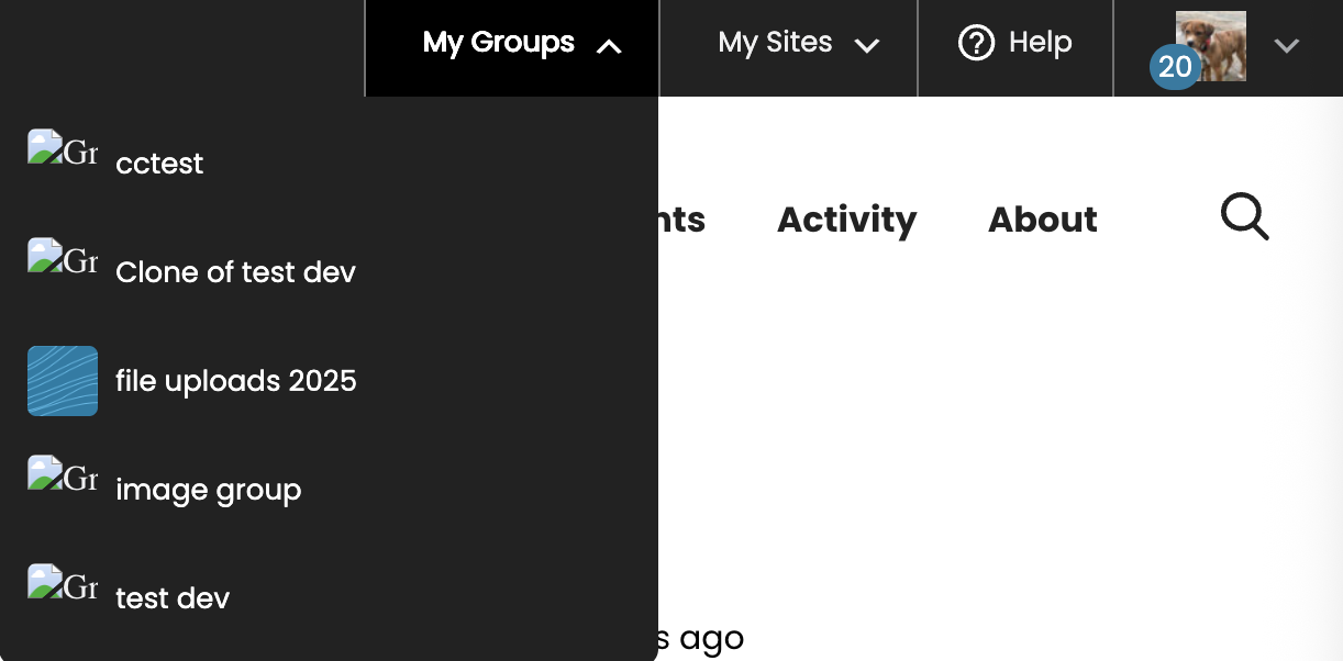
Confirmed, at least on the "My Sites" menu. I've added some code to remove the duplicate logo in the "My Sites" menu in https://github.com/cuny-academic-commons/cac/commit/adb2c52eb08482307fb3de0645f0f6a3124906d8. This is available for testing on cdev.
- Maybe this is a dev site thing, but there are broken images for the group logos in the drop-down
I was able to replicate some of the broken images for private site icons due to private site icons needing to be signed by S3 (also see #22966). I've added some code to address this in https://github.com/cuny-academic-commons/cac/compare/9a6bc07...33eb541. Boone, in https://github.com/cuny-academic-commons/cac/commit/6da28a3c81b80b0324e8a6f27f45910a1b109648, I'm mirroring the blog_public option to BP user blog meta so we can call it efficiently when in a bp_has_blogs() loop and have altered the cac_s3_uploads_is_site_private() function to utilize this. On production, we'll need to sync the blog_public option to blog meta, I've written a script located at ~/wp-cli-scripts/blog_public-sync.php that will need to run before deploying 2.7.0.
For the other broken images, it is likely a S3 / dev site thing. If you see broken images, try re-adding an image for the group or site in question to see if the image shows up again.
Maybe it's just us, but the way that the arrows flip up/down when you mouse over the drop-downs is a little laggy and distracting
I'm utilizing WordPress's built-in 'hover' CSS class here for the arrow flip, which only adds the CSS class when the menu is certain to open up in a mouseover state. This causes the inherent lagginess you are experiencing. (The WP admin bar uses the hoverIntent JS library for this.) If the arrow flip is distracting, I'll remove it and make it static like before.
Updated by Sara Cannon 6 months ago
- File Screenshot 2026-01-13 at 10.18.06 AM.png Screenshot 2026-01-13 at 10.18.06 AM.png added
- File Screenshot 2026-01-13 at 10.18.39 AM.png Screenshot 2026-01-13 at 10.18.39 AM.png added
I am good with a static arrow.
FYI In testing on cdev, the link is blue when I went to a site and the mobile view is a bit wonky (see screenshots)
Updated by Boone Gorges 6 months ago
~/wp-cli-scripts/blog_public-sync.php
Thanks so much, Ray!
Updated by Colin McDonald 6 months ago
Not sure if this is related the blue link Sara mentions in her last comment above, but Scott is also seeing some weird link color behavior when clicking on a My Sites dropdown item and looking at the toolbar in the WP dashboard of that site. See video attached. In his report to me, he says:
"It seems only to occur in the dashboard mode. In Firefox, for some reason (in incognito) , when I click one of my sites, the url changes to the home URL in the dashboard – maybe something with the test system is causing these weirdnesses."
Updated by Boone Gorges 6 months ago
Hi Ray - I've been doing some unrelated work on the 2.7.x branch and have experienced slow load times due to the changes here. Specifically, I'm testing with a user that has perhaps 100 sites and 100 groups, and every page load is taking 60+ seconds. The slowness appears to stem from the avatar calls. I think it's because bp_core_fetch_avatar() does a file_exists() check for a "local" avatar, but in our case, this requires a round trip to S3. In a way, this is a shortcoming in BP itself - it should do a better job caching whether a user has a local avatar, one that doesn't involve filesystem scans. But I think we need to do something to address it.
One effective but broad method might be a high-level cache for menu content. Build all of the 'My Sites' menu markup one time, and then throw it into a transient, or into the object cache with some appropriate cache busting. Initial load would still be slow, but most pageloads would hit the cache. Another strategy might be to build an avatar cache. At first, it could be just for this purpose - so instead of calling bp_get_blog_avatar() when building the menu, call cac_get_avatar( 'blog', $blog_id ), which would check some persistent cache before calling bp_get_blog_avatar(). Over time we could roll this out more broadly, or try to integrate more directly into bp_core_fetch_avatar(). What do you think?
Updated by Raymond Hoh 6 months ago
I am good with a static arrow.
FYI In testing on cdev, the link is blue when I went to a site and the mobile view is a bit wonky (see screenshots)
I've removed the hover arrow and the link for the "A CUNY Academic Commons Site" link should now be white. This is available for testing on cdev.
Scott is also seeing some weird link color behavior when clicking on a My Sites dropdown item and looking at the toolbar in the WP dashboard of that site.
I could not replicate this when visiting the abigclone site in Firefox's Private Window mode. It could be a caching issue. I've bumped the CAC version number on cdev, so that should hopefully bust the cache. Can you ask Scott to try again?
In a way, this is a shortcoming in BP itself - it should do a better job caching whether a user has a local avatar, one that doesn't involve filesystem scans. But I think we need to do something to address it.
I'll look into this. Automattic has some code that caches avatar URLs to user and group meta: https://github.com/Automattic/BuddyPress-VIP-Go/. We'd need to tweak this code to work with our S3 set up, but it looks promising.
Is there a user on cdev that is an admin of a ton of sites and groups? If not, I might have to bulk-generate some so I can do some testing there.
Updated by Colin McDonald 5 months ago
Hi Ray, when you are able to get back to this, just let me know when mobile is ready to test. I still have to see if Scott is still seeing the behavior he had flagged before and will let you know if so.
I also wanted to resurface my suggestion to keep Create a Site and Create a Group at the top of the My Sites / My Groups drop-downs like we have it now. I think it's worth keeping creation a prominent item. I don't think these are elsewhere on the admin bar in one click now.
Updated by Raymond Hoh 5 months ago
I've added a first pass of the mobile overflow menu in https://github.com/cuny-academic-commons/cac/commit/f96d8fb5a6dfe7e2f28bd76ba6ca824013ff8287. This is available for testing on cdev. I've attached a GIF, but could use more testers specifically for a bunch of plugins that add menu items to the admin bar.

(Disregard the red background avatar. That only shows up for super admins!)
On my plate are the avatar caching and the mobile logo.
Sara and Colin, I've got a question about the mobile logo. This should only display for logged-out users correct? Right now, mobile logged-out users see this: https://redmine.gc.cuny.edu/attachments/34954. So when we add the mobile logo on the left, do we still keep the Login and Register menu items but move them over to the right side? Let me know.
I also wanted to resurface my suggestion to keep Create a Site and Create a Group at the top of the My Sites / My Groups drop-downs like we have it now.
I've added back the 'Create a Site' and 'Create a Group' menu items in https://github.com/cuny-academic-commons/cac/commit/bf62385a19f9ad202b882eab4129581ae714143c. This is also available for testing on cdev. You can find them under the 'My Sites' and 'My Groups' menu items respectively.
Updated by Sara Cannon 5 months ago
Ray, is there a site already on CDev that has a bunch of plugins installed where I can see the overflow menu?
Updated by Raymond Hoh 5 months ago
- File mobile-logged-out.png mobile-logged-out.png added
I've added the mobile logo for logged-out users. This is available for testing on cdev. I've also attached a screenshot. The logo will show up when the device width is less than 782px. The mobile logo might not show up on some sites due to logged-out caching. If that is the case, let me know which sites you are experiencing this problem with and I'll clear the cache for those sites.
Ray, is there a site already on CDev that has a bunch of plugins installed where I can see the overflow menu?
Try test.cunyac.reclaimhosting.dev. I did some testing with a few plugins that add some menu items to the admin bar, but while these entries show up in desktop mode, only one plugin actually shows up in the mobile menu, Yoast SEO. I should also note that I haven't tested all our available plugins that use the admin bar yet, so the list could grow. I've probably tested 50% of the admin bar plugins so far.
Updated by Raymond Hoh 4 months ago
Another strategy might be to build an avatar cache. At first, it could be just for this purpose - so instead of calling bp_get_blog_avatar() when building the menu, call cac_get_avatar( 'blog', $blog_id ), which would check some persistent cache before calling bp_get_blog_avatar(). Over time we could roll this out more broadly, or try to integrate more directly into bp_core_fetch_avatar(). What do you think?
Boone, I've added a first pass at avatar caching in https://github.com/cuny-academic-commons/cac/commit/773c3acf1f8f0b75a9fff51969dbbe8b4e0c3ed4.
I've opted to build caching directly into bp_core_fetch_avatar() by caching the full avatar URL into either user or group meta. Site icons do not need to be cached since this is already quite optimized in BP blog meta: https://github.com/buddypress/buddypress/blob/89348dfe6062c246206082bb40c82bbbd36762eb/src/bp-blogs/bp-blogs-template.php#L416.
In order to disable filesystem lookups, the 'bp_core_avatar_folder_dir' filter must return an empty string so the file_exists() call will fail at the following juncture: https://github.com/buddypress/buddypress/blob/89348dfe6062c246206082bb40c82bbbd36762eb/src/bp-core/bp-core-avatars.php#L526. Then we can load up our cached avatar URLs further down the bp_core_fetch_avatar() function with the available filters. There is one caveat here and that is the way I'm using the check_cache() function to wipe out the avatar folder directory might cause conflicts with other code utilizing the avatar folder directory. For instance, when an avatar is deleted, the avatar directory is needed to find the correct directory. I had to ensure that our filter is removed so the previous avatars can be removed correctly (see https://github.com/cuny-academic-commons/cac/blob/773c3acf1f8f0b75a9fff51969dbbe8b4e0c3ed4/wp-content/plugins/cac-bp-custom-includes/bp-avatar-cache.php#L19-L32). I'm hoping this is the only instance of this likely to occur, but I thought I'd mention this here.
Another thing is I had to re-implement Gravatar lookups due to the way I am bypassing Gravatar checks to load our cached avatar URLs (see https://github.com/cuny-academic-commons/cac/blob/773c3acf1f8f0b75a9fff51969dbbe8b4e0c3ed4/wp-content/plugins/cac-bp-custom-includes/bp-avatar-cache.php#L10-L11). Gravatars are only loaded for users if the user does not have an existing uploaded avatar and if we're loading this on production or cdev (see https://github.com/cuny-academic-commons/cac/blob/773c3acf1f8f0b75a9fff51969dbbe8b4e0c3ed4/wp-content/plugins/cac-bp-custom-includes/bp-avatar-cache.php#L108-L128). The rationale here is local development doesn't need to ping Gravatar, but let me know if we want to change this.
Lastly, I am also disabling BuddyPress's avatar history feature. This feature was introduced in BuddyPress 10, but I do not think we need this functionality on the Commons. Avatar history means that older avatars will stay on S3 without being deleted, unless the user decides to delete their profile photo. Also the avatar history feature does a fair bit of filesystem lookups when adding a new avatar or when the related 'new_avatar' activity entry is rendered.
For the actual benchmarks, I haven't done too much in-depth testing here, but on cdev with a regular user account that has 50 groups, I've found that page load times go down on average from 4.5 seconds to 2.5 seconds. I used the Query Monitor plugin to get a sense of the page load times, but Boone, let me know if the avatar cache implementation helps with load times with your test account with 100 groups and 100 sites.
Updated by Boone Gorges 4 months ago
Ray, thanks so much for having a look at the avatar caching.
I've done some initial testing. Using the same URL and the same user data, pageload times look like this:
2.6.x: 4.09s
2.7.x before your caching: 67.99s
2.7.x after your caching: 22.79s
So it's obviously much better, but still extremely slow. I did some xdebug profiling and determined that calls to bp_get_blog_avatar() are the culprit. You mentioned that you didn't cache this because the internals are already efficient. But on my environment, bp_core_fetch_avatar() is still running and, critically, is still running file_exists( $avatar_folder_dir ) and/or opendir( $avatar_folder_dir ) in the case of blog avatars. This requires an AWS ping, which is very slow. When I comment out blog avatars altogether, the page loads blazingly fast - just around 1s - so I'm pretty confident that your caching approach is solid, and something like it should be extended to blogs (or, at the very least, the avatar_folder_dir should be nulled out to avoid the check, like you do with the other avatar types in check_cache()).
Updated by Raymond Hoh 4 months ago
Thanks for testing, Boone. Your analysis about bp_get_blog_avatar() is correct. bp_get_blog_avatar() is efficient only when site icons are used, but if a site does not have a site icon, it will default back to bp_core_fetch_avatar(), which would use the filesystem lookups for blog avatars. I've added some code to bypass the filesystem for blog avatars in https://github.com/cuny-academic-commons/cac/commit/3e94f04323e4fec1bd868a6f8753d18dcd4851bc.
I've done some brief testing with a user with 50 groups and 50 sites on cdev and the page load times goes down from around 6 seconds to 2 seconds with avatar caching in place. Let me know if you see similar results, Boone.
Updated by Boone Gorges 4 months ago
Excellent! Very snappy for me now. Thank you!
Updated by Colin McDonald 4 months ago
Hi Ray, a couple of items to pass along from the testing Scott and I have been doing:
- "A CUNY Academic Commons Site" branding/tag in admin bar: We don't think it should appear at all, whether logged in or logged out, on the main site, like it does now. It is repetitive with the CAC logo in the header. On an actual site, it should appear both when logged in and logged out, so that you have the branding as well as the quick link back to the main site. Right now it only appears when logged out.
- If you go to Users > Profile on a site and set the "Administration Color Scheme" to "Light" you get admin bar appearance like in the attached video, with the highlights/hovers not working well. It seems to work fine with all of the other color schemes. Minor I know, not sure how many people even use these color schemes, but if it's quick enough to address in some way, we might as well.
Updated by Raymond Hoh 4 months ago
I've removed the "A CUNY Academic Commons Site" line from the main site.
About:
On an actual site, it should appear both when logged in and logged out, so that you have the branding as well as the quick link back to the main site. Right now it only appears when logged out.
I've made the change so the "A CUNY Academic Commons Site" line appears when logged-in, but I feel that the logged-in view now looks a little congested and a little awkward with the line there. We do have the "Commons Home" link under the main avatar menu as well, but that is a little hidden away. Is there anything else we can do here?
If you go to Users > Profile on a site and set the "Administration Color Scheme" to "Light" you get admin bar appearance like in the attached video, with the highlights/hovers not working well.
Good catch! Should be fixed now. All changes should be available for testing on cdev. Sub-site logged-out views will require a server cache purge, so if you are testing a specific site and you are not seeing the change, let me know and I will clear the cache for the specific site.
Updated by Colin McDonald 4 months ago
Hi Ray, thanks for these changes. I see what you mean about the "A CUNY Academic Commons Site" line with clutter when logged in. Is there a direct way to exclude this line only for sites you're a member (or higher) of? Because if you don't belong to the site, that admin bar is still blank and the tag might as well be there, right? I can flag this for Sara too.
Updated by Sara Cannon 4 months ago
Can we align the admin bar text? it looks like "a cuny academic commons site" is correct but then the rest of the bar can scoot down. Also, it does not seem like the poppins font is loading.
Question: it says "log out" there when we have that in the admin bar drop down as well. Can we remove the repetitive "log out" or is there a reason it's there?
Updated by Raymond Hoh 4 months ago
In https://github.com/cuny-academic-commons/cac/commit/0555274aa5baaaade24eb1bb9081d79f209b173f, I've addressed the following:
- Add Poppins font to the
<head>of each page - Do not show 'A CUNY Academic Commons Site' line if user is a member of the site or if the user is a super admin.
- Better icon alignment in admin bar. Had to add a manual fix for the Yoast SEO plugin as that uses a background image to add the icon.
This is available for testing on CDEV.
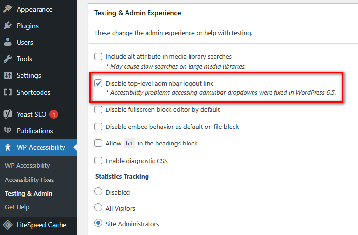
Question: it says "log out" there when we have that in the admin bar drop down as well. Can we remove the repetitive "log out" or is there a reason it's there?
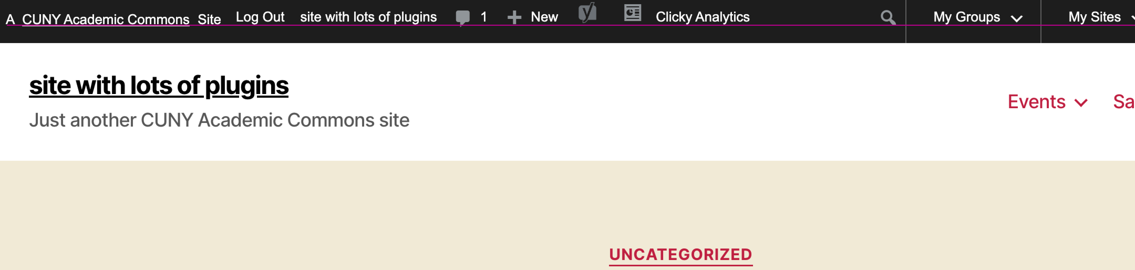
This is added by the "WP Accessibility" plugin. This is enabled by default, however there is a setting to disable this menu item under the "WP Accessibility > Testing & Admin" page in the WP admin area (see attached screenshot). I've just disabled the menu item for the "site with lots of plugins" site. I think we should leave this alone and let admins decide if they want to have the menu item or not.
Updated by Boone Gorges 3 months ago
- Status changed from New to Resolved
This has now been launched.
There was a slight bug in the blog_public-sync.php script (having to do with the GROUP BY query) that caused it not to fully work. I fixed it with "SELECT COUNT..." and ran the migration tool:
litespeed@node15377-cunyacprod-1 ~/public_html $ wp eval-file ~/wp-cli-scripts/blog_public-sync.php
Processing  100% [============================================================================] 1:03 / 1:03
Total sites: 41501
The following sites no longer exist in the wp_bp_user_blogs_blogmeta DB table : 14,25,35,50,51,52,53,54,55,100,6512,6513,6514,6515,6516,6517,6518,6520,6521,6523,6524,6525,6526,6527,11501,12376,20790,25903,28762,36951,36953

==

MariaDB [wp_1153337]> select count(*) from wp_bp_user_blogs_blogmeta where meta_key = 'blog_public';
+----------+
| count(*) |
+----------+
|    41470 |
+----------+
1 row in set (0.035 sec)