Feature #3844
closedSite/Blog or Person Emphasis in My Commons
0%
Description
Within My Commons, My Groups and My Sites updates emphasize the name of the person that has completed an action, rather than what blog or group it's in relation to.
I believe in a meeting we discussed changing the language around from 'Don Sutherland joined the CUNY Technology Group' to 'The CUNY Technology Group was joined by Don Sutherland'.
Assigning to Chris to see if he has other ideas for solutions here.
Files
Related issues
Updated by Matt Gold about 11 years ago
I don't love the passive voice here but I do like the emphasis on group/site names. Wonder what we could accomplish through styling to add emphasis
Updated by Boone Gorges about 11 years ago
My suggestion is to break it out into two parts:
[group avatar] GROUP NAME
Boone joined the group Group Name
Updated by Samantha Raddatz about 11 years ago
Yeah, without the passive voice is better. Thanks, Boone!
Updated by Boone Gorges about 11 years ago
- Tracker changed from Design/UX to Feature
- Category name set to My Commons
- Status changed from New to Assigned
- Assignee changed from Chris Stein to Raymond Hoh
Ray, could you have a look at this? I'm thinking it will largely simplify your implementation, because it'll no longer be necessary to break apart the activity_action string. In brief:
- The "primary object" - corresponding to the large avatar - should appear in large letters, where user name is current appearing
- Activity action string should be left intact, and displayed underneath
I'd say we should be consistent and do this for all activity types.
Updated by Raymond Hoh about 11 years ago
- File 2015-03-05_195924.png 2015-03-05_195924.png added
I'm thinking it will largely simplify your implementation, because it'll no longer be necessary to break apart the activity_action string.
The current implementation is actually very simple and is accomplished with CSS. What is being proposed will require a tiny bit of work if I'm reading things right.
- The "primary object" - corresponding to the large avatar - should appear in large letters, where user name is current appearing
Does this mean we're getting rid of double avatars for all activity types? What about new friendship activity items?
I've attached a mockup of what I believe is being proposed. Please let me know if I'm off the mark.
Updated by Matt Gold about 11 years ago
Thanks, Ray. The text in your mockup looks good (though we should include first + last names). I do not think we are getting rid of the double avatars. It's really the text that we are trying to work on here (so far as I understand things)
Updated by Boone Gorges about 11 years ago
Thanks for having a first look, Ray.
As Matt said, the text on the second item in your mockup looks good: large text matches the large avatar, and small text contains the full activity action string. And let's keep the double avatars.
Updated by Raymond Hoh about 11 years ago
Thanks for the clarification, Boone.
I'd say we should be consistent and do this for all activity types.
Are you saying if it's a person it would be:
Boone Gorges (large text)
Boone Gorges wrote a new activity update
Or is this only for groups?
Updated by Boone Gorges about 11 years ago
I'd say all activity types. Samantha, what do you think?
Updated by Samantha Raddatz about 11 years ago
Yes, for consistency let's apply this to all activity types.
Updated by Boone Gorges about 11 years ago
See also #3574 - I think that fixing this ticket will fix that one too.
Updated by Raymond Hoh about 11 years ago
Okay, I've added this in commit 0ead051 and is ready for testing on cdev.
One thing I've noticed since implementing this is I think we should add the object pertaining to the main object permalink. Either a textual prefix or an icon would do.
eg.
Group: CUNY Academic Commons Team
Site: Futures Initiative
User: Matt Gold
Let me know what you think.
Updated by Boone Gorges about 11 years ago
I like the idea of doing something with an icon. Do we have something we could use for this? Do we like the icons we use in the widget headers on the front page (IMO they are not great).
Updated by Raymond Hoh about 11 years ago
I like the idea of doing something with an icon
How about the dashicons font?
Groups: https://developer.wordpress.org/resource/dashicons/#groups
User: https://developer.wordpress.org/resource/dashicons/#admin-users
For "Site", not sure what we could use:
https://developer.wordpress.org/resource/dashicons/#id-alt
https://developer.wordpress.org/resource/dashicons/#format-aside
https://developer.wordpress.org/resource/dashicons/#rss
Updated by Boone Gorges about 11 years ago
I like 'aside' for blog posts. If the different icons aren't differentiating enough, we might think about different colors for group/user/site icons as well.
Updated by Samantha Raddatz about 11 years ago
I agree that 'aside' is a good icon for blogs. When this is implemented, could we change the homepage icons to match so there's consistency across the site?
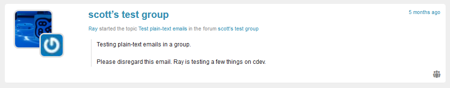
Updated by Raymond Hoh about 11 years ago
- File 2015-04-21_100716.png 2015-04-21_100716.png added
cdev is updated to use the icons as discussed above on the My Commons page, as well as the homepage widget titles. See commits 96a69de and 29329db.
For My Commons, I added the icon to the bottom-right of each activity entry as the icon looked a little odd on the first line of the entry. I've attached a screenshot. Samantha, could use your feedback here.
Updated by Boone Gorges about 11 years ago
Yeah. Love it.
The icon is somewhat lost down in the lower-right, but it'd be nice to get Samantha's feedback here.
Updated by Samantha Raddatz about 11 years ago
I think the icons on the bottom-right are a nice touch. They aren't vital enough to users that they need to be more prominent, but are helpful if noticed.
Let's leave them there for now and I'll include it in my list for the next user testing to see if there are any strong feelings about it. Thanks, Ray!
Updated by Raymond Hoh about 11 years ago
- File 2015-04-24_111059.png 2015-04-24_111059.png added
I decided to add a label after the main activity entry header. See attached screenshot for what it looks like. You can also test on cdev.
Let me know what you think, Samantha. Is it too jarring to the eye when you see the label multiple times on a page? Colors are also placeholders and can be tweaked.
Updated by Samantha Raddatz about 11 years ago
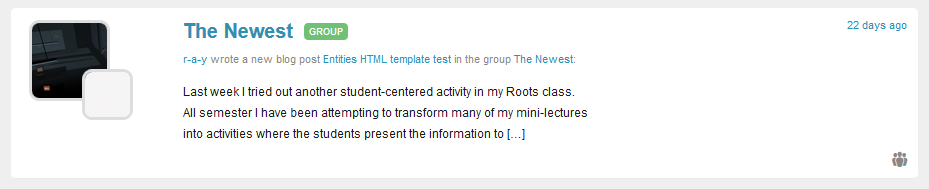
I think the label is better than the logo -- more noticeable and clear. I like them for the 'everything' tab because it clarifies what is a group vs what is a group's site, but it's a bit repetitive on the other tabs. I'm struggling to think of a better solution for this, so I'm looping Chris in.
In the meantime, the additional labeling made me notice that the Friends tab in MyCommons contains lots of different types of content, not just people-related things like friendships created (see attached screenshot). Can you explain what content is pulled into that stream?
Updated by Raymond Hoh about 11 years ago
The "My Friends" stream includes any activity created by your friends, whether that be in a group or site setting.
I agree that the new activity labels kind of confuses this a bit.
Updated by Stephen Real about 11 years ago
Is there anything more that needs to done on this ticket or can we ship as is with the 1.8 release, which needs to freeze development by 5/12 or so.
Updated by Samantha Raddatz about 11 years ago
Sorry I dropped out on this for a bit! I discussed with Chris and he agrees that the logos are helpful in some instances, but confusing in others. I recommend that we remove the icons and labels for now but ship the other great changes Ray made here with the 1.8 release.
Updated by Raymond Hoh about 11 years ago
- Status changed from Assigned to Resolved
Thanks for the feedback, Samantha.
Labels and icons have been removed in commit 3f9efb1.
Going to close this one. Thanks everyone!