Bug #4985
closedZenDesk Feedback Tab is being deprecated
Added by Raymond Hoh over 10 years ago. Updated over 9 years ago.
0%
Description
We currently rely on an older feature in ZenDesk called the "Feedback Tab" to generate our ZenDesk form in the WP admin bar.
ZenDesk informed us that this feature is now scheduled to be removed on November 2016.
We will have to either use ZenDesk's newer Web Widget API or create a custom form handler ourselves.
Read https://redmine.gc.cuny.edu/issues/3660#note-8 and on for some background info.
Files
| zendesk.gif (80.7 KB) zendesk.gif | Raymond Hoh, 2016-01-07 06:27 PM | ||
| 2016-01-27_101700.png (15.9 KB) 2016-01-27_101700.png | Raymond Hoh, 2016-01-27 01:20 PM | ||
| 2016-01-28_201101.png (11.1 KB) 2016-01-28_201101.png | Raymond Hoh, 2016-01-28 11:12 PM |
Related issues
Updated by Raymond Hoh about 10 years ago
- File zendesk.gif zendesk.gif added
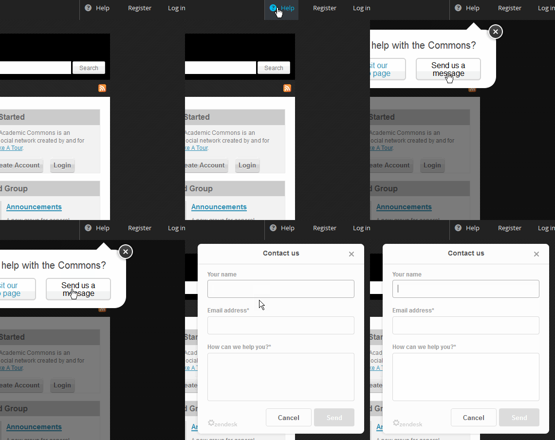
To prep for the upcoming changes to Zendesk, I've updated cdev with the new Web Widget.
Here's a quick animated GIF of it in action:

The new form lacks customization to modify the look of the form via CSS. However, we can add custom fields and pre-populate the name and email address fields if a user is logged in. I haven't done this yet.
Please let me know if there is anything that is missing from the current Zendesk form on production that you would like to add back.
Updated by Matt Gold about 10 years ago
Looks fine to me. Sam and Ray -- want me to check in with Zendesk about how to customize? It seems odd that we can't
Updated by Raymond Hoh about 10 years ago
Sam and Ray -- want me to check in with Zendesk about how to customize?
I guess the question is: Are we happy with how the new Web Widget looks?
The Zendesk webinar host got to my question about CSS customization, but kind of dodged answering it. He said that the new look is styled to be ready for mobile devices.
If we need additional customization options, we might want to get in touch with our ZD account manager to ask further questions.
Updated by Samantha Raddatz about 10 years ago
I think their widget styling works just fine. The only downside is that it lacks our branding, which may be confusing for users that visit blogs within the Commons without realizing the context (for example: http://murphyinstituteblog.org/).
If we're unable to include our logo we could always change the language at the top of the widget to read: "Contact the CUNY Commons Support Team", so I don't think it's a deal breaker.
Updated by Raymond Hoh about 10 years ago
If we're unable to include our logo we could always change the language at the top of the widget to read: "Contact the CUNY Commons Support Team", so I don't think it's a deal breaker.
It doesn't look like we are able to include our logo at the moment.
We are also not able to customize the "Contact Us" text. Zendesk only offers two options:

I have emailed Zendesk asking to see if they will allow a custom label here.
Updated by Raymond Hoh about 10 years ago
- File 2016-01-27_101700.png 2016-01-27_101700.png added
I found some code in the Zendesk forums allowing us to customize the form. The code basically injects some custom CSS into the Zendesk IFRAME.
It's not officially supported and could break at any time, but nonetheless, we are now able to customize the text and look.
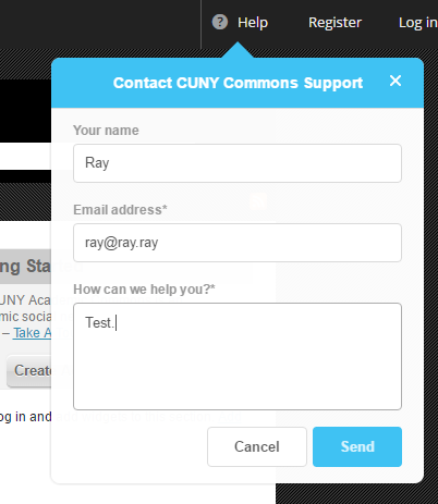
I've attached an updated screenshot:
I've used the CAC blue for the background color and have changed the "Contact Us" label to "Contact CUNY Commons Support".
Let me know if we should revert the colors back to the original.
Updated by Matt Gold about 10 years ago
Thanks, Ray! Looks good to me. Please change "CUNY Commons" to "CUNY Academic Commons," though. Thank you.
Updated by Raymond Hoh about 10 years ago
- File 2016-01-28_201101.png 2016-01-28_201101.png added
I had to move the "X" button slightly higher up due to the length of the new label.

Let me know what you think, Matt.
Once we've signed off on the look, maybe we can roll this into a 1.9.x maintenance release?
Updated by Matt Gold about 10 years ago
Looks good! I'd move the x just a bit farther way from the text, towards the corner, but this is great overall. Thank you.
Updated by Raymond Hoh almost 10 years ago
This is pretty much completed.
Just to update this ticket, ZenDesk changed a bit of their markup in their Help widget. I've updated our CSS styles so our custom modifications still take effect:
https://github.com/cuny-academic-commons/cac/commit/4cd005265da088266ea8b2b0621f5b50c6a78782
This can be tested on cdev.
Did we want to backport this to the 1.9.x branch?
Updated by Raymond Hoh over 9 years ago
So ZenDesk updated their Web Widget API, which broke our customizations.
I have temporarily disabled ZenDesk in the v1.10 branch while I can look into this without affecting cdev. (v1.9 still uses the older Feedback Tab API, which still works as of now.)
Updated by Raymond Hoh over 9 years ago
I'm still looking into this, but I'm running out of time for today.
It's not imperative for me to get this done by tomorrow, since we're looking at releasing 1.10 in November.
But, I'll get to this later this week.
Updated by Raymond Hoh over 9 years ago
- Status changed from New to Resolved
I've updated the Zendesk code to the latest API changes.
This is now available for testing on cdev.
Going to mark as resolved for now. If you find any issues, feel free to reopen or create a new issue.
Updated by Raymond Hoh over 9 years ago
- Target version changed from 1.10 to 1.9.32
I think we need to push these changes to 1.9.x since Zendesk is deprecating Feedback Tab this week.
Earmarking this for 1.9.x branch.
Boone - If I do not get to this in the next few days, just copy wp-content/mu-plugins/assets/zendesk.php from 1.10.x branch over to 1.9.x branch.
Updated by Raymond Hoh over 9 years ago
I've gone ahead and copied over the changes to ZenDesk from 1.10.x to 1.9.x branch in commit 31e853b.