Design/UX #19733
closedInvite Modal
0%
Description
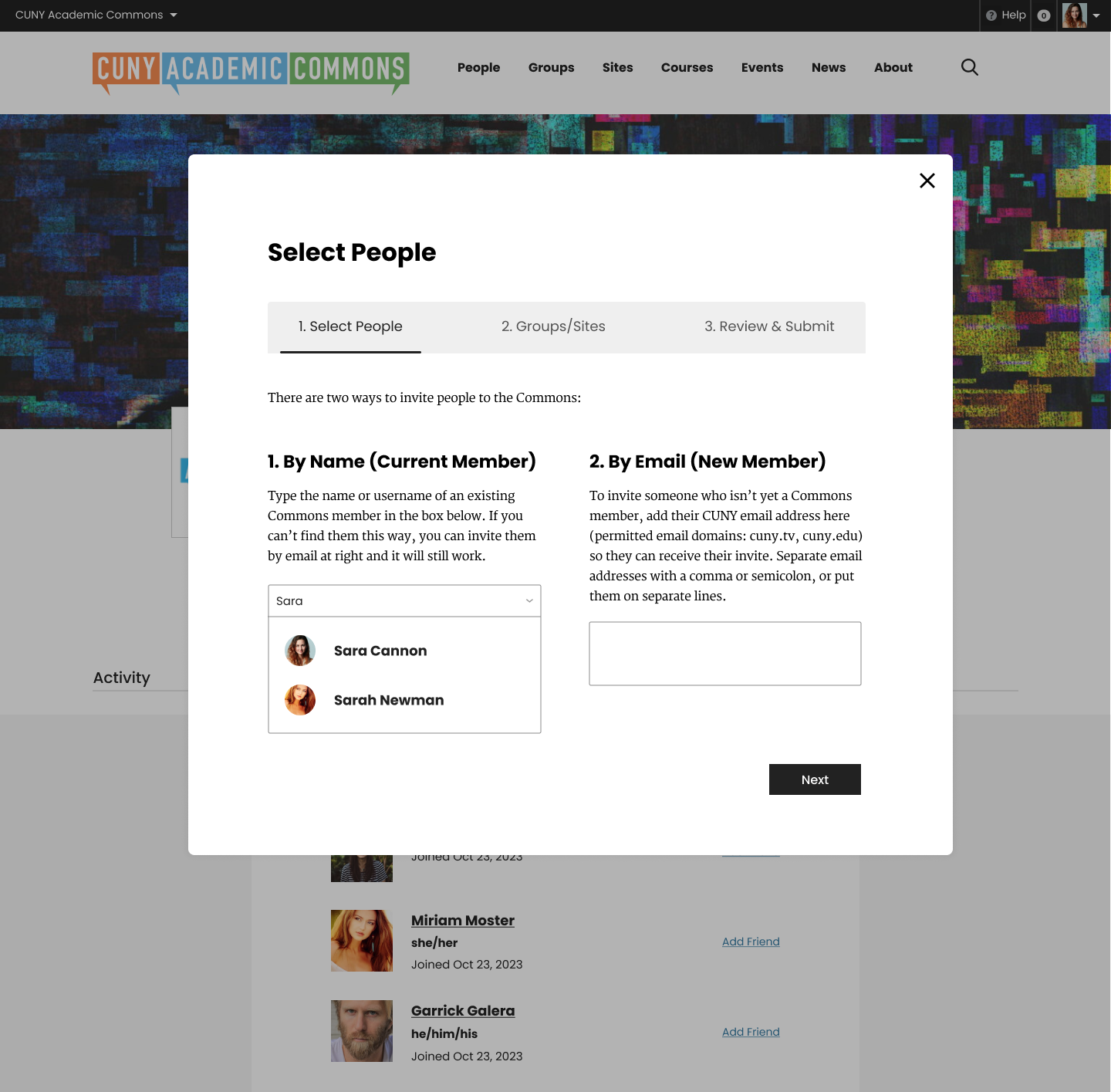
Here are the initial comps for the invite modal
I'm attaching the new comps but if you want to view them alongside the current modal screens, you can view them in presentation format here:
https://www.figma.com/proto/XtBvj6Z9N5sLn9eHco4ArO/CUNY-Design---Spring-2024?page-id=4328%3A43252&type=design&node-id=4328-44687&viewport=1333%2C-760%2C0.13&t=doNbpw4uC2iSmkMt-1&scaling=min-zoom&mode=design
Notes:
- There is a bit of confusion as to who is allowed to be invited here and how that fits into the registration process
- We discussed changing the wording of "memberships" to something else - possibly "Invitations"
- The confirmation party emoji is a placeholder instead of a massive check box. I would like to think through that screen more
- There was discussion around what emails are sent out, what those look like, and if the sender could get an email confirmation.


Files
Related issues
Updated by Boone Gorges about 2 years ago
- Category name set to Onboarding
- Target version set to 2.4.0
Updated by Colin McDonald about 2 years ago
- File invite-email.png invite-email.png added
I spent some time thinking about the copy etc. here and have some more notes, broken down page by page or screen by screen in the modal:
"Invite People" screen
- The copy here seems mostly ok, just a couple small edits I can address when we get closer, like "you can invite them by email below" should be "by email at right" for the side-by-side options.
- If you invite someone with an approved CUNY email domain, they receive this (screenshot attached):
Colin McDonald has invited you to join the CUNY Academic Commons:
Group: ctest
Colin McDonald also wrote the following message about this invite:
This is my invite message, thanks!
If you already have a CUNY Academic Commons account, click this link to claim your invitation.
If the link does not work, visit "Manage Invites > Claim an Invitation" from your Commons Profile and enter the claim key: alwDt9msBLR4
If you are not a member of the CUNY Academic Commons, click this link to register and accept the invitation.
So I guess this same email goes out to any email address put in the "Invite by Email" box, whether already a Commons member or not. It's pretty straightforward if you're already a member to follow the direct link to accept the invite. If you are not a member, the link to register at the bottom just goes to the general registration form. Presumably, after one registers, the invite is waiting in your inbox, but I didn't test that yet.
"Membership" screen
- This could probably just be "Invite" at the top. I think it's pretty straightforward after this. There is a lot of scrolling to do in the smaller boxes if you have a lot of admin Groups or Sites, though.
"Review & Submit" screen
- The copy here can probably be condensed. First though, where we say this: "To change the people you are inviting or the groups and sites to which you're inviting them, click the edit link for that area." Where is the edit link? I can't seem to find it on production. We do have a Back button so you can go back and alter.
- For this line at the end: "Clicking 'submit' will send an email to all invitees and add notifications on the Commons for any existing members." I take it that by "invitees" we mean anyone who isn't already a Commons member, right? I might try to clarify that language if so.
- Does the above quoted line also mean that email is only generated when the invite request includes someone who isn't already a Commons member? This might complicate offering an option to get a carbon copy of your sent invite. Otherwise though, is there a tech limitation on including a checkbox at the bottom for "Please email me a copy of this invite request." or similar?
- Perhaps if the carbon copy issue is difficult, we can emphasize the Manage Invites section you're linked to on the final confirmation page following invite submission. At least there you can see everything that you've sent out and whether it is accepted/pending.
Updated by Boone Gorges about 2 years ago
If you are not a member, the link to register at the bottom just goes to the general registration form. Presumably, after one registers, the invite is waiting in your inbox, but I didn't test that yet.
Yes, it goes to the registration page, but the URL should have claim_key and invitation_id parameters. These are used to ensure that the registration is linked to the invitation, and the group/site invites are sent after you activate your account.
- The copy here can probably be condensed. First though, where we say this: "To change the people you are inviting or the groups and sites to which you're inviting them, click the edit link for that area." Where is the edit link? I can't seem to find it on production. We do have a Back button so you can go back and alter.
The links are there, but they're white. The color was inadvertently changed in a recent redesign-related release, when some CSS for another part of the site change the link color here too.
- For this line at the end: "Clicking 'submit' will send an email to all invitees and add notifications on the Commons for any existing members." I take it that by "invitees" we mean anyone who isn't already a Commons member, right? I might try to clarify that language if so.
No, everyone gets an email, members and non-members. I agree this could use some rewording, though. Maybe: "Clicking submit will send an email to all invitees. Existing Commons members will additionally receive a notification about their invitations." Or we could even scratch the bit about notifications - I'm not sure it's salient for the sender.
- Does the above quoted line also mean that email is only generated when the invite request includes someone who isn't already a Commons member? This might complicate offering an option to get a carbon copy of your sent invite. Otherwise though, is there a tech limitation on including a checkbox at the bottom for "Please email me a copy of this invite request." or similar?
There's no technical limitation with adding a checkbox. The limitation is that different recipients receive different emails, so there's not a single "invite request" to CC. Members receive different text from non-members. And if you include someone in the list that is already a member of the Commons and is already a member of the group in question, then they don't receive anything at all. Put differently: Clicking submit sends multiple invitations, not a single one, and the most straightforward way to implement CC would be to CC each individual invitation.
Updated by Sara Cannon about 2 years ago
- File Invite Modal - Step 1.png Invite Modal - Step 1.png added
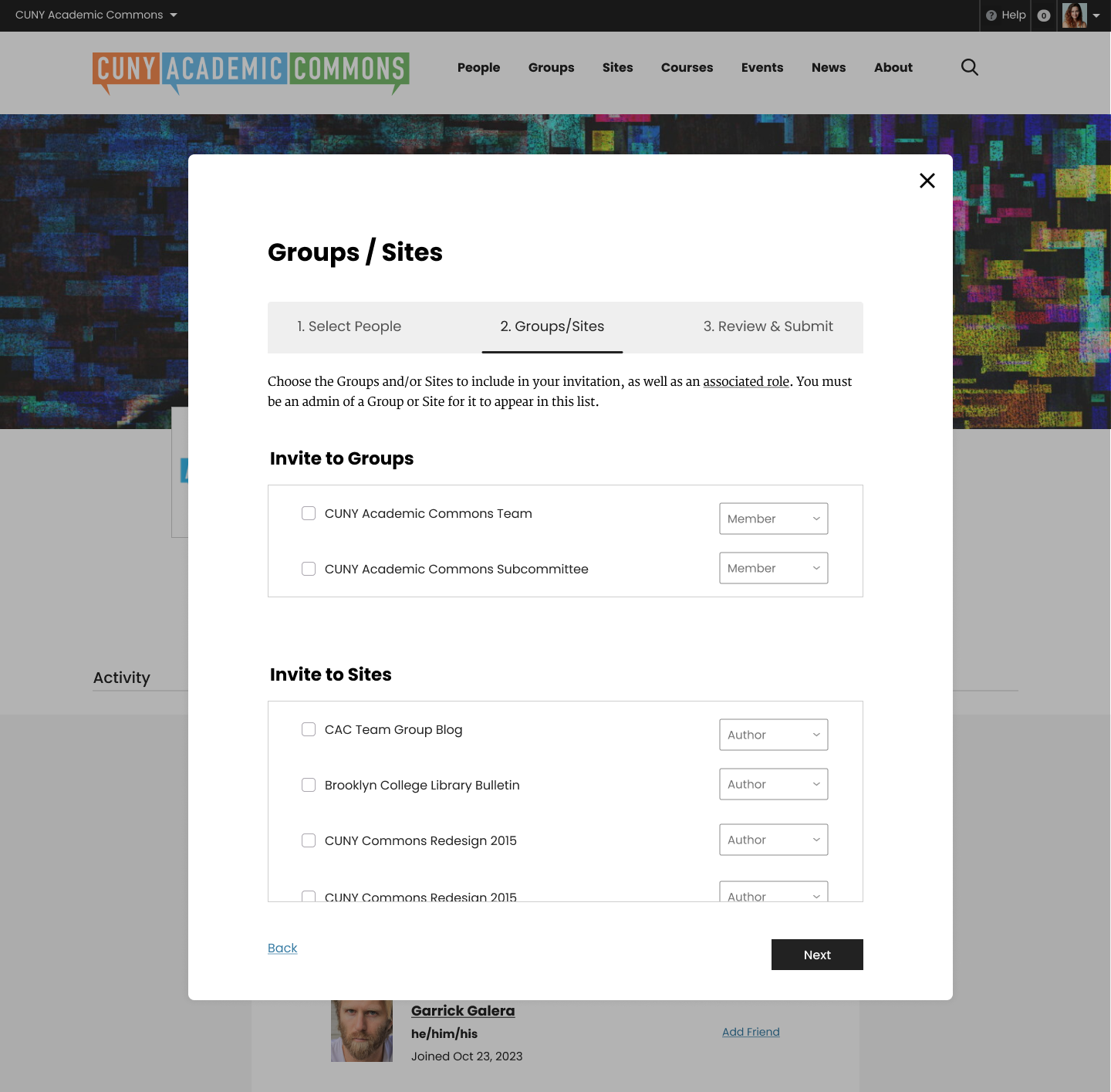
- File Invite Modal - Step 2.png Invite Modal - Step 2.png added
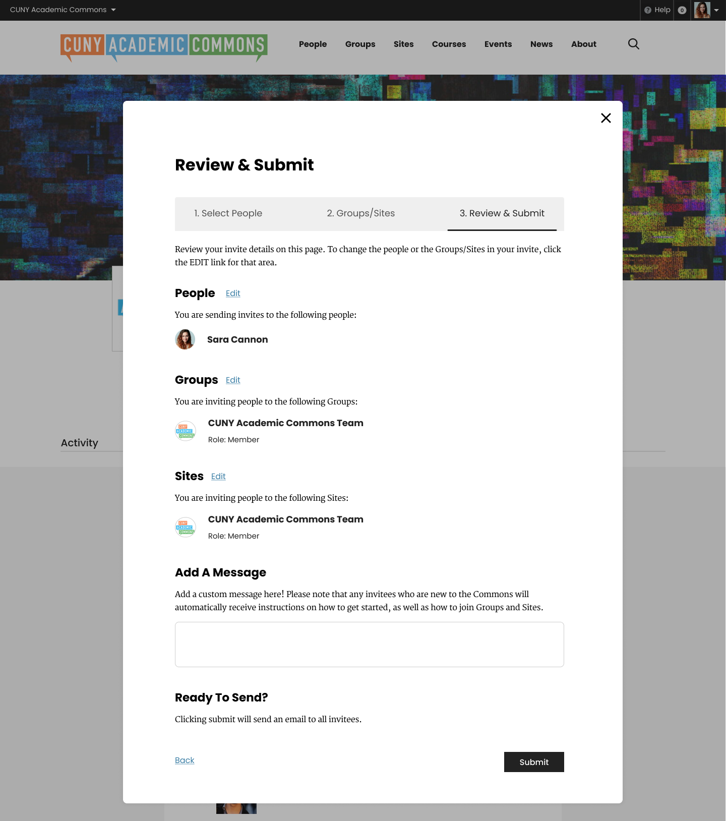
- File Invite Modal - Step 3.png Invite Modal - Step 3.png added
- File Invite Modal - Step 4.png Invite Modal - Step 4.png added
Invite Modal Comps
I added a fun success design. Thoughts?


Updated by Colin McDonald about 2 years ago
I took a stab at updating the copy for the model panels in this Google Doc. Feel free to jump in and suggest any changes. Otherwise, perhaps Sara you can add this text for your next round of revisions to this?
https://docs.google.com/document/d/1ZSnQ06va3yufy3H4Y9_RDY0BgjTBoK-5LKtP0egRmew/edit?usp=sharing
Regarding a checkbox to CC the person doing the inviting, given what Boone said above about the multiple invitations at play and needing to potentially send a CC for each individual invitation in order to enable this, I'm thinking it's more trouble than it's worth.
Updated by Sara Cannon about 2 years ago
- File Invite Modal - Step 1.png Invite Modal - Step 1.png added
- File Invite Modal - Step 2.png Invite Modal - Step 2.png added
- File Invite Modal - Step 3.png Invite Modal - Step 3.png added
- File Invite Modal - Step 4.png Invite Modal - Step 4.png added
Colin, Here are the modals where I've applied your changes in the doc you wrote


Updated by Colin McDonald about 2 years ago
Thanks Sara, looks great, and looking forward to going over this with the group tomorrow. A couple very small things I noticed, not necessary for tomorrow:
- Panel 2 title should be Groups/Sites, not Invite
- Remove the "Send me a copy" checkbox and text on Panel 3
- On Panel 4, should the two buttons/columns be centered? Alignment seems a little off to me, just a thought.
Updated by Sara Cannon about 2 years ago
- File Invite Modal - Step 1.png Invite Modal - Step 1.png added
- File Invite Modal - Step 2.png Invite Modal - Step 2.png added
- File Invite Modal - Step 3.png Invite Modal - Step 3.png added
- File Invite Modal - Step 4.png Invite Modal - Step 4.png added
Fixed! 


Updated by Sara Cannon about 2 years ago
- File Invite Modal - Step 1.png Invite Modal - Step 1.png added
- File Invite Modal - Step 2.png Invite Modal - Step 2.png added
- File Invite Modal - Step 3.png Invite Modal - Step 3.png added
- File Invite Modal - Step 4.png Invite Modal - Step 4.png added
- File Invite Modal - Step 6.png Invite Modal - Step 6.png added
- File Invite Modal - Step 7.png Invite Modal - Step 7.png added
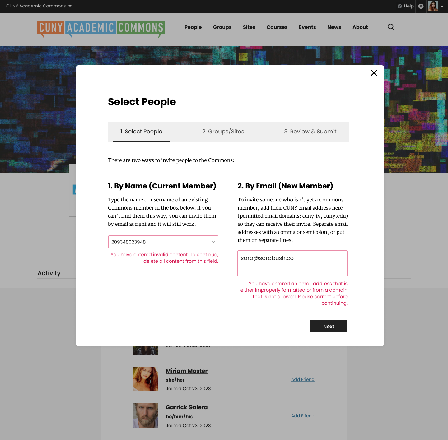
Here is the invite modal handoff for development (Desktop). I included the user drop-down and some error warnings.
Updated by Boone Gorges about 2 years ago
Sara, could you please give me a rendered version of the confetti graphic? In Figma it's cut into a bunch of pieces and I'm not sure the best way to flatten it.
Updated by Boone Gorges about 2 years ago
I've taken a first pass at the reskin of the invitation modal, but it doesn't look quite right yet on group pages. This is because the shared.css stylesheet isn't yet loaded there. I'm going to let Ray do his magic on the group pages before touching it.
In the meantime, you can test using the invitation modal on your own Invites page on cdev. I don't know how you get there through the interface (did we remove all links?) but you can visit directly: http://commons.gc.cuny.edu/members/[yourusername]/invites. Then click 'Invite Members'.
Sara, a few implementation notes and questions for you:
a. The comp shows a down arrow in the 'By Name' box. But this is not a select box, it's a type-ahead. So there's nothing that the down arrow could do. I've left it out.
b. I added a highlight/hover state for the 'By Name' selector dropdown. Actually, I just left in place what was already in the plugin :-D
c. The comp shows that only the outline of the By Email field is highlighted when there's an error. But this glosses over some of the fine-grained error-checking of the plugin. Namely, if you enter multiple email addresses, only some of which are invalid, then only the invalid ones are highlighted in red. As such, I've added the red border color, but left the red-text highlighting.
d. Seems like the aspect ratio of the 'Next' button is slightly different from other buttons in Commons interface. I have tried to match the comp, but I wanted to bring this up in case you wanted to cross-referenc.
e. The comp doesn't show a vertical scroll bar for group/sites lists on step 2, but it seems important, particularly on desktop. I've added it.
f. The comps for different pages differ somewhat regarding the space below the nav, as well as the space following the intro paragraph below the nav. I've adjusted them so that they're roughly the same.
g. I've left empty spaces on the Review panel when there's no avatar. This happens in the case of (most?) sites, as well as invites by email address.
h. I took some guesses about how mobile styling should work. Take particular notice of how I stacked the tab navigation.
i. We briefly discussed that the nav items should be clickable, this doesn't really make sense when you're moving in the forward direction. For example, you shouldn't be able to skip to step 3 when you haven't filled out step 1 or 2. As such, I've made previous steps only clickable in the nav tabs.
j. The confirmation screen doesn't have the confetti yet. I'll put this in place when I get the asset from you.
Updated by Sara Cannon about 2 years ago
- File confetti@2x.png confetti@2x.png added
Attached is the confetti Graphic
Updated by Boone Gorges about 2 years ago
Thanks, Sara! I've added the confetti image. I set it to background-size: cover, so it's not precisely positioned at all sizes, but I think it's legible as I resize the screen.
Updated by Sara Cannon about 2 years ago
This is looking great!
d. Seems like the aspect ratio of the 'Next' button is slightly different from other buttons in Commons interface. I have tried to match the comp, but I wanted to bring this up in case you wanted to cross-referenc. -- Interesting, I will take a look
g. I've left empty spaces on the Review panel when there's no avatar. This happens in the case of (most?) sites, as well as invites by email address. -- I'm not sure how I feel about this. Would we want to use default avatars?
h. I took some guesses about how mobile styling should work. Take particular notice of how I stacked the tab navigation. -- Looking great
Styling notes:
- The error text needs to be in the Poppins sans serif
- the "back" link needs to be the darker A11y friendly blue #367BA3 and underlined
Updated by Boone Gorges about 2 years ago
Thanks for having a look!
g. I've left empty spaces on the Review panel when there's no avatar. This happens in the case of (most?) sites, as well as invites by email address. -- I'm not sure how I feel about this. Would we want to use default avatars?
Yes, we can do that. I've made the change.
- The error text needs to be in the Poppins sans serif
- the "back" link needs to be the darker A11y friendly blue #367BA3 and underlined
I've made these changes too.
Updated by Colin McDonald about 2 years ago
- File small-field.png small-field.png added
This is looking good to me too, upon a brief review. One thing I noticed is that the field on the first screen to "Type user's name to invite" is pretty short. Perhaps it could be heightened to make it easier to click and to see what you're typing? Screenshot attached.
Updated by Boone Gorges about 2 years ago
Thanks, Colin. I'm not seeing what you're seeing. Are you sure you're accessing this via commons.gc.cuny.edu/members/[yourname]/invites? As noted above, the global styling is not yet available when testing from groups.
Updated by Colin McDonald about 2 years ago
My apologies, Boone. As you suspected, I missed that part about the proper link for testing. It looks fine to me at that link now. Do we need some sort of inventory of the various places one can access the invite modal, or will that take care of itself once we do the full rollout?
Updated by Boone Gorges about 2 years ago
Do we need some sort of inventory of the various places one can access the invite modal, or will that take care of itself once we do the full rollout?
The group interface should look fine once the groups inherit the redesign styling. But yes, it makes sense to do a quick check from the various interfaces. The plugin was intended to support several different launch points:
1. 'Send Invites' nav menu item when visiting a group
2. The 'Invite New Members' button on commons.gc.cuny.edu/members/[yourname]/invites
3. Users > Add New User when viewing the dashboard of a site
I'm not sure that 2 is accessible via navigation since the rework of our profiles.
Anyway, as we get closer, we should be sure to test that the modal can still be accessed and still looks right via all three of these paths.
Updated by Colin McDonald about 2 years ago
Thanks Boone, this sounds good to me, and I can make a note of it for testing.
Updated by Colin McDonald about 2 years ago
- Related to Feature #19592: Groups Page Re-Design added
Updated by Colin McDonald almost 2 years ago
In the Friday meeting, we decided it would be good if possible to add an "X" or close-out option at the top of the congratulations screen to close the modal and take you back to whatever page you were on when you opened it to send invites.
Updated by Sara Cannon almost 2 years ago
Bug: for some reason, when testing the invite modal, I encountered a Gravatar avatar for a group. I'm not sure where this is pulling from, but it should be a default avatar.
Updated by Boone Gorges almost 2 years ago
Good catch. This is being caused by the API returning URLs with HTML-encoded characters. When feeding them directly from the API response into the Vue.js component, they were being double-escaped. This bug has likely existed since the feature was introduced. Should be fixed in https://github.com/cuny-academic-commons/cac-onboarding/commit/02332b67c04d55ee7515559c8a87134db57b8ecc
Updated by Colin McDonald almost 2 years ago
I was testing Ray's updated site creation design in #20426, and the invite modal on the congrats screen at the end is the old version. Can we update this to match the new modal we've tied to the group invite flows?
Updated by Boone Gorges almost 2 years ago
I was testing Ray's updated site creation design in #20426, and the invite modal on the congrats screen at the end is the old version. Can we update this to match the new modal we've tied to the group invite flows?
Hm, I'm not able to reproduce this on cdev. The "old" version doesn't exist anywhere on cdev - the old styles have been replaced. Is there a chance your browser is caching something from the production site (which is, of course, running the "old" styles)?
Updated by Colin McDonald almost 2 years ago
Sorry about the false alarm here, please disregard. I just tried again and wasn't able to reproduce this, either. Not sure what I was doing before.
