Design/UX #21095
closed
Clarifying Group Menu and Submenu Items
Added by Zachary Muhlbauer over 1 year ago.
Updated 17 days ago.
Description
I’m having some difficulty distinguishing between parent menu items and the submenu items that unfold when I toggle “Manage” in a group where I'm admin. I'm starting to keep these options straight, but I'm not sure other group admins will understand the difference if they're just starting out.
For example, one "Settings" option refers me to email notification settings while the other opens group privacy settings (see attached). There also duplicates for "Forum" and "Events" that link out differently between the parent menu and Manage submenu.
Is there any way to clarify the navigation flow with group menu and submenu items?
Files
- Assignee set to Sara Cannon
- Target version set to 2.8.0
Hi Zach - Sorry that this ticket got lost in the shuffle. The "Settings" and "Manage" language is indeed a bit confusing, but basically it breaks down like this: "Manage" is configuration work you can do as the admin of a group, while "Settings" corresponds to group-related settings available to any member of the group. I'm assigning this ticket to Sara because I also find the nomenclature just a bit confusing, and I wonder if there's something we could do to improve it. This could be better wording ("Manage" feels just a bit opaque to me) or even something visual - like a padlock next to Manage, or perhaps a slightly different visual look (background color, etc) for items that are admin-only?
What if we changed the admin section to "Advanced" and it's settings to "admin settings"

Notes from our conversation on this in the dev call just now:
- Can we incorporate a visual element to delineate the admin-only area? How Github does it, an outline or color or icon
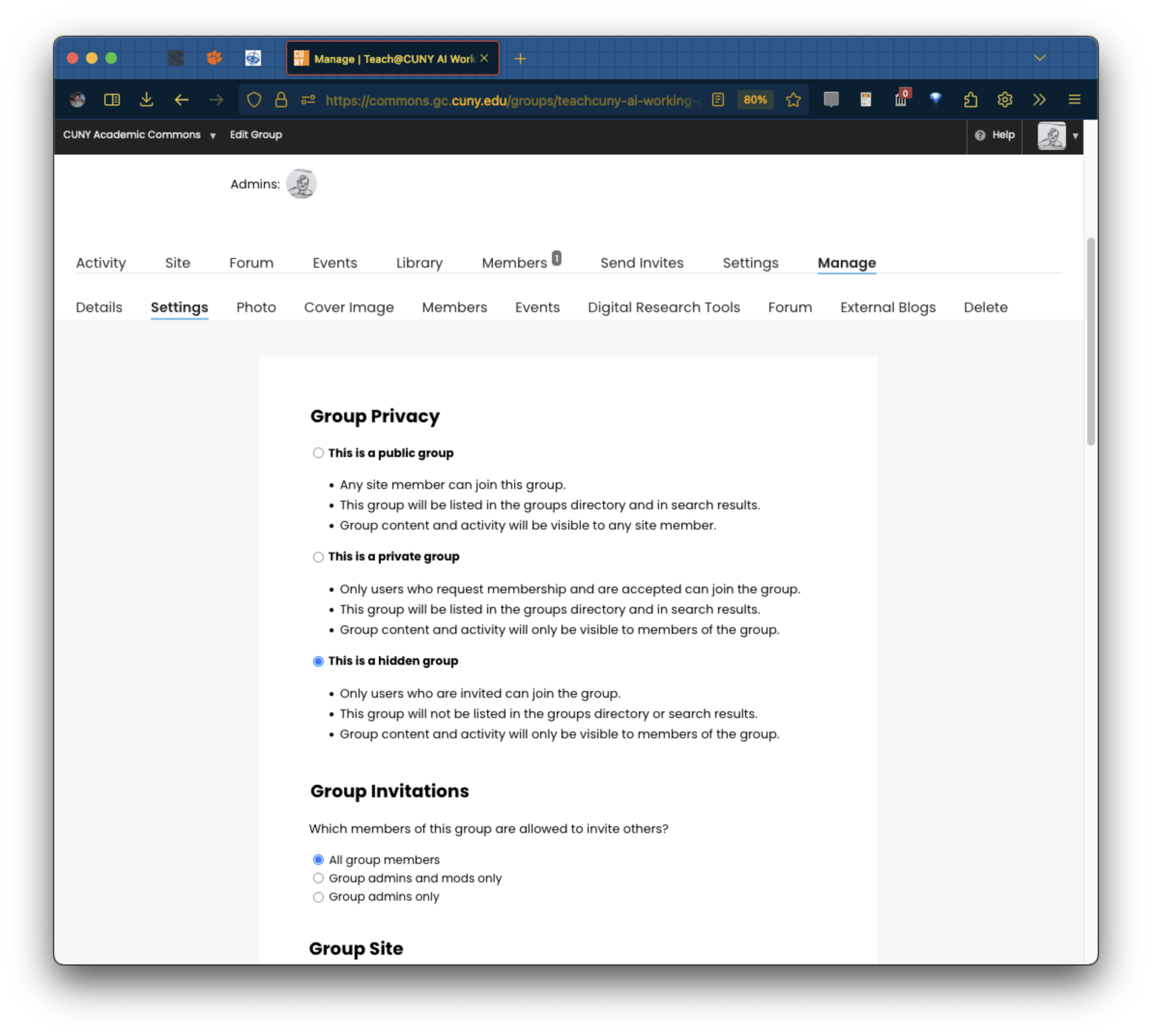
- For the wording, let's avoid repeating Settings. Maybe Settings stays in the top row, and then Manage is replaced by Admin or Admin-Only to be specific about what that area's for and to whom it appears.
- Could the lower-row Settings just become Manage, or more specifically is Privacy & Defaults too long? That actually describes what you can change in that area.
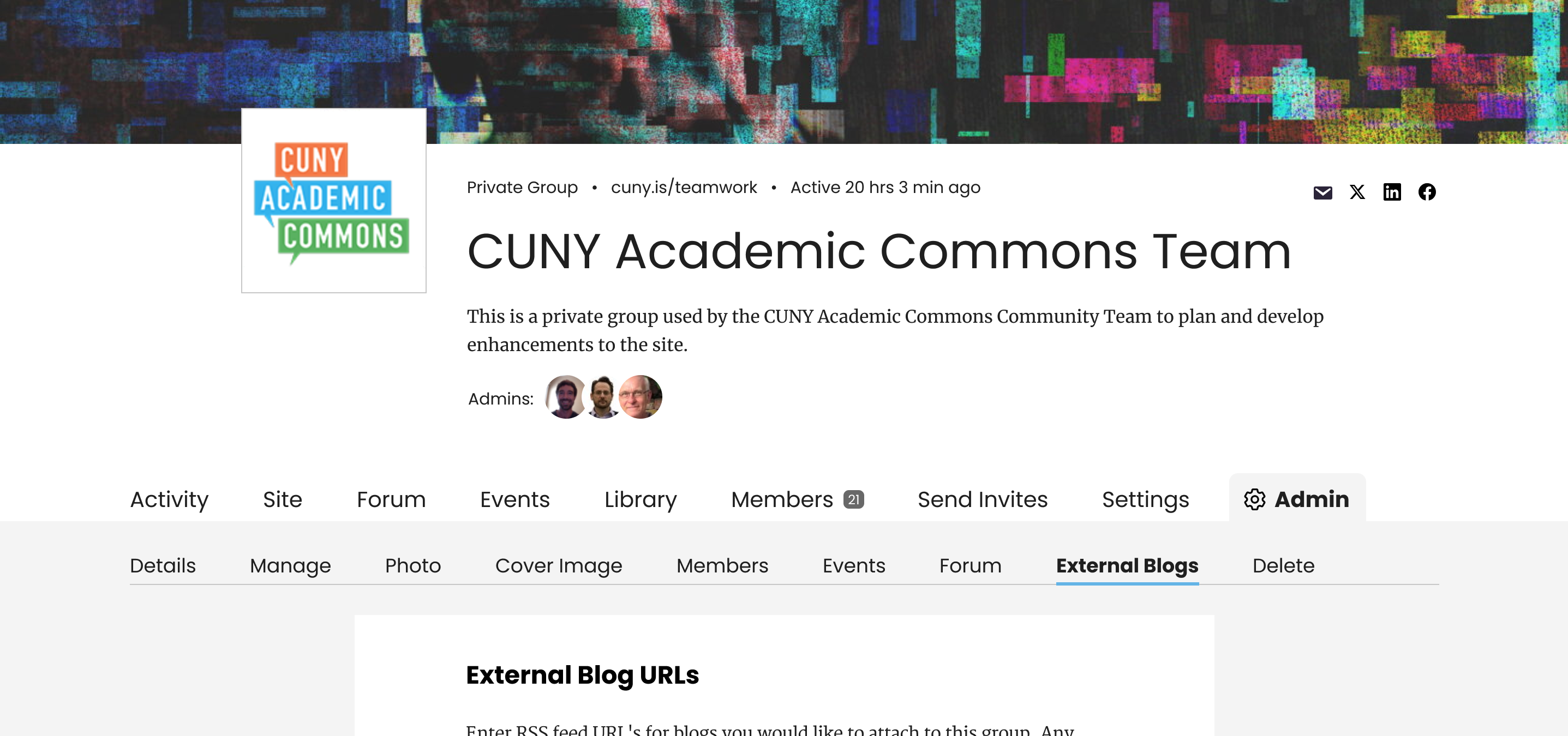
What about "Admin" with a gear icon and then "Manage"
I really like this, Sara. Curious to hear what Laurie and Zach have to say.
Nice catch on this, Zach. I do like Sara's proposed fix!
If we're ready to proceed, I have some code ready to roll out for the updated group admin menu tab and the renaming of the "Manage > Settings" tab to "Admin > Manage". See attached screenshot for the Admin tab with the gear icon.
I used a gear SVG that looks similar to the one from Sara's mockup, but Sara, if you can attach the gear SVG you used, that would be great.
- Status changed from New to Staged for Production Release
- Target version changed from 2.8.0 to 2.7.2
Looks great on dev Ray, thanks!
- Status changed from Staged for Production Release to Resolved
Also available in: Atom
PDF
.svg)