Feature #22069
closedGroups Submenu design
0%
Description
HI All,
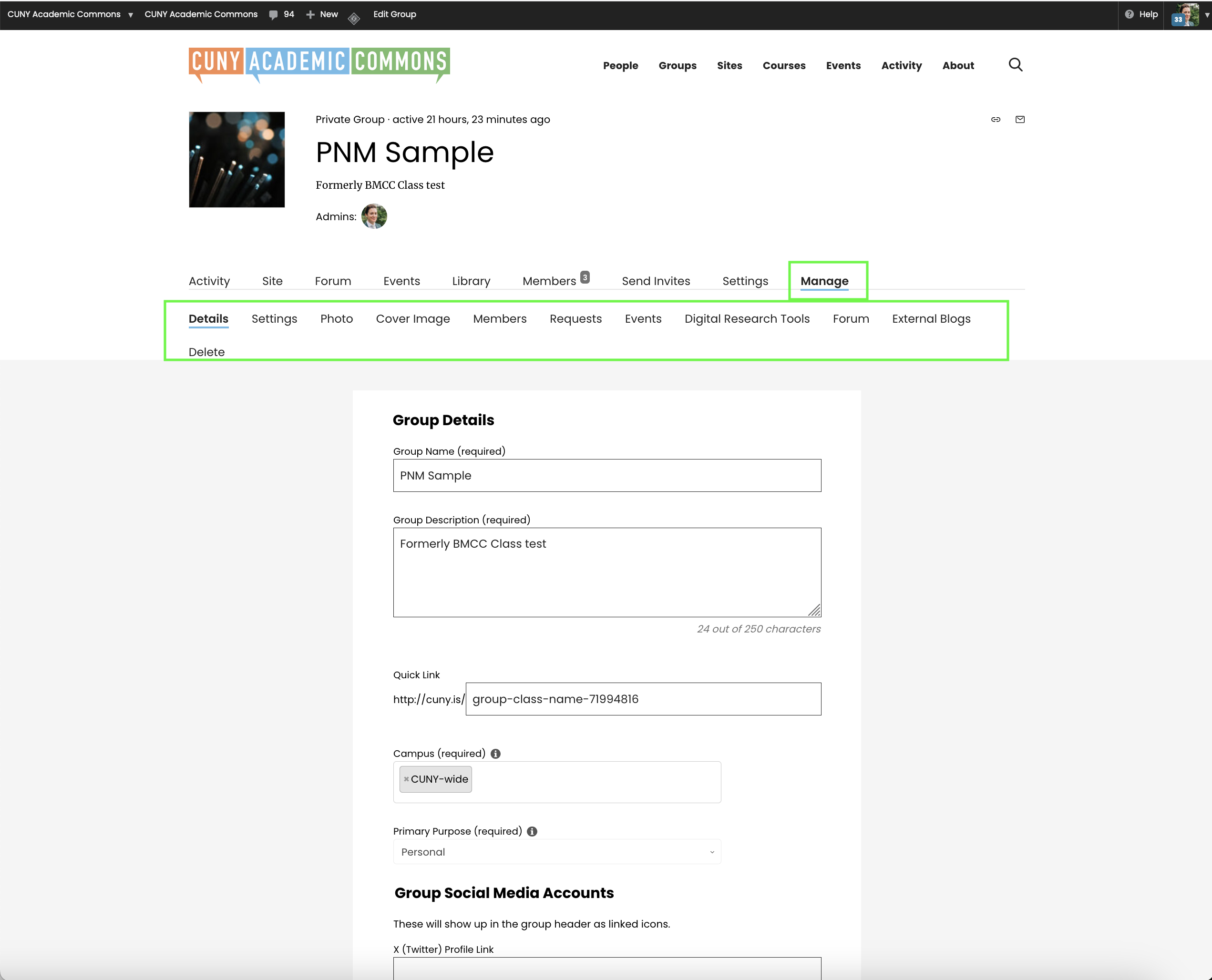
I have been working with several faculty over the last few weeks who are using groups to teach. For some reason, they have all been confused by the layout/design of the groups Manage sub-menu. I think the main point of confusion is that they don't understand that submenu (in green in screenshot) is essentially a drop down submenu of the manage option.
I am hoping we might talk through some design options to make this menu more visibly to the main nav menu in a group, maybe be using a gray background and gray "tab" background behind "manage" to connect the menus visually.
I would also like to suggest we remove "digital research tools" from the group "manage" menu. DRT are not widely used and, as far as i can tell, the DRT disable/enable option does not change anything about the group.
Files
Related issues
Updated by Laurie Hurson over 1 year ago
Updated by Colin McDonald over 1 year ago
Thanks Laurie, I am adding Sara as a watcher and adding this to our agenda for Friday.
Updated by Sara Cannon over 1 year ago
- File navigation-1.png navigation-1.png added
Thank you for surfacing this - I love actual user feedback so this is really important.

Here is an option - do you think something like this would address their concerns?
Updated by Raymond Hoh over 1 year ago
About the "Manage > Digital Research Tools" menu, we still have the Tapor Client plugin activated, which is why this menu item is showing up. Boone, do we still need this plugin activated? If so, I can write a code snippet to remove this menu item. If not, let's deactivate the Tapor Client plugin.
For the new styling for the Groups submenu, we would probably want to mirror the same change to the Users submenu too right?
Updated by Raymond Hoh over 1 year ago
- Related to Feature #17416: Sunsetting Digital Research Tools feature added
Updated by Raymond Hoh over 1 year ago
- File Group Tabs - Manage.png Group Tabs - Manage.png added
- File User Tabs - Account Settings.png User Tabs - Account Settings.png added
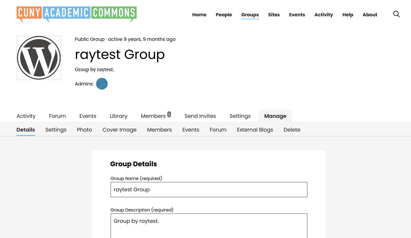
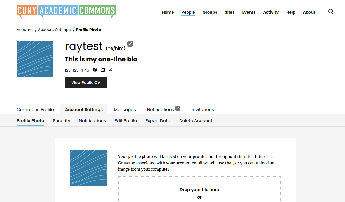
I've attached some in-progress screenshots of the revised tab design for both a group's Manage page and a user's Account Settings page.
Sara, I made one change to the design and that is to extend the line underneath the subnav to the entire page. I think this gives the layout a bit more of a delineation, but let me know what you think about this. I can revert back to the mockup if you think the floating line is better.
Updated by Raymond Hoh over 1 year ago
I've committed the new submenu design to a new Git branch: feature/22069-new-submenu. Once we have a dev site up-and-running, we can get the team to test out the change.
In the meantime, I've removed the "Manage > Digital Research Tools" tab from the group tabs in https://github.com/cuny-academic-commons/cac/commit/415b2fbf654fd719e96985e92b8a9830634901cc.
Updated by Boone Gorges over 1 year ago
- Target version set to 2.6.0
Thanks, Ray! Moving this into the next major release milestone, though the hidden 'Digital Research Tools' will be part of today's maintenance release.
Updated by Colin McDonald 12 months ago
- File manage-tab-stack.png manage-tab-stack.png added
Is this updated submenu design available to test on the dev site now? Bumping in particular because I noticed some strange formatting on the Manage tab just now (see attached) in an incognito window in Chrome.
Updated by Boone Gorges 12 months ago
I had to switch over the dev site to the 2.5.x branch to do some work with Reclaim regarding replication, so what you're seeing probably doesn't include Ray's changes. I can't make the switchover right at the moment - Ray, feel free to switch the branch if you'd like, otherwise I'll do it in about an hour when I can hop on the VPN.
Updated by Raymond Hoh 12 months ago
Is this updated submenu design available to test on the dev site now? Bumping in particular because I noticed some strange formatting on the Manage tab just now (see attached) in an incognito window in Chrome.
Are you seeing this display bug on production or on the dev site, Colin? I'm not seeing this on production.
On cdev, I've just merged the new submenu design into 2.6.x branch and is now available for testing. You might need to purge your browser cache to see the new changes. Let me know if anyone finds any display issues with the new design.
Updated by Colin McDonald 12 months ago
- File dev-tab-display.png dev-tab-display.png added
Thanks, Ray. I'm seeing this display bug on both dev and production, strangely, but the tabbed design change looks great to me otherwise on dev. I've attached a screenshot of what I saw on dev just now at this link:
https://cunyac.reclaimhosting.dev/groups/test-dev/admin/edit-details/
Sorry if I missed this, but is it expected that the dev site doesn't work in an incognito window/tab? I get a 403 error. Not a big deal, I can purge cache etc, but I sometimes go incognito as a fast proxy or to compare new and old.
Here are the production links where I see the display error:
https://commons.gc.cuny.edu/groups/teaching-courses-on-the-commons/admin/edit-details/
https://commons.gc.cuny.edu/groups/cac-community-team-project-planning/admin/edit-details/
Updated by Raymond Hoh 12 months ago
Updated by Colin McDonald 12 months ago
Thanks Ray, I just took another look and the workaround and submenu redesign both seem to be working well. I'll mention this in the community call on Friday for further testing, but especially given the issue on production, it seems to me we could push all of this sooner rather than later, whenever you think works best.
Any thoughts on why I'm getting a 403 error trying to go incognito on the dev site?
Updated by Raymond Hoh 12 months ago
I've just pushed a fix, which is part of a fix to address #22668 and #23101, that should also address the group "Manage" submenu display bug on production.
We can push the tabbed submenu change in the next maintenance release, if others are okay with that.
About:
Any thoughts on why I'm getting a 403 error trying to go incognito on the dev site?
Can you list some steps to duplicate the issue? On cdev, which URLs are you experiencing 403s with?
Updated by Colin McDonald 12 months ago
Thanks for that immediate fix Ray, and sounds good about the tabbed change. I'll get some more testing done on it. Sara, maybe you can take a look on dev?
You can disregard my thing about 403s in incognito. I think I was doing something silly before.
Updated by Raymond Hoh 12 months ago
- Category name set to Layout
- Assignee set to Raymond Hoh
- Target version changed from 2.6.0 to 2.5.14
I'm going to hold off on the tabbed submenu change until the next maintenance release on the 26th, just to get some eyes on it before we deploy it.
Updated by Colin McDonald 12 months ago
Thanks Ray, that sounds good. I spoke to Scott on our Friday call last week about testing this and reporting back to this ticket when he can. Adding him as a watcher here.
Updated by scott voth 12 months ago
- File 2025-08-14_12-34-49.pdf 2025-08-14_12-34-49.pdf added
I think the new design works well. When testing, I notice that on wide screens, the cover image doesn't stretch the full width. See attached.
Updated by Raymond Hoh 11 months ago
- Status changed from New to Staged for Production Release
Thanks for testing, Scott. I've added the submenu change to the next maintenance release in https://github.com/cuny-academic-commons/cac/commit/312e225a3871aeeab16c86ab6bee43b9a9d02e3f.
Regarding the group cover image:
When testing, I notice that on wide screens, the cover image doesn't stretch the full width. See attached.
We discussed various sizing options when implementing the group cover image in #20376 and ultimately landed with a fixed-width cover image. If we want to revisit this, let's open a new ticket to talk about it.
Updated by Boone Gorges 11 months ago
- Status changed from Staged for Production Release to Resolved