Feature #8897
closedRedesign Filter Interface
0%
Description
We currently have a People (members) filter interface (https://commons.gc.cuny.edu/members/). We may add similar filters to Groups and Sites as new features are added like categorizing them. The filters interface should be rethought and redesigned with these things in mind:
- creating a more generalized, reusable filter interface
- responsive UI (currently it's not great on small screens)
The process will most likely start with the UX team and general discussions.
Files
Related issues
Updated by Boone Gorges over 7 years ago
- Target version changed from 1.14 to 1.15
Updated by Boone Gorges over 7 years ago
- Related to Feature #1544: Group Filtering and Sorting added
Updated by Boone Gorges about 7 years ago
- Target version changed from 1.15 to 1.16
As we begin to have more info about sites and groups (like Primary Purpose; see #10987), it makes sense to think more generally about this.
Updated by Boone Gorges over 6 years ago
- Related to Feature #11298: Explore Ways to Make the "Courses" tab More Interesting added
Updated by Boone Gorges over 6 years ago
- Assignee changed from Chris Stein to Sonja Leix
Looks like our initial implementation may focus on Courses filters. See #11298.
Updated by Boone Gorges over 6 years ago
- Related to Design/UX #11395: Design consistent directory filter UI pattern added
Updated by Sonja Leix over 6 years ago
- File 8897-courses-filtering-v10A.pdf 8897-courses-filtering-v10A.pdf added
- File 8897-courses-filtering-v10B.pdf 8897-courses-filtering-v10B.pdf added
- File 8897-courses-filtering-v10C.pdf 8897-courses-filtering-v10C.pdf added
Matt and Colin,
Continuing work on just the search/filter interface of the Courses tab here, since #11298 is approved. But for seeing discussions around this element, please see the other ticket (#11298).
Attached are the three versions we discussed earlier:
A: Iteration of v9 > adding arrows to filter dropdowns to indicate interaction
B: Iteratioin of A > adding arrows to filter dropdowns to indicate interaction and distinguishing dropdowns visually more from the search field by adding a different background color
C: Is in essence the search/filter interface of v7 and updating the rest of the design to v9
Please review internally and share feedback and pick a direction ASAP.
Boone, let us know if you have a final design approval deadline in mind. Thanks.
Updated by Matt Gold over 6 years ago
Hi Sonja,
Thanks so much for your work on this. V10B ( https://redmine.gc.cuny.edu/attachments/download/12685/8897-courses-filtering-v10B.pdf ) resolves most of my concerns while keeping the menu all on the same line. I will still check in with a few people on this, but I think this can work, as it is much more clear visually. Thank you for your work on this.
Updated by Colin McDonald over 6 years ago
This one's for Boone or Ray, I think -- looking at Sonja's new A/B/C options, the question arose about whether a keyword search for a professor's name will surface courses taught by that professor in the results. I think we discussed this before, but I wanted to confirm how this would work. We do have that Instructor field on the current Courses page -- will that be indexed for the new search?
Updated by Boone Gorges over 6 years ago
v10B addresses my concerns too. Thanks for bearing with us, Sonja.
Colin - this has not been specified, but yes, I think it makes sense for search to match the following fields: group name, site name, instructor name. "College" is a question mark - feels redundant since it's a filter. But it doesn't make a huge technical difference.
Updated by Boone Gorges over 6 years ago
- Target version changed from 1.16 to 1.17.0
I'm going to bump this ticket to the next release, so that we can consider whether the UI used for the new filters in the Courses directory can/should also be extended to Sites, Groups, and Members directories.
Updated by Sonja Leix over 6 years ago
Boone Gorges wrote:
I'm going to bump this ticket to the next release, so that we can consider whether the UI used for the new filters in the Courses directory can/should also be extended to Sites, Groups, and Members directories.
Thanks Boone. It will be good to gather some data and user feedback once released for courses to make sure it's solid before we consider extending it to Sites, Groups and Members directories.
Updated by Boone Gorges almost 6 years ago
- Target version changed from 1.17.0 to 1.18.0
Updated by Colin McDonald almost 6 years ago
Hello, resurfacing this ticket, perhaps to Sonja at first to see what she thinks now about extending the Courses filtering interface work to other areas, namely the tabs for Groups, Sites, and People (which is the only other tab with any filtering right now, just in the sidebar).
The Courses interface is much more slick of course, but we'd have to think about how to adapt it given those other tabs wouldn't have dropdowns for Semester or Cluster but probably could for Keyword and Campus. And People has the "Role" data that could be used -- are there others for Sites and Groups that could be swapped in?
Updated by Sonja Leix over 5 years ago
Hi team,
I took at stab at this aligning with the UI patterns around search and filters established for the Courses tab. Please review the attached wireframes and share your feedback. Thanks.
Updated by Matt Gold over 5 years ago
Thanks, Sonja. I think it's looking good. I do think there are a lot of options there. Is there any thing we can simplify? One thought that occurs to me is whether the "Order by" option, which currently appears in its own line, might be integrated into the pagination options below -- but maybe that's a bad idea.
Updated by Sonja Leix over 5 years ago
Matt Gold wrote:
Thanks, Sonja. I think it's looking good. I do think there are a lot of options there. Is there any thing we can simplify? One thought that occurs to me is whether the "Order by" option, which currently appears in its own line, might be integrated into the pagination options below -- but maybe that's a bad idea.
Hi Matt, I see what you're saying. We have a lot of options on these types of pages. Would you be open to only have the numbered navigation at the bottom of the page, so we have space to move the "order by" dropdown in its place at the top?
Boone might have some opinions about this, but I think it's too much to squeeze the three items (directory pagination message "Viewing 1 - 20 of 1,372 groups", the pagination AND the order by dropdown) all in one line. That also gets tricky on smaller devices then too.
Updated by Boone Gorges over 5 years ago
I agree it's too much, and I think it's a good idea to convert pagination to bottom-only.
Updated by Colin McDonald over 5 years ago
This is looking good to me as well, Sonja. I'm all for the simplification of pages at the bottom. I wonder whether we need that full line "Viewing 1 - 20 of 1,372 groups" at the top. the "1,372" or whatever results number is already there in the filter buttons at the top, and the less important 1-20 viewing range can be communicated next to the pages lower down. So perhaps we focus on fitting Order By as smoothly as we can at the top, and the rest goes to the bottom.
Should we also talk about adding Campus and Purpose filter drop-downs for the Sites and Groups pages? We ask for that metadata now in the new creation flow for both. I'm not sure if it's an issue that you could select Teaching purpose in the Sites search filter, and then you'd basically be searching Courses, in which case you might as well be on the Courses tab where you'd have more filter options (semester, etc). Perhaps we could tooltip or note that.
Updated by Sonja Leix over 5 years ago
Talked about "Academic Interest" on the People page on today's dev call.
The interests are a way to find people by interest that is otherwise hard to distill. We'll need to explore how we can possibly better elevate these terms within the search (let's discuss more here), but we'll also explore how we can add this filter option within the new filter UI.
Updated by Sonja Leix over 5 years ago
I thought I've posted these updates already, but here they are.
I've explored adding an "Academic Interest" field both inline and hidden within an "Advanced" option and frankly it's confusing. I'd like for us to seriously consider how we can write these search terms into the general search algorithm to surface results by those terms. I'd love to hear Boone's further thoughts on this.
Please share your feedback on the updated/condensed designs attached (doesn't include "academic interest" option).
Updated by Boone Gorges over 5 years ago
I like the simplicity of removing the standalone 'academic interest' UI. From a technical point of view, it's easy to include Academic Interests in a general 'keyword' search. The main question is how to ensure that search-result ordering works in a way that makes sense for most use cases. Say you have the following users:
1. One named Karen English
2. One who has listed '19th century English poetry' in the Academic Interests field
3. One who is an Assistant Professor in an English department
When searching for 'English', what would you expect to find? Presumably (a) all of these would appear in the list. And I would suggest that (b) they should appear in the 1-2-3 order suggested here. That is, 'name' is the most salient field, and Academic Interests is perhaps next, followed by others. It may be helpful to look at all the fields that users can currently fill in and decide, first, which of it should not be matched by keyword search at all (like a personal website URL, probably), and second, of those items that should be matched, how we weight the results.
Related, we should probably ensure that any fields matched by keyword searches (or other filters) are listed on the search results page. If I search 'English' and match user 2 above, the user's Academic Interests - or a sufficient portion thereof - ought to appear on the search results page, so that I know why there was a match. This is already the case with Academic Interests, but perhaps not as clearly in the case of Role and Campus.
Updated by Colin McDonald over 5 years ago
Thanks for this new version, Sonja. I think that moving the "Create" buttons for Groups and Sites to the top and the page numbers to the bottom has decluttered things a lot.
Did we talk about putting Campus and Purpose filters in the top bars for Groups and Sites, since we've been collecting that metadata? Perhaps those would just fit in there, maybe if the search keyword bar was a little less wide?
I agree about removing the separate Academic Interests search and focusing on the universal search and how to prioritize terms in different areas. Boone's hierarchy seems about right to me. I tried to compile the different relevant fields we might want to allow for searching. I wonder if we might give weight to the first two, Descriptor and About, because they're more prominent in the interface and more likely to be filled out. The other fields seem roughly equal.
I definitely agree too that search results should surface a keyword you've searched, and perhaps highlight or bold it, in the excerpt for each individual result item. Here are the terms we have, other than Campus and Role, which I assume we'll keep separate from the keyword search:
Brief Descriptor
About You
(One issue with these two fields is that you can specify who sees them -- Everyone, Only Me, All Members, My Friends. Perhaps search only crawls them if it's set to Everyone?)
Free Entry
Academic Interests
Education
Publications
Positions
(These don't seem to have a privacy toggle)
Updated by Sonja Leix over 5 years ago
Thanks Boone, I agree with all your suggestions and course of action in regards to determining the search algorithm rules.
Related, we should probably ensure that any fields matched by keyword searches (or other filters) are listed on the search results page. If I search 'English' and match user 2 above, the user's Academic Interests - or a sufficient portion thereof - ought to appear on the search results page, so that I know why there was a match. This is already the case with Academic Interests, but perhaps not as clearly in the case of Role and Campus.
And you're absolutely right, we should surface that information in the results so the user understands how the result relates to their search terms/options. For this it would be good to understand which information we surface by default and if it differs from what we might surface conditionally based on terms. Let's discuss during our call today.
In response to Colin:
Did we talk about putting Campus and Purpose filters in the top bars for Groups and Sites, since we've been collecting that metadata? Perhaps those would just fit in there, maybe if the search keyword bar was a little less wide?
Yes, I can add those to Groups and Sites.
Updated by Sonja Leix over 5 years ago
I've added the Campus and Purpose selectors for Groups and Sites.
If you could share some direction around what content might be missing for the search results before EOD tomorrow, I can update the mockups once more before the Friday meeting.
Updated by Colin McDonald over 5 years ago
Sonja, the latest mockup for this went over very well in the Friday meeting. I have no change/improvement feedback to pass along. Let's finalize with Boone the hierarchy and handling (including excerpt/highlighting of search terms) of search results, and we should be able to finalize from there.
Updated by Boone Gorges over 5 years ago
As Colin notes, there's a couple of issues regarding search (field priority in determining the order of results, and the surfacing of matched fields in the directory) that need clarifying. The two issues are somewhat interlinked and it may be helpful for me to give a brief overview of how things currently work.
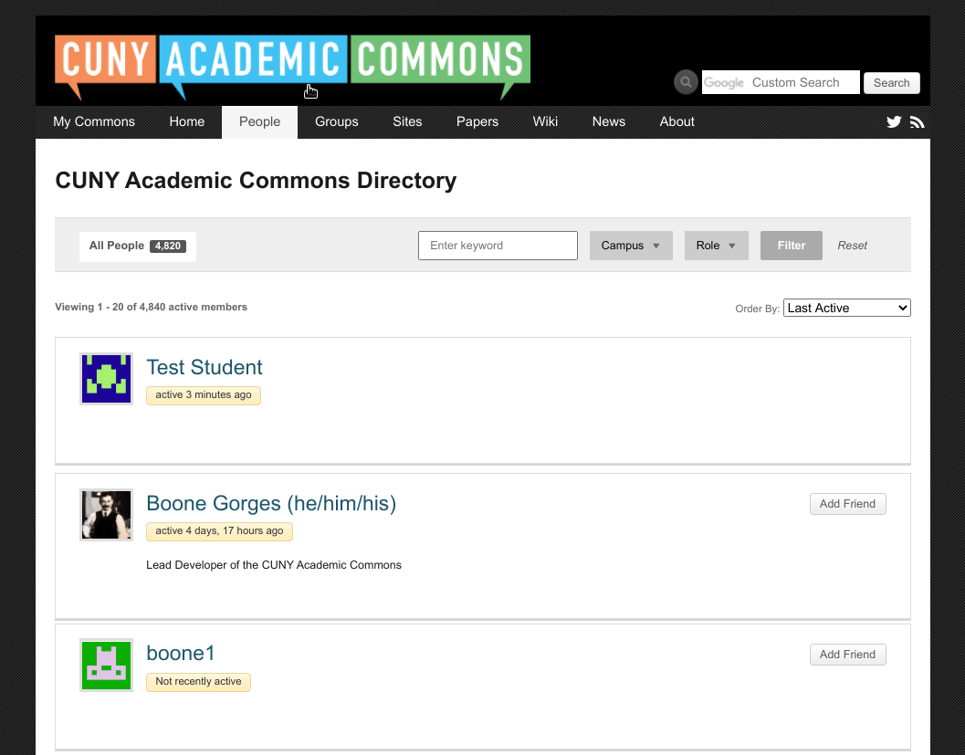
When you search the Members directory (search field at top left) - let's use 'English' as an example keyword - the following fields are matched: user_login, user_nicename, any xProfile fields. On the Commons, there are many xProfile fields:
| Full Name                |
| College                  |
| Title                    |
| Academic Interests       |
| Email Address            |
| Phone                    |
| Skype ID                 |
| IM                       |
| Website                  |
| Blog                     |
| Twitter                  |
| Delicious ID             |
| Facebook Profile Link    |
| YouTube ID               |
| Flickr ID                |
| LinkedIn Profile Link    |
| Role                     |
| academia.edu Profile URL |
| Brief Descriptor         |
| About You                |
| Publications             |
| Education                |
| Github                   |
| Vimeo                    |
| ORCID ID                 |
| Google Scholar           |
Query results are then displayed in the directory with the following fields: Display name, last activity update (if available), Positions (if available; otherwise College and Title are shown), Academic Interests. See screenshot.
There are a couple of oddities in this setup, some of which we may decide to fix as part of this ticket:
a. Search matches all of the listed xProfile fields, some of which may not be appropriate to search. For example, what's the benefit of matching the academia.edu profile URL?
b. Search matches all xProfile fields, regardless of their visibility status (Logged-in users, Friends, etc). This is a longstanding BuddyPress issue that is hard to work around and probably is not solvable for this release, but it may be worth investing time into down the road https://buddypress.trac.wordpress.org/ticket/6211
c. We match all of the fields above, but we don't show all of them in search results, so there are cases where you don't know why a field was returned.
Sonja had some ideas about how to approach c, and it sounds like she was going to incorporate them into the next set of designs. As for a: Since we have to do some work to set field priority anyway, I'd suggest we take the opportunity to stop matching all fields. Specifically, I think that keyword searches should match the following fields, in roughly the following order of priority:
1. Full Name
2. Brief Descriptor + About You
3. Academic Interests
4. College, Title, Positions
5. Publications, Education
All other fields would not be matched by keyword searches.
Updated by Colin McDonald over 5 years ago
Stopping the matching of all fields sounds right to me. I pasted all of the xProfile fields into a text doc and eliminated the ones that seemed extraneous to me for searching, and I got the same final list as Boone. I think it would be great to move ahead with that, for the multiple reasons mentioned on efficiency and relevance, with Sonja's revised design direction.
Updated by Sonja Leix over 5 years ago
Thanks Boone and Colin,
I agree with this approach for a.
For c, I've been working on new wireframes which now indicate when there is a match in a field that isn't displayed in the search results. To make it easier to spot, I've added a pink dot to the left of those search results on the pages that have search results based on a search term – in the mockups I've used the search term "English". We could also bold the related search term in the text that is displayed in the search result, see page 2 for an example of that.
If there's any type of content we're missing within the search result item display, please let me know and we can add it in there. Alternatively to naming e.g. "Contains: English in Publications" we could also list the publications (or the relevant content) for those results – this might mean the search results items could get quite lengthy though.
I decided against using the "expand" feature we established for the new Groups Library. The reason for that is, that it doesn't make sense to only collapse the relevant search info since it's inconsistent in its display. There is certainly an option to collapse all info besides the most relevant info (e.g. group/site title or person's name, and activity status as well as the primary CTA button).
Looking forward to your thoughts and feedback!
Updated by Boone Gorges over 5 years ago
I think that the "Contains [keyword] in [field]" is a pretty good convention - it's succinct and clear.
Updated by Colin McDonald over 5 years ago
Thanks for this, Sonja. I agree with Boone that the "Contains" convention is good, but I had a couple of followup questions.
What happens when searching multiple words in the keyword box? Does that convention get complicated? I'm not sure about our standard Boolean search parameters. So if I search 'english 101 mcdonald' will the results run through the "Contains" convention for each of those three words? Maybe prioritize results that have the most instances of those words, especially in combination? If I put "english 101" in quotes to define that phrase that would change things too, right?
Also, what are we showing by default in search results, and what are we showing when you search a keyword(s)? Are we always showing the group/site/person Name and "Brief Descriptor + About You" if they exist? Then we'll bold any keywords that appear in those two parts, and for other fields, show the bolded term in the Contains convention? I agree with avoiding the extra expand/collapse functionality if we can show enough clearly by default.
Updated by Boone Gorges over 5 years ago
So if I search 'english 101 mcdonald' will the results run through the "Contains" convention for each of those three words? Maybe prioritize results that have the most instances of those words, especially in combination? If I put "english 101" in quotes to define that phrase that would change things too, right?
We currently don't really do any of this. Results are ordered by "recently active" in pretty much all cases. I can introduce support for quoted phrases ("english 101"), and I can do weighting for certain fields, but it's beyond our resources to do a more robust "order by relevance" tool like you'd find in a full-fledged search engine.
Also, what are we showing by default in search results, and what are we showing when you search a keyword(s)? Are we always showing the group/site/person Name and "Brief Descriptor + About You" if they exist? Then we'll bold any keywords that appear in those two parts, and for other fields, show the bolded term in the Contains convention? I agree with avoiding the extra expand/collapse functionality if we can show enough clearly by default.
Yes, I think this needs to be defined. Name + Brief Descriptor seems OK to me, though Brief Descriptor doesn't seem to be shown currently. "About You" is likely too long to put on the results page and should be treated like the other "contains" fields.
Updated by Sonja Leix over 5 years ago
As discussed during the meeting yesterday, we need to define which fields/content we'll surface for search results for each of the content types "groups, sites, people" (and I'd argue we should replicate this in the list view) and in addition, which fields we'd like to show conditionally if it matches the search terms.
Here are my suggestions for each:
Groups
Always show: Title, description (currently truncated at 212 characters ?), activity, action buttons, meta data (public/private, number of members)
Conditionally show: quick link
Sites
Always show: Site title, activity, action buttons, latest post
Conditionally show: site tagline
People
Always show: Name, brief descriptor, college, position (truncate), activity, action buttons
Conditionally show: about you (truncate), update(s) (i found an example where this was displayed in a search result), quick link
Boone, if you could correct any of the names of these fields for me to make sure we're displayed the correct ones on a technical level. And please indicate if there are reasonable character limits or where you would recommend we truncate it. Let's agree on a character limit.
Once we've agreed on those I can update the mockups if needed.
Updated by Boone Gorges over 5 years ago
Sonja, thank you so much for spelling this out in such precise detail.
~200 character limit seems reasonable for most of these (with the caveat that I will try to break only on word endings). In the case where we're matching a term in a conditional field that is then truncated - such as 'About You' - presumably we would truncate the beginning and the end of the field value, so that the matched term appears in the excerpt. Does that seem right to you? If so, let's be sure to include an instance of this in the mockups. (might look like "About You: [...] lorem ipsum [...]")
You've listed 'quick link' as a conditional field, which suggests that we should show 'quick link' only if it's matched by a keyword search. But should we really be matching quick link in search? This doesn't seem like the kind of thing that anyone would search for.
Regarding People > Update: The idea behind this feature is to show the latest update from a given user, kinda like "latest status" or whatever like Facebook used to have (maybe still does? I'm not sure). IMO this suggests that it's not great as a conditional field. For one thing, I think it should not be matched by keyword searches - it's not relevant to searching for people, and it's potentially too noisy. I think we should either show it whenever it's available, or never show it at all. I lean toward never showing it at all, but this would probably also mean removing the 'What's up, [username]' field from the top of member profile > Commons Profile > Activity.
Updated by Sonja Leix over 5 years ago
Boone Gorges wrote:
Sonja, thank you so much for spelling this out in such precise detail.
~200 character limit seems reasonable for most of these (with the caveat that I will try to break only on word endings). In the case where we're matching a term in a conditional field that is then truncated - such as 'About You' - presumably we would truncate the beginning and the end of the field value, so that the matched term appears in the excerpt. Does that seem right to you? If so, let's be sure to include an instance of this in the mockups. (might look like "About You: [...] lorem ipsum [...]")
Yes, that sounds good to me. Once I hear from Colin or someone else on the team, I can update the mockups.
You've listed 'quick link' as a conditional field, which suggests that we should show 'quick link' only if it's matched by a keyword search. But should we really be matching quick link in search? This doesn't seem like the kind of thing that anyone would search for.
Quicklinks were just a suggestion, they might not make a ton of sense.
Regarding People > Update: The idea behind this feature is to show the latest update from a given user, kinda like "latest status" or whatever like Facebook used to have (maybe still does? I'm not sure). IMO this suggests that it's not great as a conditional field. For one thing, I think it should not be matched by keyword searches - it's not relevant to searching for people, and it's potentially too noisy. I think we should either show it whenever it's available, or never show it at all. I lean toward never showing it at all, but this would probably also mean removing the 'What's up, [username]' field from the top of member profile > Commons Profile > Activity.
Thanks for this reflection. I agree it probably doesn't make sense to include this in the search term matching. I only included it in the list because I saw it on a search result and had to investigate where the copy came from (see screenshot). Happy to not show it at all if the team agrees.
Updated by Colin McDonald over 5 years ago
This all sounds good to me, on both the search term matching and what we'll be showing. I'd say go ahead and update the mockups Sonja, and then we can get moving on the development.
Updated by Sonja Leix over 5 years ago
Colin McDonald wrote:
This all sounds good to me, on both the search term matching and what we'll be showing. I'd say go ahead and update the mockups Sonja, and then we can get moving on the development.
Thanks Colin,
As discuss today during our call, attached is the updated mockup. Based on Boone's feedback, there was only one small update to be made on the last page, where I've included an instance of showing a search result based on the term being in the About Me section. There you can see the example of the term being in the middle of it and the content being truncated at the beginning and end to show the term: [...] lipsum English dolor [...]
Please let me know if there are any other revisions that need to be implemented. Thanks.
Updated by Colin McDonald over 5 years ago
Thanks, Sonja. This is looking ok to me. Boone, let us know what you think.
Updated by Boone Gorges over 5 years ago
- Assignee changed from Sonja Leix to Boone Gorges
Thanks! I think this should be enough to get started.
Updated by Boone Gorges over 5 years ago
Hi all - I've made a first pass at implementing these features.
The Groups and Sites directory front-end changes were fairly straightforward. I had to do some icky things to add meta_query support to blog queries, and I'll advocate for upstream improvements in BuddyPress that allow us to pull out this ickiness int he future.
The Members directory rewrite was much more extensive and required some mods from the behavior discussed above.
Fields displayed for each member
In https://redmine.gc.cuny.edu/issues/8897#note-34 and the follow-up comments, we talked about some user fields that should always show, and others that should show only when matched by a keyword search. As I built using a subset of actual user data, though, I ran into some issues.
Brief Descriptor and Positions: We discussed always showing Brief Descriptor, which we don't currently do on the Commons. I really like this idea, because it's a field that the user has direct control over. IMO it's the best single piece of info we've got to display in directories, where you want an at-a-glance sense of what a given user is all about. However, in the vast majority of cases, the Brief Descriptor is at least partly redundant with Positions. (Often it's pretty much exactly the same thing.) So, IMO, it doesn't make sense to show Positions if we're showing Brief Descriptor.
For related reasons, I'm not showing College, which is almost always redundant with Brief Descriptor.
Keyword behavior
We discussed several different improvements to the behavior of keyword searches:
1. Search results should be ordered by relevance, which is to say that (for example) a 'Name' match should appear higher in results than an 'Academic Interests' match.
2. Keyword parsing should be smarter. Instead of treating keywords like a single, quoted phrase, a search like Matthew Gold should return results that match both Matthew and Gold, but not necessarily together; you would add quotes to narrow down to exact matches. We would also add some basic support for stopwords (ignoring 'a', 'the', etc) and basic boolean logic ('AND', 'OR', etc).
It turns out that it's not feasible to do both of these things at the same time without the use of an external search appliance. As such, I'm dropping item 2 and going only with 1.
Relevance sorting, which I'm calling 'Best Match' in the user-facing interface, introduces a couple of UX problems. Our default sort options are 'Last Active', 'Alphabetical', 'Newest Registered'. When searching, most users will presumably want to see results sorted by relevance, but we don't want them to lose access to the other sorts. At the same time, simply adding 'Best Match' to the list doesn't make any sense in contexts when you're not searching by keyword. So I've done the following:
a. When you begin a keyword search - ie, when you're moving from a view of the directory that does not include a keyword filter (like the default view, or when you're filtering only by Campus) to one that does include a keyword filter - Best Match will appear in the 'Order by' dropdown after the page refreshes, and it is selected by default.
b. Users can then select a different option from 'Order By'. All existing filters (keyword and otherwise) will be maintained after this re-sort.
c. As described in the designs, if the keyword search matches a profile field other than 'Name' or 'Brief Descriptor', those fields will be shown in the results. In these cases, the keyword is in boldface text. Text is excerpted as necessary.
d. It added a great deal of technical complexity to match Positions by keyword. As described above, Positions is almost always redundant with other fields: the 'College' filter does match Positions, and keywords do match 'Brief Descriptor'. For these reasons, I chose not to match Positions with keyword. I don't think this takes away from the usefulness of keyword search, for the reasons given here.
The changes will be up on cdev momentarily for testing.
Updated by Sonja Leix over 5 years ago
Attached is the mobile design for the filter interface. It should be consistent in styles with the mobile experience on the Courses page.
Updated by Boone Gorges over 5 years ago
- Status changed from New to Testing Required
Thanks, Sonja. I've implemented the mobile designs. https://github.com/cuny-academic-commons/cac/commit/d47d4d0335c2833114283e620076470bcea4fe2d
Updated by Boone Gorges over 5 years ago
- Status changed from Testing Required to Resolved