Bug #15147
closed
Homepage Launch Design Tweaks
Added by Sara Cannon over 4 years ago.
Updated over 4 years ago.
Description
Logged In Homepage:
- Under Groups, when the title gets to be two lines the title/time does not align to the top of the thumbnail https://share.getcloudapp.com/9ZuDWrEP
- Same with sites https://share.getcloudapp.com/6quED72y
- Members section: section title and "discover more members" - not centered in the background. The background seems thicker than groups and sites https://share.getcloudapp.com/rRuNnX7O
- Members section: the names on the "From your campus" side need to be aligned https://share.getcloudapp.com/7KuqxgPQ (looks great on the logged out)
- When I load the page, the campus groups and sites seem to be "lazy" in their loading ... they need me to scroll to load it seems. Could they load on pageload?
Logged Out:
- active groups have the same alignment issue for 2 lines as above
Mobile:
- when you get to the scrolling sections, the next item should go to the edge of the screen:https://share.getcloudapp.com/WnuqA4k8
Files
Thanks for jumping in on these, Ray.
If we remove the right margin here, if you scroll all the way to the right, there will not be any margin. See https://i.postimg.cc/NMk8N1hT/scroll-no-right-margin.png. Is that okay?
I was able to juggle the markup so that this isn't necessary. I've made the change in https://github.com/cuny-academic-commons/cac/commit/b92fd1a3f7f9aa560f3ce1930969b6ee013621e5 and it's ready to test on cdev. (Be sure to hard-refresh or clear browser cache.)
I coded the suggestions blocks to lazyload intentionally. See https://redmine.gc.cuny.edu/issues/14181#note-7. This is done to speed up the initial page load time. If others feel this is not a good idea, I can look into refactoring the code to load as part of the page.
How about just setting the scroll threshold a bit higher so that no one notices? Maybe 100px before it appears on page, or something like that? IMO the lazyload is a nice performance enhancement (especially on mobile, where scroll lengths are long and bandwidth could be an issue) so I'd prefer not to scrap it.
Thanks for these notes, Sara. On the lazy loading, I agree if we change the scroll threshold so the loading is just a bit more hidden, it would be nice to keep it for performance.
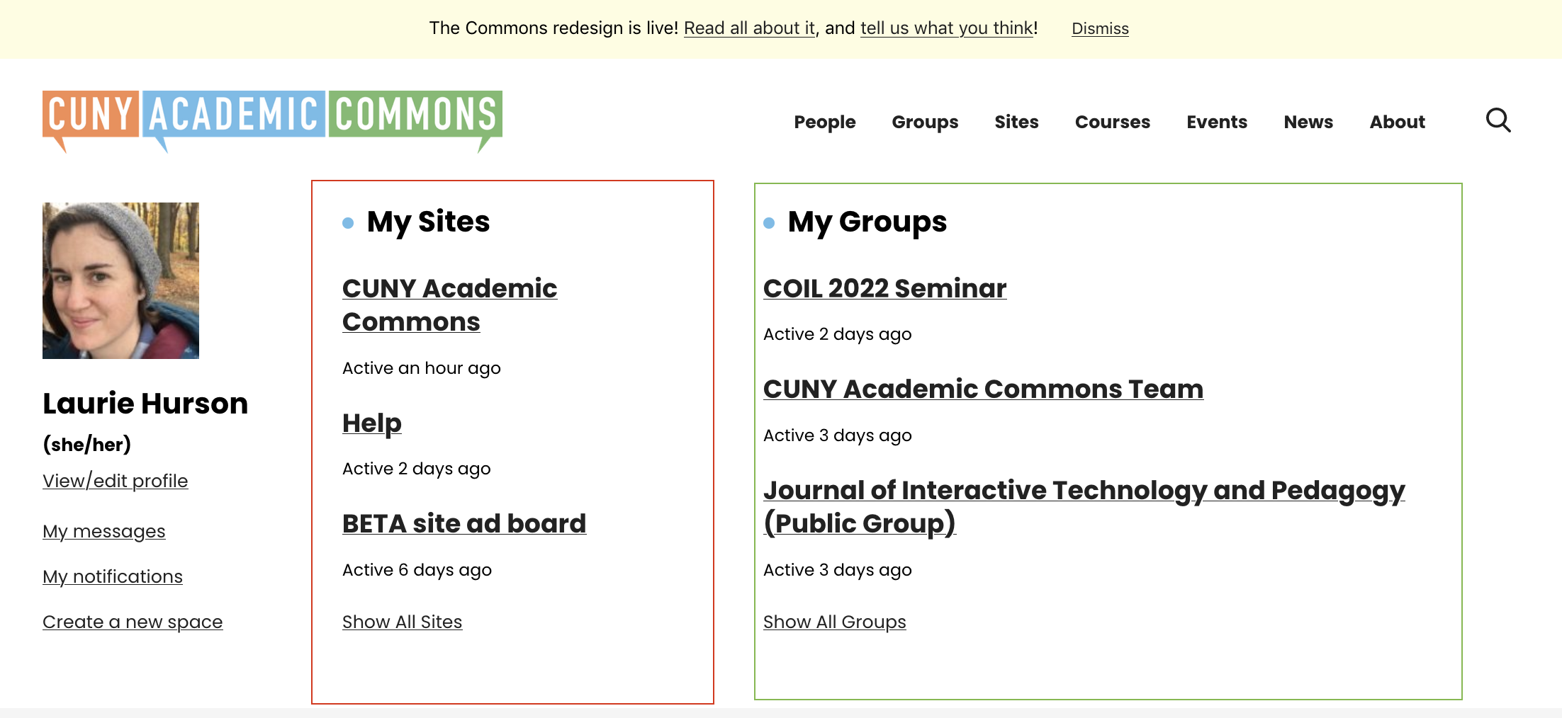
Hi All,
Writing with another home page tweak on alignment.
On the logged in home page, the "My Sites" area is aligned left but seems very narrow, making some site names take up two lines when it would make more sense just take up a single line. The "My Groups area width is more reasonable. (Am i making sense? screenshot attached)
Can we make the My sites area width and groups area width the same?
- Status changed from New to Staged for Production Release
- Target version set to 1.19.1
- Status changed from Staged for Production Release to Resolved
Also available in: Atom
PDF