Design/UX #15261
closedDirectory Design for People, Groups, and Sites
0%
Description
Continuing on with the re-design, we will be re-vamping People, Groups, and Sites Directories.
You can view the latest designs here: https://www.figma.com/proto/FKqQL0DlAC4iOT9tDjvCC2/CUNY-Design---Spring-2022?page-id=1362%3A2296&node-id=1362%3A6184&viewport=241%2C48%2C0.13&scaling=min-zoom
What these designs display:
People: Avatar, Name, Pronouns, College, Friend Status
Groups: Avatar, Name, Visibility, Number of Members, Description
Sites: Avatar, Name, Last Activity Timestamp, Latest Post
Looking forward to discussing more.
Files
Related issues
Updated by Colin McDonald over 2 years ago
Just adding a few notes here from our Friday team meeting, though I'm sure Sara will have her own to incorporate into the next round of mockups.
We agreed that the card approach is generally looking great. We just need to determine what information to show right away on the directory, both in the individual cards and in the filter bar.
We're going to do away with the timestamp line, as we're sorting by recency by default anyway.
We could show campus and purpose instead, though in the subcommittee meeting we talked through how especially for Groups and Sites, it can be hard to link one to just one campus. People are associated with many campuses, so are department or broader sites, etc.
We may want the whole card to link in to the result, but the card could also have internal links, like to the campus or purpose filtered results that match. We might also explore an OER badge like on the Openlab, but that may depend on how much OER data we're collecting and how prominent it's worth being.
We need to determine how consistent to display the card info across different directories, especially when the directories are geared toward different types of pages/spaces.
We also discussed keeping a submit button in the filter bar for performance reasons. Without it, we have to load the full directory data dynamically to be ready to display it as the filters change, rather than upon load only when hitting Submit. We may be able to account for this a little, but it would need testing.
We may also need to determine how to show public and private filters for groups and sites, since the setting options for those are slightly different.
Updated by Sara Cannon over 2 years ago
Here are the latest designs: https://www.figma.com/proto/FKqQL0DlAC4iOT9tDjvCC2/CUNY-Design---Spring-2022?page-id=1362%3A2296&node-id=1363%3A7068&viewport=241%2C48%2C0.5&scaling=min-zoom
Up Next: Courses Page
Updated by Sara Cannon over 2 years ago
Here are the latest designs for the directory pages:
Figma Designs: https://www.figma.com/proto/FKqQL0DlAC4iOT9tDjvCC2/CUNY-Design---Spring-2022?page-id=1452%3A7472&node-id=1452%3A7486&viewport=241%2C48%2C0.5&scaling=min-zoom
Figma File: https://www.figma.com/file/FKqQL0DlAC4iOT9tDjvCC2/CUNY-Design---Spring-2022?node-id=1463%3A4078
Courses Category Icons: https://drive.google.com/drive/folders/10HO5AEY_-HkelwRl--g3kaBJHjlbrQX5?usp=sharing
Updated by Boone Gorges over 2 years ago
Hi Sara - I've begun work on a skeleton implementation, and I've come up with some questions and requests. In no particular order:
1. There are some issues with color palette, especially with various greys. Specifically, there are lots of different greys between these comps and the home page, and I'm wondering whether (a) we're OK with the many greys, and we should just implement them as designed, or (b) whether we should decide on a few hues, and stick to them. A couple of examples. The light grey in the background of the directory cards is #e5e5e5 in the comps; we use #f5f5f5 in various places on the home page, which is fairly close. The line separating card actions ("Join Group" etc) from the rest of the card is a kind of medium grey, which we don't have a good match for. I'm happy to add more colors to the palette but I suppose we probably want to try to reuse where possible?
2. I've assumed that the grey background extends all the way to the edge of the viewport on very wide screens
3. Directory tab counts (as the 34 in "My Groups [34]") in Figma have font Proxima Nova. I've used Poppins instead.
4. In the directory filters, the magnifying glass in the search Keyword field suggests, to me, that it's a button. But it can't be a button, because we have a separate 'Filter' button. If we just want an always-visible indicator that it's a keyword field, perhaps we could move the magnifying class to the left of the input, where it looks less like a submit button and more like a label. See, for contrast, the sitewide search in the top nav.
5. Please have a look at the various states of the directory filters on production, and think about how these should be translated here. A few specific issues:
a. Various states (clickable, disabled, hover) for the Filter button
b. UI for the "open" state of each dropdown-style item. We currently use a scrollable pane of checkboxes. A multiselect may also work, though it would take some refactoring.
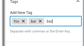
c. The "dropdown" toggles, such as for Campus and Role, have different visual states based on whether any of the internal items are checked. For example, take the Campus button, which can have the following states: 1. Closed with no items selected, when it's light grey with black text and a down-arrow icon. 2. Closed with items selected, when it's dark grey with white text, and a checkbox logo. 3. Open with no items selected, when the button is orange and there's a down-arrow. 4. Open with items selected, when the button is orange and there's a checkbox logo. We originally built these subtle-but-precise indicators of status because we hide the selected options by default; there are other possible options where we expose the selected options, and so we don't need the more complex visual indicators. See eg the attached screenshot of the WP tag interface.
6. The button styling for 'Filter' doesn't match button styling on home page ("Register") - the corners are much more rounded. It's OK with me if we have a few different button styles, I just want to be sure there's a system.
7. As discussed in today's meetings, some clarification about clickable areas and hover behavior.
8. Need mockup of at least one directory for mobile to get font-size ratios, etc
Thank you!
Updated by Sara Cannon over 2 years ago
Thank You Boone!
1. I'm good with us consolidating greys!
2. yes
3. Poppins is the font. Apologies for the proxima nova!
4. I'm good with moving the search icon to the right
5. I'll be taking a closer look here shortly
6. Correct. I was thinking for small interface-thigs we would have a small more rounded button separate from the content "hero" type button.
7. I've done some research here and I think the whole card being clickable with a hover while having a separate in-the-card clickable item is doable here. check out this documentation: https://inclusive-components.design/cards/ example: https://heydon.github.io/Inclusive-Components/cards-pseudo-content-author-link/ - what do you think?
8. I'll send that over to you shortly as well
What I owe you:
1. Searchbar change
2. Directory filters design
3. Mobile layout
Updated by Boone Gorges over 2 years ago
Thank you Sara! Thanks especially for the clickable-card article - it is a very interesting and cogent read on accessibility concerns for cards. I was able to do an initial implementation using the technique described there, which I'll hone more as I move on to other directories. https://github.com/cuny-academic-commons/cac/commit/ad1839597403bf9447b83008e54b1153f5463326
I'll be ready for another round of implementation (and probably questions!) once you've provided me with those additional comps.
Updated by Sara Cannon over 2 years ago
Boone, here are the directory filter states: https://www.figma.com/proto/FKqQL0DlAC4iOT9tDjvCC2/CUNY-Design---Spring-2022?page-id=1452%3A7472&node-id=1601%3A3929&viewport=241%2C48%2C0.1&scaling=min-zoom
More to come!
Updated by Boone Gorges over 2 years ago
Thanks, Sara! This looks good at a glance, and I'll dig in more deeply in the upcoming days. In the meantime, one question: When the filter is closed and items are selected, (a) an item that's too long will be truncated with ellipses, and (b) more than one item will be indicated by showing the first one and then "+1", "+2", etc. What do we do when you have more than one item and it's too much to show? I assume that we'll need to truncate an additional few characters to allow, so that it says "Alumn… +1"?
For what it's worth, nearly all entries in all of the dropdowns are going to require truncation. 'Role' is unusual because it has short entries like 'Faculty' and 'Staff', but things like 'Campus' are full of much longer entries. I don't think this is necessarily a bad thing - after all, we don't currently give any indication of what's checked for a given filter when that filter is closed. So these new designs give us more information from before. But I do want to point out, in case it will bother anyone, that the limited horizontal space will mean that we are almost always truncating when the filter is closed.
Updated by Colin McDonald over 2 years ago
- File admin-site.png admin-site.png added
- File email-group.png email-group.png added
- File email-popup-group.png email-popup-group.png added
Adding Laurie and Matt as watchers here, particularly because of their interest in the directory button/action language I'm going to take a stab at solidifying here.
We've had agreement over encouraging engagement in the directory (add/join/etc) while also staying as simple as possible, for accessibility and mobile display and a generally clean feel. So going directory type by type, I'm proposing the text/functionality below for the "action" area at the bottom of each card, with the understanding that the card itself will link to the main page of the member/site/etc outside of the exceptions, i.e. Courses has an internal description link for instructor.
I'm also proposing that we don't change text on hover. Ok, so the breakdown:
PEOPLE
- Not a friend: "*Add Friend*" for text, clicking works as it currently does (friend request submitted, "Cancel Request" appears in place of "Add Friend")
- Already a friend: "*Visit Friend*" for text, clicking goes to profile like the rest of the card. Currently there is a button that says "Cancel Friendship" which we talked about showing on hover. Let's leave that function on the internal profile page to avoid accidental clicks and keep the negative (disengaging?) actions more buried.
COURSES
I am pretty sure that we have some limitations on how much engagement we can encourage here since Courses are a unique animal and we want to be able to show a dual action item if it's a Group + Site course. So we won't have the ability in that case to link the card itself, because you can't specify whether it's going to the Group or the Site.
I propose we stay the same as the current mockups with either a single "*View Site*" or "*View Group*" action button, specifying "(Private)" if that applies, or a dual action item for "View Group" and "View Site" if the Course is associated with both. Can we fit "(Private)" in a dual item if it applies?
This way, it's at least clear how to navigate to either the Group or the Site, and you can engage more from there. I think we need to keep a consistent setup even if it's only a single Group or Site for the course.
GROUPS
- Not a member, public group: "*Join Group*" for text, clicking works as it currently does (join processed, "Leave Group" appears in place of "Join Group")
- Not a member, private group: "*Ask to Join*" for text, clicking works as it currently does (request processed, "Cancel Request" appears in place of "Ask to Join"). This seemed more clean to me than "Request Membership" which we've been using, but I'm happy to be outvoted...
- Already a member: "*Visit Group*" for text, clicking goes to group like the rest of the card. This replaces current button that says "Member" at directory top level, so there's an action here. I acknowledge it doesn't feel as obvious now that you're a member, but perhaps it is more clear since the other items will be about joining? We could also do "*Member* (Visit Group)" I suppose.
SITES
- Not following: "Follow Site" for text, clicking works as it currently does (follow processed, "Visit Site" appears in place of "Follow Group")
- Already following: "*Visit Site*" for text, clicking goes to site like the rest of the card. Or like with the group above, we could go with "*Follower* (Visit Site)".
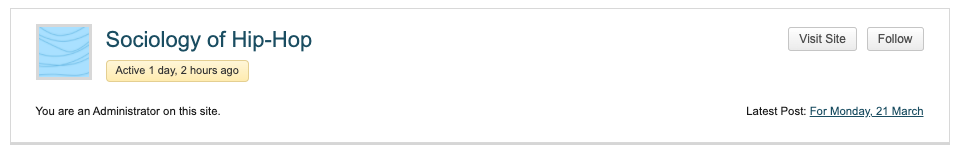
One other idea is that we could list your follower/admin/etc status on the card. We already do this for sites, see admin-site.png attached. Or were we planning to scrub that info as part of this?
I'll also note that Sites are currently the only directory where right now we offer two buttons, "Visit Site" and "Follow/Unfollow". You can also see this in that screenshot I just mentioned. This way we consolidate. Granted, it isn't entirely clear what Follow functionality means at the top directory level. Maybe address that with a tooltip?
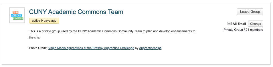
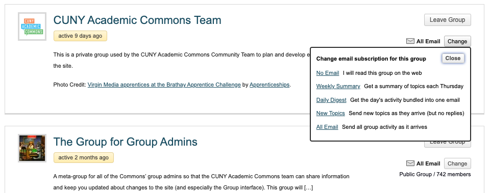
Also looking at the current Groups directory, we have an email setting that appears if you're a member. Are we keeping that around too? See the other two screenshot attachments here. I can't say I knew about it, let alone used it...
Updated by Sara Cannon over 2 years ago
Updated by Sara Cannon over 2 years ago
Here is an overview of the card states based upon Colin's note above. https://www.figma.com/proto/FKqQL0DlAC4iOT9tDjvCC2/CUNY-Design---Spring-2022?page-id=1452%3A7472&node-id=1637%3A4076&viewport=241%2C48%2C0.5&scaling=min-zoom
Looking forward to discussing this in the meeting today.
Updated by Boone Gorges over 2 years ago
Thanks for all the recent updates, Sara and team.
I've completed a first pass at implementation on the Members directory, which is ready for testing on cdev: https://commons.gc.cuny.edu/members/ (The other directories are not done, and are probably in fact broken at the moment.)
Sara, could you please have a look? Here are some specific questions and comments I've got after this round of implementation:
1. Some greys will not pass contrast ratios. Particularly the "disabled" filter buttons. https://webaim.org/resources/contrastchecker/?fcolor=FFFFFF&bcolor=CECECE (Submit), https://webaim.org/resources/contrastchecker/?fcolor=cececece&bcolor=f5f5f5 (Reset)
2. For the filter dropdowns, I've put in place a hover effect that adds a darker border
3. Your mockups don't show scrolling for filter dropdowns that have many options, like Campus. But I assume we still need it, so I've left it in place
4. During the homepage redesign, outer padding on mobile was set to 28px. The Figma file for the directories has it at 17px. I've left it at 28px. We should come up with a sitewide setting for this.
5. I've made the entire card a clickable link, with hover effect. It works well. But I need guidance on hover states for the action button ("Add Friend", etc). Should there perhaps be a separation between the two items? Or just a separate hover event for the button? Would that mean that the bottom part of the card would not get a shadow effect on hover?
6. It looks like you've gone with a common height for all cards across directories. This means that some mockups (see Members) have lots of white space above the action buttons, while others do not. A more natural technical approach is to specify the minimum desired space above the button, and to let this dictate the height of each row of cards. I've built it this way and it looks natural to my eye, but I'd like your feedback.
7. In all our discussion about button states, we neglected the most common state of all: the user is not logged in. In that case, I think we should use the "Visit" language, and in the case of Members, we can't say 'Friend'. I've used 'Visit Member' instead. Maybe "Visit Profile" is better?
I'll wait to get your general impressions before moving on to the other directories. Thanks in advance!
Updated by Sara Cannon over 2 years ago
Hello @boone - thanks for this first pass! It's looking great!
1. Inactive interface elements are considered "Incidental" and don't need to meet contrast requirements so I think it's okay to leave them with lower ratios (https://www.w3.org/TR/2008/REC-WCAG20-20081211/#visual-audio-contrast-contrast) I found an interesting article on making disabled buttons inclusive https://css-tricks.com/making-disabled-buttons-more-inclusive/
2. Filter Dropdown: I like the hover effect on the filter dropdowns. Bug: the select inputs don't check when you click them directly-just the text. Dropdown text should be grey and black when selected or hovered. All the filter text should be medium weight. I added a hover effect in the figma file for the input. Remove the hover effect on the disabled filter button
3. I added scrollbar styling which I believe should always show so that users know they can scroll.
4. Apologies for the discrepancy on the padding. Maybe we should set it at 20px sitewide?
5. I added two hover options for the bottom of the cards in the figma file.
6. Love it!
7.I like "visit profile" but we can discuss this more as a group - Matt and Colin seem to have a knack for naming :)
8. Order By: should have the same carrot as the filters
Note to everyone - I'm out of the office until next Thursday so I'm going to be missing the meeting next week. Cheers
Updated by Colin McDonald over 2 years ago
Also agree on Visit Profile for members, when not logged in. Thanks for all of this, Boone - I can highlight any action items for Sara from today's meeting since she won't be there, otherwise feel free to proceed. We can also walk through anything from the cdev implementation you'd like to go over if necessary during the call.
Updated by Boone Gorges over 2 years ago
Sara, thanks for the initial review and for the feedback. I've followed up on all these items. A few comments -
1. Inactive interface elements are considered "Incidental"
Thanks for these links. I'm not 100% convinced that a dynamically disabled element counts as "incidental", but let's go with it for now. The article from CSS-Tricks about the 'disabled' attribute was really interesting - I rewrote our implementation so that we're using 'aria-disabled' instead, so that the disabled buttons can receive keyboard focus.
2. Filter Dropdown: I like the hover effect on the filter dropdowns. Bug: the select inputs don't check when you click them directly-just the text. Dropdown text should be grey and black when selected or hovered. All the filter text should be medium weight. I added a hover effect in the figma file for the input. Remove the hover effect on the disabled filter button
8. Order By: should have the same carrot as the filters
I implemented Select2 for this dropdown so that it was possible to make the styling changes.
3. I added scrollbar styling which I believe should always show so that users know they can scroll.
Browsers have limited and inconsistent support for scrollbar styling. I've added some minimal styling for Webkit browsers to get closer to your design, but in Firefox and on mobile it may continue to use the native browser chrome. I think this is as good as we can get without a very complex JS-based replacement. I've forced the scrollbar to appear at all times.
Updated by Sara Cannon over 2 years ago
Boone: the scrollbar styling looks great!
My one nit-picky thing is the font-weight of the filters before they are selected... can they be medium rather than normal?
I believe we can go ahead and implement the styling on the other directory pages.
thanks for all your hard work
Updated by Boone Gorges over 2 years ago
- Related to Feature #15875: Introduce 'description' field for sites added
Updated by Boone Gorges over 2 years ago
Thanks, Sara! I've made the font-weight change, and also made a change so that hovering over a card activates hover states for the card title.
I'll continue on implementation and report back here with questions after the next round of work.
Updated by Boone Gorges over 2 years ago
It's dawned on me during implementation that the Sites and Groups directories no longer have 'Create' buttons. This leaves no obvious path to get to the Create flow. Can we think about a way to add something and discuss it during Tuesday's call?
Updated by Colin McDonald over 2 years ago
Great catch, Boone. The obvious place to me is a new tab in the "nav" area, i.e. All Groups / My Groups / Featured / Create, but we could try something more prominent too. Maybe right-justified on that same line, so Create is above the Order drop-down?
Sara, very open to your thoughts on this, thanks.
Updated by Sara Cannon over 2 years ago
Good catch! See attached screenshot - we can just have it as a simple link on the right
Updated by Boone Gorges over 2 years ago
Thanks, all. I like Sara's design for desktop and have implemented it.
I wasn't sure what to do for mobile, so I placed the button above the nav tabs, and below the directory title. See screenshot. Sara, does this seem OK to you?
Updated by Boone Gorges over 2 years ago
Thanks, Sara.
I've completed a pass at the Courses directory, which is now ready to test on cdev. A few follow-up notes and questions:
1. The comp has a very specific layout for the Courses directory filters. They break into two lines; the width of the filters in the top row determines the width of both rows; and the Filter button is aligned with the right-hand edge of the rows. This combination is hard to accomplish technically, due to limitations in Flexbox. It's also a little clumsy across different breakpoints, since the row break will happen in different places on different screens. I went with a slightly different implementation, where the 'Reset/Filter' section is not right-aligned, but is set off from the preceding filter. I think it works pretty well at different screen widths, but I'd like Sara's feedback on it.
2. We don't currently support a 'Purpose' filter on the Courses directory. This is for technical reasons: Purpose data is specific to a Site or a Group, and is not stored with the parent Course object. This makes it difficult to perform a filter based on Purpose information. It might be possible to add in the future if the team thinks it's important to have a Purpose filter, but for the time being, I've left it out.
Updated by Sara Cannon about 2 years ago
@boone ... I went to take a look here and the course directory filters seem broken https://capture.dropbox.com/TKT9uzxVtlX0VGkb
Updated by Boone Gorges about 2 years ago
Thanks, Sara. This is happening because of global stylesheet changes made as part of #15629. I've put some specific overrides in place that ought to fix the immediate issues. I'll follow up in that other ticket with a few more details.
Updated by Raymond Hoh about 2 years ago
Boone, I fixed an issue where the new card design conflicted with the existing homepage layout - https://github.com/cuny-academic-commons/cac/commit/d1241c880f2f39b883fafa39661d6d3f10db1f0e. The issue is with the introduction of the 'item-card-top-content' DIV. To address this, I opted to add the 'item-card-top-content' <div> for directory pages only. The alternative was to add a parent selector to the existing .item-card-top-content CSS selector: https://github.com/cuny-academic-commons/cac/blob/d1241c880f2f39b883fafa39661d6d3f10db1f0e/wp-content/themes/bp-nelo/assets/css/shared.css#L1051. If you feel the CSS method would be a better fix, feel free to do that.
As I was browsing the new directory layouts, one thing occurred to me and that is we should only show the "Featured X" block if we are on the first page of paginated results. If we are on any other page, the "Featured X" block should not be rendered.
Updated by Boone Gorges about 2 years ago
Responding to Sara's comments from https://redmine.gc.cuny.edu/issues/15629#note-14:
- Strange hover state on the tabs once something is selected with a big black block below the tab.
I'm not sure how this is supposed to work. So I opted to remove the border hover state when the menu is open. Another option is to add a black border around the button and the dropdown options, but this felt really weird when I tested it - too abrupt for a hover state. https://github.com/cuny-academic-commons/cac/commit/5422706c783a3e752e1582a2e69b8633a5d31ccb
Also hover state on the radio on the inside once the radio button is selected but no hover state when not selected: https://share.getcloudapp.com/JruOZ2gr
I made some changes to the global checkbox styling so that we have a similar box-shadow effect regardless of the checked state. Let me know if you think this is OK. https://github.com/cuny-academic-commons/cac/commit/2fe5452914f2c3d699484847aac001201bf8ac50
- the cards now don't have "visit site/group/profile" bold and underlined
This should now be fixed. See https://github.com/cuny-academic-commons/cac/commit/21e3847a06ef4dc805f727220653b7dbbf11e09c
Updated by Colin McDonald about 2 years ago
- File join-group-issue.mov join-group-issue.mov added
- File my-groups-card-issue-scaled.jpg my-groups-card-issue-scaled.jpg added
- File courses-filter.png courses-filter.png added
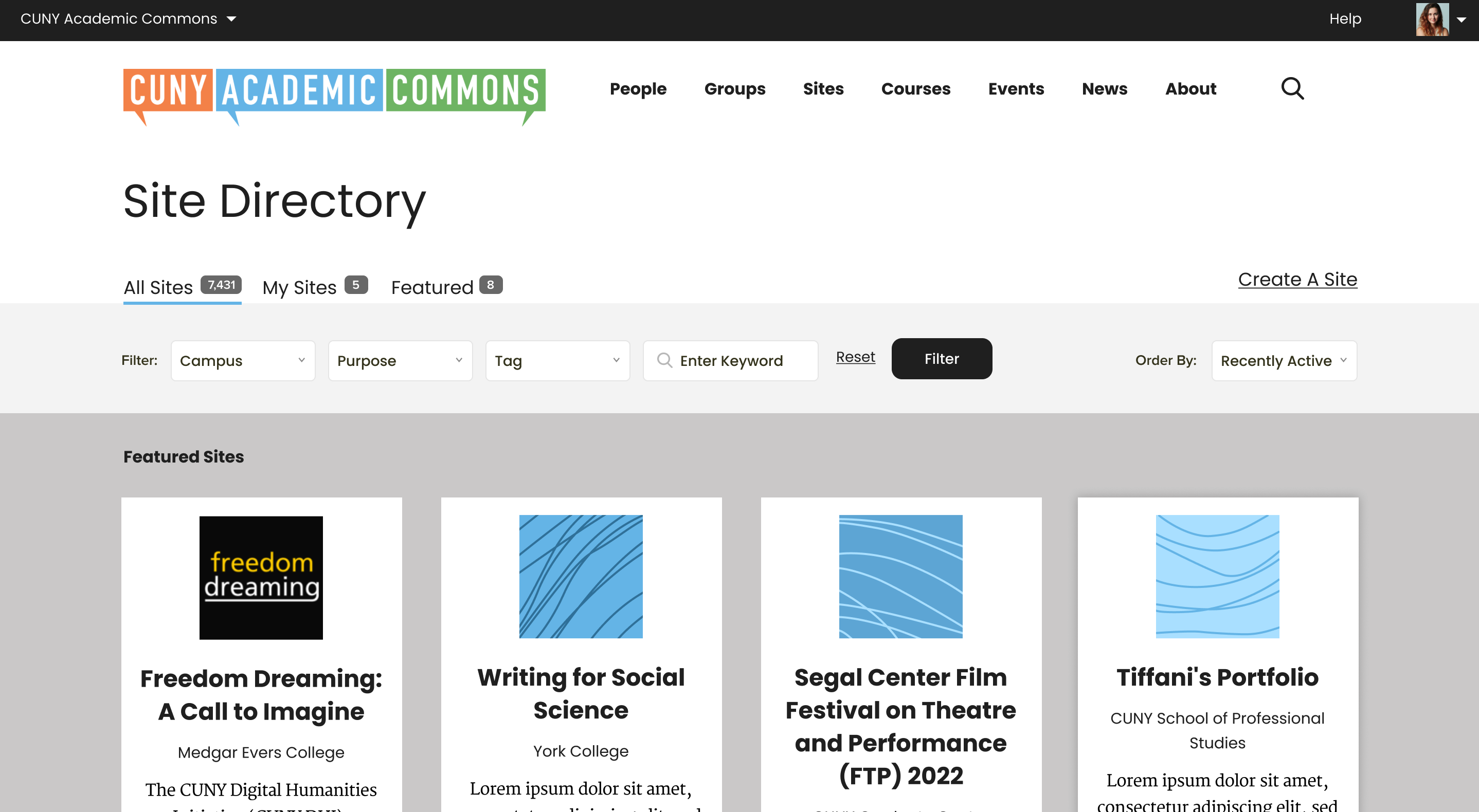
Here is what we have right now on testing feedback for the directories:
- Can't get any of the filter bar to work on the Sites directory. Ordering, OER tag, keyword, filter drop-downs, it seems they all leave you with the same 1,563 sites appearing at the bottom of the first page in the same order.
(incidentally, why does it say 1-20 of 1,563 sites at the bottom, but the number next to All Sites at the top is 1,661?)
- If I page over at the bottom to the 2nd page, shouldn't the featured bar at the top go away for 2nd page and subsequent pages on every directory? Shouldn't they also go away when using one of the ordering drop-downs, like with the rest of the filter bar options? I don't think they do now.
- Are the featured bar item tiles a little taller than the tiles for the regular items? Is this intentional if so?
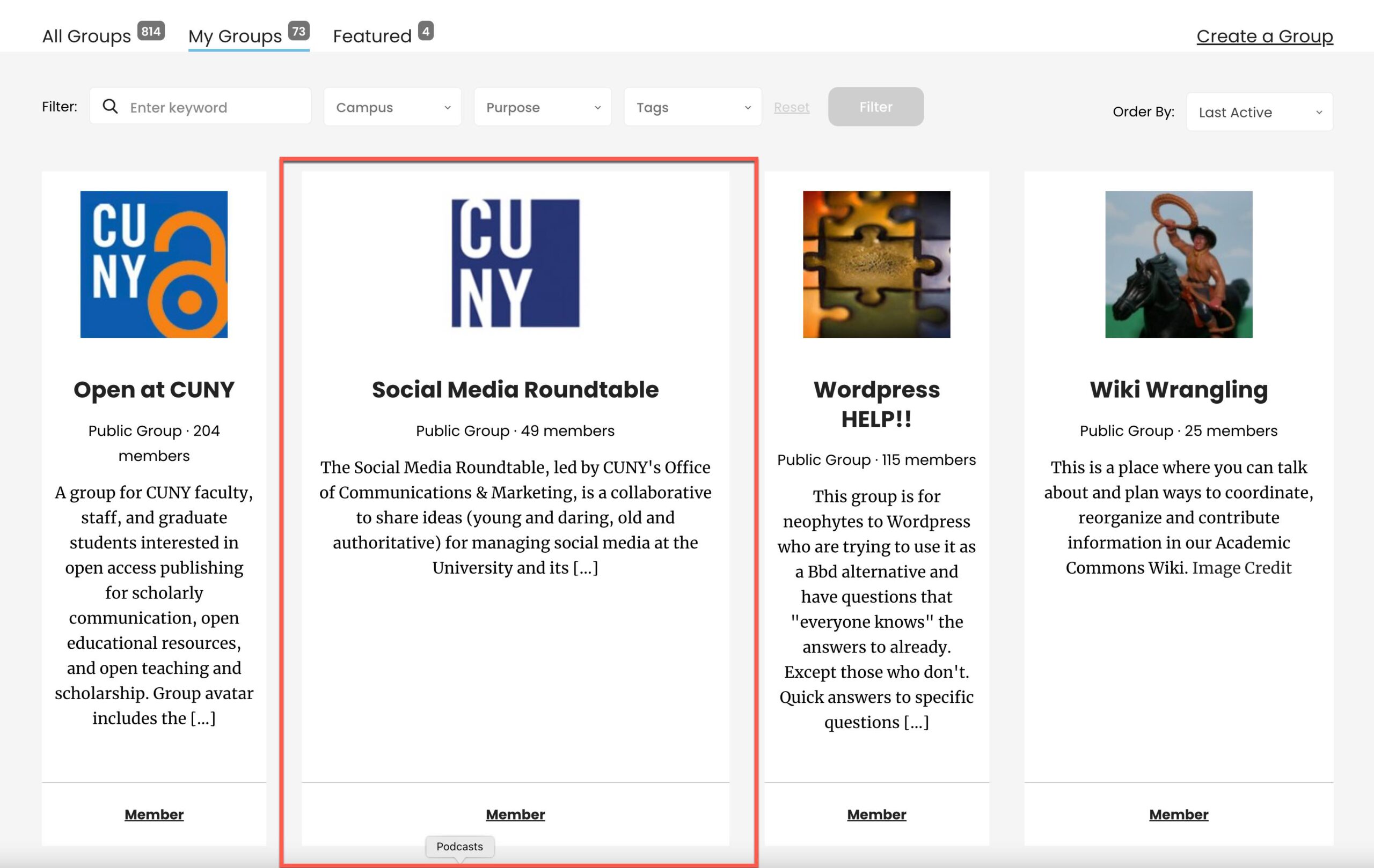
- See attached video for strange performance on Group directory action link at bottom of tiles. Joining in a featured group takes you to the group page saying you've joined. Joining in a regular group tile changes the status (this seems like the planned/expected behavior) but then at the top seems to mess up the formatting for the My Groups tab.
- When you go to My Sites, should it say Follow underneath each tile? They're already your sites, after all. Maybe it just says Visit?
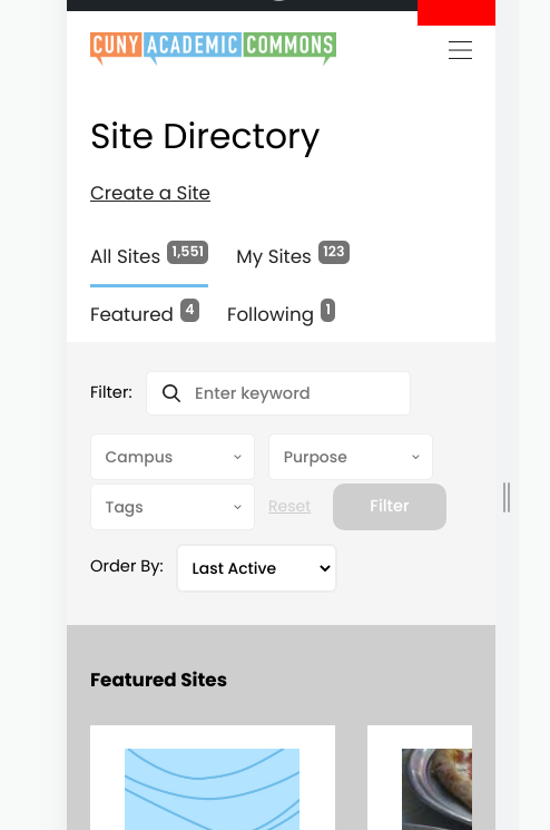
- Scott reports he was paging down on My Groups. On page three, the card size got wonky. See attached screenshot.
- The CAC home site seems to appear in search results. Can we filter that out?
- In Courses, see screenshot for filter bar, confirming this is the right layout. Something seemed off about the filter button lower on a second line in the middle, but I may be misremembering.
Updated by Boone Gorges about 2 years ago
- Related to Feature #16092: Don't show main site in Site search results added
Updated by Boone Gorges about 2 years ago
Responding to these points:
- Can't get any of the filter bar to work on the Sites directory. Ordering, OER tag, keyword, filter drop-downs, it seems they all leave you with the same 1,563 sites appearing at the bottom of the first page in the same order.
This was a bug, fixed in https://github.com/cuny-academic-commons/cac/commit/07e2002bbe7bdb8eda88a77920187dd724ae5b09
- If I page over at the bottom to the 2nd page, shouldn't the featured bar at the top go away for 2nd page and subsequent pages on every directory?
We'd discussed this once or twice, but I never knew if there was a final decision. I've now implemented it. https://github.com/cuny-academic-commons/cac/commit/c90b64b59e3aeac6ce6f4e52a59267aeb1ed35a0
Shouldn't they also go away when using one of the ordering drop-downs, like with the rest of the filter bar options? I don't think they do now.
This seems incorrect to me. Sorting is a different kind of operation from filtering. But if there's general agreement, we can remove it in this case as well.
- Are the featured bar item tiles a little taller than the tiles for the regular items? Is this intentional if so?
The height of any row, including Featured, is determined by the tallest item in that row. Featured items may tend to have longer descriptions.
- See attached video for strange performance on Group directory action link at bottom of tiles. Joining in a featured group takes you to the group page saying you've joined. Joining in a regular group tile changes the status (this seems like the planned/expected behavior) but then at the top seems to mess up the formatting for the My Groups tab.
I've implemented AJAX for the Featured buttons and also fixed the way that the 'My Groups' item is incremented after clicking 'Join'. https://github.com/cuny-academic-commons/cac/commit/2fb00dda9de3abe3b55ca1cc9515d531d8128cc6
- When you go to My Sites, should it say Follow underneath each tile? They're already your sites, after all. Maybe it just says Visit?
Pinging Ray on this. Technically, Following a site is a different relationship from something being "your" site - the 'My Sites' tab is populated with sites on which you have a role. Seems like there are legitimate reasons for following one's own site, so I'd leave it, but other opinions are welcome.
- Scott reports he was paging down on My Groups. On page three, the card size got wonky. See attached screenshot.
I made a modification that should enforce equal column width. https://github.com/cuny-academic-commons/cac/commit/abba1bbfca0370c69792304d23720e8b79cf1dcf
- In Courses, see screenshot for filter bar, confirming this is the right layout. Something seemed off about the filter button lower on a second line in the middle, but I may be misremembering.
See https://redmine.gc.cuny.edu/issues/15261#note-25. This is likely the best we can do because of the requirement that the filters cascade across multiple lines in different way depending on window width.
Updated by Raymond Hoh about 2 years ago
Pinging Ray on this. Technically, Following a site is a different relationship from something being "your" site - the 'My Sites' tab is populated with sites on which you have a role. Seems like there are legitimate reasons for following one's own site, so I'd leave it, but other opinions are welcome.
Boone is correct. Following a site is different than having a role on a site. You can view the activity for followed sites under your profile's "Activity > Followed Sites" page and also on the "My Commons" page.
Updated by Colin McDonald about 2 years ago
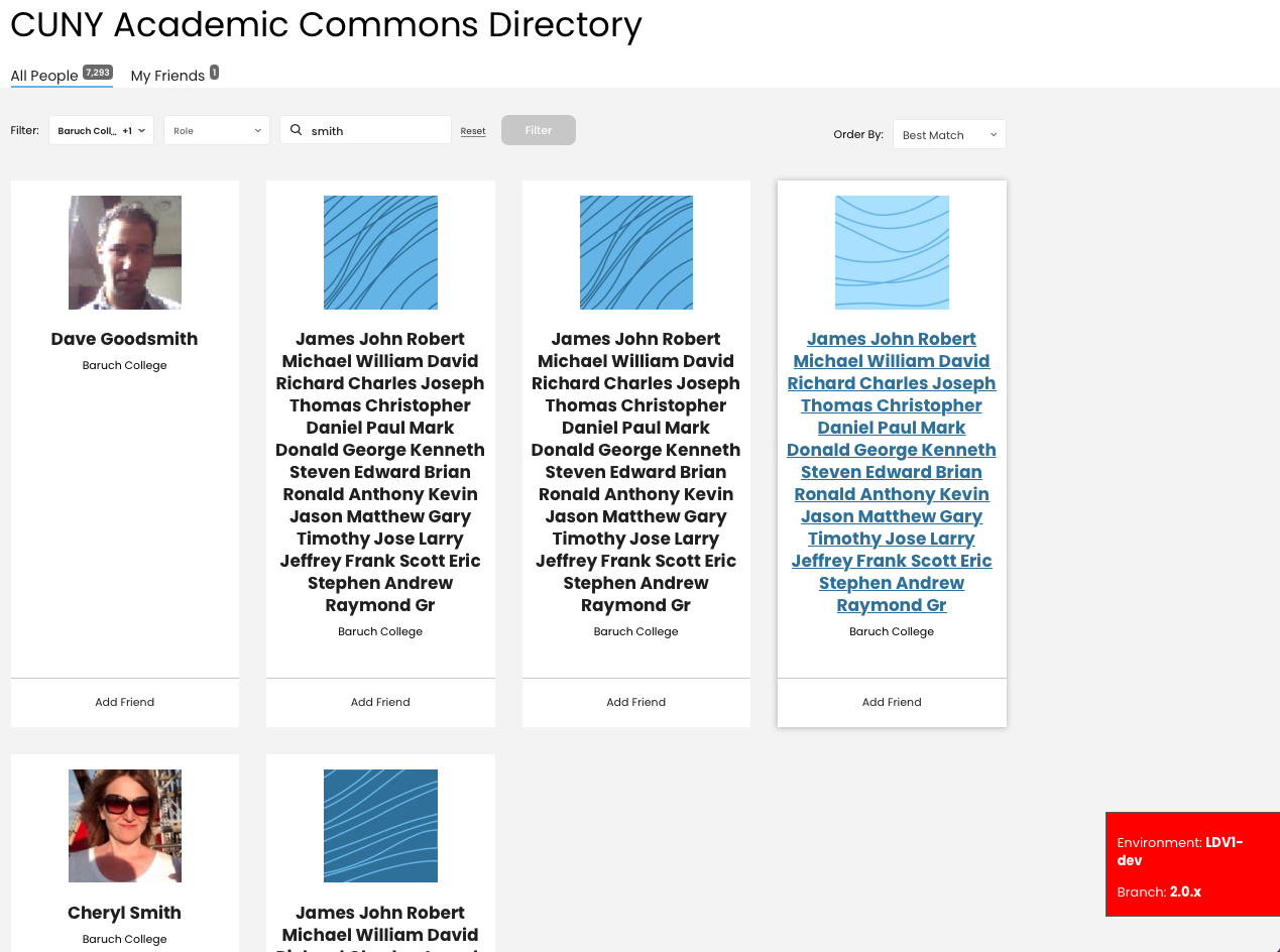
- File smith-results.png smith-results.png added
- File newest-registered.png newest-registered.png added
Thanks for all this follow-up, Boone and Ray. I added Scott as a watcher here. Scott, see Ray's explanation of why having a role (i.e. Admin) on a site is different from following a site, hence the Follow functionality under My Sites.
I think we're in good shape on my prior list otherwise. I still think that using one of the ordering functions in the top-right corner should remove the Featured sections, simply because once you've done anything in that bar to change the results, you'll want to see those new results right away. Plus you've already seen the Featured section on first load. But this is minor, if we don't get to it (in dev call tomorrow or here) it's fine to leave.
In the Group Directory, if you're a member, shouldn't the Member text at the bottom of the card take you to the Group? It looks to be hyperlinked right now, but a click doesn't do anything.
A few things on the People Directory:
- Shouldn't the title be People Directory instead of "CUNY Academic Commons Directory" as we have it now?
- Try searching Baruch and BMCC for Campus and smith for Keyword. The results are strange (see attached).
- Shouldn't the "action item" bars at the bottom of each card be in bold text?
- There's a full line between Newest and Registered in the Order By dropdown, but that's one phrase/function. See attached.
Updated by Boone Gorges about 2 years ago
I still think that using one of the ordering functions in the top-right corner should remove the Featured sections
I've made the change in https://github.com/cuny-academic-commons/cac/commit/b915d91cae2dd6e84d2a70057b4e437afd53989e
In the Group Directory, if you're a member, shouldn't the Member text at the bottom of the card take you to the Group? It looks to be hyperlinked right now, but a click doesn't do anything.
There was a bug in the legacy JS which I've fixed in https://github.com/cuny-academic-commons/cac/commit/918506fc3069b9f866d762fc82e88640d53f403b
- Shouldn't the title be People Directory instead of "CUNY Academic Commons Directory" as we have it now?
I built it to the spec. https://www.figma.com/proto/FKqQL0DlAC4iOT9tDjvCC2/CUNY-Design---Spring-2022?scaling=min-zoom&page-id=1452%3A7472&node-id=1452%3A7486
- Try searching Baruch and BMCC for Campus and smith for Keyword. The results are strange (see attached).
I assume by "strange" you mean the entries that have many first names? If so, these are some old junk entries on cdev, from 2010. I've deleted these specific ones, though you may come across others. You can safely ignore them.
- Shouldn't the "action item" bars at the bottom of each card be in bold text?
It is supposed to be, and in fact it is in most places. I noticed that on the Members directory there was an issue that resulted in inconsistent markup, making the styling different. This has been fixed in https://github.com/cuny-academic-commons/cac/commit/ee7ad3eea080482780ecf6df3415ec84e2eae361. If you still see issues elsewhere, please provide details (URLs, screenshots, specific descriptions of the text in question)
- There's a full line between Newest and Registered in the Order By dropdown, but that's one phrase/function. See attached.
I've made an adjustment in https://github.com/cuny-academic-commons/cac/commit/e0ceb8094d600a4b19874144066a3d79047149d3
Updated by Colin McDonald about 2 years ago
Thanks, Boone. I'll confirm in the dev call today, but I think we may have missed the member page title copy edit, and People Directory is better and more consistent than CUNY Academic Commons Directory.
Everything else looks good, thanks for the quick changes.
Updated by Colin McDonald about 2 years ago
We agreed during the dev call that Member Directory makes the most sense as that title. Can we make that change? "People" doesn't read as nice alongside "Directory" but works as the top-level nav item. Sorry we missed this copy before.
Other than that, I think we're ready to close this up, and the release in general. I'm not awaiting any additional testing feedback or changes in other tickets. I am mostly going to move on to PR/social and other items to get us ready for the proposed May 25 or 26 release date next week.
Updated by Boone Gorges about 2 years ago
- Status changed from New to Resolved
I've changed the directory title to 'Member Directory' in https://github.com/cuny-academic-commons/cac/commit/a3b45eb69c9209e8e8ae7d870a734ea4c8676a32
On the basis of the previous comment, I'm going to close this ticket out. Thanks, all!