Design/UX #16672
closedReview group / site creation workflow
0%
Description
Hi Sara, Colin, and Laurie -- I was just cloning a group/site for my Fall class, and I found it a bit confusing to figure out where to go to create a site or group. Can I ask you to review the workflow and see whether there are other places where we should add "Create a [Site/Group]" on the CAC?
Files
Related issues
Updated by Laurie Hurson over 3 years ago
- File Screen Shot 1 Group_site directories.png Screen Shot 1 Group_site directories.png added
- File Screen Shot 2 logged in home.png Screen Shot 2 logged in home.png added
- File Screen Shot 3- shortcuts banner.png Screen Shot 3- shortcuts banner.png added
- File Screen Shot 4 - Group section banner.png Screen Shot 4 - Group section banner.png added
Hi All,
Some thoughts on better surfacing the "create a site/group" path below.
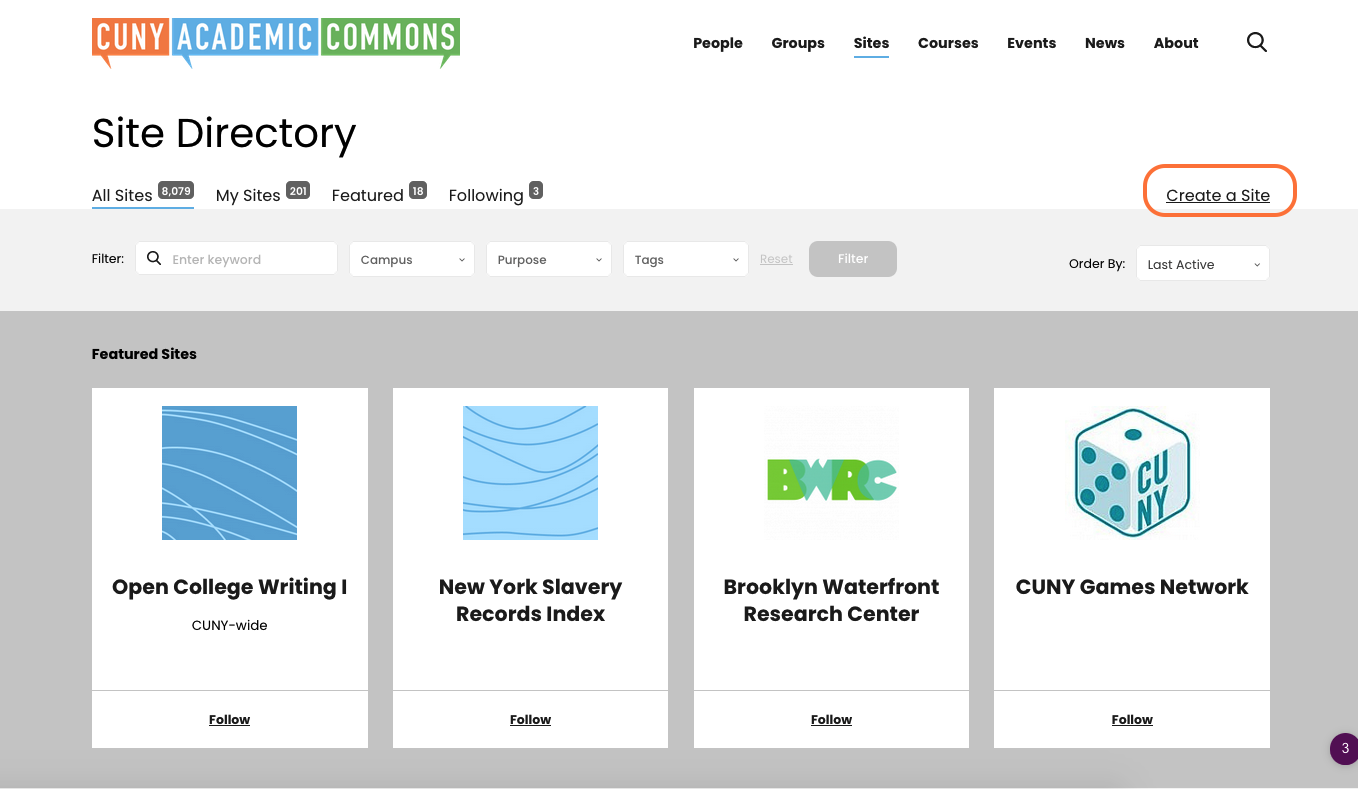
1. As it stand now in the Groups and Sites Directories the "Create a Site/Group" Text is not very obvious. (Screenshot 1). I think it would make more sense to make this a button with a color background for some contrast.
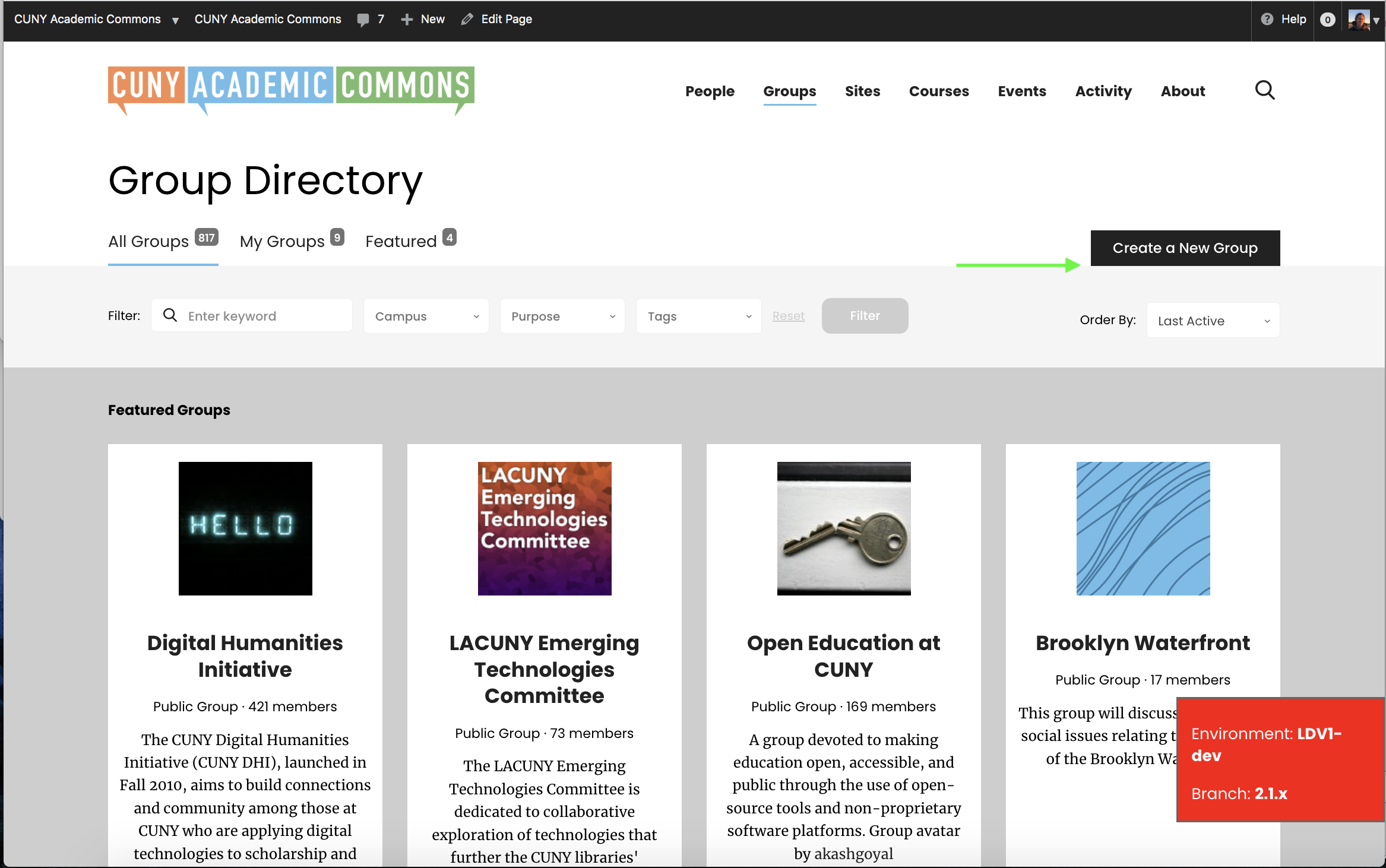
2. On the signed in home page (screnshot 2), a few updates might help surface the path to creating a site or group:
A: The create a new "space" (orange) could be changed to "Create a New Site or Group" to be more consistent with language
B: The "Show all sites" and "Show all groups" links (green) should link to the My sites section of the site directory, not the old profile list of sites. This will help durface that new and improved button mentioned in above
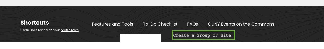
C: Make one of the "Shortcuts" links for all roles "Create a Group or Site" leading to creation portal. (Screenshot 3)
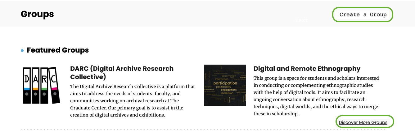
D: In the Group and Sites Banner sections move the "Disciver more link to under the featured groups/site and add a "Create a Site/Group" link. (Screenshot 4)
Doing all of these might be overkills but just putting some options out there.
Updated by Sara Cannon over 3 years ago
Here are some comps for adding in clearer buttons for Create actions:
- 1. Homepage: Rename the link "create a new space" to "create a new site or group", Add a button in the shortcut tool bar, in the group section, and in the site section: https://share.getcloudapp.com/QwudLBLD. Notation: https://share.getcloudapp.com/nOubRQRQ
- 2. Groups & Sites: Replace the link with a button in the top right: https://share.getcloudapp.com/wbuQz5kx
Updated by Colin McDonald over 3 years ago
Hi Sara, realized this ticket got a little buried, but your suggestions seem great to me. Laurie/Matt, what do you think?
I'm adding Boone and Ray as watchers. I realize it's late to be adding to our fall release scope, but perhaps they can see whether this is small enough to fit in once we're in agreement on the implementation.
Updated by Laurie Hurson over 3 years ago
I like the
1.Homepage:
a. Rename the link "create a new space" to "create a new site or group",
b. Add a button in the shortcut tool bar
2. Groups & Sites: Replace the link with a button in the top right
I am on the fence about 1.c in the group section,and d. and in the site section:
I think c and d take away from the "discover more link" which if clicked, a user will see those new buttons outlined in #2
Updated by Boone Gorges over 3 years ago
None of what's suggested here is technically difficult, and it should be possible to include in the fall release if we can settle on scope soon.
A few thoughts:
- I agree with Laurie that the "Create" buttons on the homepage Groups and Sites sections (1d) feels like overkill, and distracts from the Discover links. In any case, people don't create groups and sites nearly as frequently as they use them, so I don't think we need to overemphasize on the homepage.
- If we do go with 1d, we'll need some thoughts about mobile treatment. Those Discover links drop down below the horizontal scroll on narrow screens.
- I agree with Laurie that the button treatment under 1c is a bit too striking visually (for similar reasons to my point above). IMO it's reasonable to have the link there, but it should just look like the other links.
- The button treatment on the Groups and Sites directories, in contrast, makes a lot of sense to me.
Updated by Colin McDonald over 3 years ago
Consolidating here, I think we're on board with:
- Replace the link with a button on Group and Site directories, see treatment:
Mockup: https://share.getcloudapp.com/wbuQz5kx
- Rename upper personal homepage shortlink to Create New Site or Group
- Add a create link in the shortcut bar, not a button though (need to update links going back to #14217)
Mockups: https://share.getcloudapp.com/nOubRQRQ
And decided against:
- New homepage create button on homepage next to discover link (in mockups above)
Updated by Boone Gorges over 3 years ago
- Related to Feature #17090: Copy review for Create page added
Updated by Boone Gorges over 3 years ago
- Status changed from Assigned to Reporter Feedback
I've done the following:
- Create buttons on directories now look like buttons https://github.com/cuny-academic-commons/cac/commit/565de1b6b981013cb17507df30b6514289f632c8
- Homepage banner text is 'Create a New Site or Group' https://github.com/cuny-academic-commons/cac/commit/74b206665b4c0939a8e70c4c2fd96dcfaa83fd79
- Add a create link in the shortcut bar,
I'll need some more info about this. As a reminder, these links are different for different user types. Here's the existing list: https://gist.github.com/boonebgorges/404e8f6471dcf7998bf436f9efce316c Should we replace the fourth item for each user type?
Updated by Laurie Hurson over 3 years ago
- Create buttons on directories now look like buttons
- Homepage banner text is 'Create a New Site or Group
This looks good to me.
My only suggestion: in the directories, perhaps a little padding under the button could add some white space and help separate the button from the gray search area. This may help the button stand out a bit more. See screenshot
Updated by Boone Gorges over 3 years ago
Thanks, Laurie. I've added a bit of space in https://github.com/cuny-academic-commons/cac/commit/358f84ece2fbe051eaea7d96e0a9ad6f6e85b285
Updated by Boone Gorges about 3 years ago
- Status changed from Reporter Feedback to Resolved