Feature #17769
closedDesign/UX #17385: Profile CV & Account Settings
Account Settings Tab
0%
Description
The profile/account redesign will have several components, including those like Inbox/Notifications that aren't fully fleshed out yet.
We've agreed that the Settings tab is in a good place for Sara to submit assets for development though, so we can have this as a starting point for building out the wider redesign while she is away through April.
I'm breaking the workflow for the tab off into this ticket, a subtask of the main ticket at #17385.
Files
Related issues
Updated by Sara Cannon about 3 years ago
Here is the Figma Preview with notes: https://www.figma.com/proto/0Ke5bCwheE5SXXkT6wDd2l/CUNY-Design---Spring-2023?page-id=2900%3A68936&node-id=2900%3A83092&viewport=3909%2C5816%2C0.13&scaling=min-zoom
Note: this also includes the "My commons profile" tab
Updated by Colin McDonald about 3 years ago
Just noting here, even though we've cordoned off the tabs and are focused on the Settings tab for development right now, that in the monthly meeting last week we agreed that "Unfriend" made more sense for that button when it appears, and also that Activity might be better as the default/first tab than Sites when looking at a member's profile.
We also agreed that the forum tab under Settings is kind of a misfit where it sits currently. Could these options for thread display mode and posts per page be set by the user within each group, on the forum page perhaps, kind of like your email status? Something we'll have to discuss more as we get into the Group Page redesigns, but wanted to mention it here too.
Updated by Raymond Hoh about 3 years ago
I've started going through some of the Commons Profile / Account Settings pages.
Not everything is 1:1 to Sara's mockups, but most of these pages should be styled with exception to the "Commons Profile > Docs" and "Commons Profile > Digital Research Tools". I believe we are not going to feature the latter anymore, so we can simply ignore DiRT, but did we want to show "Docs" under "Commons Profile"?
I've done a number of things in a new Git branch: https://github.com/cuny-academic-commons/cac/commits/feature/17769-commons-profile. (This is also available for testing on cdev.)
- Remove bp-default as the parent theme for our bp-nelo theme: https://github.com/cuny-academic-commons/cac/commit/dc2fdd0b241845a0d0426db15e7d9198062f2ac3. In the commit message, I noted why I did this, but to summarize, moving away from bp-default gives us greater flexibility when overriding BuddyPress templates.
- Add new template conditional tags to determine if we're on a "Commons Profile", "Account Settings" or "Inbox" page: https://github.com/cuny-academic-commons/cac/commit/7fde1a58f765f5568da0214409e5c13554a5e59f
- Set up an alternate, main navigation tab routine. Since our "Commons Profile", "Account Settings" and "Inbox" tabs are the new, primary tabs and some of the secondary tabs now reside in diferrent places ("Profile > Change Profile Photo" is now located under "Account Settings > Profile Photo"), I didn't want to drastically reinvent how BuddyPress registers subnav items and screen loader functionality. In the case of moving the "Profile > Change Profile Photo" subnav item under "Account Settings > Profile Photo", I'm actually leaving the "Profile > Change Profile Photo" subnav item as-is, but what I'm doing is highlighting the new alternate 'Account Settings' nav and rendering the 'Settings' option nav when on the 'Profile > Change Profile Photo' page. I also had to add a new "Settings > Profile Photo" subnav item, which is basically a shortcut link to the 'Profile > Change Profile Photo' page. I'm also using this approach for "Inbox" pages. This is more of a masquerade approach, but I think this works rather well. Would welcome your thoughts here, Boone.
- Ensure "Commons Profile > Events" page defaults to the "Upcoming" page and format from the Events Directory page instead of the "Calendar": https://github.com/cuny-academic-commons/cac/commit/267bbfcf35db5617d2efd299163f19efc00f3b9f#diff-1dfbefc79e2aec9ba9f6839552b623339738cfb8a363fa2da2aff9703244b11dR2475-R2481
- Add redesign styling to the Activation page. I noticed that this page was still using a mixture of the older bp-nelo style, so just made an update to this page.
- Add redesign styling for the Social Papers Directory page. Since my testing profile had a "Commons Profile > Papers" tab, I decided to style this page and the corresponding Papers Directory page. I kind of did a riff on the wide card format from the Activity page and used it for the Papers Directory.
Questions / Notes:
- The "Inbox" pages are currently unstyled and have a mismash of bp-nelo styles and cac-shared styles. I will fix these up in the coming weeks so it will maintain the same functionality before the Commons Profile redesign.
- The new Commons Profile has a breadcrumb at the top. I'm wondering what the first "Account" item links to. Is it the Public CV page?
- I remember Sara showing a mockup of a Commons Profile with three navigation rows. Right now, some of the Commons Profile and Inbox pages would benefit from having three rows such as "Commons Profile > Events" and "Commons Profile > Friends" and all the "Inbox" pages. I guess the subnav items for Events such as "Events > Manage" and "Events > Create" can be moved up to the Events Directory level, although "Events > Manage" has some items that are more specific to the current user such as the private iCalendar URL. The "Commons Profile > Friends > Requests" will probably be replaced with the new "Inbox" page, however we could probably move "Commons Profile > Friends > Requests" to "Inbox > Friend Requests" for now?
- The "View Public CV" button in the member header currently points to the main user URL, but when Jeremy is closer to implementing the Public CV we can implement all the proper CV button states such as "Create Public CV" and "Edit CV Draft"
- I also came across what Jeremy mentioned about having the CAC Advanced Profiles plugin active or not: https://redmine.gc.cuny.edu/issues/17768#note-2. I had to make one modification so CACAP is not rendering its top-level template: https://github.com/cuny-academic-commons/cac/commit/9b850f33c479ac717b23f639e2b0e960d7b024f2 and also so CACAP assets are not loaded on our redesign pages. But would agree that we should deactivate CACAP and have a migration routine in place for the new Public CV data schema.
So that is what I have for a first pass. I'll work on a second set of revisions and will post an update when I'm ready.
Updated by Boone Gorges about 3 years ago
Ray, this is all amazing. Thanks for starting this very difficult project.
The general approach looks sound to me. I like that we're ditching bp-default. Your "masquerade" approach for the navigation seems fine to me. It means that URLs don't necessarily match the nav structure, though IMO this is not a big deal at all. It also means that we have to be careful moving forward when detecting the "current page" both in PHP and in CSS selectors, since items like "Profile Photo" don't technically live where it looks like they do. Your new template tags should do much of this work for us, but it's something to keep in mind in the future.
I think we need to talk through the relationship between CVs and member URLs. Currently, member URLs like members/boonebgorges point to the Public Portfolio. In the new system, the Public Portfolio corresponds to the CV. But CVs will be optional, which means that member URLs can't point to the CV (at least not always). I see some suggestion in Ray's code that members/boonebgorges/public is intended to be the URL of the CV https://github.com/cuny-academic-commons/cac/commit/7fde1a58f765f5568da0214409e5c13554a5e59f#diff-1dfbefc79e2aec9ba9f6839552b623339738cfb8a363fa2da2aff9703244b11dR247. Something like this seems OK to me, but it means that existing users will experience a change whereby their Commons URL (members/boonebgorges), which used to point to the Public Portfolio, will instead point to the Commons Profile. Another option is to leave the CV at members/boonebgorges; users who don't have CVs would have this URL redirected to members/boonebgorges/activity (Commons Profile); and we'd filter most instances of bp_core_get_user_domain() so that it points to /members/boonebgorges/activity, so that links from directories, member cards, etc go to the Commons Profile. Anyway, we should talk through this flow, as it has some effect on the navigation structures that Ray has put together here.
Updated by Raymond Hoh about 3 years ago
I see some suggestion in Ray's code that members/boonebgorges/public is intended to be the URL of the CV https://github.com/cuny-academic-commons/cac/commit/7fde1a58f765f5568da0214409e5c13554a5e59f#diff-1dfbefc79e2aec9ba9f6839552b623339738cfb8a363fa2da2aff9703244b11dR247
The public CV code check is basically the same as for the Public Portfolio in CAC Advanced Profiles. In other words, the landing page URL for /members/boonebgorges/ remains unchanged from CACAP. This is because I'm waiting to see how the Public CV will work before we proceed further with this. My assumption is the Public CV will use a new top-level template, but this can be adjusted once Jeremy pushes the Public CV prototype for us to play with.
Another option is to leave the CV at members/boonebgorges
Leaving the CV at /members/boonebgorges/ was my original intention since it would use a similar setup to CAC Advanced Profiles and wouldn't change too much from a current Commons user's perspective, but we can do whatever makes the most sense usability-wise.
users who don't have CVs would have this URL redirected to members/boonebgorges/activity (Commons Profile); and we'd filter most instances of bp_core_get_user_domain() so that it points to /members/boonebgorges/activity, so that links from directories, member cards, etc go to the Commons Profile.
Redirecting could work. Or we can try setting the default subnav slug to activity if the user has no Public CV. This would need some testing, but this should work in theory.
Updated by Colin McDonald about 3 years ago
Hi Ray, thanks again for all your work here. Circling back on a few things:
- No need to show Docs on the profile, and that's right about hiding Digital Research Tools too.
- At the top, I'm wondering if the Account / part of the breadcrumb is even necessary, and if it can just start with Commons Profile / -- but we should ask Sara when we can. It's not obvious in her mockups.
- I think it would be good to find ways to avoid the third tier of tabs if we can, and I think your ideas make sense especially on moving items to the Inbox when we tackle that. Let's circle back on this with Sara.
- Order of Commons Profile sub-tabs should be Activity, Sites, Groups, Friends, Events. Sara has Activity last in her mockups but I like making it first/default, as it's the most likely to be fresh.
- We agreed in the last meeting that the "Forums" settings tab seems out of place compared to the other. I'm going to ask Sara if she thinks we might move that elsewhere, maybe when we redesign Groups pages.
- On the default URLS, I also like what redirecting would allow us to do -- keep the CV at the /membername/ URL, corresponding to the current Public Portfolio URL, and redirect /membername/ to /membername/activity if there is no CV yet. Or if there is a more technically sound approach with a similar result, I'm all for it.
- I didn't quite follow your point here Ray. Where is the Social Papers Directory page? Sorry I'm drawing a blank here "Add redesign styling for the Social Papers Directory page. Since my testing profile had a "Commons Profile > Papers" tab, I decided to style this page and the corresponding Papers Directory page. I kind of did a riff on the wide card format from the Activity page and used it for the Papers Directory."
Updated by Raymond Hoh about 3 years ago
Thanks for the feedback, Colin.
Some follow-up notes:
No need to show Docs on the profile, and that's right about hiding Digital Research Tools too.
Done in https://github.com/cuny-academic-commons/cac/commit/2334a07e0b639285fcf229a5bce7d67adba60219.
Order of Commons Profile sub-tabs should be Activity, Sites, Groups, Friends, Events.
Done in https://github.com/cuny-academic-commons/cac/commit/6400751f5b61ff884900d0c8c8c56be68dbb01e8. I've moved the Groups tab so it matches this order. New users will not see the Papers tab, but if a user has Papers, I've moved the tab to the very end.
Where is the Social Papers Directory page?
It can be found at commons.gc.cuny.edu/papers/.
We can work through some of the other points with the team and when Sara is available.
Updated by Boone Gorges almost 3 years ago
- Related to Feature #17977: Add member search features to Group Manage section added
Updated by Sara Cannon almost 3 years ago
- File Account Settings.png Account Settings.png added
Attached is a screenshot of the account settings page with a toggle styling
Updated by Raymond Hoh over 2 years ago
- File Screen Shot 2023-07-25.png Screen Shot 2023-07-25.png added
- File account-settings.gif account-settings.gif added
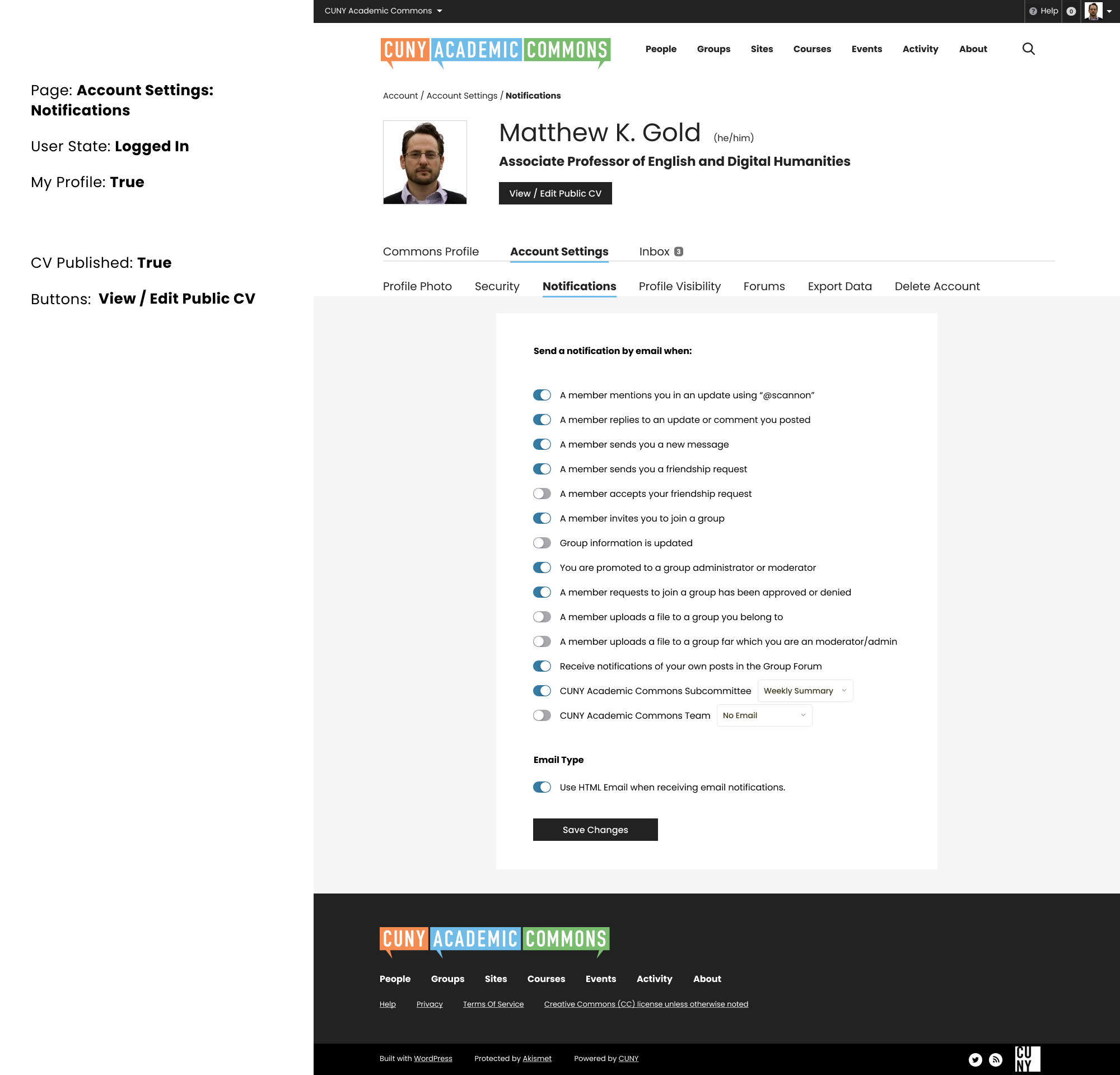
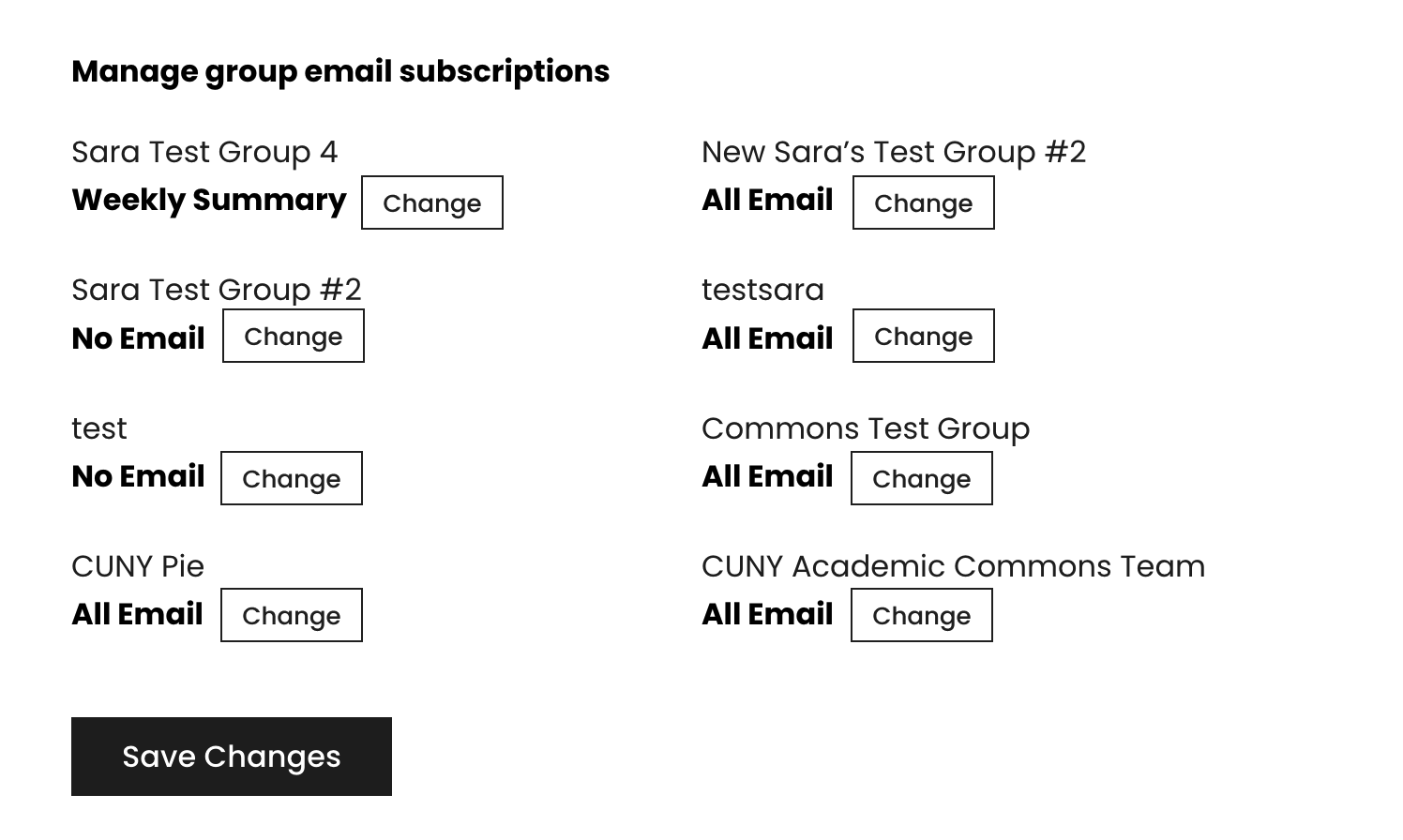
Thanks Sara for the Account Settings mockup. I've got a version of this working. I've attached a screenshot and an animated GIF.
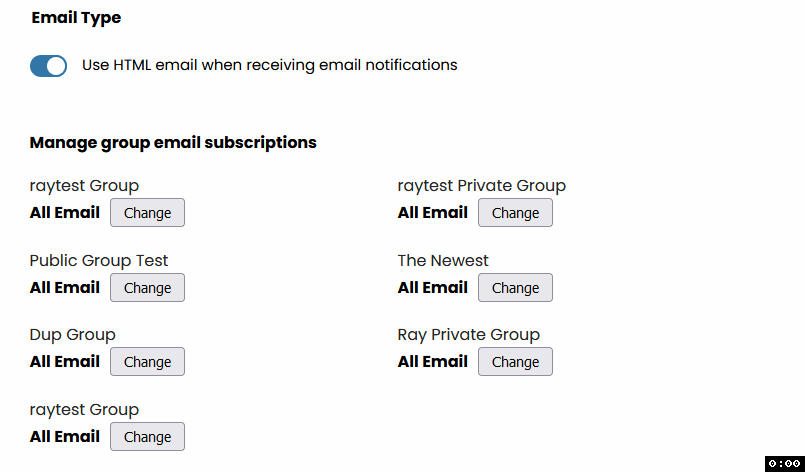
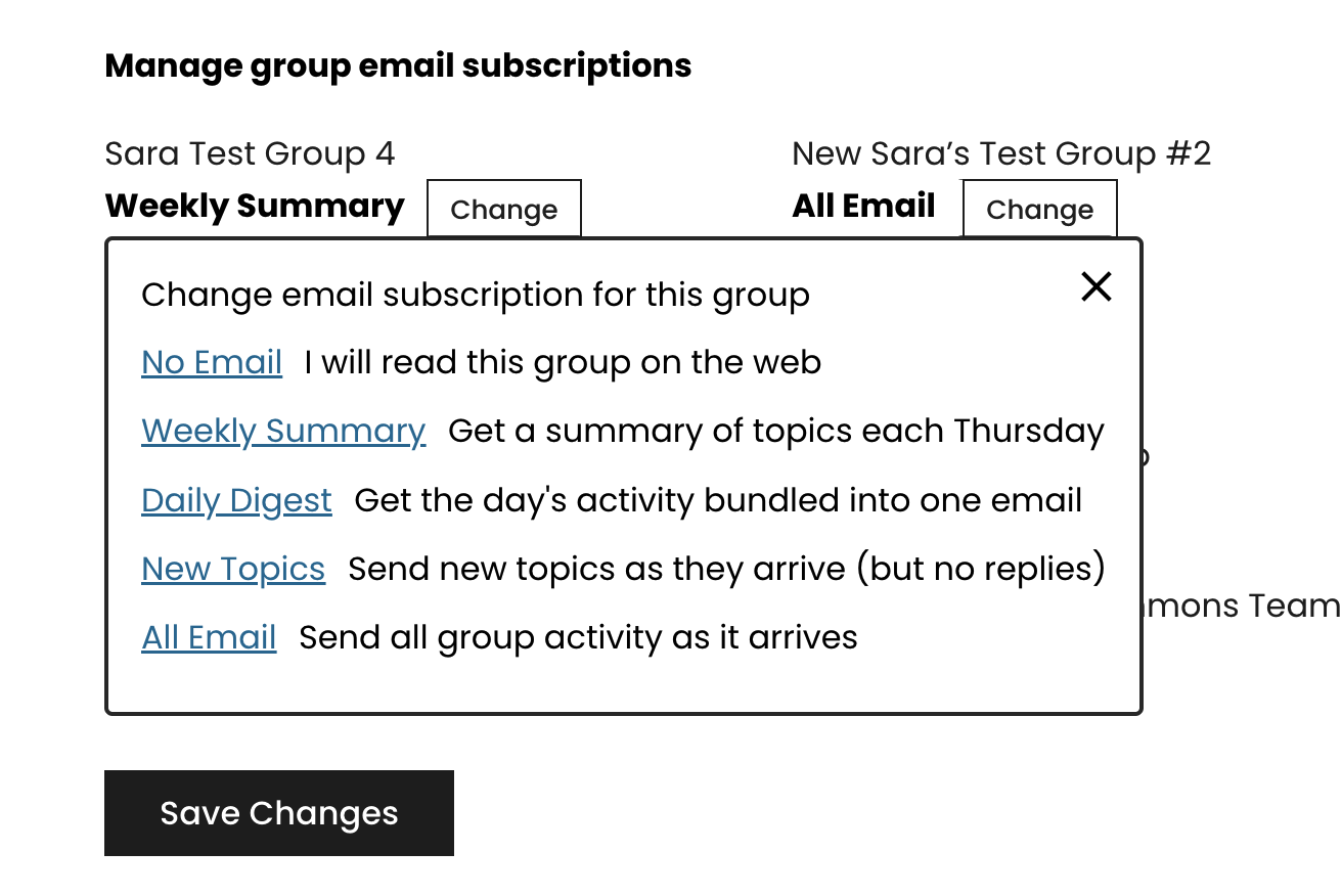
I made one difference with how the group email subscription portion was laid out in the mockup because each group had both a toggle button and a dropdown select option, which doesn't really work that well. As an alternative, I decided to re-use the existing group subscription "Change" button that is shown when on a single group page (see https://redmine.gc.cuny.edu/attachments/25854). I was also thinking about adding the group avatar to each group if that would make things visually distinctive, but could use your thoughts, Sara, about whether this layout works better.
Some implementation notes:
- BuddyPress renders the "Settings > Notifications" page with separate "Yes" and "No" radio input buttons, whereas the new layout uses a toggle button. I implemented the toggle button as a checkbox.
- I didn't want to override the "Settings > Notifications" template and having to hardcode and create a list of all the various notification options, so I parsed out the existing options from the HTML markup. Then I took those options to render the checkboxes. See https://github.com/cuny-academic-commons/cac/commit/3aa68a3021c7328275c7ae67628545b08f73ed56 .
- Changing from dual-radio input buttons to a single checkbox also required an adjustment so the BuddyPress settings API can properly save unchecked options. See https://github.com/cuny-academic-commons/cac/commit/3aa68a3021c7328275c7ae67628545b08f73ed56#diff-b6b72c8eca6f64522e37eedc943456ed725c0c7214b3c01d8e718c0d04d6a7b2R5-R33
- I added a separate, checkbox toggle stylesheet: https://github.com/cuny-academic-commons/cac/commit/d00246d235d2a7ebda86986ff89340a29c995894 . So if we want to re-use these checkbox toggles on other pages, enqueue the 'cac-checkbox-toggle' stylesheet on the page you want to use it on with markup that resembles the following:
<fieldset class="toggles">
    <legend>Toggles</legend>
    <div>
        <input type="checkbox" name="my-toggle" id="my-toggle" value="whatever" />
        <label for="my-toggle">This is my toggle!</label>
    </div>
</fieldset>
Updated by Raymond Hoh over 2 years ago
Hi Sara, do you have a Figma link with the updated mockups for the Notifications and Messages pages that you presented in the dev chat?
Apologies if you already posted it somewhere, but I couldn't find it. Thanks!
Updated by Sara Cannon over 2 years ago
- File Screen Shot 2023-09-05 at 10.27.03 AM.png Screen Shot 2023-09-05 at 10.27.03 AM.png added
- File Screen Shot 2023-09-05 at 10.35.46 AM.png Screen Shot 2023-09-05 at 10.35.46 AM.png added
- File Screen Shot 2023-09-05 at 11.07.24 AM.png Screen Shot 2023-09-05 at 11.07.24 AM.png added
- File Screen Shot 2023-09-05 at 11.07.57 AM.png Screen Shot 2023-09-05 at 11.07.57 AM.png added
- File Screen Shot 2023-09-05 at 11.10.10 AM.png Screen Shot 2023-09-05 at 11.10.10 AM.png added
- File Screen Shot 2023-09-05 at 11.12.36 AM.png Screen Shot 2023-09-05 at 11.12.36 AM.png added
- File Screen Shot 2023-09-05 at 11.14.24 AM.png Screen Shot 2023-09-05 at 11.14.24 AM.png added
- File Screen Shot 2023-09-05 at 11.17.38 AM.png Screen Shot 2023-09-05 at 11.17.38 AM.png added
- File Screen Shot 2023-09-05 at 11.21.47 AM.png Screen Shot 2023-09-05 at 11.21.47 AM.png added
- File Screen Shot 2023-09-05 at 11.22.31 AM.png Screen Shot 2023-09-05 at 11.22.31 AM.png added
I've been combing through the account settings looking for bugs:
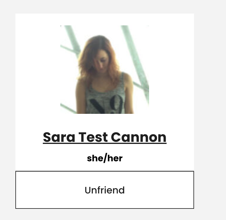
- https://commons.gc.cuny.edu/members/scannon/friends/ - The bottom "Unfriend" section has a black box around it. The styling should match the lower sections that are on the other pages - with a thin grey top line. (see attached)
- https://commons.gc.cuny.edu/members/scannon/events/ - The events section has a menu that is not styled. Do we even need this menu here? (see attached for current and then the mockup)
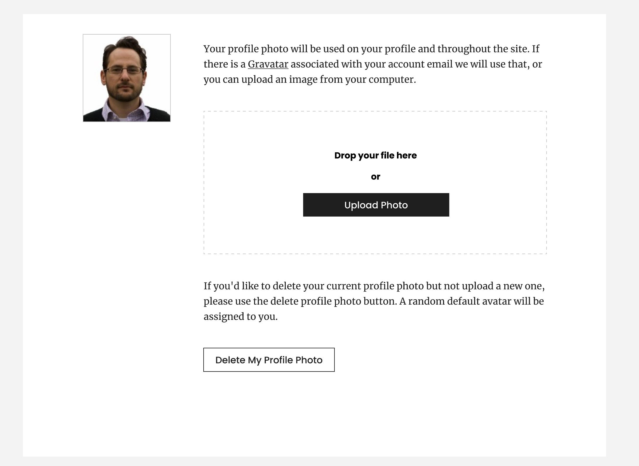
- https://commons.gc.cuny.edu/members/scannon/profile/change-avatar/ Profile Photo does not quite match the mockup. Remove the tabs as an interface and make the delete a button rather than a tab (see attached mockup)
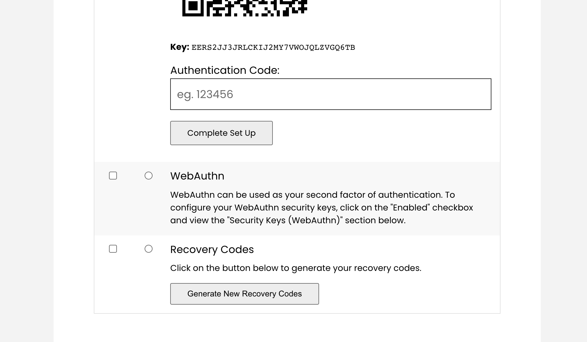
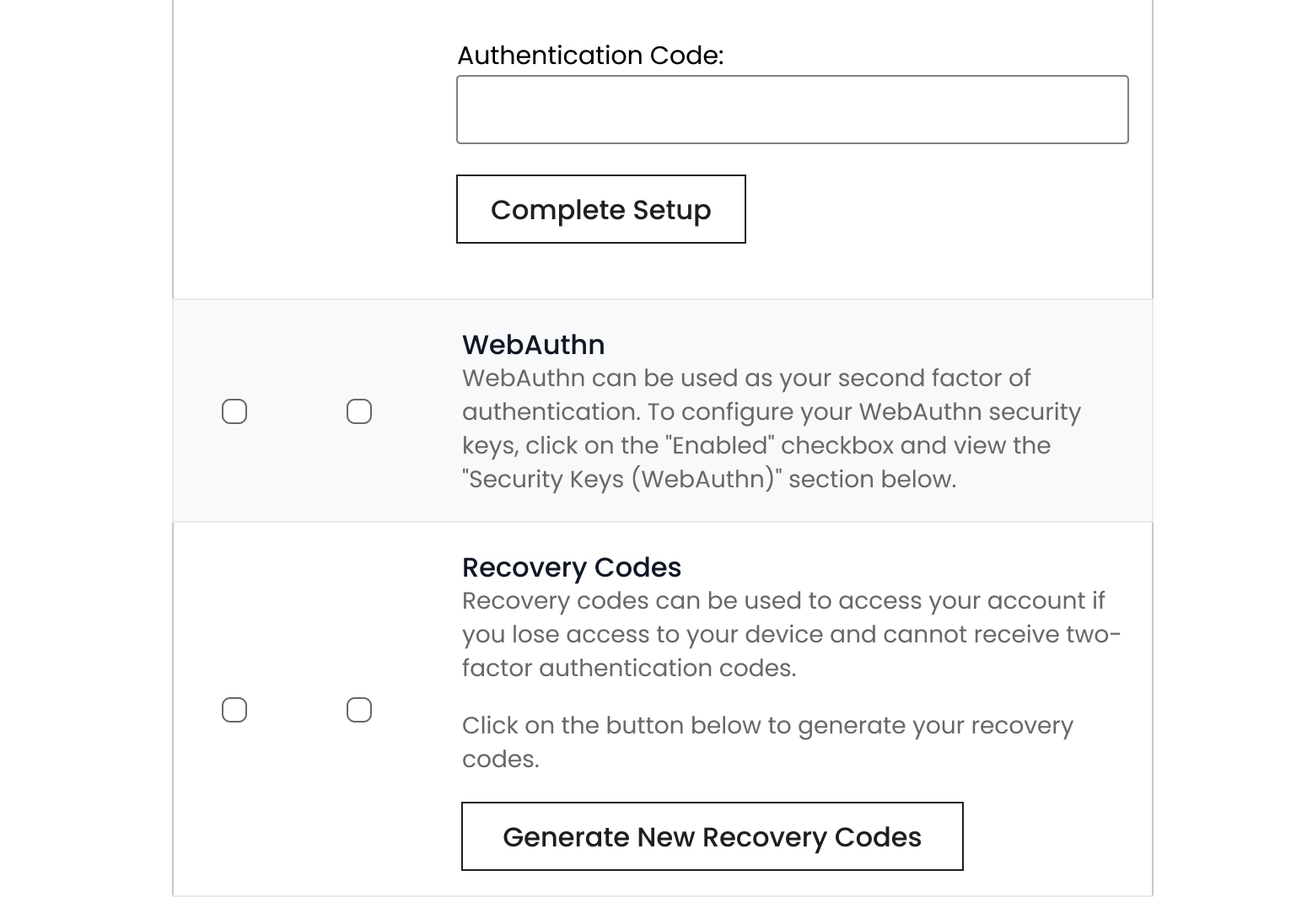
- https://commons.gc.cuny.edu/members/scannon/settings/ Account Settings / Security: The buttons inside this section have a grey background. ("complete set up" and "generate recovery codes" Can they match the comps and have a pointer on hover? Grey BG on hover makes sense
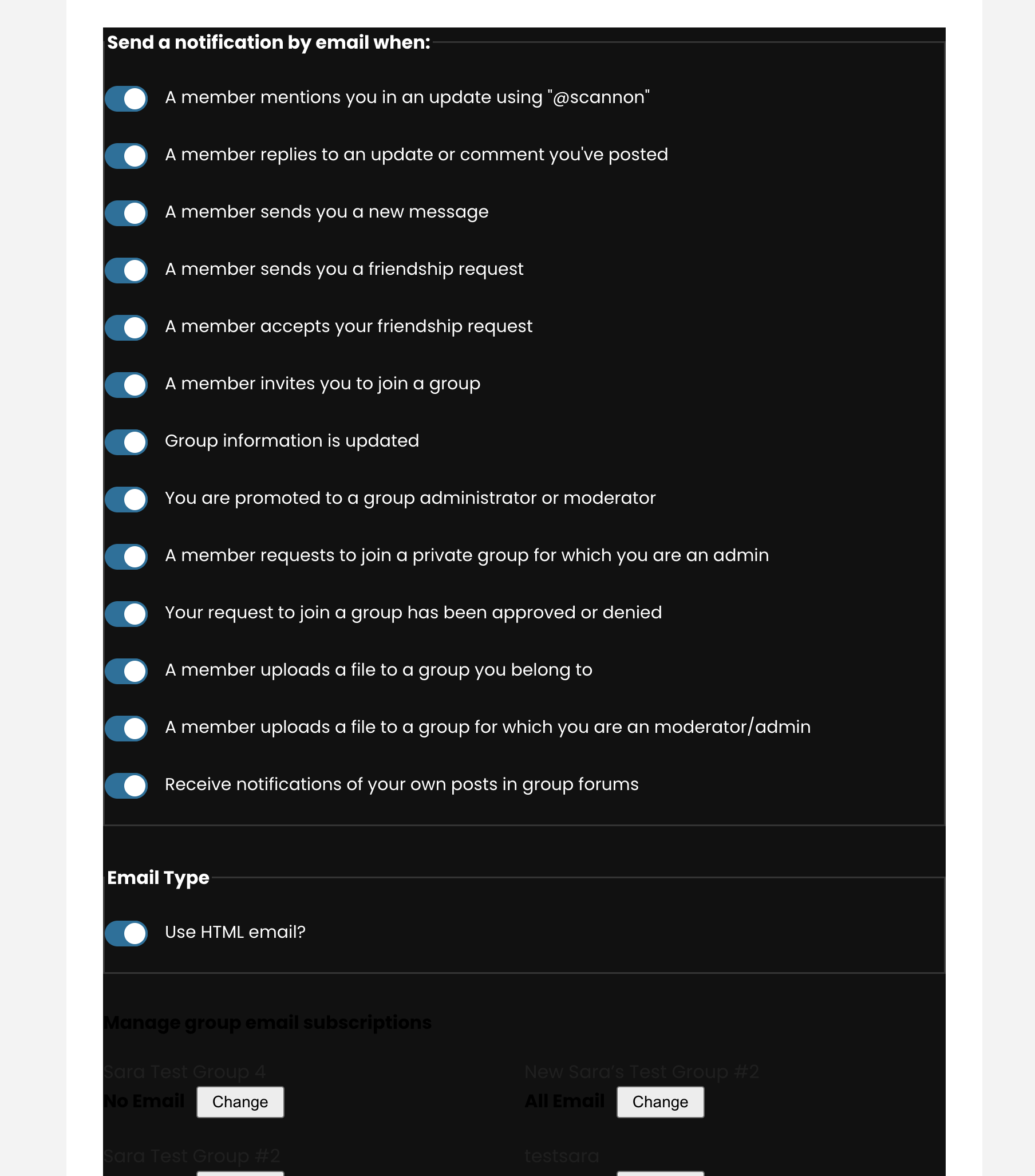
- https://commons.gc.cuny.edu/members/scannon/settings/notifications/ Notifications: This section has a black background styling bug (see attached)
- https://commons.gc.cuny.edu/members/scannon/settings/profile/ Profile Visibility was changed to where you can also edit the fields. I will post about this separately.
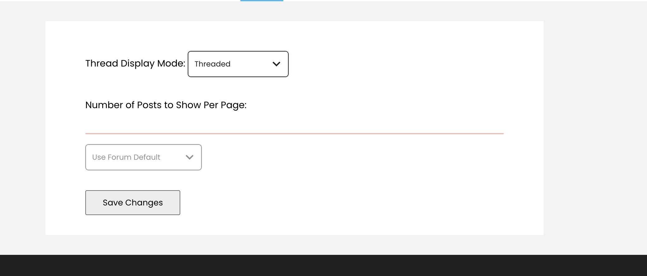
- https://commons.gc.cuny.edu/members/scannon/settings/forums/ Forums: currently has the wrong button style and a thin red line? not sure what is going on (see attached) but I have included the screenshot of the mockup
- https://commons.gc.cuny.edu/members/scannon/settings/data/ Export Data needs black button style
- https://commons.gc.cuny.edu/members/scannon/settings/delete-account/ Delete account needs Black button style
Updated by Sara Cannon over 2 years ago
"Profile Visibility" was changed to "Edit Profile" so that we can have the ability to edit the sections as well as determine their visibility. See the attached screenshot. Is this going to be doable?

Updated by Sara Cannon over 2 years ago
Following up on our meeting on 9/5: We determined that we are going to look into the possibility of holding of on having the account be editable like the above but keep it editable like how it currently is on the dark profile and possibly re-skin the current profile to update it slightly. TBD on what that is going to look like.
Updated by Raymond Hoh over 2 years ago
I've been combing through the account settings looking for bugs:
Thanks for taking a look, Sara. I'm aware of many of these bugs, particularly the button styling ones as I didn't want to override an entire template file just to add a button CSS class because that would mean adding a bunch of template files to our theme and I want to avoid that. I've been thinking of two ways around that, both of which are a little messy, but they will get the job done.
- https://commons.gc.cuny.edu/members/scannon/profile/change-avatar/ Profile Photo does not quite match the mockup. Remove the tabs as an interface and make the delete a button rather than a tab (see attached mockup)
This one is tricky as the edit profile photo interface is built in javascript so we cannot really make these changes easily without rewriting or supplementing the javascript that BuddyPress provides. Boone, do you want to take a minute or so to see if this would be easy to do without doing too much work?
Updated by Boone Gorges over 2 years ago
Sure thing. I've taken a pass in https://github.com/cuny-academic-commons/cac/commit/082910bff05cd09b0a88b9b535c5d9c004f76db1. I was able to use most of the existing tools, I just needed to move around the markup a bit (including one JS-based trick). I also improved the behavior a bit so that the Delete button doesn't show up incorrectly when a user has no local avatar, but does have a Gravatar.
Updated by Sara Cannon over 2 years ago
When it comes to button styles, I'm unsure what is the best approach. Do we need to do a sitewide audit and figure out what we can change globally so that we aren't overriding template files?
Updated by Boone Gorges over 2 years ago
When it comes to button styles, I'm unsure what is the best approach. Do we need to do a sitewide audit and figure out what we can change globally so that we aren't overriding template files?
Ray, do you think we're far enough along in the redesign process that we could switch over to Sara's button styles for the default across the entire theme? Currently, we are limiting to the .cac-button class, which means that we're only targeting new markup, or markup that we are overriding from the bp-legacy templates. But maybe it's time for us to use the more general `button` and `.button` selectors that bp-legacy uses. If we need to keep the existing button styles for certain types of pages, perhaps we could scope everything with body classes?
Updated by Raymond Hoh over 2 years ago
Ray, do you think we're far enough along in the redesign process that we could switch over to Sara's button styles for the default across the entire theme?
I think we can look into doing this. The "black background on white text" button would probably be the default and we can override buttons that require the "white background on black text" button style where necessary.
In the meantime, I've manually addressed the button display issues by adding an override style for each unstyled button mentioned above.
- https://commons.gc.cuny.edu/members/scannon/settings/notifications/ Notifications: This section has a black background styling bug (see attached)
Sara, it looks like you had dark mode enabled in your browser while you were testing the "Settings > Notifications" page. The checkbox toggle CSS that I copied took inspiration from had some dark mode CSS declarations. I just removed them and the page should look okay now. Side note: I would love to see us implement a dark mode for the new redesign! :)
Everything except the Profile Visibility changes has been addressed and is ready for testing on cdev.
Updated by Sara Cannon over 2 years ago
- File Screenshot 2023-09-20 at 10.12.24 PM.png Screenshot 2023-09-20 at 10.12.24 PM.png added
- File Screenshot 2023-09-20 at 10.12.32 PM.png Screenshot 2023-09-20 at 10.12.32 PM.png added
- File Screenshot 2023-09-20 at 10.21.26 PM.png Screenshot 2023-09-20 at 10.21.26 PM.png added
A few more small tweaks:
- Group Email Subscriptions: utilize a small outline button instead of the small grey one if possible (see attached).
- Group Email Subscriptions: Replace the drop shadow "close" on the modal with an X (see attached).
- Profile Visibility: Align the dropdowns with the labels (see attached)
Updated by Raymond Hoh over 2 years ago
Thanks Sara!
I've addressed the padding problem on the "Account Settings > Profile Visibility" page, as well as the button styling for the group subscription block on the "Account Settings > Notifications" page. This is available for testing on cdev.
Updated by Sara Cannon over 2 years ago
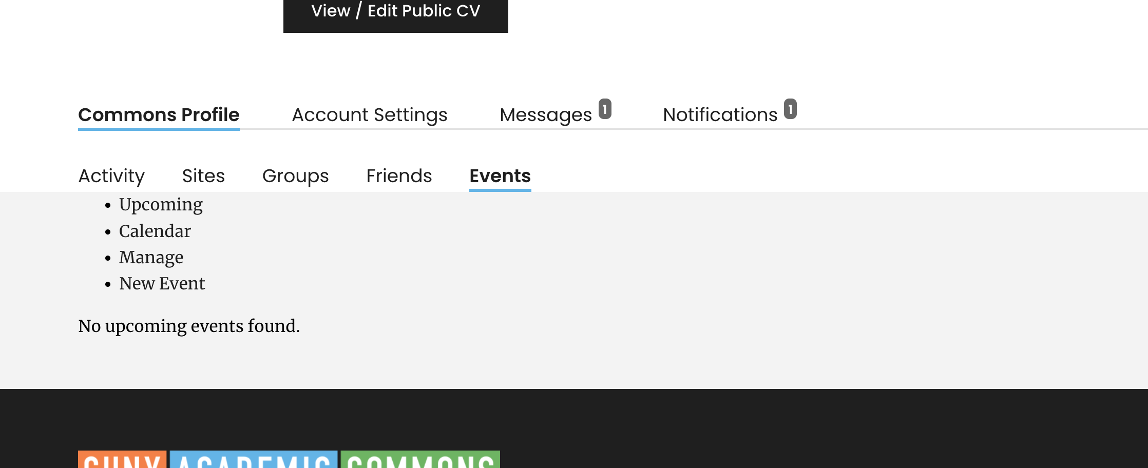
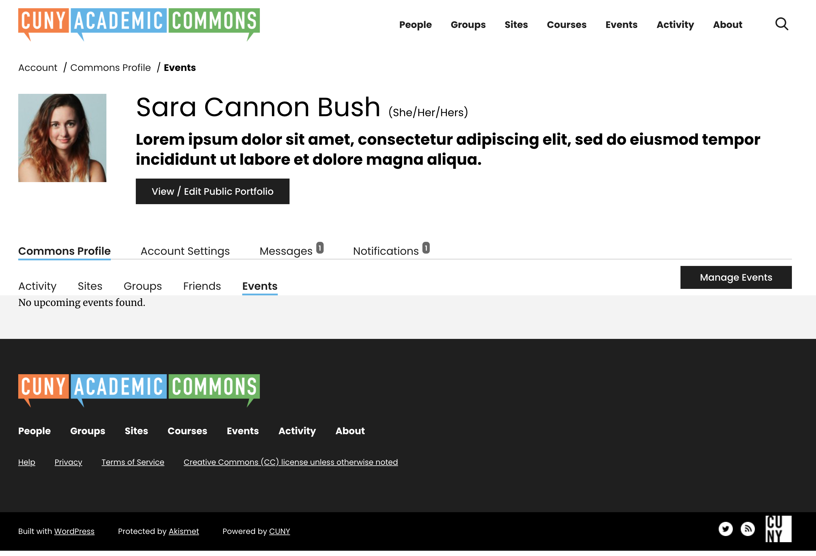
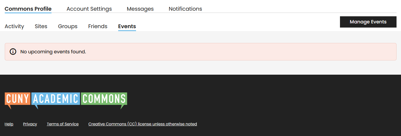
On "Events" under the "Commons Profile": when there is no event, the page looks unstyled. (see attached)
Could we add some min-height to that section so that the footer does not come up all the way and get some padding above "No upcoming events found."?
Updated by Raymond Hoh over 2 years ago
- File 2023-09-22_100238.png 2023-09-22_100238.png added
On "Events" under the "Commons Profile": when there is no event, the page looks unstyled.
Thanks Sara. Should be fixed on cdev now. I've attached a screenshot as well.
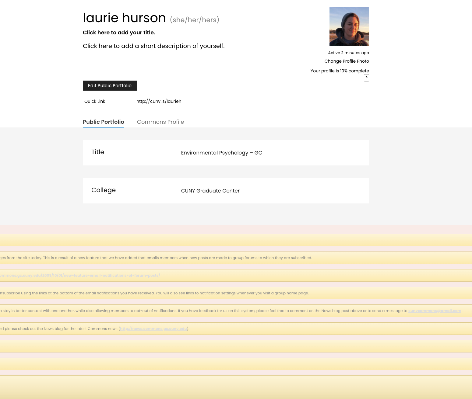
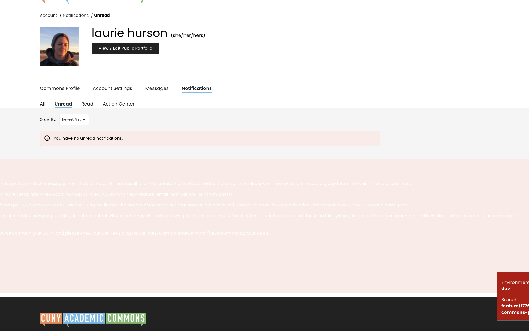
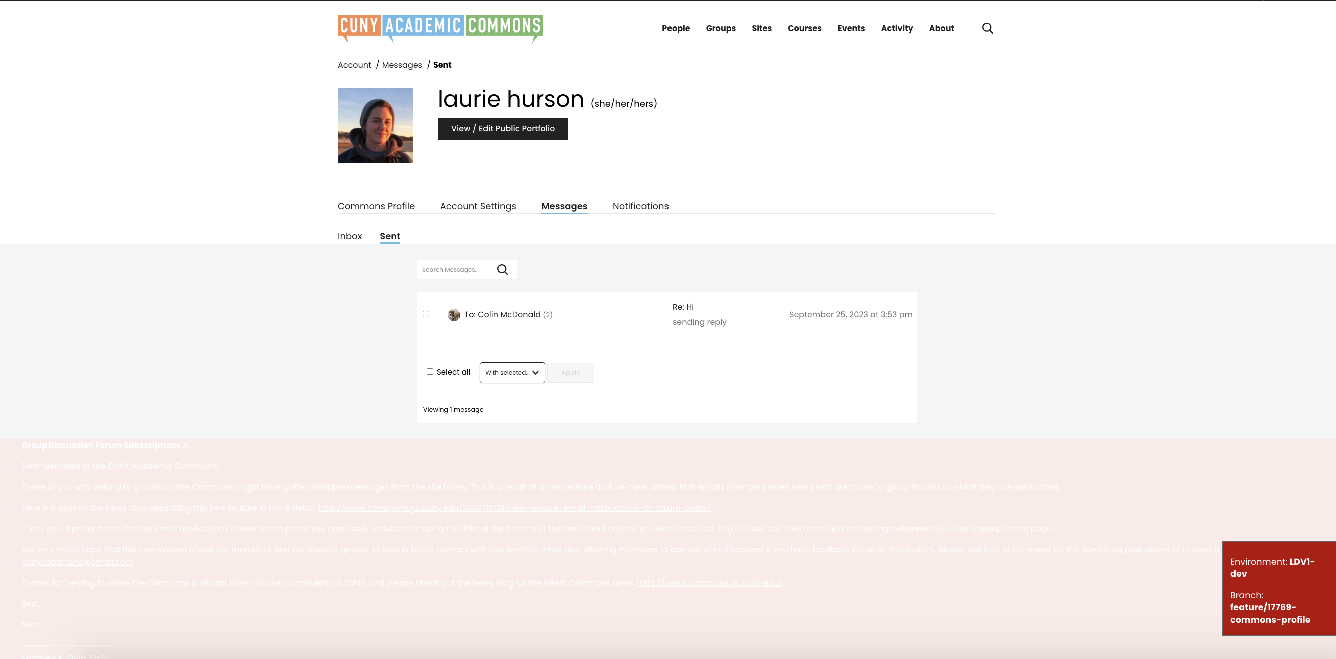
Updated by Laurie Hurson over 2 years ago
- File Screen Shot 2023-09-25 at 3.54.10 PM.png Screen Shot 2023-09-25 at 3.54.10 PM.png added
- File Screen Shot 2023-09-25 at 3.55.01 PM.png Screen Shot 2023-09-25 at 3.55.01 PM.png added
- File Screen Shot 2023-09-25 at 3.57.29 PM.png Screen Shot 2023-09-25 at 3.57.29 PM.png added
- File Screen Shot 2023-09-25 at 3.57.43 PM.png Screen Shot 2023-09-25 at 3.57.43 PM.png added
Hi All,
I went into CDEV to take a look at the new account settings. On my account settings pages and messages tabs, I have a weird grayed out/red notification message at the bottom of my pages that has info about "Group Discussion Forum Subscriptions". It looks like its supposed to be a notice? I was able to dismiss it, but I don't think this is how we want the notices displaying?
Updated by Boone Gorges over 2 years ago
Thanks for flagging this, Laurie. It's not part of the new feature but instead is a very old notice that happens to be there because of the legacy content on cdev. I've marked it as 'inactive' so that it no longer appears, and I've made the same change on the production site so that it doesn't appear after launch either.
Updated by Colin McDonald over 2 years ago
- Related to Design/UX #18746: Top Navigation Bar changes added
Updated by Raymond Hoh over 2 years ago
I was doing some testing and found that the dropdown filter on a user's "Commons Profile > Activity" page was only working for certain filters.
I did some digging and found that this is due to the bp-legacy template pack only allowing registered activity filters to work. I added a workaround so the older method of loading activity filters will work without checks like before. See https://github.com/cuny-academic-commons/cac/commit/2ce139433fcbe762ec4a28b527b9c795c38f8617 .
I also took the opportunity to mirror the filters used from the main Activity Directory page over to the "Commons Profile > Activity" page.
Before, the activity filters contained the following:
- Updates
- New Sites
- Posts
- Comments
- Friendships
- New Groups
- Group Memberships
- Group Updates
- Groupblog Comments
- Events created
- Events edited
- Events deleted
- Papers added to groups
- Digital Research Tools Used
- Paper comments created
- Paper edits
- Topics
- Replies
- New Docs
- Doc Edits
- Doc Comments
Now, they resemble the following:
- Site Posts
- Site Comments
- Site Updates
- Group Forums
- Group Library
- Group Memberships
- Group Updates
- Events
- People Updates
This is available for testing on cdev. Let me know if we need to trim any of the activity filters above.
Updated by Boone Gorges over 2 years ago
- Status changed from New to Staged for Production Release
Updated by Boone Gorges over 2 years ago
- Status changed from Staged for Production Release to Resolved
Updated by Sara Cannon over 2 years ago
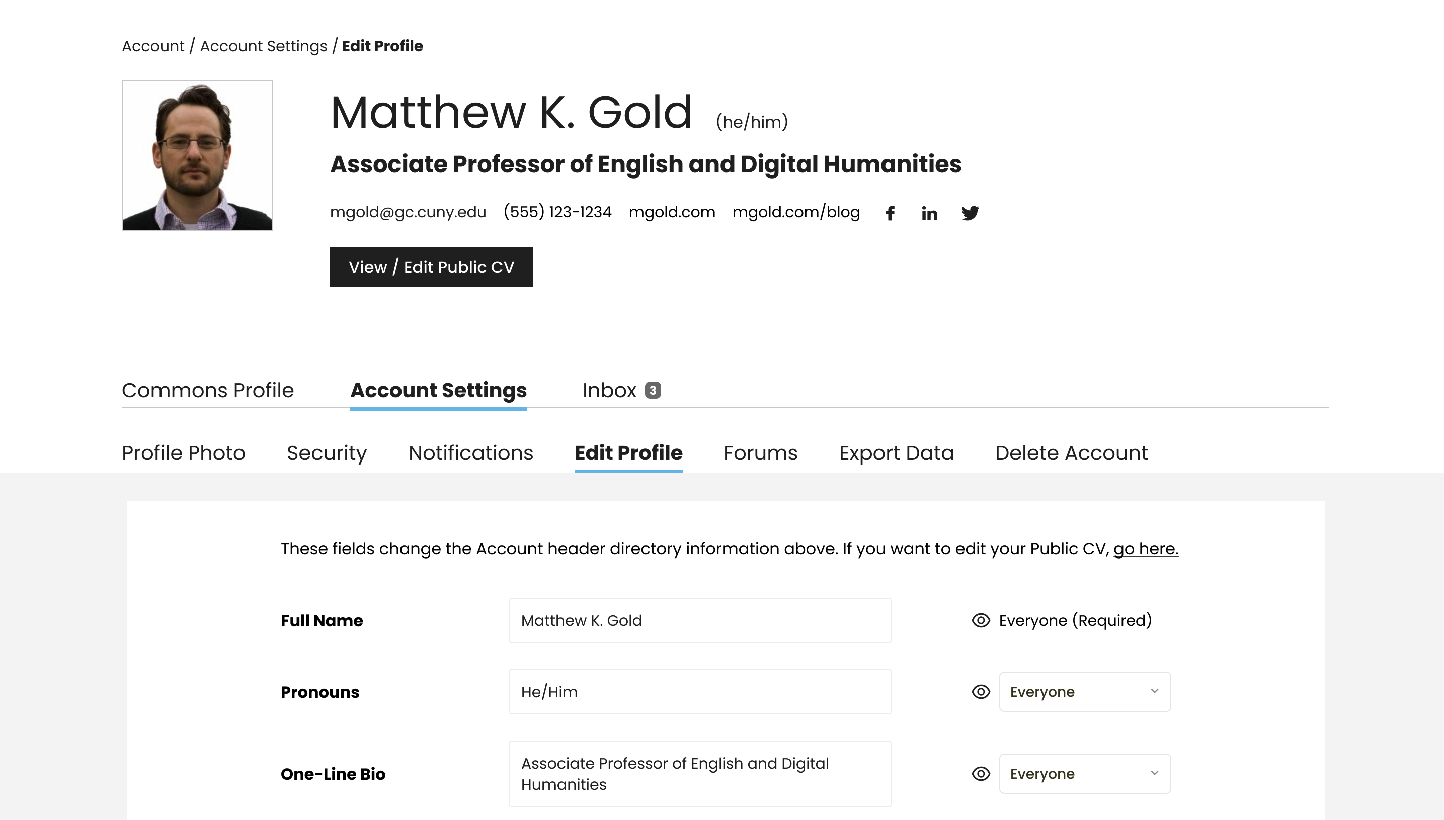
Posting for us to get the wording above the profile fields down. Something along the lines of "These fields change the account header directory information above. If you want to edit your Public CV, go here."