Bug #19376
closedNew Help Email Process
0%
Description
Hi All,
I wanted to give feedback on the process of submitting a help ticket through the new platform.
Previously when you clicked "Help" you got the options to 1.visit the help page or 2.Send us an email. The same happens now, but as a pop up box over the whole page. See screenshot. I think the email address should be listed in this box because of the issue outlined below.
The process for option 2 (email) has changed. Previously if option 2 was clicked it produced a pop up form to submit a ticket. Now if clicked, it opens a local email client. Users who don't use email clients will get stuck at this phase of the process and there is no way to copy an paste the email address because it is not listed in the previous screen. A user would need to seek out the email address at the bottom of the help page, copy/paste into their own email and then send.
Is there a way we can just direct users to https://cachelpdesk.org/ to submit a ticket. We could change the language around needing to register (ex: "for commons teams only") or create a similar user-facing page without the registration information.
We can ignore this suggestion for now and see if the help desk tickets continue to roll in at a similar pace but I worry that the new process is a bit confusing.
Files
Updated by Laurie Hurson over 2 years ago
Updated by Raymond Hoh over 2 years ago
According to W3AG guidelines, the "Send us an email" label is accessible. Using the email address instead of the "Send us an email" label would make things better for those that want to copy the email address. We should tie this in with #19366 because the email address will be more prominent when we make this change and there was some talk about potentially changing the email address in that ticket.
If we do replace the "Send Us an email" label with the email address, we should probably get rid of both buttons in the modal and do something like this instead:

The email address would remain linkable and the "Copy" button would help for those that just want to copy the email address.
About using a form instead of using the email address, using a form would place less emphasis on the email address and could be implemented again. I think Marilyn mentioned that she did not like the Zendesk form when we were still using it because users were more likely to fill in anything in the form, but we can revisit this if others want the form reinstated.
As for:
Is there a way we can just direct users to https://cachelpdesk.org/ to submit a ticket. We could change the language around needing to register (ex: "for commons teams only") or create a similar user-facing page without the registration information.
Everything on cachelpdesk.org can be edited and altered to what we want. We would just need to nail down what we want to display, then we can replace the "Send us an email" label with "Send us your question" and link to the help desk site. This would almost be the same as implementing the form option.
Updated by Marilyn Weber over 2 years ago
Unsurprisingly, I do indeed like the pop-up better than the form.
Updated by Raymond Hoh over 2 years ago
Hi Marilyn,
On the call today, you mentioned if it was possible to ban certain users from being able to create tickets. You can do so here: https://cachelpdesk.org/wp-admin/admin.php?page=wsdesk_email . You'll have to add the user's email address you will want to block on that page.
About creating templates, there is some documentation to do that here: https://woo.com/document/wsdesk-helpdesk-customer-support-ticket-system/#section-13 . Scroll down to the "Creating Canned Responses" section to view how to create a template and how to use it.
Updated by Raymond Hoh over 2 years ago
- File new-help-modal-2.gif new-help-modal-2.gif added
On the call today, for the help modal, we talked about displaying the email address with a 'Copy' button while leaving the larger 'Visit our help site' button at the bottom. I've attached a mockup:
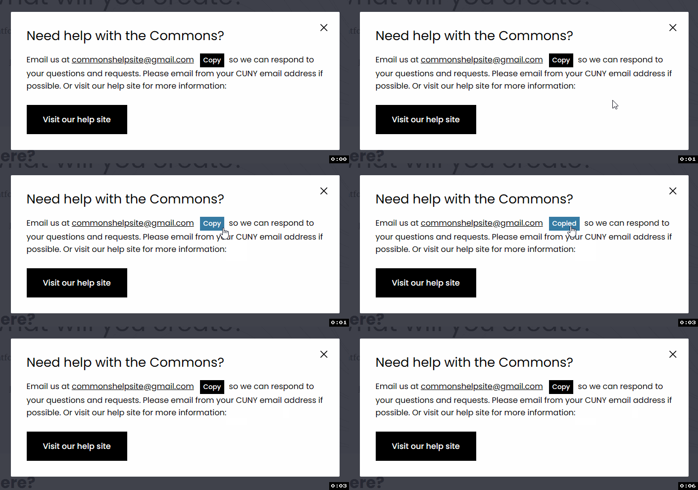
Would welcome feedback from others, especially from Sara and Laurie about whether anything needs to be changed.
Updated by Matt Gold over 2 years ago
Thank you, Ray. Sara, I'd love to hear from you about design. Ray, I'd be in favor of using a copy icon instead of the word "copy" -- unless having "copy" spelled out is important for accessibility reasons. Maybe something like this? https://freeicons.io/office-and-folders-icons/copy-icon-37724
Updated by Raymond Hoh over 2 years ago
Ray, I'd be in favor of using a copy icon instead of the word "copy" -- unless having "copy" spelled out is important for accessibility reasons.
Right now, when you click on the "Copy" button, the text of button changes to "Copied" to let the user know that the email address was copied to the clipboard. If we switched to an icon, would we still show the "Copied" label after clicking on the icon?
Updated by Marilyn Weber over 2 years ago
- File recording.conf recording.conf added
- File audio1282433559.m4a audio1282433559.m4a added
- File video1282433559.mp4 video1282433559.mp4 added
Ray
Thanks for this - "On the call today, you mentioned if it was possible to ban certain users from being able to create tickets. You can do so here: https://cachelpdesk.org/wp-admin/admin.php?page=wsdesk_email . You'll have to add the user's email address you will want to block on that page." I'll try this as needed
But these instructions don't work for me https://woo.com/document/wsdesk-helpdesk-customer-support-ticket-system/#section-13 . Scroll down to the "Creating Canned Responses" section. I attach a video to show you the problem. Thanks!
Updated by Raymond Hoh over 2 years ago
But these instructions don't work for me https://woo.com/document/wsdesk-helpdesk-customer-support-ticket-system/#section-13 . Scroll down to the "Creating Canned Responses" section. I attach a video to show you the problem. Thanks!
Looks like the guide is missing one step. In the guide's screenshot, a ticket is checked:
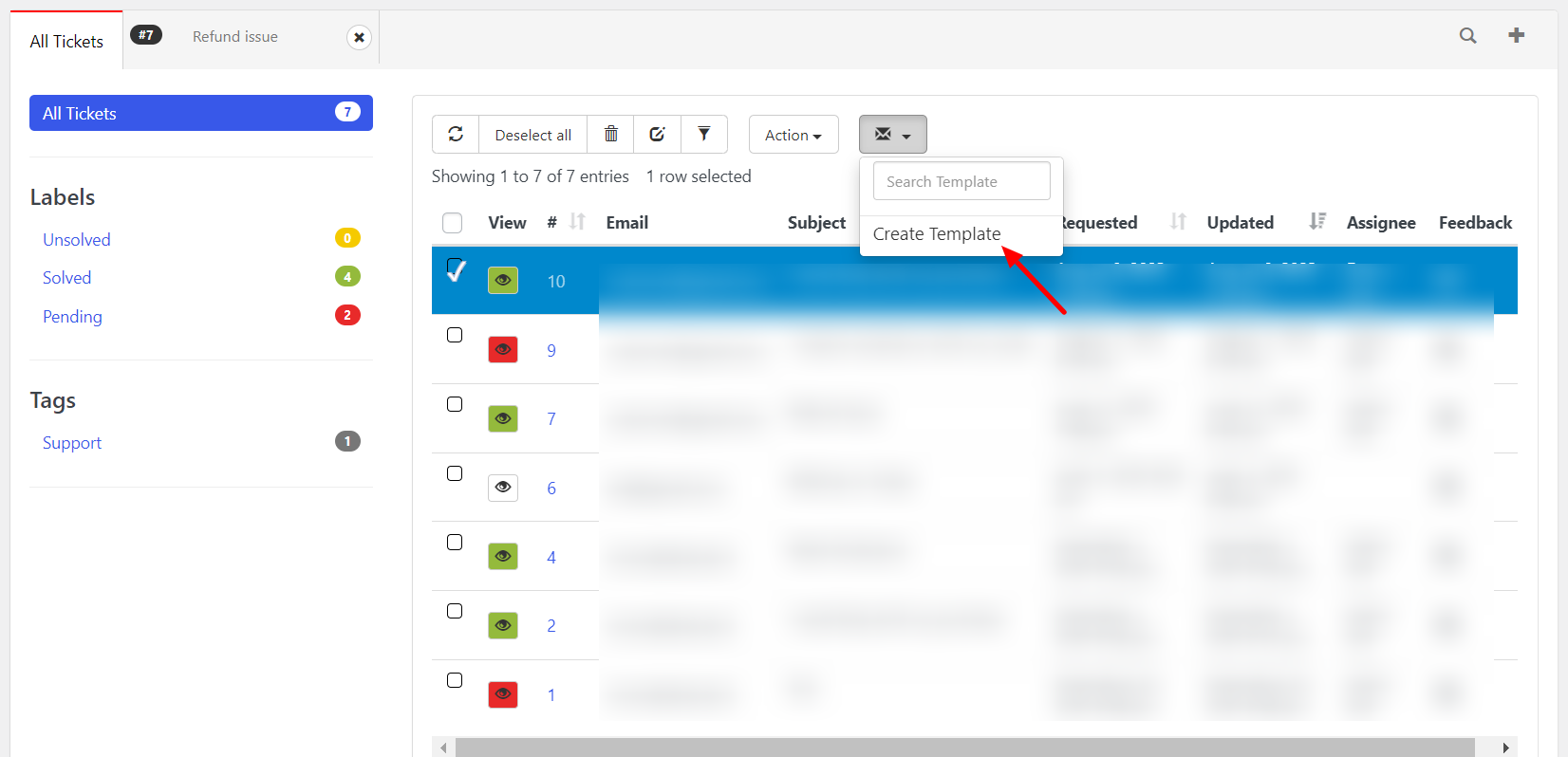
So try clicking on a checkbox in the ticket list, then the envelope icon should be available to click. If that doesn't work, let me know.
Updated by Sara Cannon over 2 years ago
I think the copy button is fine. It will make copying the email on mobile easier.
Updated by Sara Cannon over 2 years ago
- File inline copy.png inline copy.png added
- File inline copy2.png inline copy2.png added
- File Content copy icon.svg Content copy icon.svg added
An elegant solution would be to do it similar to what they do on this site: https://shoelace.style/components/copy-button

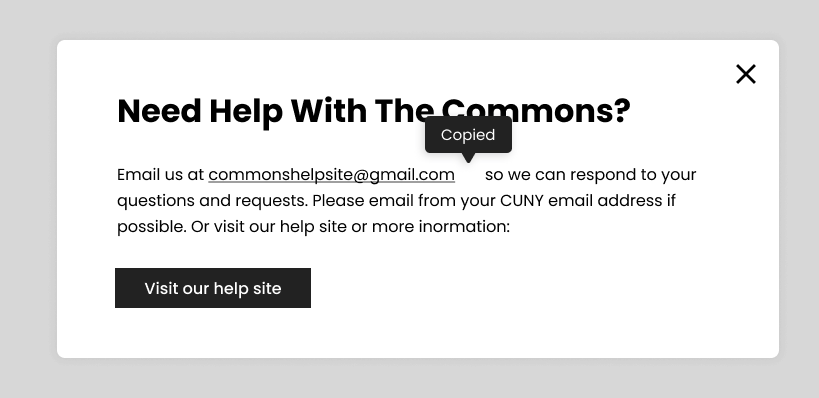
Updated by Raymond Hoh over 2 years ago
- File new-help-modal-3.gif new-help-modal-3.gif added
Thanks Sara. I've implemented Shoelace's Copy button. See attached GIF:
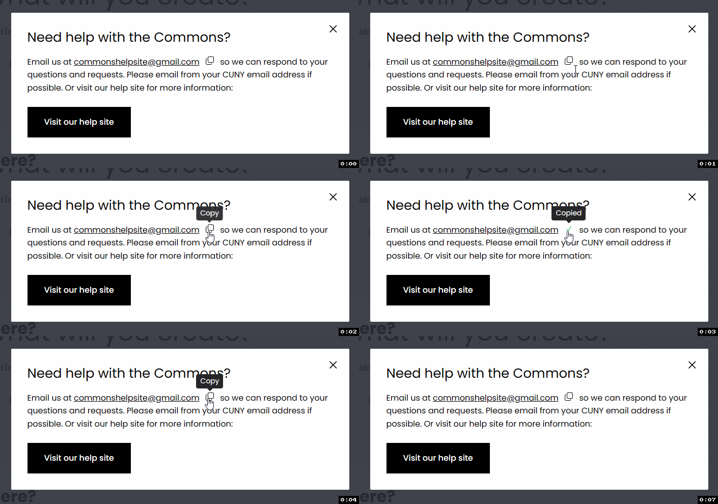
This is also available for testing on cdev. Let me know if anything else needs to be tweaked.
Some implementation notes: I ran into a problem with loading Shoelace's Copy button on secondary sites. I created a new ticket about this: #19415. However from Shoelace's docs, I do have a workaround, which requires manually setting the locale to 'en' in javascript:
document.documentElement.lang = 'en';
Updated by Sara Cannon over 2 years ago
actually, I spoke too soon. There is a little box and shadow over the X button that has a hover effect. Can that be removed? 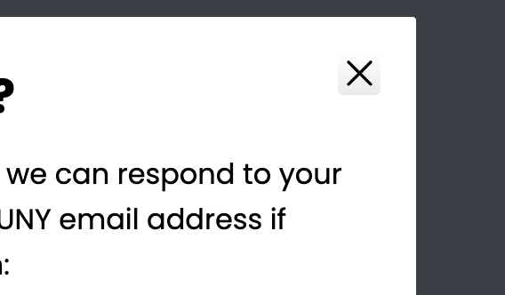
Updated by Raymond Hoh over 2 years ago
Thanks Sara, the close hover bug should be fixed on cdev now.
Colin, do we want to add the updated help dialog modal for next week's maintenance release or wait for the larger January release to roll out?
Updated by Colin McDonald over 2 years ago
I don't see any reason to wait on rolling this out now that it's ready. It's separate from the main release, and it might help people in the meantime if we launch it sooner. Thanks all!
Updated by Raymond Hoh over 2 years ago
- Category name set to Help/Codex
- Status changed from New to Staged for Production Release
- Assignee set to Raymond Hoh
- Target version set to 2.2.5
I've committed the changes for the updated Help Dialog modal in https://github.com/cuny-academic-commons/cac/commit/d98db4170128b267a7e161acb2f9b2cd2ed92e90 . This will be a part of this week's maintenance release.
Updated by Boone Gorges over 2 years ago
- Status changed from Staged for Production Release to Resolved