Design/UX #3176
closedConsolidate Doc/File/Forum Attachment interface
100%
Description
I think that we should look into having a single navigation tab that consolidates views of BP Docs, uploaded files, and discussion forum attachments. I remember we were working on this at one point, but don't know where we left it.
Files
Related issues
Updated by Boone Gorges about 12 years ago
- Tracker changed from Feature to Design/UX
- Assignee changed from Boone Gorges to Chris Stein
Moving this over to Chris for the moment. I'll need some mockups or at least some description before moving forward with implementation.
Updated by Boone Gorges almost 12 years ago
- Target version changed from 1.7 to 1.8
Moving to 1.8 for further discussion.
Updated by Boone Gorges over 11 years ago
Adding Samantha as a watcher. Sam, I think this is a fairly low priority item, but I'm wondering if maybe something has come up in user testing, or if maybe you had any ideas about how we might combine some of these various interfaces.
Updated by Boone Gorges over 11 years ago
- Assignee changed from Chris Stein to Samantha Raddatz
- Target version changed from 1.8 to Future release
Moving out of active milestones. I think it's worth having the discussion about this, though I'm open to the possibility that we should just scrap the idea and leave things the way they are.
Updated by Matt Gold over 11 years ago
Okay. Maybe at some point we could do some UX testing around the group interface and see whether people find these different sections confusing or not. Samantha, can you please put that on a list to look at at some point? Thank you
Updated by Matt Gold over 7 years ago
- Target version changed from Future release to 1.16
think about something like a "group library." Putting in 1.16 for now
Updated by Sonja Leix about 7 years ago
Matt Gold wrote:
think about something like a "group library." Putting in 1.16 for now
Happy to draft up some UX recommendations for this if it's something we're looking to tackle for 1.16. In that case I'd need some more info and ideally some screenshots of which specific areas of the UI this should effect.
Updated by Boone Gorges almost 7 years ago
- Related to Feature #11755: Add ability to delete group file folder added
Updated by Boone Gorges almost 7 years ago
- Assignee changed from Samantha Raddatz to Sonja Leix
Updated by Boone Gorges almost 7 years ago
- Target version changed from 1.16 to 1.17.0
Given other focuses for 1.16, I don't see us having the design bandwidth to tackle this. But I think we should begin the conversation this fall if we want to pursue this, and look for implementation for 1.17.
Updated by Matt Gold almost 7 years ago
Thanks. I'd really like us to tackle this in the Spring at the latest. I think it's doable and important (something reinforced to me this semester by my student as I taught on the commons), and not dependent on the redesign.
Updated by Colin McDonald over 6 years ago
After the Tuesday call about planning the Library feature for the spring release, Matt provided me with the below feedback to get us started, as he's seen firsthand the need for it. For next steps, it would be great to get everyone's impressions on Matt's ideas here. Sonja in particular, it would be good to hear the thoughts and questions you have for us so we can better equip you to put together a design later.
Boone, could you also provide this analytics data -- how often are new group docs created, updated, and accessed? And how often are new papers created, updated, and accessed?
BACKGROUND FROM MATT:
We currently have three very similar menu items for uploading/creating documents related to groups:
-- files
-- papers
-- docs
I've proposed that these distinctions are not clear to users -- as a faculty member, when I tell students to look for a PDF I've uploaded to the group, they are confused about the difference between these menu options.
We created all three of these areas for different reasons (papers, especially, which was a special grant-funded initiative), but now we should consolidate and make things clearer for our users.
I am proposing that we create a single area (and menu item) within groups called the Library -- e.g. the group library. The Library would contain all types of files associated with groups:
-- forum attachments
-- files
-- papers
-- docs
And then the challenge becomes, from a UX perspective, how to make the differences between the various ways of creating/sharing/accessing files visible and understandable to the user.
Based on our discussions and analytics, we may decide to:
-- discontinue docs and/or papers
-- continue docs and/or papers
-- explore third party integrations like google docs or dropbox
-- some combination of the above
It seems to me (Colin speaking now) that CUNY's partnership with Dropbox would be worth looking into here, as we may not need to reinvent the wheel, but could instead build around something like this (and save ourselves the storage demands):
https://www.gc.cuny.edu/News/Announcements/Detail?id=52383
Updated by Boone Gorges over 6 years ago
- File cac-3176-scratch.txt cac-3176-scratch.txt added
For background, I've collected some data about Docs, Papers, and Files. For each content type, I queried for some all-time totals, as well as totals since Nov 1 2017 (about 2 years) and May 1 2019 (about 6 months). These dates are obviously arbitrary but they should illustrate some patterns. "Groups" is a count of how many unique groups had items created/edited during the given time period. "Users" is similar, but for users. "Revisions" counts the number of edits to existing items; the total number of "saves" is really "items + revisions".
These numbers don't say anything about how often the items are accessed.
The attached "scratch" document contains some SQL queries I used, in case I need to do similar queries in the future.
My initial take is that Files functionality is obviously widely used and should stay, while Papers are hardly ever used and could be eliminated. Docs are somewhere in the middle.
Docs
All time
Items: 2227
Revisions: 7303
Groups: 290
Users: 785
Since Nov 1 2017
Items: 437
Revisions: 571
Groups: 63
Users: 296
Since May 1 2019
Items: 66
Revisions: 51
Groups: 14
Users: 62
Papers
All time
Items: 581
Revisions: 1331
Groups: 40
Users: 263
Since Nov 1 2017
Items: 206
Revisions: 290
Groups: 10
Users: 129
Since May 1 2019
Items: 29
Revisions: 6
Groups: 0
Users: 16
Group Files
All time
Items: 11926
Groups: 642
Users: 1133
Since Nov 1 2017
Items: 2693
Groups: 171
Users: 389
Since May 1 2019
Items: 573
Groups: 55
Users: 116
Updated by Colin McDonald over 6 years ago
Hi Boone, on today's call we were talking about whether we should consider moving away from our own open. contained solution for collaborative docs and toward supporting something like Google Docs or Dropbox Paper.
There's a bigger Commons philosophy discussion to be had here about relying on third-party, proprietary services versus those we control and maintain on our own, but for now, we're wondering what would even be feasible if we kept going it alone. We would need to update the current Docs interface -- right now it's clunky overall, you can't have more than one editor at a time, annotation/comment features are minimal, etc -- but how big of a task would such an update be? Are there other Wordpress or open-source projects out there that can help us get closer to a Google Docs-like functionality? Thanks.
Updated by Boone Gorges over 6 years ago
Before I answer that question, I should say the following: The question of what to do about Docs in general should not hold up progress on this ticket. Whether we keep some sort of homegrown collaborative tool or switch to integration with a third-party tool, there'll likely always be a part of the groups interface devoted to collaborative documents. So the question of how to integrate this section with Files etc remains. Moreover, an overhaul of Docs is likely to be complicated in a number of ways (see below) and is likely to derail progress on this ticket. I strongly suggest breaking off this conversation and considering it an adjacent but distinct project.
"More than one editor at a time" is likely to be impossible with a WP-only framework. It's beyond the capacity of the platform. So we'd need to integrate with a standalone tool made for this purpose. The only one I know of that might be viable - freely licensed, has an API, etc - is Etherpad https://etherpad.org/. Several years ago, I built a bridge, but it was not very good, and it would need revisiting. If we went with a tool like this, it would dictate our ability to implement other UI features. Things like rich-text editing, annotation, etc would be tied closely to the third-party tool. We'd basically have to take what they offer.
If we're willing to give up on simultaneous editing, we could consider building something WP-based. Integrating the Gutenberg tools into the front-end, as a sort of replacement for the current Docs interface, is a promising possibility. The UI will feel much smoother, and we'll get much of the functionality of Gutenberg (and available plugins), including functionality, such as inline commenting, that will likely be built in the future. See eg https://github.com/WordPress/gutenberg/issues/3026. IMO this is probably the best long-term strategy if the team is interested in maintaining a Commons solution. If we kept the existing logic of Docs - a subtab for groups, the existing directory tools and filters (tags, etc) - and looked only to swap out the editing interface with something Gutenberg-based, I'd say it's a medium-sized task.
Third-party integration is problematic in the following ways:
- Ethical/philosophical issues about content ownership and control
- APIs that are limited and subject to change at any time, making it difficult to allocate resources locally, and potentially causing us to lose the feature completely if there are significant API changes
- Account integration probably depends on some form of single sign-on, or at least Commons->Google/Dropbox oAuth handshake, which raises a variety of problems with user privacy, account individuation, sunsetted accounts, and so forth.
- The Commons privacy models, such as group membership permissions, do not necessarily map neatly onto those offered by the third-party services
It's my opinion - though I'd like to hear Ray's thoughts on this too - that robust integration with a third-party tool is likely to require as much development effort, both up-front and in the long run, as a Commons tool based on Gutenberg. The type of development will be much different in the case of third-party integration - much more work on the logic of account linking, etc - but it won't be much less in quantity.
As such, I think the technical aspects of the decision should be secondary to the following questions:
1. Are there features of third-party tools, such as collaborative editing, that are indispensable to Commons users and unachievable on WP? If so, this suggests we need to look at third-party integration.
2. Does the Commons, as a project, want to (a) take the path of least resistance with users by offering integration with proprietary platforms where users are already, in fact, doing much of their collaboration, or (b) push back by providing non-proprietary tools, at the risk of decreased usage?
Updated by Sonja Leix over 6 years ago
Thanks for all the information shared Colin, Matt and Boone.
Given our short conversation and the background behind Papers Matt shared yesterday, it would be good to make a decision about Papers, and whether we can come to a consensus to remove it. If it's not widely used I would be in favor of removing it to simplify things and to minimize maintenance of a feature that's marginally used.
A few other questions that came up for me:
1. When are Docs used vs. uploading a PDF or Word document?
2. What are the primary reasons and pros for using Docs? E.g. frequent editing, or is content within docs searchable, etc.?
3. What kind of access / editing restrictions do currently exist for Docs?
4. What file formats are allowed for the Files upload?
5. What kind of access restrictions do currently exist for Files and folders?
6. To confirm, this new UI is planned to exist only within the Groups interface? Is there a global Library too, and a My Library section (with files I've uploaded as a user)?
Updated by Boone Gorges over 6 years ago
I can take a first pass at answering your questions:
1. Docs allow items to be edited in the Commons interface. PDFs generally can't be edited, and Word documents have to be reuploaded, versioned, etc.
2. When a document needs to be editable and viewable by a whole group. Docs have edit history, which is often nice. And edits etc hook into the group notification system.
3. On the Commons, we assume that docs in public groups should be editable by group members and visible by anyone; docs in private/hidden groups are visible and editable only by group members. The BuddyPress Docs plugin supports a broader range of privacy settings, so that eg a doc linked to a private group can be made public.
4. Same as for the Commons in general. The current list is: jpg jpeg png gif mp3 mov avi wmv midi mid pdf doc docx sav epub xls xlsx rtf txt mp4 ppt pptx sps csv
5. All Files and their corresponding folders are public in public groups, members-only in private/hidden groups
6. My Library would be great but I don't think it's a must-have for this iteration. I'd recommend designing with My Library in mind, but not focusing on it until a future release. The pain point, as reported by members of the Commons team, is specifically in the Groups interface.
Updated by Boone Gorges over 6 years ago
- Related to Feature #12091: Improved pre-upload file validation for bp-group-documents added
Updated by Colin McDonald over 6 years ago
In last Friday's group meeting, we decided that our main goal here should be to get Files and Docs in one place, while making legacy Papers available but sunsetting that feature for creating new Papers.
We're not going to be able to rebuild tools like Docs for spring, exploring new collaborative features and the like, but we spoke about potentially integrating with services like Google Drive and Dropbox so that group members can collect Commons-uploaded items and items in the cloud in the same place (the cloud items would still be edited/used at their respective cloud service).
Sonja, what do you think at this point of exploring how this consolidated design could work?
Updated by Boone Gorges over 6 years ago
- Related to Bug #12144: Group file "folder" sidebar not visible on mobile. added
Updated by Sonja Leix over 6 years ago
I'm working on the designs of the new Groups Library and I just discovered this Docs Library. How does this play into this ticket, if at all?
https://commons.gc.cuny.edu/docs/
How I got there: I went to the Docs list of the CUNY Commons Team and clicked on "All Docs"
Updated by Sonja Leix over 6 years ago
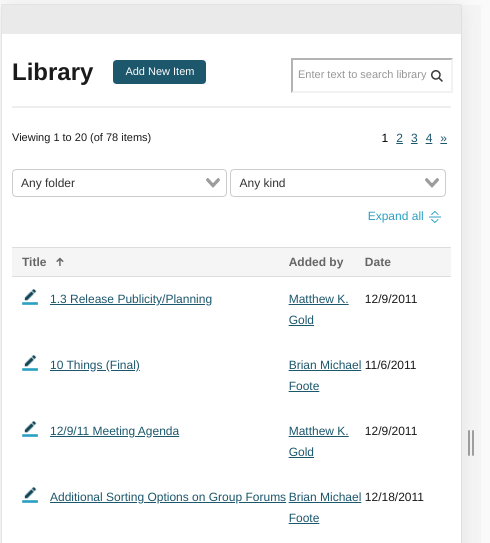
I've got the first iteration of the Groups Library ready for feedback.
In the attached PDF you can see on page 1 a list of all library items ("All") with sub nav to go to the specific type of item (e.g. Files). Since we've decided to sunset Papers, I would propose to only show the tab if papers exist. As you can see I've added a note to the top that Papers have been retired – feel free to share better copy for it if the proposed doesn't work). I furthermore removed the "follow" option for Papers, that seemed a reasonable edit.
As discussed during today's call, I've kept the "folder", now called "Tags" (which they actually are under the hood) and added a "?" to explain the change.
We don't currently have "Forum Attachments" as a section, so I took a stab at it, happy to adjust the content we want to show here.
Please note that it doesn't include the actual UI for creating an item yet. I'll be working on that next. Furthermore, I've adjusted the design of the Email section at the top to consolidate it a little more (not really part of this task, but would be nice to tweak the design slightly during implementation.
A few questions that came up during design:- Do we want to implement search in the Library?
- I wasn't sure what to do with the "Manage Folder" and "Hide Folders"(which doesn't seem to do anything) from the current Docs UI
- Are we allowing users to still edit existing Papers? In the note I added, I currently state we don't.
- See question in message above about "All Docs"
Looking forward to your initial feedback.
Updated by Matt Gold over 6 years ago
I think this looks really great, Sonja! Thank you!
In answers to your questions:
1. Yes -- it would be great to include search if technical issues don't make that impractical
I'll leave the other questions for Boone. I'm fine with cutting off the ability to edit papers if it helps us remove technical debt and complexity
Updated by Colin McDonald over 6 years ago
Hi Sonja, we spoke during the dev call today about your mockup and questions. A few notes:
- In the next draft, let's try incorporating search based on titles, descriptions and possibly users. Boone says these things are technically possible. We can't get into anything like searching the actual text of documents.
- We think the mange/hide folders links in Docs may be superfluous right now, but we do need some sort of access and interface to setting folders up in the new library. We agreed to based the organizational structure on "folders" rather than tags, as folders have the most familiarity among our users (though these are technically just tags we've identified visually as folders).
- We may adjust that Papers message wording but the sunset functionality seems right for now.
- For the All Docs point, it would be good in the new interface to be able to see everything that a group has uploaded in one place, and then toggle from there into Files / Docs / Papers / Forum Attachments (this seems like a good addition).
- Let's also explore the ability to add external links to collaborative file services like Google Docs and Dropbox. I don't know if these would need their own tab or should just be part of Files, but we'd want to at least visually separate them from files hosted on the Commons directly.
- It would be good as soon as doable to see the interface for adding a new item, and how within that you can organize and designate an item to a certain place.
Updated by Sonja Leix over 6 years ago
Thanks Colin and team for your feedback! This is super helpful!
Please see the updated mockups. I'm weaving the dropbox and drive links into the Files tab and am clearly indicating those through the icon as well as a label after the title. For those links, do we want to have the capability to add a description (I added one for now).
I just want to mention that we have a lot of UI on this page (tabs, sorting, search, download files, folders). Those are all requirements, correct? Or is there an argument to be made to remove any of these?
Note: I adjusted the file download option to only be visible on the "files" and "forum attachment" tabs. I think this makes the most sense. Within "files" we somehow need to indicate that Gdive and Dropbox files aren't included in the download (this makes this feature a little less intuitive).
Please review and share your thoughts and feedback by Thursday morning at the latest and I will make any last edits and will create a short walk-through video you can present on Friday. Thanks.
Updated by Colin McDonald over 6 years ago
Thanks, Sonja. That's a good point about the download option and the Dropbox etc. files vs. what is on the Commons itself. We'll need a good terminology to differentiate. Maybe internal/external? Uploaded/linked?
On the UI point, I can see a use for all of the different features, but it does seem like a lot the way it is arranged on the top, side, etc. right now. Might we explore a sidebar or way to make the different options more uniform and in one place? Could we get away from the tabs up top, and then where that "View folder:" right sidebar is, the options are:
Search:
Order By:
- Newest
- Alphabetical
- Etc.
Type:
- All
- Files
- Docs
- Papers
- Forum Attachments
Folder:
- Whatever folders there are.
Updated by Sonja Leix over 6 years ago
Thanks Colin,
I've worked your feedback into the updated mockup attached. Please review and let me know if there is one more round of revisions (ideally i'd receive feedback by tomorrow before noon). So I can create the final walk-through video for Friday.
Thanks.
Updated by Colin McDonald over 6 years ago
Many thanks for the quick turnaround and updated mockup, Sonja -- I think it is a lot more clean and intuitive, but I imagine we'll look at both this latest version and the one before with the tabs tomorrow to compare and make sure we're headed in the right direction. Anything else you can provide like a walkthrough would be great, or if it's late for that then just any points or questions you want to make sure that we go over in the group meeting.
Updated by Sonja Leix over 6 years ago
Thanks Colin. I've created a walk-through video of both versions AND I had time to create a very first exploration of what a "Add New Item" UI could look like.
I'll attached the updated mockups (v4) to the ticket and you can download the walk-through video here:
https://drive.google.com/file/d/16pCW_qn6IpzNSxrIj_Ca2wA8uWumOKBK/view?usp=sharing
If you don't want to share the new UI for adding an item, feel free to stop the video before I present those.
Updated by Colin McDonald over 6 years ago
Hi Sonja, during the meeting on Friday the group gravitated back toward the older mockup with the tabs. The thinking was that the newer version weighted Type to similarly to Folders, when Type is much more important, and the Tabs express that visually more than putting everything into the sidebar. Sorry about the back-and-forth there, but it helped to see both versions. Some other notes:
- Can we streamline the top of the page, perhaps losing the options for Leave Group, Email the Group, Quick Link, Email Status, etc? Perhaps we might even lose the Group title at the top, and just start with Library (with Add New Item next to it), since the Group title is also bolded at the top of the left sidebar? These other hidden options should still appear on the group home page.
- The three tabs could now be All, Commons Files and External Links
- Then in the right sidebar: Folders and Type (which would show docs, papers, and forum attachments if they exist for that group)
- Can we have an icon for Docs (like a pencil) that indicates they are editable? We might also need a generic icon for any external links added that aren't Dropbox or Google Drive.
- Be able to go back and edit title etc of external links (more of a dev issue but noting it here)
- We need to nail down language about external link sharing and access to them, probably for the creation flow but maybe also for under the External tab in the Library, so people are aware these are just links out and whatever settings/permissions are applied on the external site will carry over. Maybe something like this for now: "Google Drive, Dropbox, and other external links cannot be edited or controlled within the Commons. Any changes, sharing permissions or other options must be made within the external site itself."
Updated by Sonja Leix over 6 years ago
Thanks Colin for summing this up. A few questions:
1. In the new tab "Commons Files" where we'll list all files, docs, papers (if exist) and forum attachments. Is it possible to download all of those file types with one click ("download all" functionality)?
2. I assume within the "External Links" tab we won't show the "file type" selector, since they are all of one type.
3. On the "All" tab, when a user filters by file type, where would the external links show up? Only under "All" or under "Files" too?
4. Now that we're removing the "Papers" tab, where are we thinking about placing the papers notice of retirement? Only when a user clicks on the "Papers" filter in the sidebar?
Updated by Colin McDonald over 6 years ago
Hi Sonja, I think it's only files that can be downloaded in the zip file (and forum attachments are a subset of files). Docs and Papers exist only on the site. I suppose we could say something like "External links, Docs and Papers can't be downloaded."
That sounds right about file type for external links.
I think the external links could under All could be listed by an External Links file type in the sidebar that would be the same as the External Links tab. That redundancy seems fine to me.
Yes, that sounds right about the Papers message, that it would only appear when filtering to that type.
Updated by Sonja Leix over 6 years ago
Thanks Colin for your feedback on my questions. With the shift to All / Commons Files / External files from using the tabs for file types, I think we’re actually introducing a lot of complexity in the UI that might not be necessary. There would be a few redundant ways to get the same set of items (e.g. by selecting the type of “external link” on the “All” tab, the user would see the same set of files as on the “External Links” tab.
I would like to explore a direction that would remove the tabs completely and only have the sidebar selectors for type and to browse folders. I’ve moved the sidebar to the left, since that is now the primary way for the user to navigate the library. See attached mockup.
Would love to hear your thoughts and concerns on this (incl. Boone’s).
I think we should also create a new ticket for "Create New Library Item" so we can continue working on that too. Or do we have one already?
Updated by Colin McDonald over 6 years ago
Hi Sonja, thanks for the work here and thinking through a few limitations of our last feedback round. I'm definitely open to revisiting. We discussed this a little on the call today after you dropped off, but agreed we might want to use our team meeting next Friday to all look at the same mockups and hash this out together. Will you be available for that meeting?
In the meantime, I think one concern of having the Types and Folders in the same sidebar is any suggestion that the two are related -- i.e. they're joint or dependent filters so you're filtering by Type and ALSO Folder, rather than one or the other. Or maybe either way would work... a question for Boone when he's back next week.
You'll also see #12315 for the new item flow added as a subtask of this ticket. Thanks!
Updated by Boone Gorges over 6 years ago
Sonja, thanks for sharing updated concepts on this ticket.
Similar to some of the comments above, v5 leaves me unsure about the relationship between Type and Folder. Either they work together (ie it's possible to look for Docs in the folder 10things) or they don't, but either way the interface should make this clear. The fact that folders are links, rather than radios, suggests that they're independent. For context, we addressed this in the case of the Courses directory by requiring the click of a button to apply filters
Updated by Sonja Leix over 6 years ago
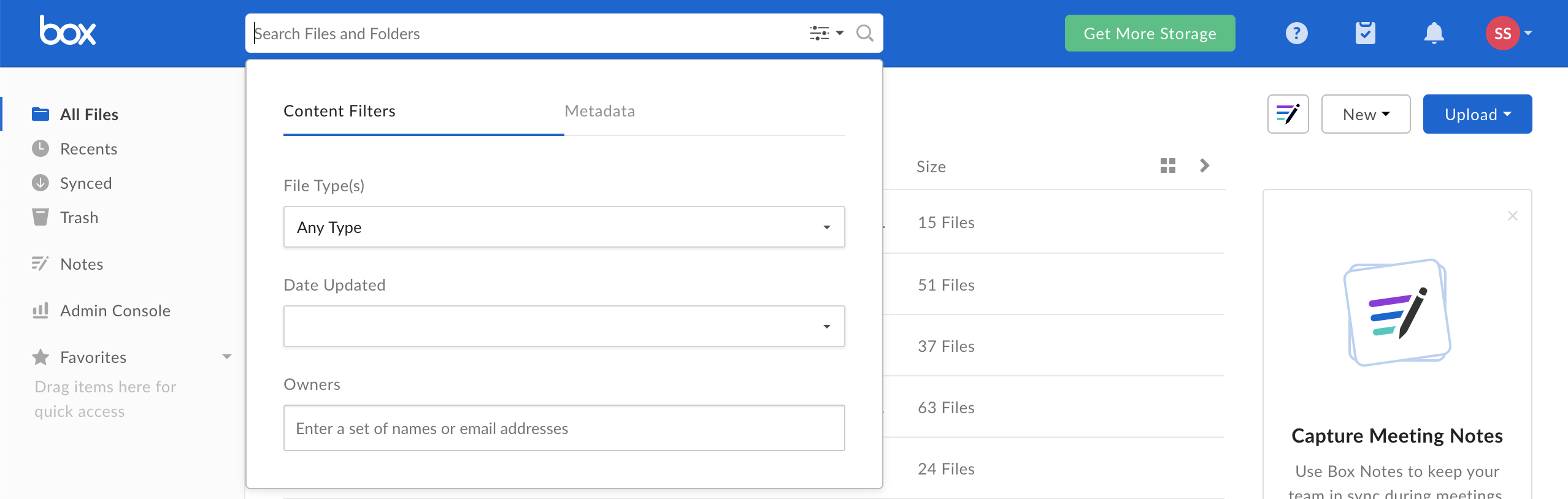
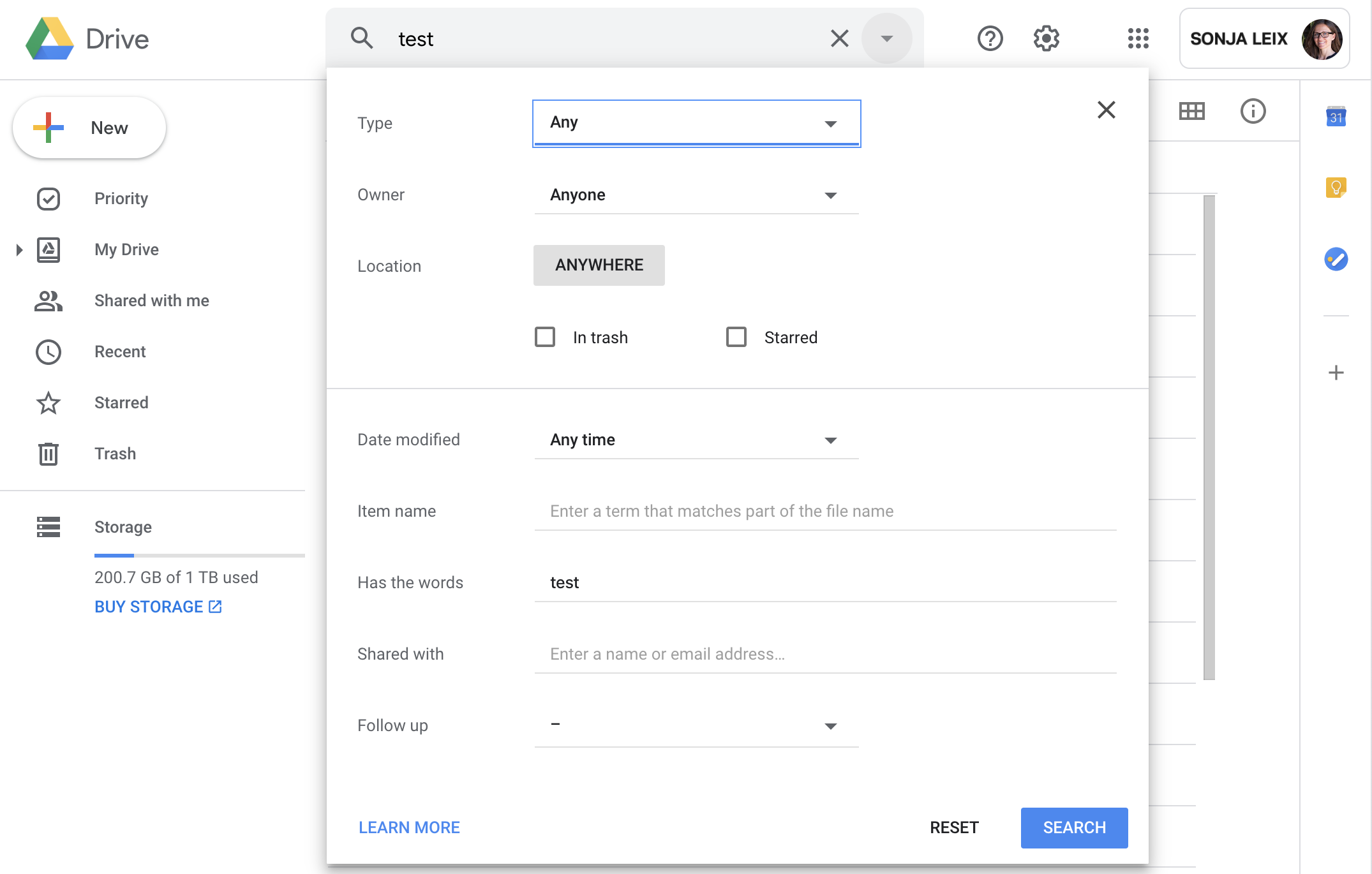
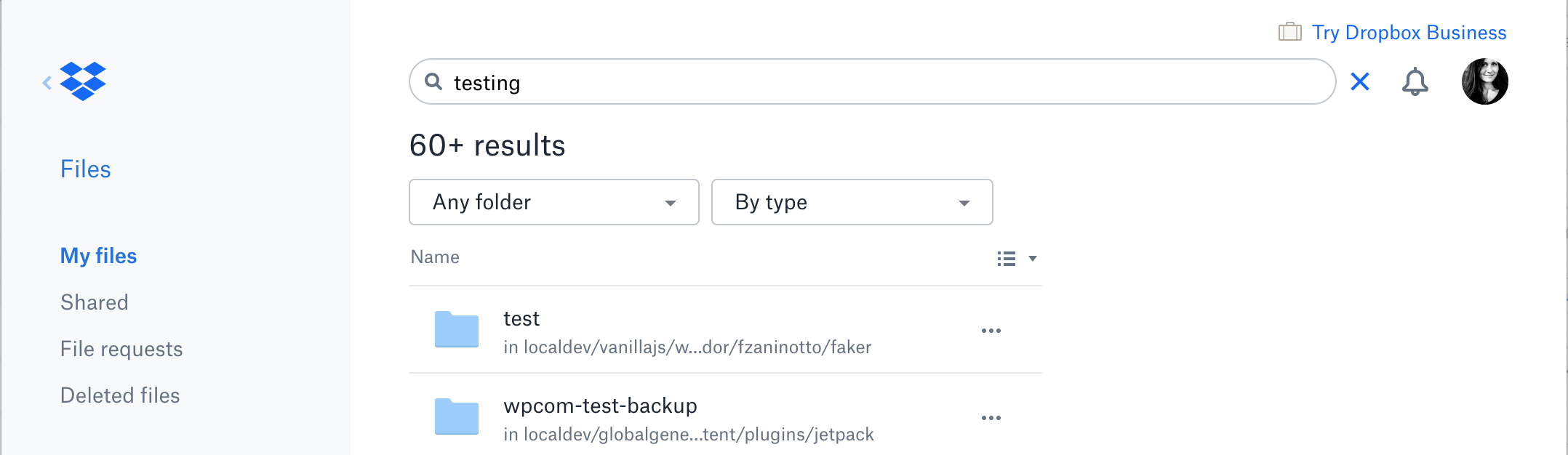
- File Box-search.png Box-search.png added
- File GDrive-search.png GDrive-search.png added
- File Dropbox-search.png Dropbox-search.png added
Interfaces with multiple filters, sorting and search are the most complex to design, as we are realizing once again. What's makes it harder for me is to not fully understand what is possible on the CUNY Commons platform, when it comes to technical debt etc. Boone, maybe you can elaborate a little more about any existing limitations. For example, but not limited to, what is possible when a user clicks on a type or folder, can it load instantly or is it always a new page load?
Looking at common file libraries like Dropbox, Google Drive and others here are some commonalities in the UI (see attached screenshots):
A. Accessing the contents of folders are independent from search (access to folders is usually in the left sidebar)
B. Within the search results interface, each library UI has additional / advanced options (hidden or visible) to either filter by type or folder
C. None of the solutions have a primary way of browsing by file type
Question for Colin and Matt (maybe Boone has stats here too):
1. What are common amounts of files users store in individual groups? What are edge cases (high numbers)?
2. As someone using the Commons on a regular basis, how would you want to browse your existing files? What kind of considerations do you make?
3. Do we need a primary way of filtering by type? Can we simplify the UI?
Updated by Boone Gorges over 6 years ago
For example, but not limited to, what is possible when a user clicks on a type or folder, can it load instantly or is it always a new page load?
It's always more complex to build interactive interfaces than to build interfaces that require pageloads. But in this case we have to build something from scratch anyway, so the amount of additional work required to build a JS-driven interface is less than it would be otherwise. If it makes design much easier and better, let's assume we can build instant interactivity for these filters.
(Two salient pieces of background info: One is that we need to build a data layer on top of existing data - Docs, Files, etc - to support cross-type filtering/folders/taxonomy. It's a lot of work to create and ensure proper sync integrity of this kind of additional data layer. But the advantage is that it makes it somewhat easier to build a JS-powered UI, since that kind of UI requires the data to be consistently structured - that part of the work will already be partly done. Two, AJAX requests on the Commons are slow because WordPress is slow. For true "instant" UI filters we will need to preload all data into the browser. Because we're dealing with group-specific interfaces, this should be feasible - only in certain edge cases will a group have many thousands of Library items, to an extent that preloading all of the data in the browser will pose a performance problem. The same can't be said for a sitewide Library, which would necessarily need to be AJAX-powered.)
1. What are common amounts of files users store in individual groups? What are edge cases (high numbers)?
Not sure how to summarize this data. In the case of Files, about 649 groups have Files uploaded. Only about 20 of these groups have more than 100 Files, and 8 have more than 200. The top is 440. The numbers for Docs are smaller than this but similarly distributed (they're harder to query so i'm not providing exact numbers).
Updated by Sonja Leix over 6 years ago
Thanks Boone!
I took another stab at a simplified concept for discussion tomorrow. I've minimized options to the following:
- search
- folders (click to view contents of specific folder, or click All to see all
- sort by
I've removed the sorting by file type completely to simplify the interface based on the stats Boone has shared.
We can weave the file type filtering/sorting into the UI in one or multiple of the following ways:
- Add an option to the sorting dropdown to sort by "file type" (this would not show only docs for example, but it would sort items based on their file type)
- Add options to the expanded search UI (see more below) to filter by file type
Search UI
I'd propose that we improve search. I've been having some more thoughts on search since we've implemented it on the groups and sites pages and maybe we can improve search globally. Would love to hear Boone's thoughts on implementing something similar to what Dropbox does:
1. When a user clicks on the search bar it expands, while also removing some UI that distracts the user. this will help focus the user on searching
2. Add additional options to the search UI – in our case we could add a file type and or folder dropdown to enable a more granular search
3. Implement AJAX for instant search results
Would love to hear everyone's feedback.
Updated by Boone Gorges over 6 years ago
1. When a user clicks on the search bar it expands, while also removing some UI that distracts the user. this will help focus the user on searching
2. Add additional options to the search UI – in our case we could add a file type and or folder dropdown to enable a more granular search
3. Implement AJAX for instant search results
1 and 2 seem OK to me, though I want to tread carefully when our designs start departing from established traditions. IMO it's jarring when I click into what looks like a text-input search field and it's not actually a text-input search field :) I think we can work with/around these concerns, I just don't want to lose sight of them.
Regarding 3, I think the idea here is that we want it to feel fast, and we don't want page reloads. This seems fine, but let's table for the moment whether this works via AJAX (asynchronous server requests).
Updated by Sonja Leix over 6 years ago
Thanks Boone, we can discuss more tomorrow
IMO it's jarring when I click into what looks like a text-input search field and it's not actually a text-input search field :) I think we can work with/around these concerns, I just don't want to lose sight of them.
Sorry if it was unclear. The search input field would still be a text input field. It would simply expand in width to focus the user on search. Take a look at the dropbox-search screenshots in this thread.
Updated by Colin McDonald over 6 years ago
Thanks for the helpful back-and-forth here too, Boone and Sonja. I like the simplified default/overview interface that removes Type from the sidebar and just includes Folders. I imagine that after the call today, Sonja will be able to mock up how the Dropbox-like search box or expanded view will look when activated to complement this view and allow more granular queries that include Type, Folder, or both (it would also be good to see the sorting options). Perhaps we could have this by the group meeting on Friday to have that mockup to explain to everyone how this will all fit together.
Updated by Sonja Leix over 6 years ago
Here are the updated mockups for the Group Library incl. search flow.
I've simplified all library items in the list to a consistent look and content as well as the icons on the page.
Wasn't able to post these earlier (busy day), but if you have any final tweaks, I'm in the office early tomorrow. I should be able to make minimal last minute revisions before the meeting.
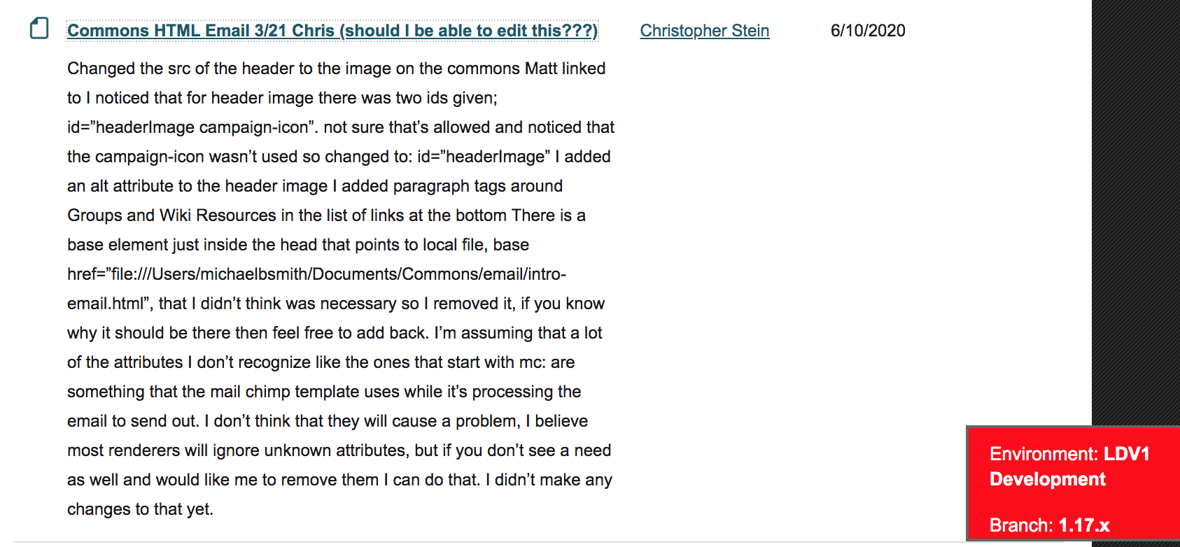
Updated by Chris Stein over 6 years ago
- File mobile-show-items.jpeg mobile-show-items.jpeg added
- File order-by-options.png order-by-options.png added
- File show-items-of-type.png show-items-of-type.png added
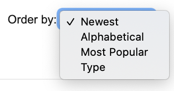
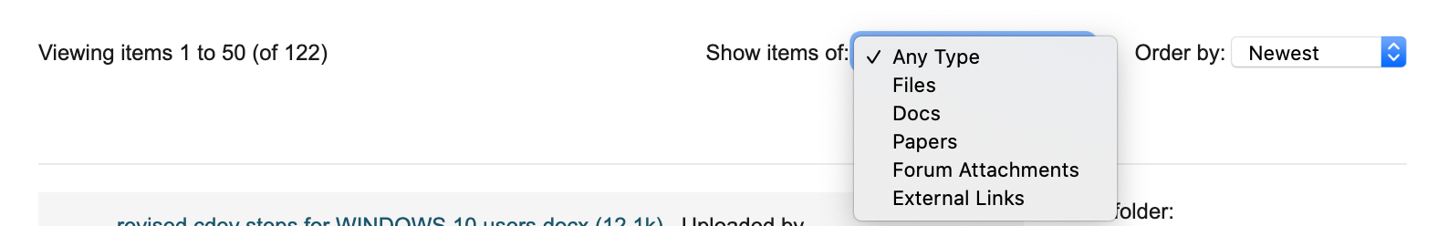
Hi All, great work here, Sonja and Boone especially. I'm adding a couple of images for potential discussion items. One is to look at the Order by options and maybe add type to those (and maybe not have Most Popular, this was taken from current files interface).
Another is to think about whether and if so, how, we might want to allow for filtering by type with this new interface. A dropdown option is shown and a mobile version of the same.
Best,
Chris
Updated by Colin McDonald over 6 years ago
Here are my notes from the meeting for this ticket:
- Just say "All" as the top option above the folder hierarchy, and perhaps we can remove the "View Folder" title since the icons make it clear that they are folders?
- Add the Microsoft OneDrive icon as specific icons that will appear when added as an External Link, to go along with Dropbox and Google Drive.
- We need to work on icons designating different types. There's tension and confusion between actual file format (PDF, doc) and Library type (forum attachment, external link). Can we reduce this only visually, i.e. one icon for different items that shows both piece of information visually, or perhaps can we work with the line of text underneath the title of each item (where it says "Uploaded by..." or "Created by..." right now). Could we have the icons show the file format and text underneath say the Library type, such as: "External link added by NAME on DATE"?
Updated by Sonja Leix over 6 years ago
Thanks for summarizing the feedback, Colin!
Given the various feedback and in an attempt to simplify and make the UI more intuitive, I've restructured a few things beyond the specific that we've discussed. I've created two versions of the Library Landing UI:
Version A:
- You'll be familiar with the structure of the list: icon left, title of item in the first line, second line "by AUTHOR on DATE".
This content structure of each list item is a little harder to scan for the user than Version B, since it is stacked vs. in columns (see below). It also has a lot more "white space" on the right, unless we have a lot of very long library item titles. I personally am leaning towards Verison B.
Version B:
- I've tried a new list structure of the list, a column-based approach (which helps with sorting, see next point): icon + item title (column 1) / Added by (column 2: author), Date (column 3)
- I've removed the Order by dropdown and am replacing it with a different approach to sorting. The new labeled columns have sorting functionality, similar to what we're used to within the file library in Dropbox or our desktop folder. When the user hovers over the column title, it changes states, indicating it is clickable. Upon click the user can sort by the column in ascending order. Here we could allow another click to sort in descending order, or we can keep it simple.
This version is clean, more condensed in height, has a structured order to it and is easy to scan for information. Even if we don't want to implement the sorting via the column headers, I'm leaning towards this solution. In such a case we could add the Order by dropdown back in here.
General changes in both versions:
- I've condensed the search bar to a square button with just the lupe icon. I think this helps clean things up and this is a common pattern for search users will be familiar with
- I've moved the "Add New Item" button to the top, next to the "Library page title". This is prominent enough and down't clutter the UI of the library list
- I kept the label "Folders" given the new structure and moved the gear icon next to it. To me, this structure makes a lot more sense now.
- I've decided to move the folders over to the right again. With the new structure, it took away from the library list and given that not all groups set up folders, the folder navigation would take up a lot of prominent screen real estate. I think this works well and is still accessible and easy to find.
- Neither version has a written out indication of the "type / kind" (more below)
Search
- I've added the interstitial screen into the mockups with some user instructions. Ideally when a user clicks on the search button, the cursor should be active in the search field. Else we should tweak the copy on this screen
- If we decide to implement the sorting via the column headers, we might want to consider adding this same functionality to the search results page.
- In the previous mockup I've had a "Add new folder" option in the folder dropdown of the search results page. That actually doesn't make any sense, so I've removed it in this iteration.
File type / kind indicators
We've stumbled over the terms here during the meeting. What is a "type", how can we distinguish file type (e.g. PDF) from item type/kind (e.g. Forum Attachment or File)? Furthermore Files are the only type/kind which encompasses a variety of file types, as well as applies to Forum Attachments. I couldn't come up with better terms, so for the explanation below I'll go with File Types (for PDFs, images, video, Excel, etc.) and Item Kind (for External Links, Files, Docs, Papers, and Forum Attachment).
You can see an overview of all File Type icons on the last page of the PDF. Please review carefully.
- I've created new icons for all File Types, please let me know if I'm missing any we are supporting
- I've added Microsoft OneDrive
- I've added a generic icon for External Links which aren't Dropbox, Google Drive or Microsoft OneDrive
- My solution for clearly indicating Forum Attachment is utilizing the same File Type icon and adding a link icon to it (see mockup)
Would love to hear your feedback in regards to any or all of these updates.
Updated by Colin McDonald over 6 years ago
Hi Sonja, all of Version B is looking good to me. Thanks for your work on it. I follow the rationale on the columns and clarity there, and same with the Folders right sidebar and other visual tweaks.
One thing on the columns -- I wonder if people might want to sort by File Type, if it says Type over the column with all of the icons and then Title over the actual title text for each item? So an extra sortable column for the Type (format) itself, like PDF, Word, Excel, etc.
Also, one format I think could be used is audio file (mp3, m4a), as opposed to just a video file, if we could do an icon for that. I imagine we may also need a generic icon in case someone uploads something obscure every once in a while also.
You're right that the real issue of iconography and information between the different File Types and Item Kinds, as you described them, was the difference between a file uploaded directly and a file attached to a forum post, so I think your solution of using the same File Type icons with a paperclip overlay for forum attachments is good.
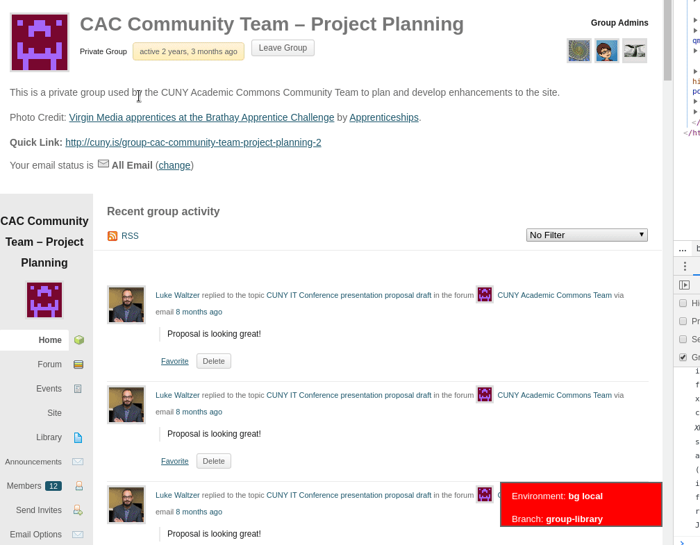
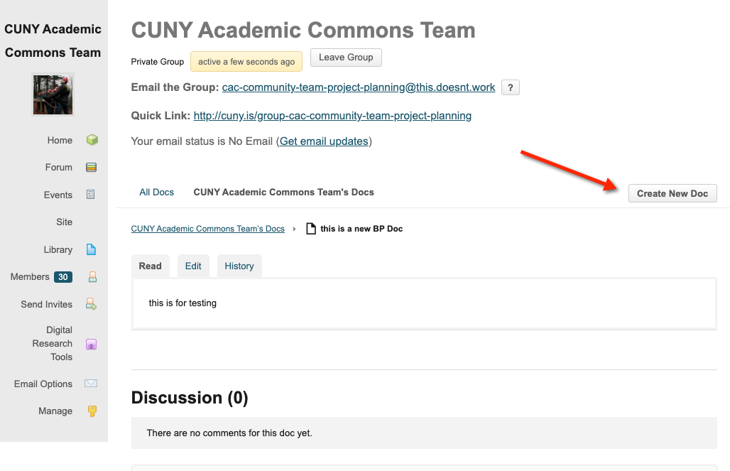
I wonder if we might go a step further, though, because I'm also just remembering now (sorry) that we talked about linking to a forum attachment's context in the Library too. It looks like we already do that, for example in the Forum Attachments folder in our Team group's library here:
https://commons.gc.cuny.edu/groups/cac-community-team-project-planning/documents/?category=-1
There is the "in the topic" link in the main column, and then the "View in Thread" link on the right. It seems to me that the latter link might be sufficient, and pretty useful both for working with Forum Attachments and further differentiating them from straight-upload files that have no other context. I hate to clutter up the main view more, but what do you think about incorporating that link? Could we even make it a hidden row underneath each attachment row that isn't shown until expanded?
Updated by Boone Gorges over 6 years ago
One thing on the columns -- I wonder if people might want to sort by File Type, if it says Type over the column with all of the icons and then Title over the actual title text for each item? So an extra sortable column for the Type (format) itself, like PDF, Word, Excel, etc.
I'd like to push back against this, for two reasons. One, as I argued in the case of sorting by External/Doc/File, it's not super useful in the sense that you may have to go through many pages of results of (say) .doc and .pdf in order to get to .xls. Two, presumably the sort order would be alphabetical, but alphabetical by what? The file extension? But the file extension is not visible - only an icon. For these reasons, I'd argue in favor of keeping the icon purely informational, and not adding the ability to sort.
Updated by Colin McDonald over 6 years ago
Fair enough, bad idea -- maybe just move Title over a bit to the right, then, so it's aligned with the start of the text and not the icon.
Updated by Chris Stein over 6 years ago
Sonja, this is looking good. I am also leaning towards version B. It is easier to scan and the ordering intuitive. One question, have you tried a mobile version of this? I'm wondering if this layout is too wide for a mobile screen.
A second question re the Date. I'm assuming this is Date Added (as opposed to Updated). If so, perhaps we should add "Added" into the column heading?
A couple of questions re Forum Attachments. Colin noted that we currently link to the thread in which the attachment appears. In version A this is not too hard to see adding on to the end. In Version B it's less clear where that would go. Do you have thoughts or are you advocating for not including the link?
The other Forum Attachements question is perhaps for Boone: are we going to automatically add a Forum Attachments folder as we currently do in files?
I agree, as you mentioned earlier in the thread Sonja, these are some of the most difficult things to design, especially with all of the different types we're trying to combine. Thanks for working through this.
Updated by Sonja Leix over 6 years ago
It would be helpful if we could make the final decisions on the discussed during our dev call tomorrow, so I can share the next revision.
Thanks.
Updated by Colin McDonald over 6 years ago
Hi Sonja, we spoke on the call today about doing final approvals for this release during our next group meeting on Feb. 21st, since that's coming up fast in only about a week and a half. We can iron a couple more things out in the mockups here before then, I think. Going back a couple of comments and consolidating things from Chris and me, these are outstanding issues:
- One file type format I think could be used is audio file (mp3), as opposed to just a video file, if we could do an icon for that. I imagine we may also need a generic icon in case for the more obscure file types we're allowing, like spss files.
- Chris asked whether we might consider saying "Date added" instead of just Date, to avoid confusion over whether we are saying this was the date the file was updated as opposed to originally added. I see the point though the "Added by" for the user column kind of explains it for me. Do you have any thoughts about this?
- Chris also asked if we are going to automatically add a Forum Attachments folder as we currently do in files. I'm thinking that we're getting away from that and pushing users to the Search functionality you designed which makes it easy to filter and search through different file types, and the folders stay in their own place in the sidebar. Do I have that right?
- We talked about linking to a forum attachment's context in the Library too. It looks like we already do that, for example in the Forum Attachments folder in our Team group's library here:
https://commons.gc.cuny.edu/groups/cac-community-team-project-planning/documents/?category=-1
There is the "in the topic" link in the main column, and then the "View in Thread" link on the right. It seems to me that the latter link might be sufficient, and pretty useful both for working with Forum Attachments and further differentiating them from straight-upload files that have no other context. I hate to clutter up the main view of version B more, as we lean toward that, but what do you think about incorporating that link? Could we even make it a hidden row underneath each attachment row that isn't shown until expanded?
Updated by Sonja Leix over 6 years ago
Thanks Colin.
- Chris asked whether we might consider saying "Date added" instead of just Date, to avoid confusion over whether we are saying this was the date the file was updated as opposed to originally added. I see the point though the "Added by" for the user column kind of explains it for me. Do you have any thoughts about this?
Here are my thoughts around the date: For Files and External Links we only have one date – the date the file or link was added. For Docs and Papers, we have have two dates – the date it was first added and the date it was last updated. When looking at other file systems, the date is usually always the date it was last updated (which in the case of adding a file, is the date it was updated for the first and last time since it won't change). I wonder what would be most helpful for the users of the Groups Library: Seeing when a Doc and Paper was last updated or when it was first added? Based on this question, we should make a decision on if and how to rename the date column title.
- Chris also asked if we are going to automatically add a Forum Attachments folder as we currently do in files. I'm thinking that we're getting away from that and pushing users to the Search functionality you designed which makes it easy to filter and search through different file types, and the folders stay in their own place in the sidebar. Do I have that right?
Yes I agree with this.
- We talked about linking to a forum attachment's context in the Library too. It looks like we already do that, for example in the Forum Attachments folder in our Team group's library here:
I've added a new column for this link. It's getting a little cluttered. I'll leave it to you and the committee to decide if this works.
Updated by Colin McDonald over 6 years ago
We're going to pick the final tweaks to this up during the group meeting on Friday, and Sonja mentioned on the dev call today that she would look into an alternative presentation of the Forum Attachment link/context so that it may not have to live in a separate column that won't be used by other library item types.
Updated by Sonja Leix over 6 years ago
I'll present the attached latest version of the Group Library UI (incl. search).
Updates in this version:
- Explored adding link to thread for forum attachments in the "title" column below the title
- Added zoomed in versions of all file kind and type icons for presentation purposes
Updated by Colin McDonald over 6 years ago
We decided on Friday to go with the Version B3 page of Sonja's v10 mockup, which puts a link to a forum attachment's thread context below its title. Let's change it to "In forum: LINK" instead of "In topic: LINK" though.
We also discussed having the Date column just say Date, and it will show the date that the item was originally added, even for our internal editable docs. This is for simplicity in the header, and because someone can go to the history of a Doc to see revisions and dig into date history more, and same for something like a Google Doc external link.
For search, let's also make it so that as soon as you click on the search icon, the interface pops up with the search filters, showing all files in a list until you either enter a search term or choose a filter. Then if you X out of the search in the upper-right corner, you go back to the main library view with the folder sidebar.
We'd also like the search button/bar to be a bit more prominent, maybe with a stronger icon and text in the bar that says "Enter text to search library" and the search will look for that text among the title, Added By user, date and description text.
Updated by Sonja Leix over 6 years ago
Thanks for the summary, Colin.
Please review the updated mockups for the Group Library. I've woven the feedback into the design.
- Add descriptions
- Add expand/collapse toggle to show forum thread link and description
- Add search field text on library list screen
- Remove interstitial search screen and drop user directly into full search list
- Add tooltip to library item icons (see bottom of last page)
Please review and share your final feedback.
Updated by Sonja Leix over 6 years ago
As a bonus I've also mocked up what the library list could look like when removing the folder sidebar and expanding the list in width. This would allow for the description to live just within the title column.
This could be a later release update.
Updated by Sonja Leix over 6 years ago
- File 3176-group-library-v11X-final.pdf 3176-group-library-v11X-final.pdf added
- Assignee changed from Sonja Leix to Boone Gorges
Feedback from Commons team in this thread: [[Spring release mockups for final feedback]]https://commons.gc.cuny.edu/groups/cac-community-team-project-planning/forum/topic/spring-release-mockups-for-final-feedback/
Boone,
→ Final and approved designs are here:
https://xd.adobe.com/view/602811d9-42ad-433d-49de-1759096a28d2-1619/
[PDF attached for reference]
I've added the mobile designs to it as well. Please note that the typography dimensions are not correct on the mobile mockup – please align with our mobile styles. This mockup is illustrating how the mobile UI should ideally stack.
It would be ideal if we could implement smooth transitions for the following:
- Slide open transition to expand the search field
- Fade in or some sort of content transition for search from "Viewing item 1 to 50 (of 122 items)" to "122 results" copy
- Fade in or some sort of content transition for changes in the list when a filter is applied in the general list or within the search UI
Let me know if you have any questions.
Updated by Boone Gorges about 6 years ago
- File group-library-browse-overview.gif group-library-browse-overview.gif added
- File Screenshot_2020-05-04_21-44-28.png Screenshot_2020-05-04_21-44-28.png added
- File Screenshot_2020-05-04_20-49-30.png Screenshot_2020-05-04_20-49-30.png added
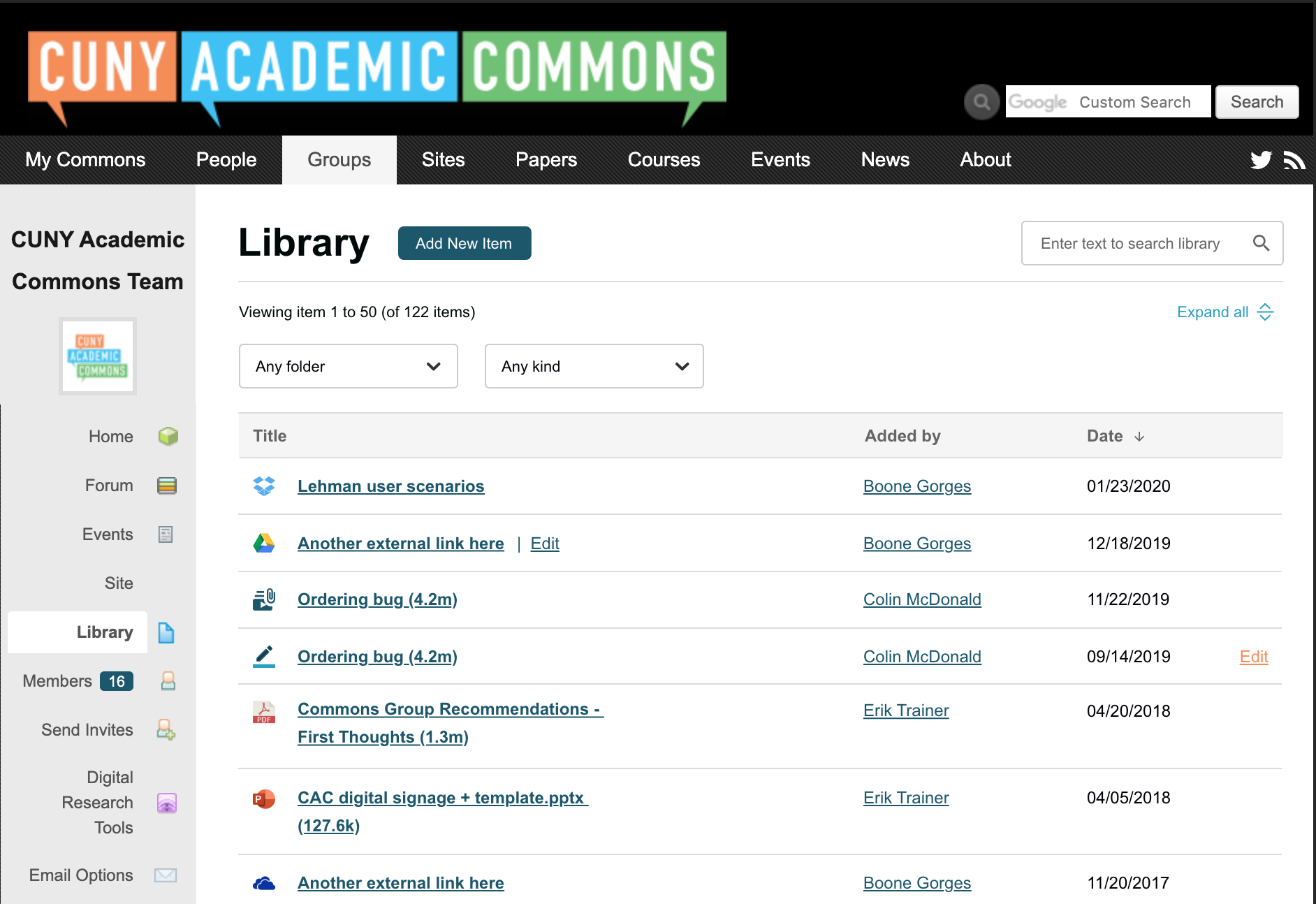
Hi all - I've completed a first version of the Group Library and I'm attaching a few items for review. (cdev is currently being used for testing on another ticket, and I'll put the library tool there for playing around once it's available again). Implementing the design was mostly a straightforward process, and the group-library-browse-overview gif should give you a brief sense of how the various parts of the interface feel. For the most part, I think it's fun and easy to use. Codebase: https://github.com/cuny-academic-commons/cac-group-library
During the implementation process, I made a few decisions and came across a few issues, which I'll outline below.
1. Probably the most important issue is that the current implementation has no Edit or Delete tools. The severity of this differs with the different content types. Forum Attachments are (and should be) edited in their forum context, so probably nothing is required here. Likewise for Papers, which are on the way out anyway. Docs can be edited/deleted via the Edit tab when viewing the Doc, so while it's an additional click to get to it, it's still possible. External Links and Files, on the other hand, have no delete/edit interface at all. So we need to come up with something. There are two parts to this: (a) The question of how to get into edit/delete mode (ie where does the link go in the main Library interface, and (b) what does the edit/delete UI look like once you're there? For (b) it's easy to imagine repurposing the existing Add New UIs, with some minor mods ('cancel' button, improved breadcrumbs, etc). For (a), I'm not sure. Action links that become visible on hover? A new "pencil" column? Sonja, do you have ideas?
2. Currently on the Commons, Docs and Files have a "silent" checkbox that suppresses the email notification associated with the newly created item. This wasn't part of the design, so I didn't implement it. I assume we want it?
3. Should we create a group activity item (which would trigger email/digest notification) on External Link creation? Other content types (Docs, Files, etc) already do this.
4. I realized during implementation that the design didn't include pagination. After talking with Sonja, I added some that mimics existing Docs pagination. This new piece of UI requires moving some other stuff around, as I believe it makes sense to keep the pagination links in the same horizontal row as the pagination text ('viewing 1-10 of...'). This especially required some judgment calls on mobile. See the 'mobile header' screenshot attachment.
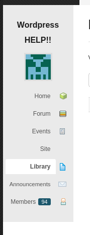
5. It's not written out in the design, but I did some mods to the BP nav system to integrate the Library. I used sheet-of-paper icon for the Library, though happy to consider something else. (See screenshot.) I made a judgment call about where it appears in the menu - below 'Site' (if present). Files, Docs, and Papers no longer appear in the nav. Attempts to visit the existing Files or Docs URLs will result in a redirect to the new Library.
6. Search doesn't match author name. Should it?
Thanks in advance for your thoughts.
Updated by Sonja Leix about 6 years ago
Thanks Boone, this is looking great!
To your questions where I can share input:
1. Probably the most important issue is that the current implementation has no Edit or Delete tools. The severity of this differs with the different content types. Forum Attachments are (and should be) edited in their forum context, so probably nothing is required here. Likewise for Papers, which are on the way out anyway. Docs can be edited/deleted via the Edit tab when viewing the Doc, so while it's an additional click to get to it, it's still possible. External Links and Files, on the other hand, have no delete/edit interface at all. So we need to come up with something. There are two parts to this: (a) The question of how to get into edit/delete mode (ie where does the link go in the main Library interface, and (b) what does the edit/delete UI look like once you're there? For (b) it's easy to imagine repurposing the existing Add New UIs, with some minor mods ('cancel' button, improved breadcrumbs, etc). For (a), I'm not sure. Action links that become visible on hover? A new "pencil" column? Sonja, do you have ideas?
Thanks for catching that. Definitely something we'll need to implement. How about we'll add a very skinny column on the far right, where an "Edit" link appears on hover over the column. It would link to a page in the same form like "add new" but says "Edit doc" for example. This page would also have a "Delete" link at the bottom. If we feel we'll need an easy way to delete items, we create a different solution. Would love to hear feedback from the team.
4. I realized during implementation that the design didn't include pagination. After talking with Sonja, I added some that mimics existing Docs pagination. This new piece of UI requires moving some other stuff around, as I believe it makes sense to keep the pagination links in the same horizontal row as the pagination text ('viewing 1-10 of...'). This especially required some judgment calls on mobile. See the 'mobile header' screenshot attachment.
Thanks Boone, I don't think the mobile pagination you're suggesting will work. The "hit targets" on those pagination numbers is really small and prone to mis-tab. Would it be hard to implement something similar to what we're doing on the groups directory on mobile – a "Load more button at the bottom?
5. It's not written out in the design, but I did some mods to the BP nav system to integrate the Library. I used sheet-of-paper icon for the Library, though happy to consider something else. (See screenshot.) I made a judgment call about where it appears in the menu - below 'Site' (if present). Files, Docs, and Papers no longer appear in the nav. Attempts to visit the existing Files or Docs URLs will result in a redirect to the new Library.
That works for me for right now. During the redesign I'll work on a new set of icons for the various interfaces.
Other feedback:
A few other considerations I'd like to bring up seeing the gifs:
7. When entering the search experience, it might be better to reset the type and folder dropdowns. It might be frustrating to search for an item you think or know exists and not realize that you're simply searching in the wrong folder or type. Thoughts?
8. When items are filters by "type", we might want to remove the "expand/collapse all" option where it doesn't do anything
Excited to test drive this.
Updated by Sonja Leix about 6 years ago
Here's a screenshot of the solution for #1 – edit / delete option in library list
Updated by Boone Gorges about 6 years ago
- Status changed from Assigned to Testing Required
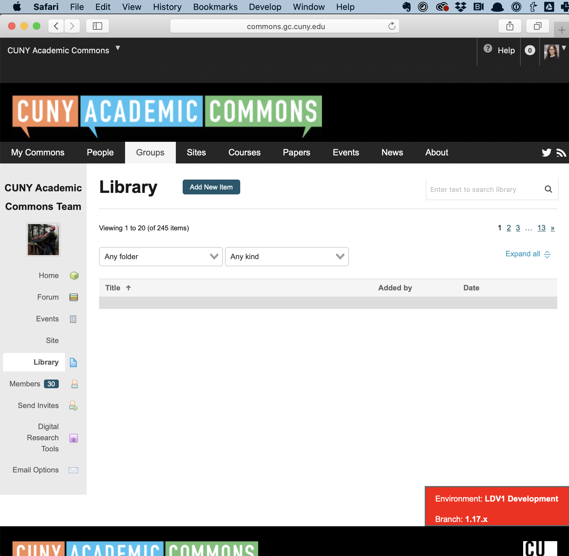
Thanks, Sonja. The system is now on the test server for you to have a closer look at. https://commons.gc.cuny.edu/groups/cac-community-team-project-planning/library/ is a good place to start if you want a group with lots of existing content, but you should be able to test on any group on the site.
How about we'll add a very skinny column on the far right, where an "Edit" link appears on hover over the column.
I went with this. It works in a manner a bit more complex than what you've described.
- For External Links, you're led to a page that looks much like the corresponding Add New page. The existing values are prefilled, and some of the language (like the submit button text) is a bit different, and there's a Delete button.
- For Files, you're led to a page that looks like the corresponding Add Now, with some small changes as above, and in addition there's no longer a file input. You can change the title/description/folder, but not the file itself. Instead, you see a static link to the existing file. This is in keeping with the existing functionality of Files. There's also a Delete button. Here and in the case of External Links, I'd welcome your feedback on the styling for the Delete button, and the styling/language for the confirmation modal.
- For Docs, Papers, and Forum Attachments, the Edit button appears according to the same logic (ie, you hover over and see it if you have edit access to that item) but the link leads to the "native" interface for that particular item. In the case of Docs in particular I left this in place because the native Docs interface has one-click access to the History tab and other bits of Doc-specific UI. In addition, the native Docs edit interface has 'save and continue' functionality. It does create a situation where the Add New and Edit screens diverge for Docs, but IMO it's not very jarring once you're actually editing.
Thanks Boone, I don't think the mobile pagination you're suggesting will work. The "hit targets" on those pagination numbers is really small and prone to mis-tab. Would it be hard to implement something similar to what we're doing on the groups directory on mobile – a "Load more button at the bottom?
I made this change at < 600px.
7. When entering the search experience, it might be better to reset the type and folder dropdowns. It might be frustrating to search for an item you think or know exists and not realize that you're simply searching in the wrong folder or type. Thoughts?
I personally could go either way. I made the change as you've suggested it.
8. When items are filters by "type", we might want to remove the "expand/collapse all" option where it doesn't do anything
I've made the change.
In addition to Sonja's comments, I made some executive decisions about some questions/comments I made earlier. To wit:
2. Currently on the Commons, Docs and Files have a "silent" checkbox that suppresses the email notification associated with the newly created item. This wasn't part of the design, so I didn't implement it. I assume we want it?
I implemented this. I tried to standardize a little bit across the content types, so that the language used for Files, External Links, and Docs is pretty much the same. I also changed the functionality a little so that, instead of suppressing the creation of an activity item, it suppresses the BPGES notification instead. IMO this is much better.
3. Should we create a group activity item (which would trigger email/digest notification) on External Link creation? Other content types (Docs, Files, etc) already do this.
I implemented this too.
Updated by Sonja Leix about 6 years ago
- File ellipsis.png ellipsis.png added
Thanks Boone, it's looking great!
A few things I've noticed:
1. We need to add a one-liner in the case that there are no files in the library "The library is empty. Add an item (link second sentence)". And a different one-liner when someone searches or filters and there are no results "No items found. Try a different filter option or search query."
2. We're missing the divider lines between list items (color #ddd)
3. Let's add a little padding between the columns, some of the text is right on top of each other. Even 16px would suffice
4. Let's align with the design and make the library item title bold so it stands out more
5. Let's drop the search box to a separate line on mobile, it overlaps with the "add new item" button
6. Thanks for adding the "Edit" button. It looks however that files can't be deleted. I'm now wondering if it would make more sense to add the ellipsis "more" button with the option to Edit or Delete (see example Dropbox attached). We could even add a Download option if we wanted (but I know this is scope creep). This button would be on every item, edit option only available for Docs and Papers, Delete option for all. We might then need a popup to confirm deletion – I'll look at your for what the standard convention is implemented on the Commons for this kind of action
7. Odd bug: when I look at this in Safari, I don't see the list items at all. It shows the number of items, but no items. Can someone check if they get the same issue. Safari and Chrome work as expected.
I hope this makes sense, happy to discuss.
Updated by Boone Gorges about 6 years ago
Thanks, Sonja.
I've made changes 1-5.
5 feels a bit odd. Could you play with the mobile view of the search input and let me know whether you're happy with it?
I'll hold off on making any changes to 6 until at least Colin has weighed in.
Sonja, could you please clarify 7? You mention Safari in one place but I assume you meant Firefox. And I'm not sure which is which :-D
Updated by Colin McDonald about 6 years ago
Hi Boone, I'm surely missing something obvious, but I can't seem to find the new library within a group for testing on the dev site. I see the new site cloning feature just fine, but attached is what I see when I try to go your suggested library testing link above:
https://commons.gc.cuny.edu/groups/cac-community-team-project-planning/library/
I don't see the new library in any other groups, either. Let me know what I'm doing wrong when you can, thanks.
Updated by Boone Gorges about 6 years ago
Colin - Sometimes the plugin becomes unactivated after an update. Not sure why. Please try again.
Updated by Colin McDonald about 6 years ago
Thanks Boone, that did it -- for a little while at least. I think it's gone again now. But fortunately I started writing the below when the plugin was back, before stepping way, so I don't need it urgently any more.
Jumping right to "6" i.e. the Edit column we were talking about on the Tue call, I think keeping it simple is the way to go and we don't need the ellipsis. I think that if the item is editable to the user (if it's a collaborative Doc or if they're the original uploader), it should say so in the new Edit column, and if the item isn't editable to them, that should also be clear.
I'm happy to defer to Sonja on the design approach, but to my eye the cleanest way to do that is to have fixed Edit links in the column wherever editing is possible, and to not have them when it isn't (or have Edit be grayed-out). Perhaps we could insert a ? button or tooltip, maybe at the top of that column, where you can see a message like "Users are able to edit any item they originally uploaded, or any Doc (which are collaborative for all group members)."
I don't see the proposed Download option being used much. Clicking on a file will trigger a download anyway, so that would only apply to a Doc, right? And those are more of a web-dependent item. Delete may not be used much more, and I think it's fine to have that a step further into the Edit view where you can change the item's title and other things.
Updated by Boone Gorges about 6 years ago
Thanks, Colin. I'm unsure why the plugin keeps flaking - might be something to do with the persistent cache configuration on cdev - but I went ahead and added the plugin to a list that we force to be active at the code level, so the problem shouldn't recur.
Updated by Sonja Leix about 6 years ago
- File 3176-mobile-search-adjustment.png 3176-mobile-search-adjustment.png added
- File safari-not-showing-list.png safari-not-showing-list.png added
Boone Gorges wrote:
5 feels a bit odd. Could you play with the mobile view of the search input and let me know whether you're happy with it?
I can't test cdev on an actual mobile device (is there a way to do that? If so let me know how). On mobile view on desktop it doesn't feel odd, can you clarify what feels odd to you? The search field is surely taking up a little more space on mobile, and it doesn't span the full width. As an alternative, we could minimize the button to only show the lupe icon and upon tap it expands on the line below. That would be more in line with standard mobile behavior. I've attached what that could look like.
Sonja, could you please clarify 7? You mention Safari in one place but I assume you meant Firefox. And I'm not sure which is which :-D
When I test cdev in the Safari browser on Mac, it simply doesn't show the list of items. It shows the number of items, but the list is blank, see attached screenshot. I've emptied my browser cache too to make sure it's not an issue on my end. Please test in Safari and let me know if this is a unique issue on my end.
Updated by Sonja Leix about 6 years ago
Colin McDonald wrote:
Jumping right to "6" i.e. the Edit column we were talking about on the Tue call, I think keeping it simple is the way to go and we don't need the ellipsis. I think that if the item is editable to the user (if it's a collaborative Doc or if they're the original uploader), it should say so in the new Edit column, and if the item isn't editable to them, that should also be clear.
I'm happy to defer to Sonja on the design approach, but to my eye the cleanest way to do that is to have fixed Edit links in the column wherever editing is possible, and to not have them when it isn't (or have Edit be grayed-out). Perhaps we could insert a ? button or tooltip, maybe at the top of that column, where you can see a message like "Users are able to edit any item they originally uploaded, or any Doc (which are collaborative for all group members)."
I don't see the proposed Download option being used much. Clicking on a file will trigger a download anyway, so that would only apply to a Doc, right? And those are more of a web-dependent item. Delete may not be used much more, and I think it's fine to have that a step further into the Edit view where you can change the item's title and other things.
Thanks for weighing in, Colin. Agreed on the download option not being necessary. I like your suggestion of displaying "Edit" statically (not on hover) for items that can be edited by the user, and the ? in the column header is helpful too for clarification.
Updated by Boone Gorges about 6 years ago
I can't test cdev on an actual mobile device (is there a way to do that? If so let me know how).
Not that I know of.
On mobile view on desktop it doesn't feel odd, can you clarify what feels odd to you?
The width issues just felt a little strange. Your idea of having a smaller Search input on mobile is much better, I think. I've implemented it.
When I test cdev in the Safari browser on Mac, it simply doesn't show the list of items. It shows the number of items, but the list is blank, see attached screenshot. I've emptied my browser cache too to make sure it's not an issue on my end. Please test in Safari and let me know if this is a unique issue on my end.
Thanks for the clarification. Looks like Safari parses dates in a stricter way, which was causing a series of failures. I've pushed up a fix.
Thanks for weighing in, Colin. Agreed on the download option not being necessary. I like your suggestion of displaying "Edit" statically (not on hover) for items that can be edited by the user, and the ? in the column header is helpful too for clarification.
Good idea about removing hover. This change also addresses the question of how to display on mobile, where there's no hover. I've implemented the change. I haven't done a ? icon in the header - do we really think it's necessary? The presence/absence of Edit links seems reasonably self-explanatory. If we need it, could I please get a quick mockup and some copy? I assume that it would look sorta like the tooltip as implemented for the File upload input, but it would be good to get some more clarity.
Updated by Sonja Leix about 6 years ago
Boone Gorges wrote:
The width issues just felt a little strange. Your idea of having a smaller Search input on mobile is much better, I think. I've implemented it.
Thanks for implementing this. This is looking good. Interaction feels a little delayed, but works for right now and would like to hear other people's feedback. One issue I've encountered I missed last time I looked at it, is the "load more" button remains on mobile, even if there are fewer search results. See https://commons.gc.cuny.edu/groups/cac-community-team-project-planning/library/#/?searchTerm=release – the "load more" button renders still on the mobile viewport, but it doesn't do anything. On desktop the pagination disappears in such cases.
When I test cdev in the Safari browser on Mac, it simply doesn't show the list of items. It shows the number of items, but the list is blank, see attached screenshot. I've emptied my browser cache too to make sure it's not an issue on my end. Please test in Safari and let me know if this is a unique issue on my end.
Thanks for the clarification. Looks like Safari parses dates in a stricter way, which was causing a series of failures. I've pushed up a fix.
Tested again and works as expected.
Thanks for weighing in, Colin. Agreed on the download option not being necessary. I like your suggestion of displaying "Edit" statically (not on hover) for items that can be edited by the user, and the ? in the column header is helpful too for clarification.
Good idea about removing hover. This change also addresses the question of how to display on mobile, where there's no hover. I've implemented the change. I haven't done a ? icon in the header - do we really think it's necessary? The presence/absence of Edit links seems reasonably self-explanatory. If we need it, could I please get a quick mockup and some copy? I assume that it would look sorta like the tooltip as implemented for the File upload input, but it would be good to get some more clarity.
I'm ok to not adding the ? for now and see what feedback we get during broader testing.
Updated by Sonja Leix about 6 years ago
Boone,
I've noticed during the walk-through, that removing an item from a folder, doesn't save. I noticed when removing a file from a folder, updating it and it didn't update the option.
Updated by Boone Gorges about 6 years ago
One issue I've encountered I missed last time I looked at it, is the "load more" button remains on mobile, even if there are fewer search results. See https://commons.gc.cuny.edu/groups/cac-community-team-project-planning/library/#/?searchTerm=release – the "load more" button renders still on the mobile viewport, but it doesn't do anything. On desktop the pagination disappears in such cases.
Thanks, this is now fixed.
I've noticed during the walk-through, that removing an item from a folder, doesn't save. I noticed when removing a file from a folder, updating it and it didn't update the option.
I'll work on this and a couple of other items from the walkthrough in the upcoming days.
Updated by Boone Gorges about 6 years ago
- Category name changed from Group Files to Group Library
Updated by Boone Gorges about 6 years ago
I've pushed a number of fixes, including the removal-from-folder item that Sonja raised above, as well as moving Doc editing into the Library interface (rather than the native Docs interface) for greater consistency.
During today's meeting it was suggested that we add a service-specific icon for Zoom external links. Sonja, I don't want to keep asking you for stuff, but is this something you could easily provide to me?
Updated by Sonja Leix about 6 years ago
Boone Gorges wrote:
I've pushed a number of fixes, including the removal-from-folder item that Sonja raised above, as well as moving Doc editing into the Library interface (rather than the native Docs interface) for greater consistency.
During today's meeting it was suggested that we add a service-specific icon for Zoom external links. Sonja, I don't want to keep asking you for stuff, but is this something you could easily provide to me?
No problem at all. Attached.
Updated by Colin McDonald about 6 years ago
Hello, here's the consolidated testing feedback from the team's forum posts:
- Perhaps the default library sorting view should be reverse-chronological rather than alphabetical. Also, sorting by date either doesn't work on Safari, or it works one time and then you can't toggle back and forth again.
- Can the universal library search include the name field, and should it? I'd say yes, but curious about the dev team thoughts.
- Can we add the description field for editable links, both in the create and editing flows?
- This might be an existing issue with BP Docs – when I edit an existing doc, the button to save the doc says “Create” rather than “Update.”
- I am an admin of the group, and when I edit the title or description of an existing item that is in a folder already, the folder name is changed to [object Object].
- Can we confirm that a group admin can change the title AND the description of any existing item, whether they uploaded it originally or not? There was a report of being able to change the title and not the description.
- A group admin has a Manage option in the sidebar, and then there is a Files option in the horizontal bar with things like Details, Settings, etc. What does the Files option do? Something with categories? Perhaps it should be removed? Also clicking on Files removes some of the other sidebar and horizontal options.
- What should happen to the Added By field in the main view when a group admin goes in to edit an item? If they change the title or description (or external link) , should that name switch to their name? If they don't change anything but still click Save Changes, should the original name stay the same?
- How are the library permissions controlled? Can any member of a group add an item to the Library? This might be an issue for classes that use groups.
- See screenshot for a testing issue from Chris in the dev site's CAC team group. He had added a file a while ago and was wondering if he should be able to edit the title and description, which it looks like he did on 6/10/2020 which the date says now. But he can't edit the zip file (or whatever item) itself, right? He would need to add a new item.
Updated by Colin McDonald about 6 years ago
- File create a new doc.png create a new doc.png added
One more to add here, see screenshot attached -- when you go into an editable doc to make an update, there is a Create New Doc button that appears, but it doesn't seem to do anything. Perhaps we can just remove it given the new Add New Item button across the top?
Updated by Boone Gorges about 6 years ago
Many thanks to all for testing, and to Colin for consolidating the feedback here.
I've addressed all issues save for the following:
- I am an admin of the group, and when I edit the title or description of an existing item that is in a folder already, the folder name is changed to [object Object].
- Can we confirm that a group admin can change the title AND the description of any existing item, whether they uploaded it originally or not? There was a report of being able to change the title and not the description.
I'm unable to reproduce either of these issues. If anyone is still experiencing them, please share precise steps to reproduce, including URLs, buttons clicked, user accounts used, and so forth.
Updated by Colin McDonald about 6 years ago
- File object object.mov object object.mov added
Hi Boone, glad to hear it. Scott reported that description second bullet point. I'm going to see what he says about the specifics/status of that now. For the object Object thing, see the attached screencast of me reproducing it in Chrome on my Mac with my dev account colinmcd and group "colin test group."
Updated by Boone Gorges about 6 years ago
Thanks for the screencast, Colin. I was able to reproduce the bug, and I just pushed a fix to cdev.
Updated by Colin McDonald about 6 years ago
Thanks Boone, I went through the list in dev and everything is looking good to me. I also passed this along to Scott - I'll see if he says anything else, but otherwise I think we're set here. I just wanted to surface these two questions again, for general reference:
- Does the Added By field now always state the name of the original uploaded/creator of a Library item, or does it change to the last person to make an edit to that item? Does it change if you save out (rather than close out) of an item without actually editing anything?
- How are the library permissions controlled? Can any member of a group add an item to the Library? This might be an issue for classes that use groups.
Updated by Boone Gorges about 6 years ago
Thanks, Colin, and sorry for missing these two questions.
- Does the Added By field now always state the name of the original uploaded/creator of a Library item, or does it change to the last person to make an edit to that item?
Always the original creator. The Date field, on the other hand, reflects the last update.
Does it change if you save out (rather than close out) of an item without actually editing anything?
Neither field would change in this case.
- How are the library permissions controlled? Can any member of a group add an item to the Library? This might be an issue for classes that use groups.
Yes, any group member can create an item in a group. I suppose we could consider more fine-grained permissions than that, but we should do this based on actual user feedback. Let's be sure we're looking out for this kind of request once the feature is launched.
Updated by Colin McDonald about 6 years ago
No problem, thanks for clearing all of this up!
Updated by Boone Gorges about 6 years ago
- Status changed from Testing Required to Resolved
Updated by Boone Gorges almost 6 years ago
- Related to Feature #13093: Adding Zoom icon for External Links in Group added