Feature #11298
closedExplore Ways to Make the "Courses" tab More Interesting
0%
Description
Right now the "Courses" tab is just a data list of courses. Do we want to feature courses with a slider? Ore have a weekly featured course or a short video recording of a professor's thoughts about the course?
Files
Related issues
Updated by Raymond Hoh about 7 years ago
- Target version set to Future release
Thanks for the suggestion, Scott.
I've added Colin and Matt as watchers to determine what we might want to do in a future milestone.
Updated by Matt Gold about 7 years ago
Hi Boone -- one thing Scott mentioned on a call was adding a slider at the top of the page. How difficult would that be in the current state of the page?
Updated by Matt Gold about 7 years ago
- Target version changed from Future release to 1.15
Updated by Boone Gorges about 7 years ago
- Assignee changed from Boone Gorges to Sonja Leix
- Target version changed from 1.15 to 1.16
A slider of sorts is a good idea, but it would need spec-ing out and some visual design. We likely cannot use the same hero-slider tool from the homepage, at least not without modification to allow us to differentiate between homepage and Courses slides, so some development work would be needed.
We could explore introducing something into a 1.15.x release, but it's too late to conceive and build for 1.15.0.
Updated by Matt Gold about 7 years ago
Great -- thanks. and that timing makes sense
Updated by Sonja Leix about 7 years ago
Scott,
This is a great idea! Can we identify, based on the Common's and user goals, what type of features and what frequency of rotation would make most sense and I'm happy to draw something up visually.
Boone,
what's the sorting of the course archive page? Sorted by latest publishing date?
I assume we are planning to pull courses into this directory automatically based on the new meta data at some point. Can you share some thoughts around this for context. Thanks.
Updated by Boone Gorges about 7 years ago
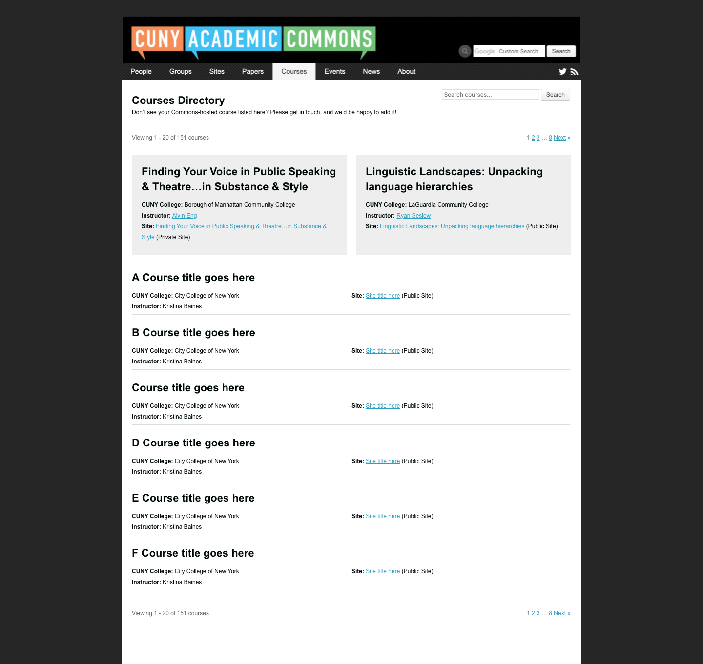
Hi Sonja - Sort order is:
1. First, show courses in descending chronological order, based on the "Term" setting.
2. Within a given term, sort alphabetically.
You are correct that Courses in this directory are generated automatically when the Primary Purpose is Teaching, after the 1.15 release. See https://gist.github.com/boonebgorges/158cfd27708017f4939ef11c9e17a53d#group-creation
Updated by Sonja Leix about 7 years ago
Boone Gorges wrote:
Hi Sonja - Sort order is:
1. First, show courses in descending chronological order, based on the "Term" setting.
2. Within a given term, sort alphabetically.You are correct that Courses in this directory are generated automatically when the Primary Purpose is Teaching, after the 1.15 release. See https://gist.github.com/boonebgorges/158cfd27708017f4939ef11c9e17a53d#group-creation
Thanks, Boone. And are we already planning to introduce any filtering on this page based on the new meta data we're collecting? (related ticket: #8897). We should probably create a new ticket for this unless we already have one or should use #8897.
Updated by Boone Gorges about 7 years ago
Hi Sonja - I don't think there's an existing ticket for it, no. #8897 is a good ticket for thinking generally about how our directory filters work, but I don't think we need to hold up any beneficial work here by trying to solve it all at once - there are existing UI conventions on the directories that we could probably reuse for the purposes of course filters. I'd suggest starting a new ticket, which would reference #8897 as a related issue.
Updated by Sonja Leix about 7 years ago
Boone Gorges wrote:
Hi Sonja - I don't think there's an existing ticket for it, no. #8897 is a good ticket for thinking generally about how our directory filters work, but I don't think we need to hold up any beneficial work here by trying to solve it all at once - there are existing UI conventions on the directories that we could probably reuse for the purposes of course filters. I'd suggest starting a new ticket, which would reference #8897 as a related issue.
Thanks Boone. I just added a new ticket to explore a consistent directory filter UI (#11395).
Updated by Sonja Leix almost 7 years ago
Matt and Colin,
if you could share a little more thoughts around how many courses you'd like to feature at the top of the courses page and any additional thoughts you have about the format. Why would courses be featured there? How often do featured courses in that section change?
I'll mock something up once I have a little more clarity on those questions.
Thanks!
Updated by Sonja Leix almost 7 years ago
- File 11298-courses-tab-v1.jpg 11298-courses-tab-v1.jpg added
I still would like to explore the purpose and logic of the featured courses more, but maybe a mockup will help start the conversation.
See attached.
Updated by scott voth almost 7 years ago
Great start! Could we add the group or site avatar to the list so it is similar to the site and group tabs?
Updated by Sonja Leix almost 7 years ago
scott voth wrote:
Great start! Could we add the group or site avatar to the list so it is similar to the site and group tabs?
Thanks for the suggestion Scott! Courses itself, as I understand it, don't have an avatar of their own. If we would incorporate the group and / or site avatars on the Courses landing page, those might:
A: be displayed quite small next to the site / group links
B: might take away visual focus from the actual course
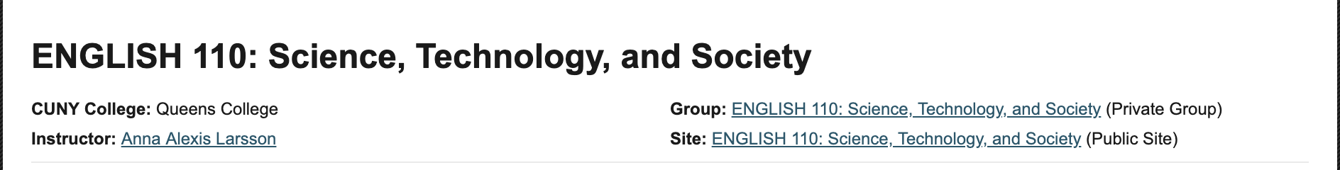
Now, if there is a reason to elevate an associated site or group's avatar and display it more prominently next to the courses title, like we do on the group and site landing page, we can certainly talk about that. But we'd need to define which avatar to pick if a course is associated with a group AND a site – see screenshot attached.
Updated by Laurie Hurson almost 7 years ago
Hi All,
At the Domains 2019 Conference a few weeks ago I saw a presentation from Tim Clarke who runs the Domains of One's Own instance at Muhlenberg College. In their domains instance students are running stand alone wordpress sites but he wanted to build a community site to pull these sites together and make them searchable and discoverable based on site metadata, much like we are doing with the courses tab. The Muhlenberg community site (on slide 4, linked below) looks a bit like one of Sonja's mock ups (11298-courses-tab-v1.jpg).
This might be way off but I thought his presentation might lend some insight and/or provide ideas for development of the courses tab. Major caveat: I realize their install is technically different from ours (many single WP sites vs. a multisite) so I apologize if none of these ideas are actionable.
A couple takeaways from the presentation:
- Using the metadata he created a faceted way (through juried.json, i think?) to search and filter sites (i.e. you can see [1] history courses at [2]BMCC). Since we are beginning to collect metadata on sites, this might be something to consider in the future
- He used node.js and puppeteer to automate screenshots of the sites to populate the community site. If possible, creating an automated way to collect screenshots might inform our design of the courses tab.
Here is more info from the presentation:
Slides: https://drive.google.com/file/d/1zFYxpcjD4uHsUlvBXrwutNxljUPSHhly/view
Video: https://www.youtube.com/watch?v=hCYBxrFkR1A&list=PLpK5svzslv8qi8YZjqJqKS2hLEGwnUPF0&index=4
Again, apologies if none of this is applicable but I figured I would share just in case.
Updated by Sonja Leix almost 7 years ago
Laurie Hurson wrote:
Hi All,
At the Domains 2019 Conference a few weeks ago I saw a presentation from Tim Clarke who runs the Domains of One's Own instance at Muhlenberg College. In their domains instance students are running stand alone wordpress sites but he wanted to build a community site to pull these sites together and make them searchable and discoverable based on site metadata, much like we are doing with the courses tab. The Muhlenberg community site (on slide 4, linked below) looks a bit like one of Sonja's mock ups (11298-courses-tab-v1.jpg).
Thanks for sharing this! Always good to see other examples out there that resonate.
A couple takeaways from the presentation:
- Using the metadata he created a faceted way (through juried.json, i think?) to search and filter sites (i.e. you can see [1] history courses at [2]BMCC). Since we are beginning to collect metadata on sites, this might be something to consider in the future
We're looking to work on a universal filtering/sorting option for section like the Courses tab, see https://redmine.gc.cuny.edu/issues/11395
Updated by Colin McDonald over 6 years ago
Matt and I spoke about the mockup, and we'd like to explore a more visual next draft that breaks up the text. Can we incorporate featured images in the top section, or even some sort of slideshow/carousel like on the homepage? The idea with that part of the page would be to show courses that are particularly active or unique examples of Commons teaching, almost in tandem with what Anthony is bringing back on In Common:
https://in.commons.gc.cuny.edu/2019/08/22/in-common-comes-back-new-editor-new-content-and-more/
We'd like to talk more about how that top featured section could be managed. We'd probably want a manual component, and perhaps a way to label each course (maybe a callout over the image) and indicate why it's being featured.
It will also be good to see the next draft incorporate the filtering functionality we're working on in ticket 11395. I'm putting up some specific feedback on that issue as well:
Updated by Boone Gorges over 6 years ago
- Related to Feature #8897: Redesign Filter Interface added
Updated by Sonja Leix over 6 years ago
- File 11298-courses-tab-A.pdf 11298-courses-tab-A.pdf added
- File 11298-courses-tab-B.pdf 11298-courses-tab-B.pdf added
Colin McDonald wrote:
Matt and I spoke about the mockup, and we'd like to explore a more visual next draft that breaks up the text. Can we incorporate featured images in the top section, or even some sort of slideshow/carousel like on the homepage? The idea with that part of the page would be to show courses that are particularly active or unique examples of Commons teaching, almost in tandem with what Anthony is bringing back on In Common:
https://in.commons.gc.cuny.edu/2019/08/22/in-common-comes-back-new-editor-new-content-and-more/
We'd like to talk more about how that top featured section could be managed. We'd probably want a manual component, and perhaps a way to label each course (maybe a callout over the image) and indicate why it's being featured.
It will also be good to see the next draft incorporate the filtering functionality we're working on in ticket 11395. I'm putting up some specific feedback on that issue as well:
Thanks for the feedback both in this thread and in regards to the filters (#11395). The updated designs address both.
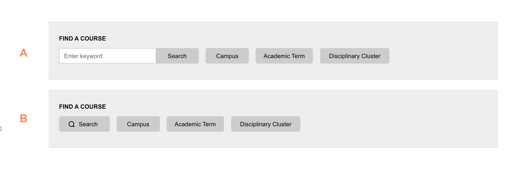
Attached are two approaches for the search / filtering of courses on the page. The featured courses are structured the same in both versions, but the width of the featured area is different based on the filtering placement.
Version A follow roughly the shared City Tech example. The filters are in a right sidebar. Once a filter or search term is applied it displays this information above the results. This version is commonly implemented on the web, but it dis-joints the filters from the results. The user might not see the filtering options clearly visible.
Version B places the filtering / search options right above the list of courses, and feels therefore more contextual.
In both versions, we should explore if we can link search and filtering on a technical level.
I'm happy to present one or both versions during tomorrows call.
Updated by Sonja Leix over 6 years ago
- File 11298-courses-tab-v5.pdf 11298-courses-tab-v5.pdf added
Hi everyone,
Would love to receive some feedback on the updated Courses page. I've made changes based on the feedback during the monthly meeting and Tuesday's dev call.
Please review content, visual, and potential technical issues.
Note: I've added a short description for each course, which would be truncated at a certain number of characters. It might be too much information on this page, but wanted to illustrate what that could look like. Happy to remove it again.
Updated by Boone Gorges over 6 years ago
Thanks, Sonja. Just increasing the font size of the course name on the list seems like it helps a lot. A few questions and pieces of feedback:
1. I'll need some clarification on the behavior of the filters. For instance, if Campus is open and I click Primary Purpose, does Campus close? Does changing the checkboxes in any section trigger an immediate refresh, or is it only on SAVE? I can imagine people clicking out of the box and being confused why the changes didn't apply. This'll need specific consideration on mobile, where user expectations about filter operation might be different (and we have less space to indicate what's going on).
2. IMHO it's a bit confusing to use the blue button to indicate that filters from that section are currently being applied, and also to use that same blue color to indicate the search button. More generally, I understand the purpose of the "in-use" style for these buttons, but the workflow feels unclear to me: if I see that 'Primary Purpose' is highlighted, I can only get the full context by clicking Primary Purpose and seeing the checked sub-items, or by looking at the "breadcrumb" text above the list ("27 Results..."). I don't have any real ideas about how to improve this, and maybe it's clear to others, so feel free to disregard this.
3. IMO it would be nice to have a visual indicator on the button that the open filters are associated with that button - a "current" state of some sort. So, on page 3 of your most recent mockup, 'Courses' would have some sort of different color, additional outline, whatever.
4. All items on the Courses tab have the 'Primary Purpose' of 'teaching', so we don't need this button here. If we decide to use similar filters on the Groups and Sites directories, we'd need the button there.
5. We aren't currently collecting a course description anywhere, so it's not possible to implement it at the moment. I think it'd be fine to add this to the course creation process, but it would need some additional thought. For example, when you select 'Teaching' during creation, you're prompted to enter some additional info (term, disciplinary cluster). We could add 'Course Description' to this. If we do this, I'd suggest further that we should add "Course Title", and indicate in the inline help that the Title and Description are used to help users discover your course in the Courses Directory. In any case, we probably ought to break off this suggestion and weigh it on its own merits.
6
Updated by Colin McDonald over 6 years ago
- File zappos.png zappos.png added
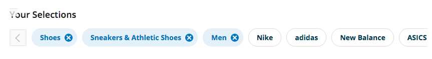
I echo Boone's thought about making the Search button a different color from the filter "buttons." I also see what he's saying about the workflow and seeing visually the details of the filters you've selected. Under the main buttons, could we have an 'x row' of sorts that shows what specific filters are active, and that you can x out of? There's something like that with Zappos search, screenshot attached.
Also, we need to add the sorting of the results, right? So next to the results pages perhaps, there is an element to sort the (filtered or not) results by Alphabetical and Most Recent. By recent I think we mean most recently added to the Commons, though I could be wrong. And I'm not sure if there are any others we'd want.
I think the general visual display is coming along as well. I know we talked last Friday about some sort of shading or other design flourish to make the results look a little more lively. Not sure if that was attempted and discarded or if we might still try it.
Updated by Sonja Leix over 6 years ago
Thanks for your feedback and questions. See replies below in line
Boone Gorges wrote:
Thanks, Sonja. Just increasing the font size of the course name on the list seems like it helps a lot. A few questions and pieces of feedback:
1. I'll need some clarification on the behavior of the filters. For instance, if Campus is open and I click Primary Purpose, does Campus close? Does changing the checkboxes in any section trigger an immediate refresh, or is it only on SAVE? I can imagine people clicking out of the box and being confused why the changes didn't apply. This'll need specific consideration on mobile, where user expectations about filter operation might be different (and we have less space to indicate what's going on).
Regarding filter button behavior: If we keep using the "clear" and "save" buttons, then yes, nothing will be refreshed until someone clicks either. If one filter menu is open and the user clicks on another, the former will be closed and changes won't be applied. If we remove the save button we should refresh right away, but I would personally advise against that as a user might want to tick multiple options within one filter menu and a refresh with each click would mean a lot of refreshes. However, if that's no concern on the technical side and it happens instantly, we might want to explore this route.
On mobile, I would recommend having a full-screen overlay when someone opens a filter. The user then needs to close (dismiss), clear, or save the filter options, which will then refresh the results.
2. IMHO it's a bit confusing to use the blue button to indicate that filters from that section are currently being applied, and also to use that same blue color to indicate the search button. More generally, I understand the purpose of the "in-use" style for these buttons, but the workflow feels unclear to me: if I see that 'Primary Purpose' is highlighted, I can only get the full context by clicking Primary Purpose and seeing the checked sub-items, or by looking at the "breadcrumb" text above the list ("27 Results..."). I don't have any real ideas about how to improve this, and maybe it's clear to others, so feel free to disregard this.
Good point. We can change the color for the indicator to a dark grey instead. To your second point, we could add an icon to the button, maybe a checkmark. I'll have to think about what icon would be most descriptive a little more. Would that suffice in your opinion?
3. IMO it would be nice to have a visual indicator on the button that the open filters are associated with that button - a "current" state of some sort. So, on page 3 of your most recent mockup, 'Courses' would have some sort of different color, additional outline, whatever.
Also a good point. This same color should be the outline or background of the filter menu. So we'd need to design various states of the filter buttons: inactive, active (open), applied (filters are applied to search results)
4. All items on the Courses tab have the 'Primary Purpose' of 'teaching', so we don't need this button here. If we decide to use similar filters on the Groups and Sites directories, we'd need the button there.
Good point. I can remove that.
5. We aren't currently collecting a course description anywhere, so it's not possible to implement it at the moment. I think it'd be fine to add this to the course creation process, but it would need some additional thought. For example, when you select 'Teaching' during creation, you're prompted to enter some additional info (term, disciplinary cluster). We could add 'Course Description' to this. If we do this, I'd suggest further that we should add "Course Title", and indicate in the inline help that the Title and Description are used to help users discover your course in the Courses Directory. In any case, we probably ought to break off this suggestion and weigh it on its own merits.
Yes agreed. I wasn't sure about this one, but wanted to suggest it for a longer term goal.
An additional question that just popped up. Are there any "private" courses? If so, we'll need an indicator for those if they are displayed on the archive page.
Updated by Sonja Leix over 6 years ago
Thanks Colin, replies below in-line
Colin McDonald wrote:
I echo Boone's thought about making the Search button a different color from the filter "buttons." I also see what he's saying about the workflow and seeing visually the details of the filters you've selected. Under the main buttons, could we have an 'x row' of sorts that shows what specific filters are active, and that you can x out of? There's something like that with Zappos search, screenshot attached.
This is a different type of filter UI from what we are currently discussing and have mocked up. In the Zappo's example each of the filter terms are in fact individual terms (e.g. "Men"). Our filter options are filter groupings (e.g. Campus), with each grouping having multiple filter options within (in the case of campus quite a few). If we'd implement something like Zapos and a user selects a lot of options, we might end up 20+ of these terms displayed with the little x to remove them. During our Friday call I mentioned that in my opinion that would clutter the UI and that a filter UI that is more organized (as mocked up by groupings) would be more manageable. Let me know if this makes sense or if you have more questions. Happy to get deeper into this.
Also, we need to add the sorting of the results, right? So next to the results pages perhaps, there is an element to sort the (filtered or not) results by Alphabetical and Most Recent. By recent I think we mean most recently added to the Commons, though I could be wrong. And I'm not sure if there are any others we'd want.
If the sorting is something that users find useful then we should add it. I'm always a strong advocate to keep UI simple and therefore haven't included it from the get go. I would love to get some data on what users use it for. Maybe we can add some tracking to search, filters, and sorting, Boone?
I think the general visual display is coming along as well. I know we talked last Friday about some sort of shading or other design flourish to make the results look a little more lively. Not sure if that was attempted and discarded or if we might still try it.
I kept the UI simple, but shifted a few things: adding description (which we've discovered we don't yet have, so I'll remove it again), increased font size and shifted the other info over to the right (which I might shift again when removing the description). Keeping the upcoming redesign in mind, I don't think we should introduce anything extravagant for design here, but I can take another stab at this. Once we come up with a new visual pattern here, we might want to implement that same pattern on the other archive pages too (sites, groups).
I'll work on another mockup and will post it later today so we can look at it tomorrow during our call.
Updated by Colin McDonald over 6 years ago
Hi Sonja, thanks for the clarifications on my feedback. I understand what you mean about the Zappos design vs. ours. I like when I'm doing a filtered search to be able to see at a glance the filters I've already applied, but I see the challenge when there are a lot of options in a group and you can select many at once.
I suppose we'll save some space/clutter by removing Primary Purpose. I don't know if there's another way to potentially show what you've applied all at once or if others see that need.
On the sorting, perhaps we can surface more user data on this, but I was relaying the feedback from our Friday meeting. Luke and Matt and a few others (power users, at any rate) brought up the importance of at least explaining to the searcher how their results are being ordered, and how it would be nice to be able to alter that by at least a small number of factors like ABC and recency.
Updated by Boone Gorges over 6 years ago
If it helps, here's stats from the last month of collecting data on directory toolbar/sorting clicks:
Members directory
2208 total visits
436 clicks on a College filter
177 clicks on a Role filter
118 clicks on the Order By dropdown - I don't appear to be collecting specifics on the values selected
35 clicks on the 'My Groups' tab
Groups directory
3540 total visits
41 clicks on Order By dropdown - just 4 'most members' and 3 'active', the rest split between alpha and newest.
Updated by Sonja Leix over 6 years ago
- File 11298-courses-tab-v6-filters-left.pdf 11298-courses-tab-v6-filters-left.pdf added
- File 11298-courses-tab-v6.pdf 11298-courses-tab-v6.pdf added
Colin McDonald wrote:
Hi Sonja, thanks for the clarifications on my feedback. I understand what you mean about the Zappos design vs. ours. I like when I'm doing a filtered search to be able to see at a glance the filters I've already applied, but I see the challenge when there are a lot of options in a group and you can select many at once.
I suppose we'll save some space/clutter by removing Primary Purpose. I don't know if there's another way to potentially show what you've applied all at once or if others see that need.
On the sorting, perhaps we can surface more user data on this, but I was relaying the feedback from our Friday meeting. Luke and Matt and a few others (power users, at any rate) brought up the importance of at least explaining to the searcher how their results are being ordered, and how it would be nice to be able to alter that by at least a small number of factors like ABC and recency.
Hi Colin,
Thanks for your feedback.
I understand your thought around seeing what's applied at a glance. Let's look at the numbers. We have:
29 options for campus
4 options for Term
6 options for disciplinary cluster
That's a total of 39 options. Surfacing all in a way that helps orient and inform the user would drastically push the list of courses down.
Regarding the sorting, the numbers Boone shared are quite small, but if power users find this feature helpful, we might want to introduce it for the courses page as well. I'll leave the decision up to you and the team.
I've tried reveal more options at a glance in a left sidebar filter menu. It reveals 5 at a time for each category with a show more options. Let's discuss if this version works better for us (11298-courses-tab-v6-filters-left.pdf).
I've also worked in the feedback into the previous design (11298-courses-tab-v6.pdf). In regards to visual improvements I've played with a few things (different on various pages to show options). Primarily I've played with two things, I've added icons to indicate the disciplinary cluster of a course and added a box with a slight sharp shadow below (see page 1) to elevate and separate courses from each other visually.
See attached PDFs.
Updated by Raymond Hoh over 6 years ago
Nice work, Sonja.
About the icons, WordPress comes with an iconfont that we might be able to use:
https://developer.wordpress.org/resource/dashicons/
Maybe we can use some icons from there for the disciplinary clusters?
Updated by Sonja Leix over 6 years ago
Raymond Hoh wrote:
Nice work, Sonja.
About the icons, WordPress comes with an iconfont that we might be able to use:
https://developer.wordpress.org/resource/dashicons/Maybe we can use some icons from there for the disciplinary clusters?
Would love the team's input if we can find icons within these. That would be easy to implement. Else, I'm happy to design icons for each.
Thanks for the feedback during today's dev call. We'll be moving forward with mockup "11298-courses-tab-v6.pdf" and refining it based on the feedback.
- Implement icons and visual box around individual courses in courses list
- List checked options in filter dropdown at the top (will be applied upon re-opening of dropdown)
- Remove "save" button in filter option and populate list based on filter options once the filter dropdown closes
- Adjust the results copy for selected filters to be easier to implement technically and to be in correspondence with the number of courses copy ("Viewing 1 - 20 of 27 courses").
- Design icons for disciplinary clusters (will need help from team to better understand what visuals would make sense for each cluster > Matt, Colin, Laurie)
- Implement the new courses list style on the groups and sites directory too. I've added a new ticket for this: #11901 (https://redmine.gc.cuny.edu/issues/11901)
I'll also work on a mobile version for the design adjustments of this page.
Updated by Sonja Leix over 6 years ago
- File 11298-courses-tab-v7.pdf 11298-courses-tab-v7.pdf added
Hi all,
I've implemented the changes we've discussed on Tuesday. I removed the "save" and "clear" options in the filter dropdown as well.
I'll need some input for the disciplinary cluster icons before I can make changes there.
Looking for feedback on the rest and input on icons.
Thanks.
I'll work on mobile version next.
Updated by Boone Gorges over 6 years ago
Thanks for posting this, Sonja.
It dawned on me looking at it that we didn't really discuss the interaction between search and filters. It was suggested earlier that the two should work together. But the presence of separate "go" interfaces - the Search button and the Save buttons for filters - makes it feel like they'll be independent. Would it be jarring if clicking Save in a filter also took into account whatever the user had typed into Search, even if Search hadn't been clicked? Or vice versa, if clicking Search took into account what'd been checked under filter types? If someone drills down with filters + search, and then decides they want to clear search, there should probably be a way to make this happen.
If search behaves just like filters (and alongside them), perhaps it should be hidden behind a button, alongside 'Campus' etc? "Filter by 'Search Term'" or something like that. Then we'd inherit the Save and Clear conventions from the other button types.
Updated by Sonja Leix over 6 years ago
And here is the mobile version.
Boone, would love to hear your technical feedback. We can implement the filter menu in various ways:
- an overlay with background opacity lowered, which would allow the user to close by tabbing outside the overlay (as in attached PDF)
- in a full-screen takeover overlay
- by expanding the filter inline
Let me know what makes most sense.
Updated by Sonja Leix over 6 years ago
Boone Gorges wrote:
Thanks for posting this, Sonja.
It dawned on me looking at it that we didn't really discuss the interaction between search and filters. It was suggested earlier that the two should work together. But the presence of separate "go" interfaces - the Search button and the Save buttons for filters - makes it feel like they'll be independent. Would it be jarring if clicking Save in a filter also took into account whatever the user had typed into Search, even if Search hadn't been clicked? Or vice versa, if clicking Search took into account what'd been checked under filter types? If someone drills down with filters + search, and then decides they want to clear search, there should probably be a way to make this happen.
If search behaves just like filters (and alongside them), perhaps it should be hidden behind a button, alongside 'Campus' etc? "Filter by 'Search Term'" or something like that. Then we'd inherit the Save and Clear conventions from the other button types.
Yes we should clarify the expected behavior for search and filter.
My thoughts expressed in various user behaviors:
Scenario 1:
1.0 user searches by term (e.g. "literature") and the results are surfaced
1.1. the user now has the option to further refine the results by applying filters, this would retain the search term and apply the filter options to it
or 1.2. the user instead can sort the search results (from 1.0) alphabetical, recent, etc. (by the options we provide)
or 1.3 the user isn't satisfied with the results and decides to search a different term, which will reset the filters
Scenario 2:
2.0 user applies filters to all courses to narrow down results
2.1 the user sorts the filtered results (from 2.0) alphabetical, recent, etc. (by the options we provide)
or 2.2 the user isn't satisfied with the results and decides to use a search term to find relevant courses, this would reset the filters and sorting
I'd love to hear the feedback of the full team (incl. yours of course Boone from a technical standpoint) on these behaviors so we can move forward. This is a good UI pattern to validate during testing – making sure it's not confusing that filters reset. My thoughts behind resetting filters is, that my assumption is that users who search a different term might be looking at different variables all together.
Updated by Boone Gorges over 6 years ago
Thanks, Sonja. Overlay on mobile seems OK to me. Could you mock up Save and Clear as well? Perhaps these buttons could be fixed to the bottom of the modal, with only the list scrolling.
Scenario 1:
1.0 user searches by term (e.g. "literature") and the results are surfaced
1.1. the user now has the option to further refine the results by applying filters, this would retain the search term and apply the filter options to it
or 1.2. the user instead can sort the search results (from 1.0) alphabetical, recent, etc. (by the options we provide)
or 1.3 the user isn't satisfied with the results and decides to search a different term, which will reset the filters
1.3 feels confusing and "magic" to me. The flow in 1.1 and 1.2 lead me to believe that the changes I make to search/filter are retained, unless I clear them. I'd expect the same to happen with a new search term as well. IMO it's better to require the extra step of manually clearing unwanted filters than to clear them automatically, as the latter option makes it hard to combine filters in a reliable way.
If we want search+filter to work only in one direction (you can use filters to narrow down search results, but not vice versa), I think we should be enforcing this with the UX. For example, perhaps the search box disappears once you start filtering.
Most natural from my point of view would be for search and filters to always work together, and to be cleared only when done so manually. But this also strongly suggests that the search input should match the filter inputs, as I suggest in an earlier comment.
I don't see technical issues as blockers in any case, though if the logic is complex (eg filters are auto-cleared only when you've entered a new search term, but not in other kinds of cases) then it becomes more complicated to build.
Updated by Sonja Leix over 6 years ago
Boone Gorges wrote:
Thanks, Sonja. Overlay on mobile seems OK to me. Could you mock up Save and Clear as well? Perhaps these buttons could be fixed to the bottom of the modal, with only the list scrolling.
Scenario 1:
1.0 user searches by term (e.g. "literature") and the results are surfaced
1.1. the user now has the option to further refine the results by applying filters, this would retain the search term and apply the filter options to it
or 1.2. the user instead can sort the search results (from 1.0) alphabetical, recent, etc. (by the options we provide)
or 1.3 the user isn't satisfied with the results and decides to search a different term, which will reset the filters1.3 feels confusing and "magic" to me. The flow in 1.1 and 1.2 lead me to believe that the changes I make to search/filter are retained, unless I clear them. I'd expect the same to happen with a new search term as well. IMO it's better to require the extra step of manually clearing unwanted filters than to clear them automatically, as the latter option makes it hard to combine filters in a reliable way.
If we want search+filter to work only in one direction (you can use filters to narrow down search results, but not vice versa), I think we should be enforcing this with the UX. For example, perhaps the search box disappears once you start filtering.
Most natural from my point of view would be for search and filters to always work together, and to be cleared only when done so manually. But this also strongly suggests that the search input should match the filter inputs, as I suggest in an earlier comment.
I don't see technical issues as blockers in any case, though if the logic is complex (eg filters are auto-cleared only when you've entered a new search term, but not in other kinds of cases) then it becomes more complicated to build.
Thanks for your input, Boone.
Since it's technically possible to retain the filters when a new search term is applied, let's go with that.
Are you thinking of a solution like A or B attached when you suggest to make them all equal? Search terms are usually exposed on search result pages, that's why I'm hesitant to hide it behind a modal.
Updated by Boone Gorges over 6 years ago
I'm suggesting that search terms be treated exactly like other filters:
- The search box is hidden by default, and toggled with a 'Search Term' button just like 'Campus' and other filters. So, in https://redmine.gc.cuny.edu/attachments/download/12505/11298-courses-tab-v7.pdf, the search box and search button would not be there; instead, there'd be a 'Search Term' button, and when clicked it would toggle a box like the one shown for Campus on page 3.
- Current search term is part of the 'Showing 27 results...' string, just like other filters.
I realize this is somewhat of a departure from "search result pages", but note that this is not a search results page in the same way as a standard WP ?s=foo: it's a directory that can be filtered in a couple different ways.
This is all just a suggestion based on my intuition that, if search and filters work together and in the same way, then they should not have different UIs (and especially "go"/submit/save buttons). If others disagree, feel free to disregard.
Updated by Sonja Leix over 6 years ago
Boone Gorges wrote:
I'm suggesting that search terms be treated exactly like other filters:
- The search box is hidden by default, and toggled with a 'Search Term' button just like 'Campus' and other filters. So, in https://redmine.gc.cuny.edu/attachments/download/12505/11298-courses-tab-v7.pdf, the search box and search button would not be there; instead, there'd be a 'Search Term' button, and when clicked it would toggle a box like the one shown for Campus on page 3.
- Current search term is part of the 'Showing 27 results...' string, just like other filters.I realize this is somewhat of a departure from "search result pages", but note that this is not a search results page in the same way as a standard WP ?s=foo: it's a directory that can be filtered in a couple different ways.
This is all just a suggestion based on my intuition that, if search and filters work together and in the same way, then they should not have different UIs (and especially "go"/submit/save buttons). If others disagree, feel free to disregard.
Thanks Boone. I'm open to that solution and would love to hear the rest of the team's input. This UI is certainly something I'd like some user testing on when developed.
Updated by Colin McDonald over 6 years ago
Thanks for the work and conversation here, Sonja and Boone. If I follow correctly, we're coalescing around making the filters and search always linked, such that entering a search term and then applying filters will show you results that follow both sets of conditions, and vice versa. Then you have to actively X out of a search term you've entered, just like with a filter, to not have it affect the results displayed. I like that and it makes sense to me, though I agree we'll want to make it as clear in the UI as possible.
I also like the A version of Sonja's screenshot with the search box displayed by default, but alongside the filters such that the equality/linking of each factor is more clear. I see what Boone is saying about a drop-down for search just like filters, so that everything acts the same, but I feel like it is so standard on the web to have the search box right there that it would potentially be confusing. That's just my gut reaction. I do think it would be good, when searching, for the X to be there or whatever cancellation behavior/display we have for the filters to match, so you know you have to remove or change your search term if you want different results.
Hope that helps. Happy to keep talking this through. Perhaps once we hammer this out we'll be ready to get the new mockup to the group for final feedback and approval, if that sounds good.
Updated by Colin McDonald over 6 years ago
Here's what Matt, Laurie and I came up with for using the Wordpress icons to cover the different disciplinary clusters. Let us know if we can clarify or do anything else here.
Arts and Humanities
https://developer.wordpress.org/resource/dashicons/#book-alt
Social Sciences (mix of globe and person images)
https://developer.wordpress.org/resource/dashicons/#universal-access-alt
STEM
https://developer.wordpress.org/resource/dashicons/#filter
Professional
https://developer.wordpress.org/resource/dashicons/#portfolio
Other
https://developer.wordpress.org/resource/dashicons/#archive
NA
https://developer.wordpress.org/resource/dashicons/#paperclip
Updated by Sonja Leix over 6 years ago
- File 11298-courses-tab-v8.pdf 11298-courses-tab-v8.pdf added
Thanks Colin for your feedback! Regardless of which solution we're implementing between A and B, we should also include an option to easily reset/clear filters and search. I've updated the designs attached for discussion tomorrow.
Page 1: no search or filters applied
Page 2: only filters applied
Page 3: search and filters applied, with one filter option open
Updated by Sonja Leix over 6 years ago
Colin McDonald wrote:
Here's what Matt, Laurie and I came up with for using the Wordpress icons to cover the different disciplinary clusters. Let us know if we can clarify or do anything else here.
Arts and Humanities
https://developer.wordpress.org/resource/dashicons/#book-altSocial Sciences (mix of globe and person images)
https://developer.wordpress.org/resource/dashicons/#universal-access-altSTEM
https://developer.wordpress.org/resource/dashicons/#filterProfessional
https://developer.wordpress.org/resource/dashicons/#portfolioOther
https://developer.wordpress.org/resource/dashicons/#archiveNA
https://developer.wordpress.org/resource/dashicons/#paperclip
Thanks Colin. These are good.
Just noting that some of these have universal meanings for savvy internet / software users:
STEM: The funnel icon is universally used for filtering (thought not super common)
Other: The file cabinet icon is universally used for archives
NA: The paperclip is a universal icon for attachments
I would potentially re-think the NA icon, the others work if you're ok with the common use of these icons.
Updated by Colin McDonald over 6 years ago
Thanks, Sonja. Happy to adjust on the icons if you think we should, but yes perhaps we're ok on most of them given they'll be in the context of the courses page and an ornamental frame. We were also thinking of the pencil for NA, though that may not be much better because of its "edit" usages:
https://developer.wordpress.org/resource/dashicons/#edit
Maybe the pie chart?
https://developer.wordpress.org/resource/dashicons/#chart-pie
Updated by Sonja Leix over 6 years ago
- File 11298-courses-tab-v9.pdf 11298-courses-tab-v9.pdf added
The challenge we're facing with the way we've been thinking about our search-filter-interface, is that we want to give our users the option to narrow down results by either using search terms or filter options (meta data) or both at the same time. Often times in search UI, one of the options, is the primary option, and then there is a secondary option to further narrow down the results (A user types a search query > sees results > narrows them down further).
I've been doing some more research and have come across a few more examples of search-filter-interfaces we can take inspiration from. But most of these will auto-update results as soon as a filter option is clicked, which would require a lot more implementation work.
Nordstrom Rack: https://www.nordstromrack.com/shop/Women/Clothing/Coats%20&%20Jackets?sort=most_popular&colors%5B%5D=Red&colors%5B%5D=Black&sizes%5B%5D=S%20(4-6)
Filter drop downs with checkboxes, once a user selects at least one option in the dropdown, the dropdown border and arrow change color to indicate the active filter. No search on this page.
Ikea: https://www.ikea.com/us/en/search/products/?q=lamps&facetfilter=color_id%3A10156&categoryfilter=18750
Filter drop downs with various options (incl. check boxes). Once user selects at least one the filter text changes to blue and a checkmark gets added.
Uniqulo: https://www.uniqlo.com/us/en/women/outerwear-and-blazers/black%7Cwhite/m%7Cs?ptid=women-outerwear-and-blazers
This filter option is interesting, as it expands all filters at once. No search on this page. Search results page has the same filter, but a fixed search term: https://www.uniqlo.com/us/en/search/?q=blazers&lang=default
Based on the research and the last conversation we had on Tuesday, I have adjusted the designs to what Boone has suggested.
How does it work?
The user flow can look as such
A: a user enters a search term and clicks "Filter", courses with the search term will be displayed, user can then scroll through the results or sort results differently
B: a user selects one or multiple filter options (meta data) and clicks "Filter", courses that match the meta data will be displayed, user can then scroll through the results or sort results differently
C: a user enters a search term and then selects one or multiple filter options (meta data) and clicks "Filter", courses that match the search term and the meta data will be displayed. User can scroll through results or sort them differently through the dropdown.
From A, B, and C, the user can adjust their search term and/or filter options and click "Filter" again to adjust the query. This will show different results based on the new variables.
Once a search query was executed the "Clear all" option will be action, which allows the user to clear all search/filter queries to start over easily.
Thoughts?
Updated by Boone Gorges over 6 years ago
Thanks, Sonja! By consolidating all of the 'go' buttons into the single 'Apply', v9 addresses most of my concerns.
A small UX nudge that might help with the fact that we don't get instantaneous filtering: When the search/filter interfaces are "dirty" - when they've been changed by the user but 'Apply' has not yet been clicked - the 'Apply' button should be styled differently. In fact, we might consider "greying out" and/or disabling the button when the values in the filters are the same as what's being used to filter the list currently being shown below; only when you've changed the value in the search box, or checked new boxes, but not yet clicked Apply, does Apply become clickable.
Updated by Sonja Leix over 6 years ago
Boone Gorges wrote:
Thanks, Sonja! By consolidating all of the 'go' buttons into the single 'Apply', v9 addresses most of my concerns.
A small UX nudge that might help with the fact that we don't get instantaneous filtering: When the search/filter interfaces are "dirty" - when they've been changed by the user but 'Apply' has not yet been clicked - the 'Apply' button should be styled differently. In fact, we might consider "greying out" and/or disabling the button when the values in the filters are the same as what's being used to filter the list currently being shown below; only when you've changed the value in the search box, or checked new boxes, but not yet clicked Apply, does Apply become clickable.
If that's technically possible, that would be amazing!
Updated by Boone Gorges over 6 years ago
Yup, we can do it, I'll just need indication from you of how the visuals should work in that case.
Updated by Colin McDonald over 6 years ago
I think this is in great shape, too! Thanks for the research and tweaks, Sonja. Let's talk about finalizing this on the call tomorrow.
Updated by Sonja Leix over 6 years ago
- File 11298-courses-tab-v10-approved.pdf 11298-courses-tab-v10-approved.pdf added
- Assignee changed from Sonja Leix to Boone Gorges
Based on our discussions today I'm creating one final revision / version for the search / filter interface based on Matt's feedback. The team will share this with the Community team to get consensus on what we'll be implementing. Everything else on the page including the slider and the visual improvements to the list are approved.
This is why I'll be assigning this ticket (which is about "Make the "Courses" tab More Interesting") to Boone, and will continue the conversation about the filter interface in the actual task that is specifically for that there > #8897
Boone, approved designs are attached (web and mobile) and in Zeplin (links below):
Web: https://zpl.io/bJ13zXD
Mobile: https://zpl.io/VYXxNld
I'll share another file with you by tomorrow with the various states and hover styles. But this should get you started. Let me know if I can provide anything else.
Colin / Matt,
we'll still need some final decisions on the icons for the disciplinary cluster. Please share that by Friday here. Thanks.
Updated by Colin McDonald over 6 years ago
Thanks, Sonja. I will contact Matt directly now about these latest updates. A few things:
- Boone, if we need another few days to solidify the filter bar design, does that work for you schedule-wise, especially if the rest of the page is approved?
- Sonja, I believe we have the icons set or almost set. See #41 above for all but NA, and in #42 I was wondering if you thought we could use the pencil or the pie chart. Just let me know.
- We can solidify this copy edit later I think, but one thing I cut from our call today for time was the line at the top of the courses page that says, "Don't see your Commons-hosted course listed here? Please get in touch, and we'd be happy to add it!" We can probably get more specific/helpful with that at this point, right? Perhaps link to documentation about metadata and privacy so people know how to surface courses on their own there? See:
https://help.commons.gc.cuny.edu/site-metadata/
https://help.commons.gc.cuny.edu/privacy-settings/
Updated by Boone Gorges over 6 years ago
Thanks to both of you. I can definitely get started on some of the work in v10-approved before being held up by the filter work.
Changing copy is easy and can be done at any time during the development period - they don't necessarily have to be reflected in the approved designs (unless the changes in copy will affect the designs - like a much longer header that might introduce line breaks, etc).
Sonja, when you share additional documentation on hover styles etc, could you please be sure to share the approved icons so that I've got all that info in one place?
Updated by Colin McDonald over 6 years ago
Hello all, just summing up the call from earlier today. We are approved on the B design of the search/filter area here to combine with the other areas of the page that we approved last week:
https://redmine.gc.cuny.edu/attachments/download/12685/8897-courses-filtering-v10B.pdf
Sonja, let me know if the 41/42 comments don't tie up the icons. We need to pick pencil or pie chart for NA -- perhaps leaning pie chart because of the "edit" connotation of the pencil. Happy to defer to you on that too, though.
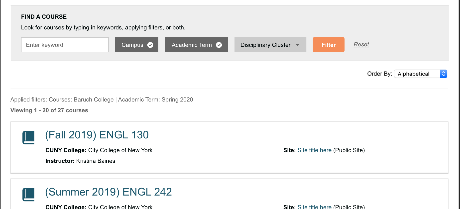
We've agreed that the copy under Find a Course could be more clear, and perhaps a bit stronger visually Sonja if you think you can. Let's try this for the text right now: "Look for courses by typing in keywords, applying filters, or both."
Remind me -- will the Filter button change to orange (or blue?) from gray when the user's entered criteria of some sort, indicating a search can now happen by pressing the button? If it's going to be static, let's make sure the button stands out as a color rather than gray.
That should do it for now. Sonja, let me know if you have other questions, and otherwise let's finalize this for Boone and Ray. We will nail down a release schedule after the Friday all-team meeting, but right now we are looking at three weeks of development to begin testing in the first full week of November (4th-8th) with an eye on finalizing everything by our next team meeting on Friday the 15th. Then, we'll prepare documentation/publicity/social over the next two weeks (factoring in a Thanksgiving hiatus) to be ready to release in the first week of December. Thanks!
Updated by Sonja Leix over 6 years ago
Colin McDonald wrote:
Hello all, just summing up the call from earlier today. We are approved on the B design of the search/filter area here to combine with the other areas of the page that we approved last week:
https://redmine.gc.cuny.edu/attachments/download/12685/8897-courses-filtering-v10B.pdf
Thanks Colin, I'll provide the design files for the filters incl the missing hover states.
Sonja, let me know if the 41/42 comments don't tie up the icons. We need to pick pencil or pie chart for NA -- perhaps leaning pie chart because of the "edit" connotation of the pencil. Happy to defer to you on that too, though.
Thanks Colin, that should conclude it.
We've agreed that the copy under Find a Course could be more clear, and perhaps a bit stronger visually Sonja if you think you can. Let's try this for the text right now: "Look for courses by typing in keywords, applying filters, or both."
I'll add the updated copy to the final design files. Thanks – the copy I put in there was def just a placeholder.
Remind me -- will the Filter button change to orange (or blue?) from gray when the user's entered criteria of some sort, indicating a search can now happen by pressing the button? If it's going to be static, let's make sure the button stands out as a color rather than gray.
Yes the color change of the search button indicates that it can be clicked.
Updated by Sonja Leix over 6 years ago
- File 11298-courses-tab-v11-final.pdf 11298-courses-tab-v11-final.pdf added
- File filter-applied.svg filter-applied.svg added
Boone,
I've added the updated approved designs to Zeplin (and also attached here as PDFs, SVG of checkmark in filter). Let me know if you have any questions.
The Dashicons to be used for the Disciplinary Clusters are as follows:
Arts and Humanities
https://developer.wordpress.org/resource/dashicons/#book-alt
Social Sciences (mix of globe and person images)
https://developer.wordpress.org/resource/dashicons/#universal-access-alt
STEM
https://developer.wordpress.org/resource/dashicons/#filter
Professional
https://developer.wordpress.org/resource/dashicons/#portfolio
Other
https://developer.wordpress.org/resource/dashicons/#archive
NA
https://developer.wordpress.org/resource/dashicons/#chart-pie
Updated by Boone Gorges over 6 years ago
Hi Sonja - A quick update to let you know that I've built a first version of the filter interface. I think I've captured most of the button state behavior (it's quite complex!). See attached gif that shows it in action. I used Dashicons for the button icons and took a guess at the proper border-radius for the 'Filter' button. One question for you for the moment: I don't see any hover states for the buttons in Zeplin or in the PDF designs. Could you please spell this out? Note that we have three different button states: light gray (no subitems checked), dark gray (some subitems checked), orange (filter is open).
Updated by Sonja Leix over 6 years ago
Boone, this is looking great already. Sorry for the late response.
You're right, I didn't include the hover states for those buttons. I've updated the designs in Zeplin to include it: https://zpl.io/2ExWR48
Updated by Boone Gorges over 6 years ago
Perfect, thanks! I'm making progress and should have something to share in the next day or two.
Updated by Boone Gorges over 6 years ago
- File cac-fill-disciplinary-clusters.php cac-fill-disciplinary-clusters.php added
- File cac-create-disciplinary-cluster-terms.php cac-create-disciplinary-cluster-terms.php added
- Status changed from In Progress to Testing Required
A first pass is now ready to test on cdev (point commons.gc.cuny.edu to 146.96.128.252 in your hosts file). There's obviously a lot going on here, and functionality can probably be best explored by playing with it. A couple of implementation notes and questions, particularly on places where I made some assumptions about how to translate the designs into functionality:
1. Directory pagination - I tried to make this look like it does on the other directories, which means (a) not aligning it with the "Viewing" text on mobile, and (b) using different 'next' and 'prev' glyphs, and (c) slightly different styling.
2. In order to make Directory Cluster search possible, I needed to mirror cluster info to the Course objects (they previously lived only on the linked groups/sites). I've added functionality to make this info sync at the time of group/site creation or edit. I also wrote two scripts to populate the necessary taxonomy terms and then to backfill these terms for existing courses. These scripts are attached, and I'll need to run them at the time of release.
3. There's no AJAX support for filters and pagination at the moment. I wanted to build it without first, and I can add it later if we feel we need it. This leads me to the next point...
4. Currently, you must click the Filter button in order to trigger a page refresh in certain cases, and I'm not sure whether this needs to be changed. There are five different kinds of ways to change the "view" of the course list: a. Typing a search keyword, b. Using one of the checkbox options (Campus etc), c. Hitting Reset, which zeroes all filters, d. Changing 'Order By', e. Clicking a pagination link. Items c and e are link clicks, so it's natural that they would force a page refresh. The others - a, b, d - don't trigger a form submission. In the case of a, it doesn't make sense to do it automatically - typical search behavior is to hit Enter or hit a button. In the case of b and d, I think it could go either way. I played with automatic form submission for b and d (ie when you make a change, the page auto-refreshes) but I found it disruptive - you're suddenly whisked away from the current page without warning - and confusing, because of the disparity with the keyword search. IMHO the way things are currently working is a decent solution (especially given that the Filter button becomes orange to indicate it must be pressed) but I would like to hear other opinions.
5. You can filter and/or sort by Semester, but a course's semester doesn't actually appear in its listing. Can we add it? If so, where?
6. The mockups have the course title (in the featured slider and in the list) as a link. But there's nothing to link to - courses don't have a landing page.
7. The only options I've added to the Order By dropdown are: Alphabetical, Semester. What else would/could there be?
8. The filter buttons on the desktop mockup read: Campus, Semester, etc. On the mobile mockups, they read 'Select Campus', 'Select Semester', etc. Is the inclusion of 'Select' intentional? I've left it out for the time being.
Sonja, perhaps you could have a first look and provide feedback on the above and on any other items you notice, before handing off to the rest of the team?
Updated by Colin McDonald over 6 years ago
Hi Boone, I think that this is looking great. Just let me know when you think is best to get the community team testing this -- I could introduce it on our call at noon, or just tell them to be ready to go on it next week. Meanwhile, a few things from my initial look:
- I think all of the page refresh trigger behaviors make sense, except maybe the Order By. I could see the results refreshing as soon as you change that, like it would in Excel or something. I'm not adamant on this though, as I think the Filter button going orange helps suggest the next step if you don't refresh right away.
- I don't think that Campus is appearing in the Applied filters: line. I'm also wondering whether that line is getting lost. Perhaps it could go in the space between the Viewing X of X results line and the filter area, in that white space, and be a little larger? More on par with the Order By area. And same with the "no results" line, as it wasn't clear to me at first that my filters weren't supplying anything.
- I guess we don't have any Semesters in use right now except Fall 2019, with the metadata being so new, so that's why that's the only choice there?
- I could see Semester being listed under the Site/Group link line in the results, i.e. the fourth line of data to balance out the 3 lines that are in the box now (College, Instructor, group/site link). I agree that it would be good to have it if we can.
- For Order By options, would it be possible to make one Most Recent or Most Recently Active? So you'd see the results that most recently edited or published something. I imagine this could be different than Semester, especially for more popular filters.
- Last, would it be possible for me to send you some content for the Featured directory at the top, so we could test out how that looks? Or even a way for me to test out how we'll be editing it ourselves, and put some slides up there myself?
Updated by Boone Gorges over 6 years ago
Thanks, Colin!
You're right about 'Campus' in the 'Applied filters' line - this has been fixed.
Thanks for the reminder about Featured courses. I'd forgotten to set this up. The workflow is: At https://commons.gc.cuny.edu/wp-admin/edit.php?post_type=cac_course, find the courses you want to feature. Click through to them and make sure that they have a Featured Image. Then, go to https://commons.gc.cuny.edu/wp-admin/edit.php?post_type=cac_course&page=cac-courses-featured and enter the IDs of those courses. I've chosen a few at random and set them up, so you can get a sense of how it works.
You're correct about the limited Semester options. I just switched one of the courses to another semester so you can see more than one option in the list. The options are dynamically populated based on the semesters attached to actual courses. (I would import data from the production site so that we had a richer set of data to work with, but this would require almost a full import of all production data, to ensure that things like user profile links, group links, etc worked.)
Re 'Order By' options: Newly created is definitely doable. 'Recently Active' is much harder, because "activity" comes from both sites and groups, and we don't have a way to store and collate this data easily. If others think that 'Newest' would be useful, let me know and I'll add it.
Updated by Sonja Leix over 6 years ago
Thanks Boone, this first pass looks great! Sorry for the late response, I didn't receive the notification since I was no longer assigned the task. Just added myself as a watcher so this won't happen again in the future.
Few replies to your points and questions:
4. Currently, you must click the Filter button in order to trigger a page refresh in certain cases, and I'm not sure whether this needs to be changed. There are five different kinds of ways to change the "view" of the course list: a. Typing a search keyword, b. Using one of the checkbox options (Campus etc), c. Hitting Reset, which zeroes all filters, d. Changing 'Order By', e. Clicking a pagination link. Items c and e are link clicks, so it's natural that they would force a page refresh. The others - a, b, d - don't trigger a form submission. In the case of a, it doesn't make sense to do it automatically - typical search behavior is to hit Enter or hit a button. In the case of b and d, I think it could go either way. I played with automatic form submission for b and d (ie when you make a change, the page auto-refreshes) but I found it disruptive - you're suddenly whisked away from the current page without warning - and confusing, because of the disparity with the keyword search. IMHO the way things are currently working is a decent solution (especially given that the Filter button becomes orange to indicate it must be pressed) but I would like to hear other opinions.
5. You can filter and/or sort by Semester, but a course's semester doesn't actually appear in its listing. Can we add it? If so, where?
We should add it in the left column either below or above instructor – which ever the team feels makes more sense. Either works for me.
6. The mockups have the course title (in the featured slider and in the list) as a link. But there's nothing to link to - courses don't have a landing page.
That's correct. I think somewhere during the design phase I started assuming that courses had a landing page. This is why I intended those titles to be clickable like Sites and Groups. I guess at this moment I'm a little confused what students would do to enroll in a course. Is that clear to students? (this question shouldn't hold up this ticket however)
7. The only options I've added to the Order By dropdown are: Alphabetical, Semester. What else would/could there be?
Is the order by dropdown actually working in cdev? When I switch between the two options nothing happens.
8. The filter buttons on the desktop mockup read: Campus, Semester, etc. On the mobile mockups, they read 'Select Campus', 'Select Semester', etc. Is the inclusion of 'Select' intentional? I've left it out for the time being.
This was an oversight. It should be consistent across mobile and desktop.
Regarding Colin's feedback:
- I don't think that Campus is appearing in the Applied filters: line. I'm also wondering whether that line is getting lost. Perhaps it could go in the space between the Viewing X of X results line and the filter area, in that white space, and be a little larger? More on par with the Order By area. And same with the "no results" line, as it wasn't clear to me at first that my filters weren't supplying anything.
Looking at this in action now, I agree that the number of results and "no results" would better live below the list of filters (see attached screenshot). We could also make the number of results bold to distinguish the two and we definitely need more spacing between the list of results on this area. In the current implementation the "applied filters" line is too close to the first result.
I think we are very close to share this for general testing!
Updated by Boone Gorges over 6 years ago
Thanks, all.
- Newly Created added to order dropdown in https://github.com/cuny-academic-commons/cac/commit/bd3710ade8992b9b4950bfbcfd31057bf3c69c0d
- 'Semester' added to course cards (just above Instructor) in https://github.com/cuny-academic-commons/cac/commit/44f4f1a534aab3b718e9cd8acf22831913cdc3c4
- Improved styling for 'Applied filters' and pagination messages, as per Sonja's suggestions in https://github.com/cuny-academic-commons/cac/commit/617645f3acc9e77cd831b64178d9a7d6eb0d442a
Is the order by dropdown actually working in cdev? When I switch between the two options nothing happens.
Sonja, when you change this value, you must then click the orange 'Filter' button to see changes. See my point 4 at https://redmine.gc.cuny.edu/issues/11298#note-58. Your experience and Colin's suggest that we should auto-refresh when this dropdown is changed, but happy to hear other ideas.
Updated by Sonja Leix over 6 years ago
Boone Gorges wrote:
Is the order by dropdown actually working in cdev? When I switch between the two options nothing happens.
Sonja, when you change this value, you must then click the orange 'Filter' button to see changes. See my point 4 at https://redmine.gc.cuny.edu/issues/11298#note-58. Your experience and Colin's suggest that we should auto-refresh when this dropdown is changed, but happy to hear other ideas.
Thanks Boone!
Yes, I would auto-refresh the list when the user changes the order-by dropdown to be consistent to the behavior of this option in other areas of thee Commons.
Updated by Sonja Leix over 6 years ago
Boone Gorges wrote:
Thanks, Sonja! I've made that change.
Thanks Boone! This feature is good for testing from my side.
Updated by Colin McDonald over 6 years ago
Hi Boone, we spoke on the dev call yesterday about getting testing going this week, maybe even a bit in advance of the Friday meeting in case we can discuss testing observations then in person. What do you think about our status there, and potentially putting a few notes together for those testing? We could also include the iCal work Ray has been doing in #11795 along with the archive styling in #11901 of course. Thanks!
Updated by Boone Gorges over 6 years ago
- Status changed from Testing Required to Resolved