Feature #19724
closedUpdating Group/Site Creation and Completion pages
100%
Description
Hi All,
I am wondering if, as part of this next phase of redesign, we might update the group/site creation portal pages and the group/site completion page?
I don't think there need to be any functional changes perhaps this is only ux/design and font changes? Maybe I am wrong though.
The completion page especially doesn't seem like it would be too complicated. But if this request adds too much labor, or muddies the group overhaul process, feel free to ignore.
Files
Related issues
Updated by Matt Gold about 2 years ago
Great idea, Laurie. Colin, can you please add this to our agenda for today?
Updated by Colin McDonald about 2 years ago
We unfortunately didn't get to this during the meeting today, but I'll flag for Sara here and during the next dev call, as I think it would be good to update these as well if we can.
Updated by Colin McDonald about 2 years ago
- Category name set to Design
- Assignee set to Sara Cannon
I've combed back through the tickets after we looked during yesterday's dev call at Sara's past work on redesigning the group/site creation flow. I can't seem to find where we posted/discussed those in the past
We did redesign the Create landing page in #16960, worked on surfacing Create buttons/links better in #16672, and did new Create "success" landing page designs in #16670. None of those are as thorough as what Sara showed yesterday, though.
Let's just use this ticket from here to combine that work with the issues Laurie highlights above. Sara, if you can please post your latest Figma here for us to review, and any other questions you might have to refine it, we can pick up on it. I'm adding some watchers here, too.
Updated by Sara Cannon about 2 years ago
- File Create A Group_ Details.png Create A Group_ Details.png added
- File Create A Group_ Settings.png Create A Group_ Settings.png added
- File Create A Group_ Photo.png Create A Group_ Photo.png added
- File Create A Group_ Cover Image.png Create A Group_ Cover Image.png added
- File Create A Group_ Cover Image-1.png Create A Group_ Cover Image-1.png added
- File Create A Group_ Publish.png Create A Group_ Publish.png added
Create Group Flow Screens
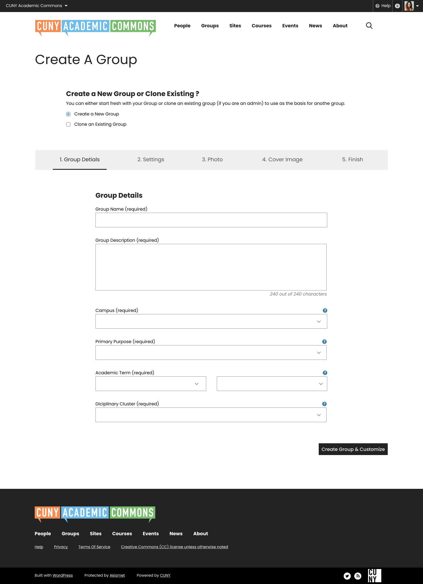
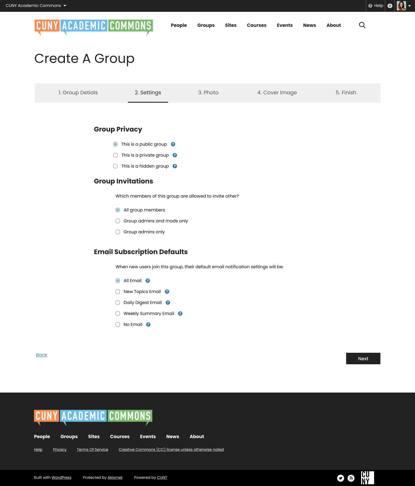

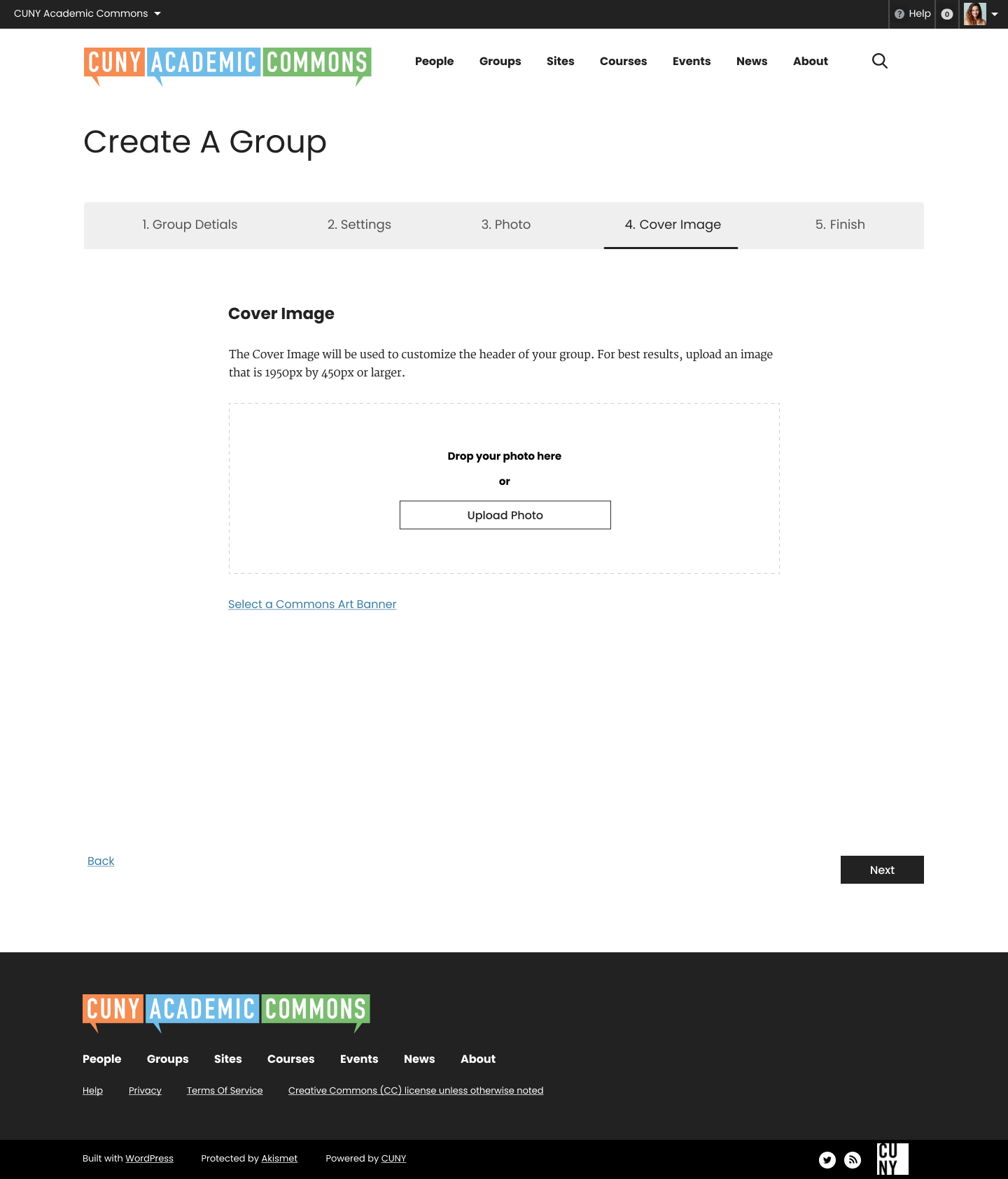

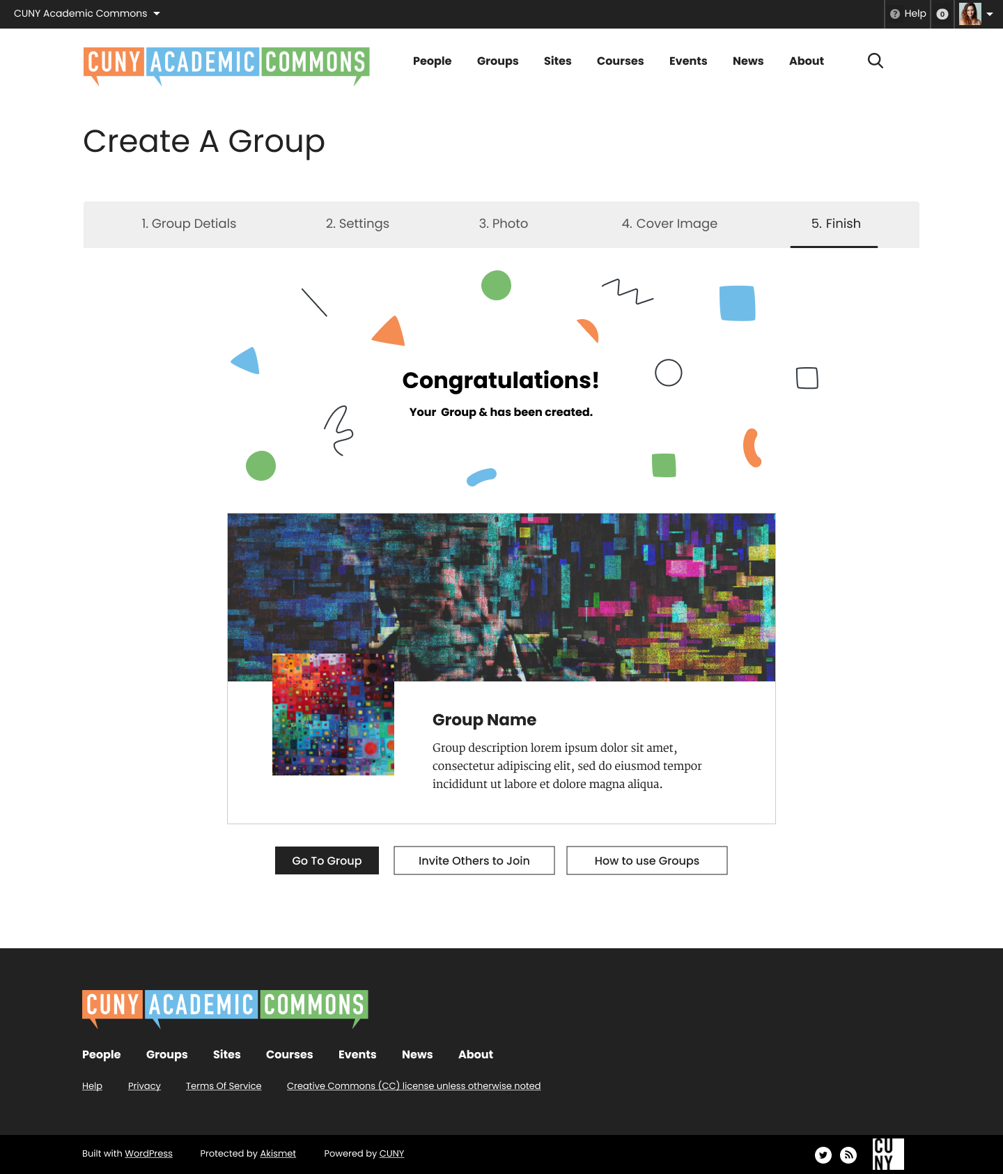
Updated by Sara Cannon about 2 years ago
- File Create A Group+Site_ Details.png Create A Group+Site_ Details.png added
- File Create A Group+Site_ Settings.png Create A Group+Site_ Settings.png added
- File Create A Group+Site_ Photo.png Create A Group+Site_ Photo.png added
- File Create A Group+Site_ Cover Image.png Create A Group+Site_ Cover Image.png added
- File Create A Group+Site_ Site Details.png Create A Group+Site_ Site Details.png added
- File Create A Group+Site_ Finish.png Create A Group+Site_ Finish.png added
Clone Group and Site Screens
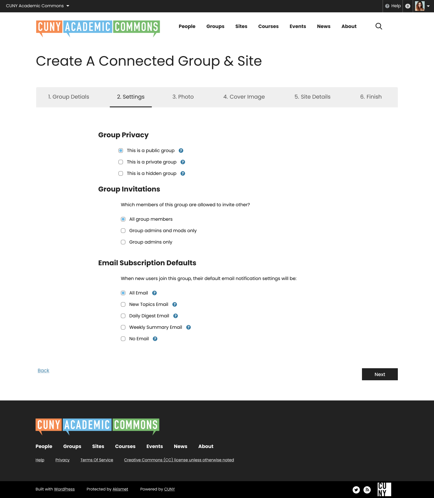
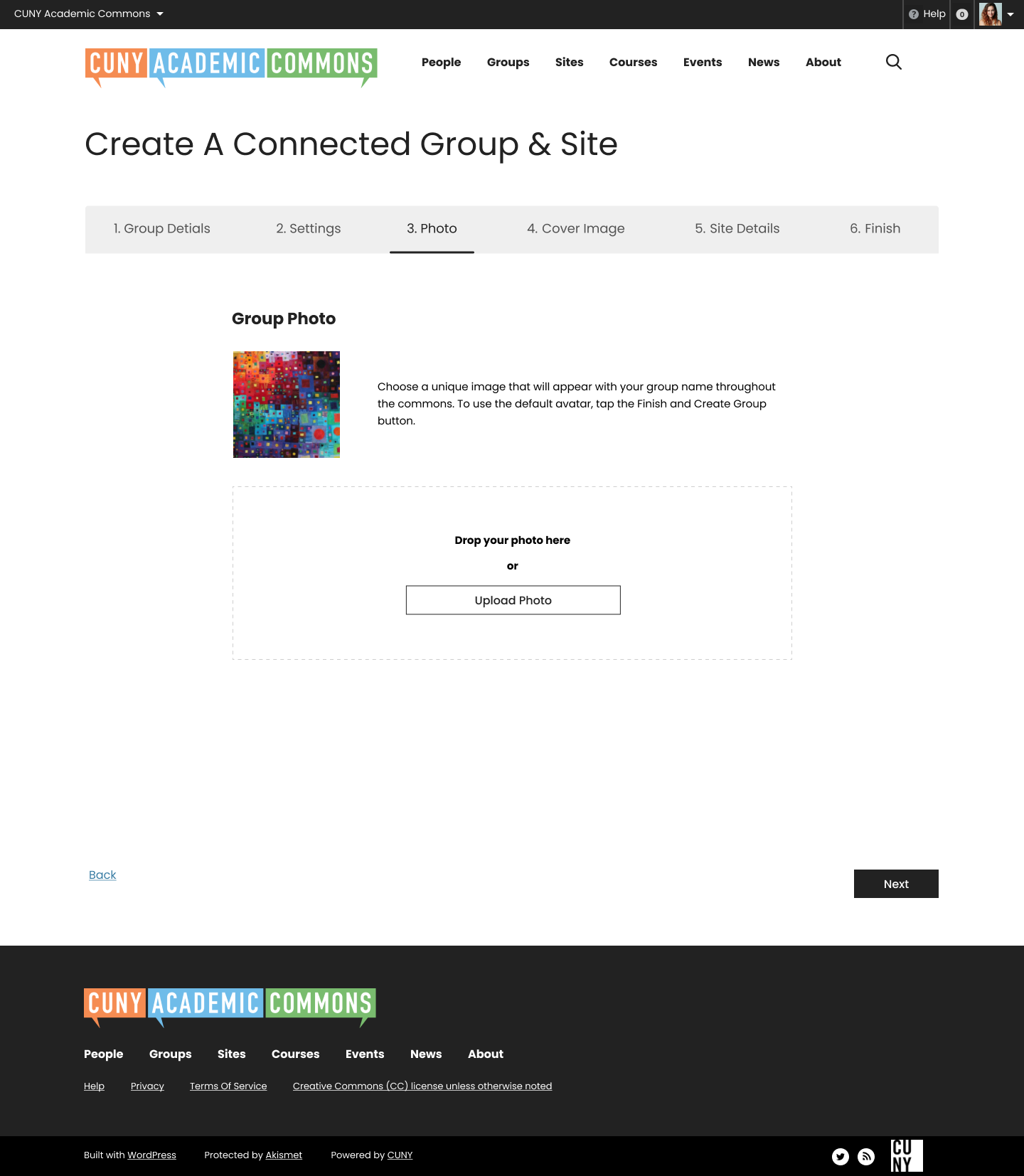
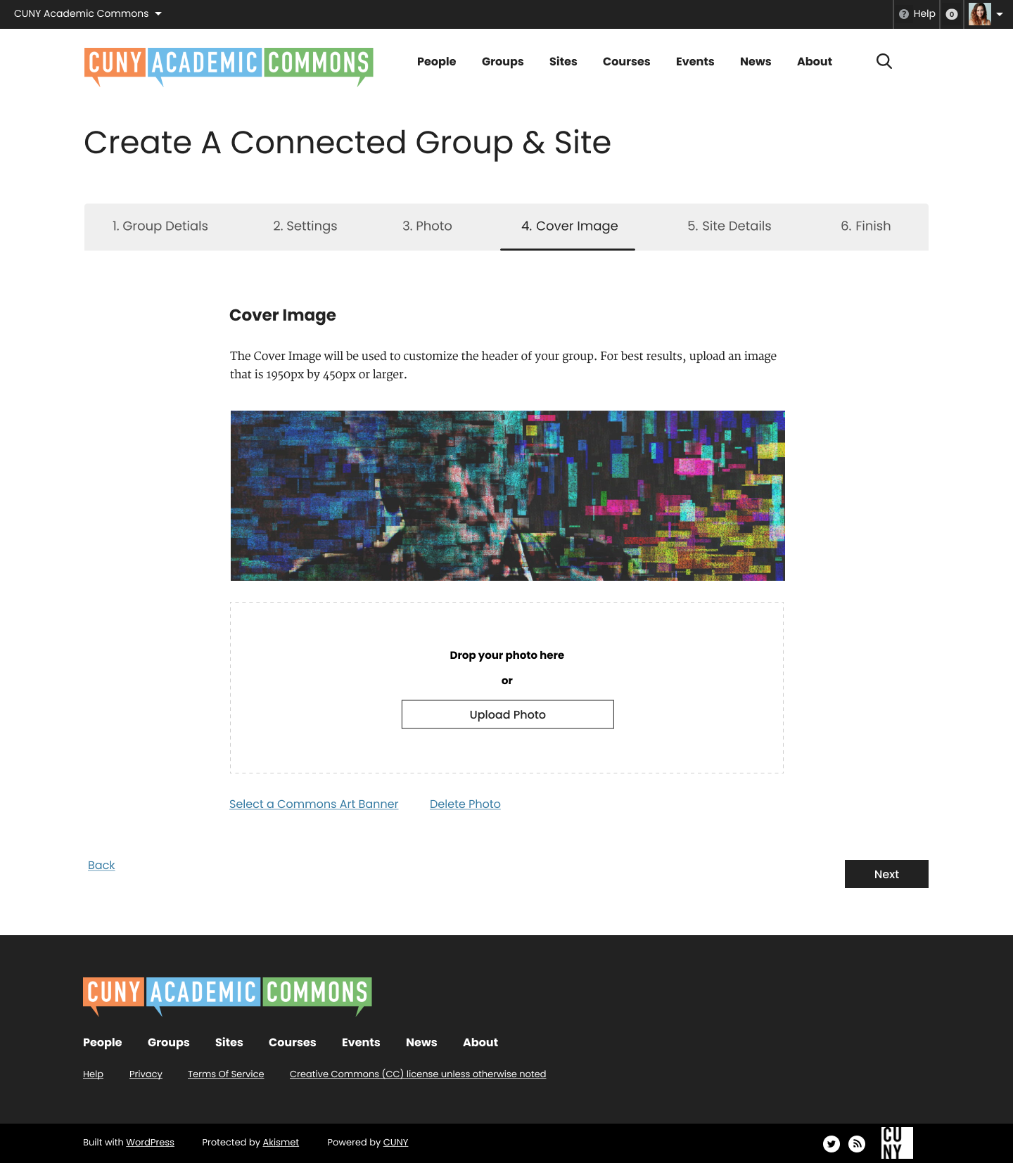

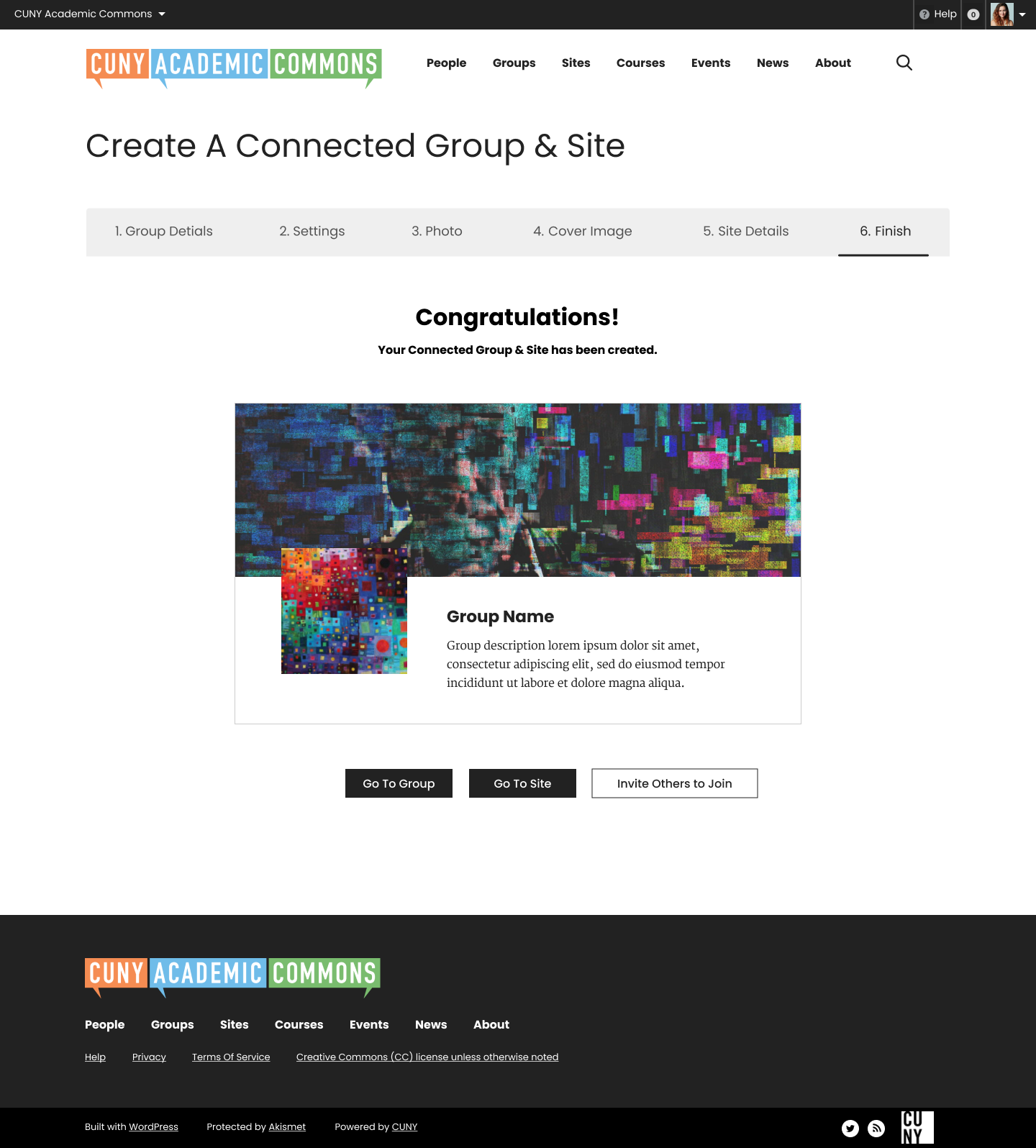
Updated by Colin McDonald about 2 years ago
Hi Sara, this is all looking good to me, only one sizable change on the copy:
- On the first page, it's "basis for another" not "anothe" at the top.
- On the first page, the Academic Term and Cluster fields should only appear if the Primary Purpose selected is Teaching (sorry if you've already incorporated this).
- On the second page, "to invite others?" not "other?".
- On the third page, "throughout the Commons" not "commons".
- On the fourth page, under the Cover Image title let's say: "You can add an image here to appear across the header of your group. For best results, upload an image that is 1950px by 450px or larger. You can also click the link below to choose a header image from our Commons Art Banner collection."
Updated by Colin McDonald about 2 years ago
Hi Sara, just a note about trying another button on the Congratulations screen linking to documentation:
- For a Group, it can say "How to use Groups" and link to:
https://help.commons.gc.cuny.edu/how-groups-can-use-the-commons/
- For a Site, it can say "How to use Sites" and link to:
https://help.commons.gc.cuny.edu/overview/
- For a Group + Site, I think we skip it since there are already three buttons.
Updated by Sara Cannon about 2 years ago
- File 3.18.24.zip 3.18.24.zip added
- File Create A Group_ Publish.png Create A Group_ Publish.png added
Figma designs for development: https://www.figma.com/file/XtBvj6Z9N5sLn9eHco4ArO/CUNY-Design---Spring-2024?type=design&node-id=4594%3A6726&mode=design&t=R4U9KPdkmbjmVts5-1
I added in the buttons Colin suggested above. I also added in the fun confetti to be similar to the delight with the invite modal.
Updated by Boone Gorges about 2 years ago
- Related to Feature #20013: Support for Commons-provided cover images in group create/edit flow added
Updated by Boone Gorges about 2 years ago
- Category name changed from Design to Groups (misc)
- Assignee changed from Sara Cannon to Boone Gorges
- Target version set to 2.3.5
I am happy to do much of the implementation work for this ticket, but many of the interfaces are shared with the group admin/edit flows decsribed in #19592. So I might let Ray get a head start there, and then inherit some of his work on this ticket.
Updated by Boone Gorges about 2 years ago
- Related to Feature #19592: Groups Page Re-Design added
Updated by Boone Gorges about 2 years ago
- Target version changed from 2.3.5 to 2.4.0
Updated by Boone Gorges almost 2 years ago
A first pass at the redesigned group creation process is in place. Some notes and questions for Sara:
- The comps don't have a Cancel button. It was added in #4350. I leave it to the team whether it's still necessary. For the time being, I've removed it.
- The text under 'Congratulations' on the final panel is built dynamically. If you've created a group+site, the language is different from if you've just created a group. The text also contains the name of the group, and a link to it. I've left some of this in place for now, and we can determine as a group whether it's worth changing/simplifying.
- Currently, the Congratulations panel shows different text and actions for post-clone than what you see post-create. I've left the existing test so that you can compare and contrast. We should decide how and whether we want these to align.
- Where should the "How to use Groups" button point to?
- I've made some guesses about the best behavior on mobile. I could use a bit of guidance on the avatar step (which should then be duplicated in the settings for existing groups) and also for the "card" view on the Congratulations panel.
- The mockup has a panel for Site Details, but it doesn't have the section at the top for deciding whether to create a new site vs use an existing site vs clone. I think we need to keep some version of this. I've left it for the time being.
- In general, there are some places where the redesigned creation flow has similar interfaces to the group settings flow, but where the comps have them appear slightly different. Compare, for example, the 'Group Privacy' section during creation with what you see at [group] > Manage > Settings. Are we indenting radio buttons? Are we hiding help text behind tooltips? Etc. Sara, as part of your initial review, it would be helpful if you did some side-by-side comparison of these sorts of screens, to ensure that we're consistent - and when we're not consistent, it should be for a reason.
Updated by Sara Cannon almost 2 years ago
- File Screenshot 2024-04-29 at 3.41.26 PM.png Screenshot 2024-04-29 at 3.41.26 PM.png added
- File Screenshot 2024-04-29 at 3.50.09 PM.png Screenshot 2024-04-29 at 3.50.09 PM.png added
Thanks, Boone for all your work here - It's looking great.
- The footer needs to span across the screen
- When cloning a group, can the group name and description be auto-populated?
- When cloning a group, It finishes at the tab "3. Finish" but then has another tab "4. Site Details" that you can't advance to for some reason (see screenshot)
- Great catch on some of the inconsistencies. We probably should not be indenting radio buttons and go with the treatment under group settings.
Updated by Colin McDonald almost 2 years ago
If I want to cancel a group creation, I'd just close the window before finishing, but perhaps others wouldn't trust or try that. If we already have the cancel button and flow in place, I can see the argument for keeping it. Here's the gif Ray made years ago showing it, which helped me understand:
https://redmine.gc.cuny.edu/attachments/9371/cancel-group.gif
Let's link the "How to Use Groups" button to this, and please capitalize "Use" in the button:
https://help.commons.gc.cuny.edu/how-groups-can-use-the-commons/
I looked at the different Congratulations Screen copy for post-clone and post-create, and they made sense to me. Correct if I'm wrong, but the main difference is that post-clone points you at the bottom to this documentation checklist, rather than to go to group / invite others / how to use buttons.
https://help.commons.gc.cuny.edu/clean-up-after-group-cloning/
Sara, I wonder how that auto-populating would work for group name and description of a clone. Should it be identical to the parent group name and description? We'd want to encourage making it distinct in some way right? In a way, perhaps leaving those blank and requiring new input encourages that?
Related to Sara's note about the Site Details tab that can't be accessed from the Finish tab -- should one be able to access ANY of those top tabs from the Finish tab, i.e. once you've completed the group creation? Because at that point going back to other tabs won't change the group you've already finished, right?
Updated by Boone Gorges almost 2 years ago
Thanks, all.
The footer needs to span across the screen
I've made the change.
When cloning a group, can the group name and description be auto-populated?
I had a similar response to Colin's, so I decided tentatively to append 'Clone of ' to the group name. However, I don't think this is a great solution. When cloning a site, we have a section under the URL interface that tells you the URL of the clone source, as a reference. I wonder if something similar would be good here.
Related to Sara's note about the Site Details tab that can't be accessed from the Finish tab -- should one be able to access ANY of those top tabs from the Finish tab, i.e. once you've completed the group creation? Because at that point going back to other tabs won't change the group you've already finished, right?
I believe I've made the necessary changes so that going back to a given step and re-saving will modify the just-created group. However, it's not possible to be 100% consistent about this. If, for example, you choose to clone an existing group, it's not possible to go back and decide not to clone that group, or to clone from a different source group. The use of a 'Back' link and the navigation is, in my opinion, liable to cause confusion and bugs, so I'd be in favor of removing it.
Let's link the "How to Use Groups" button to this, and please capitalize "Use" in the button:
Thanks, I've made the change.
Great catch on some of the inconsistencies. We probably should not be indenting radio buttons and go with the treatment under group settings.
OK, I'll take another pass through, and for those cases where an interface corresponds directly to one in the group settings, I'll change the implementation to match what's in the group settings.
Updated by Boone Gorges almost 2 years ago
If I want to cancel a group creation, I'd just close the window before finishing, but perhaps others wouldn't trust or try that. If we already have the cancel button and flow in place, I can see the argument for keeping it.
It's OK with me if we keep it, but I'm unsure where the link/button should go. Maybe a bit of guidance from Sara?
Updated by Sara Cannon almost 2 years ago
the link could go near the next button
Updated by Boone Gorges almost 2 years ago
Thanks, Sara. I've added the Cancel link, as suggested, in https://github.com/cuny-academic-commons/cac/commit/3678847043f69d434c03f51d6f438fdf5bdf8eea
Updated by Colin McDonald almost 2 years ago
In the Friday meeting, we decided it would be a good idea to have a second button, for "Group Settings," on the Congratulations screen for a cloned group that points to the admin-level Manage>Settings screen, like this:
https://commons.gc.cuny.edu/groups/cac-community-team-project-planning/admin/group-settings/
Let's also change shorten the text of the one button already built for that screen, to "Post-Cloning Checklist" from "Follow this post-cloning checklist to finish setting up your Group".
Can we also look into whether it's possible to alter the CSS for better display of the group panel on the Congratulations screen if there is no header image selected, so the empty space is reduced?
Updated by Colin McDonald almost 2 years ago
Please disregard the below. It is for the invite modal, not the creation flow. I'm adding it to the correct ticket:
- Sorry, and we also discussed adding an "X" or close-out option at the top of the congratulations screen, should you not want to proceed to any of the buttons (for either a cloned OR a new group) but just want to get out of the creation flow. Perhaps this should just take you back to your Commons homepage/dashboard? ***
Updated by Raymond Hoh almost 2 years ago
- File Group Create Confirmation - No Cover Image.png Group Create Confirmation - No Cover Image.png added
In the Friday meeting, we decided it would be a good idea to have a second button, for "Group Settings," on the Congratulations screen for a cloned group that points to the admin-level Manage>Settings screen, like this:
Let's also change shorten the text of the one button already built for that screen, to "Post-Cloning Checklist" from "Follow this post-cloning checklist to finish setting up your Group".
Done in https://github.com/cuny-academic-commons/cac/commit/b7f445b7c8b1833e2c45618fc1424c9dfa719707 .
Can we also look into whether it's possible to alter the CSS for better display of the group panel on the Congratulations screen if there is no header image selected, so the empty space is reduced?
Done in https://github.com/cuny-academic-commons/cac/commit/19cf96433045c9641b0148d71d7f90fd0cebd7be . I've attached a screenshot for those not able to view cdev.
Both items are available for testing on cdev.
Updated by Sara Cannon almost 2 years ago
Can we add a way to delete the commons art banner after you select it during the creation flow?
Also, the email on the settings tab is indented when all the others are not - can we left align it?
Updated by Boone Gorges almost 2 years ago
I've eliminated the indent at https://github.com/cuny-academic-commons/cac/commit/150ac19c54216b51402903e3bfc943a191746d6d
Can we add a way to delete the commons art banner after you select it during the creation flow?
Looks to me like this is an issue in group settings too. I'm going to move discussion over to #20209