Design/UX #13998
closedHomepage Redesign
100%
Description
This is a parent task collecting all tickets (see subtasks) for the homepage redesign we've begun over the past two months. We can use this for general updates on the project, and perhaps this will be collected into another set of tickets when we expand the homepage work into a larger redesign phase.
Files
Related issues
Updated by Colin McDonald over 5 years ago
- Assignee changed from Michael Smith to Sonja Leix
Updated by Boone Gorges over 5 years ago
- Related to Feature #14179: Featured Sites and Groups for Home Page Redesign added
Updated by Colin McDonald almost 5 years ago
- Assignee changed from Sonja Leix to Sara Cannon
Updated by Boone Gorges over 4 years ago
- File Screenshot_2021-10-26_13-28-18.png Screenshot_2021-10-26_13-28-18.png added
- File Screenshot_2021-10-26_13-30-38.png Screenshot_2021-10-26_13-30-38.png added
As noted in the dev call today, the first round of implementation is now available to view on cdev.
Sara, I'd like you to have the initial review. To access the cdev site, enter the following into your /etc/hosts file:
146.96.128.252 commons.gc.cuny.edu
I've created an account for you on cdev (it's a separate database) and will email you credentials shortly.
Certain elements are missing (featured Sites and Groups, Members from Your Campuses) but there should be enough there for you to review 95% of the design elements.
Overall, I'd like your general impressions for both the desktop and mobile versions (default breakpoint is 600px). A few things to pay special attention to:
1. On desktop, I took the main nav and the search toggle all the way over to the right-hand side of the available space. This gives better symmetry to the page, because the corner of the CAC logo and the search icon now serve as the upper-left and upper-right corners of the canvas. This was especially important on interior pages (such as http://commons.gc.cuny.edu/groups/) looked really out of balance without this change.
2. The Members grid (4x3 logged-out, or 2x(2x3) logged-in) was getting funny at medium widths (between 600px and roughly 900px). I introduced a third breakpoint at 1028px. Between 600 and 1028, the available space becomes 2x6, which allows for 2x(1x6) for logged-in users. Above 1028, we get the 4x3 desktop view.
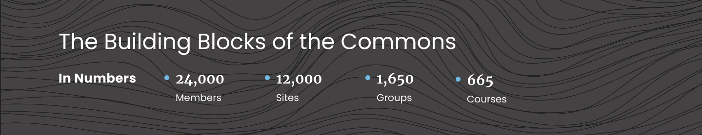
3. The side-by-side stats in 'Building Blocks' didn't look good when I let it break to multiple rows at medium widths. So I forced it to mobile view (centered, a 2x2 grid of stats) at 1028px.
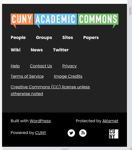
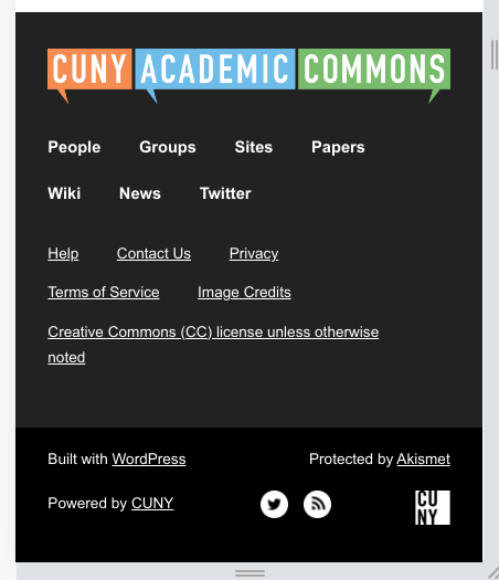
4. We use the same footer across all sites in the WP Multisite network. It would be nice to avoid loading the Poppins font across the network, if possible. I've attached two screenshots of the footer, the first with Poppins (as it appears on the main site) and the second with the fallback of Arial. Do you think this is acceptable?
Thanks in advance for your feedback!
Updated by Matt Gold over 4 years ago
Just checked it out and it is looking really great. A few minor thoughts:
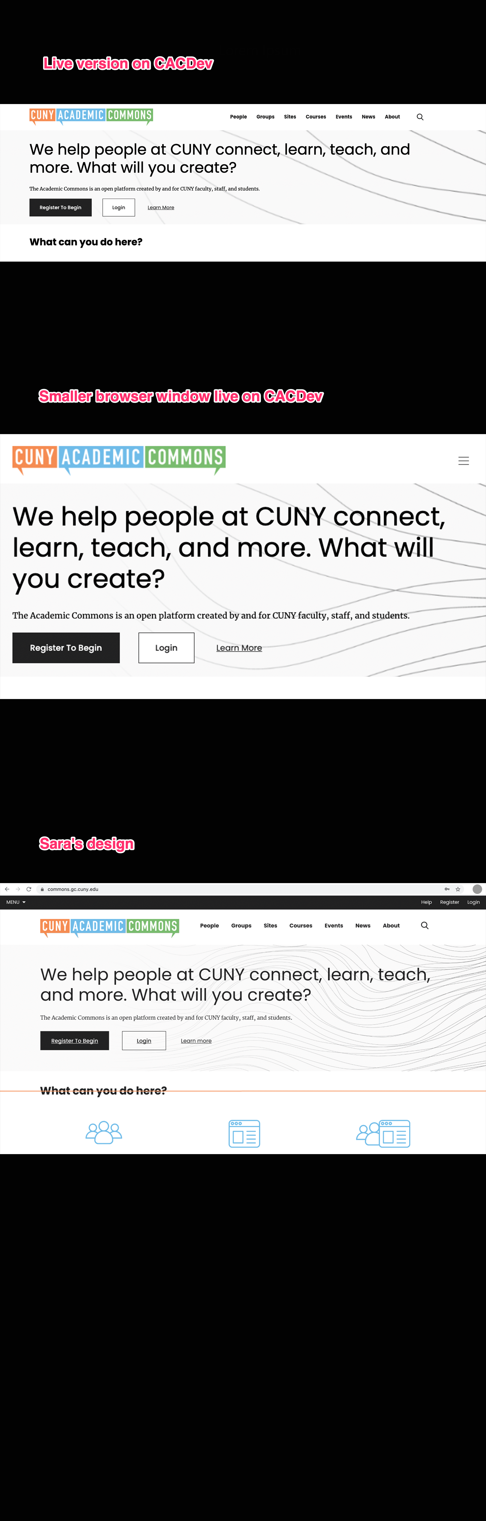
1. at a desktop view, we're getting only part of the line-drawn background for the header (under "We help people at CUNY connect, learn, teach, and more. What will you create?"). I see that when one resizes the browser, one sees more of that line-drawn image, but I'm wondering whether we can handle this differently at full-width so that we see more of the lines.
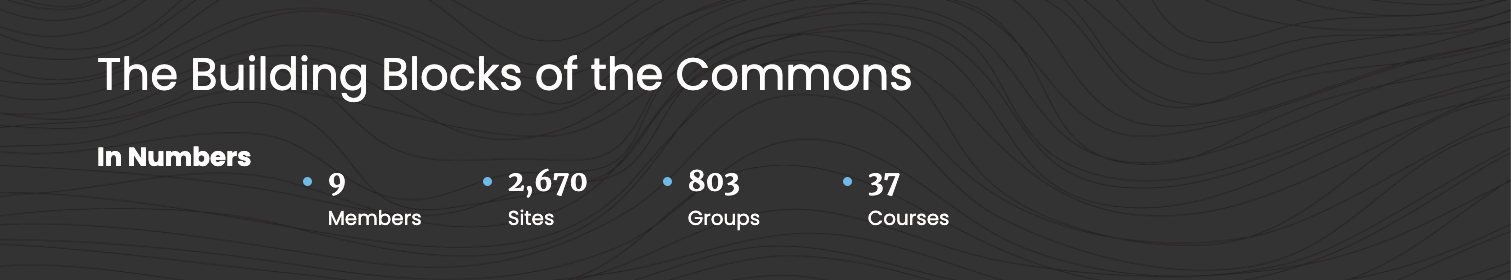
2. In the "In Numbers" section at desktop view, I'm seeing horizontal misalignment. I'm sure this is something you see and are going to work on, but I just wanted to mention it.
3. Is the reason I see only 9 members listed in the "in numbers" section that we are looking at CDEV? Ie, will it jump to 33k+ once this is on production?
Overall, it is looking really slick and I think the interior pages look great, too!!!
Updated by Boone Gorges over 4 years ago
1. at a desktop view, we're getting only part of the line-drawn background for the header (under "We help people at CUNY connect, learn, teach, and more. What will you create?"). I see that when one resizes the browser, one sees more of that line-drawn image, but I'm wondering whether we can handle this differently at full-width so that we see more of the lines.
There was a typo causing the wrong image to appear on desktop. I've fixed it. Not sure if this is what you mean by "more of the lines".
2. In the "In Numbers" section at desktop view, I'm seeing horizontal misalignment. I'm sure this is something you see and are going to work on, but I just wanted to mention it.
This is now fixed.
3. Is the reason I see only 9 members listed in the "in numbers" section that we are looking at CDEV? Ie, will it jump to 33k+ once this is on production?
Correct.
Updated by Matt Gold over 4 years ago
- File cac-header.png cac-header.png added
Hi Boone - please see the attached set of images, which I hope shows you what I am talking about. Currently, in the live demo, I see the header image zoomed in a great deal, so that I see fewer of the hand-drawn lines that I see when I look at Sara's comps. Please let me know whether this clears things up.
Updated by Matt Gold over 4 years ago
- File in-the-numbers-cacdev.png in-the-numbers-cacdev.png added
- File in-numbers-design-comps.png in-numbers-design-comps.png added
I'm still seeing an issue with horizontal alignment in the "in the numbers" section -- please see that attached screenshots
Updated by Colin McDonald over 4 years ago
- File campus-design.png campus-design.png added
- File campus-me.png campus-me.png added
This is looking great, thanks all! I haven't been able to see Matt's issues with zooming/alignment for some reason, but just a couple of other things here:
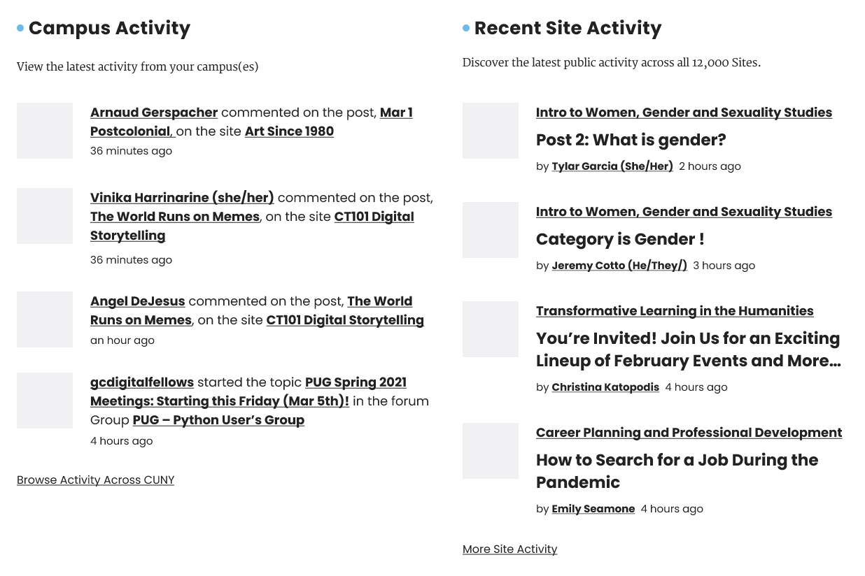
- When logged in, my Campus Activity is showing up I think in two columns, but then there is no Site Activity as in the design files. Attaching screenshots of both for reference. I'm also missing the description lines and ending "more" links for these columns.
- On public homepage, a few links don't seem to be input yet. Sorry if this is still in progress. View Group and Site Examples up top should go to the "blade" anchor links used in the In Numbers section, for example:
https://commons.gc.cuny.edu/#blade-sites
https://commons.gc.cuny.edu/#blade-groups
And there are other minor ones that seem fine on the logged-in page but aren't on public yet. I think they're in the Figma file but I could have missed some. If you need them and these aren't in progress, I can provide.
Updated by Boone Gorges over 4 years ago
Matt - You may have to clear your cache (or hard-refresh Shift+Refresh, or use a new incognito window) to see changes.
- When logged in, my Campus Activity is showing up I think in two columns, but then there is no Site Activity as in the design files. Attaching screenshots of both for reference. I'm also missing the description lines and ending "more" links for these columns.
As noted in our call the other day, not everything on the homepage is fully built yet. I appreciate the eyeballs, but we're not quite ready for full-fidelity review at this point. What I want right now is broader design feedback from Sara. I'll give the nod when we're ready for all comers.
- On public homepage, a few links don't seem to be input yet. Sorry if this is still in progress. View Group and Site Examples up top should go to the "blade" anchor links used in the In Numbers section, for example:
I added a couple that I saw were missing, but feel free to take note of any that I have missed (please note them with as much specificity as possible).
Updated by Matt Gold over 4 years ago
Boone Gorges wrote:
Matt - You may have to clear your cache (or hard-refresh Shift+Refresh, or use a new incognito window) to see changes.
Aha -- yes, I see it correctly now. Thank you!!
Updated by Colin McDonald over 4 years ago
Thanks Boone, and sorry for jumping the gun on the more detailed review. I'll defer to Sara for now and be ready to note links and other issues once the full review begins.
Updated by Chris Stein over 4 years ago
This is looking great. Good to see it live. As you noted Boone, I'll hold off on comments for full review. I do have a couple of quick observations on some possible CSS changes to some of the grids. Would you like those now or also save for full review? Unfortunately I still can't make the Tuesday meetings due to the BMCC P&B meeting overlap, so I'll mostly have to add ideas through Redmine.
Updated by Boone Gorges over 4 years ago
Chris, feel free to make your suggestions related to the design in this thread if you'd like.
Updated by Chris Stein over 4 years ago
- File unintended-gap-issue.png unintended-gap-issue.png added
- File members-display-fix.png members-display-fix.png added
- File members-display-issue.png members-display-issue.png added
- File in-numbers-center.png in-numbers-center.png added
Thanks Boone.
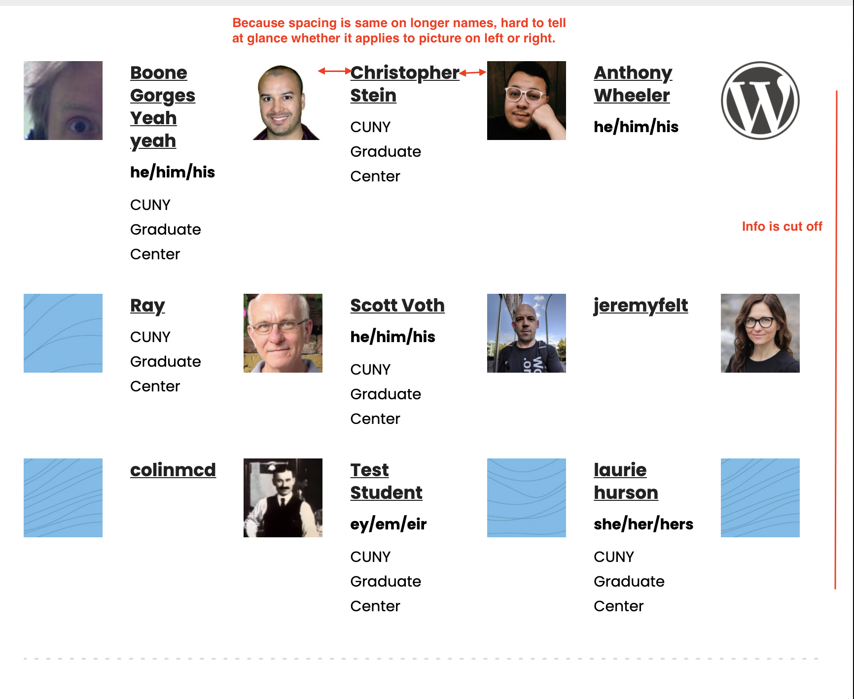
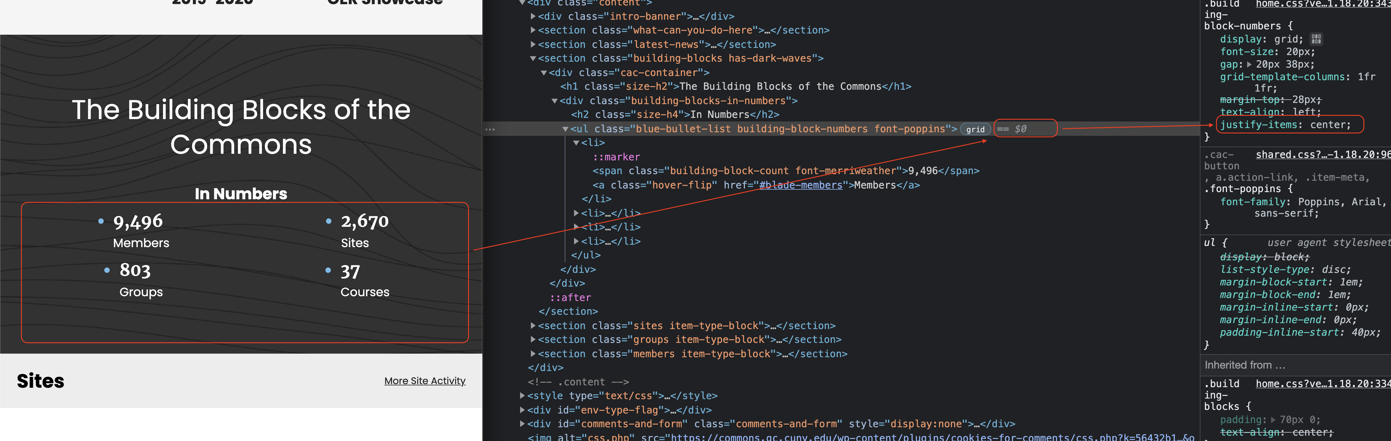
1. update In Numbers to be more centered on smaller screens. A small tweak to center the bullet points to match the centered titles when In Numbers is above the bullets. See in-numbers-center.png
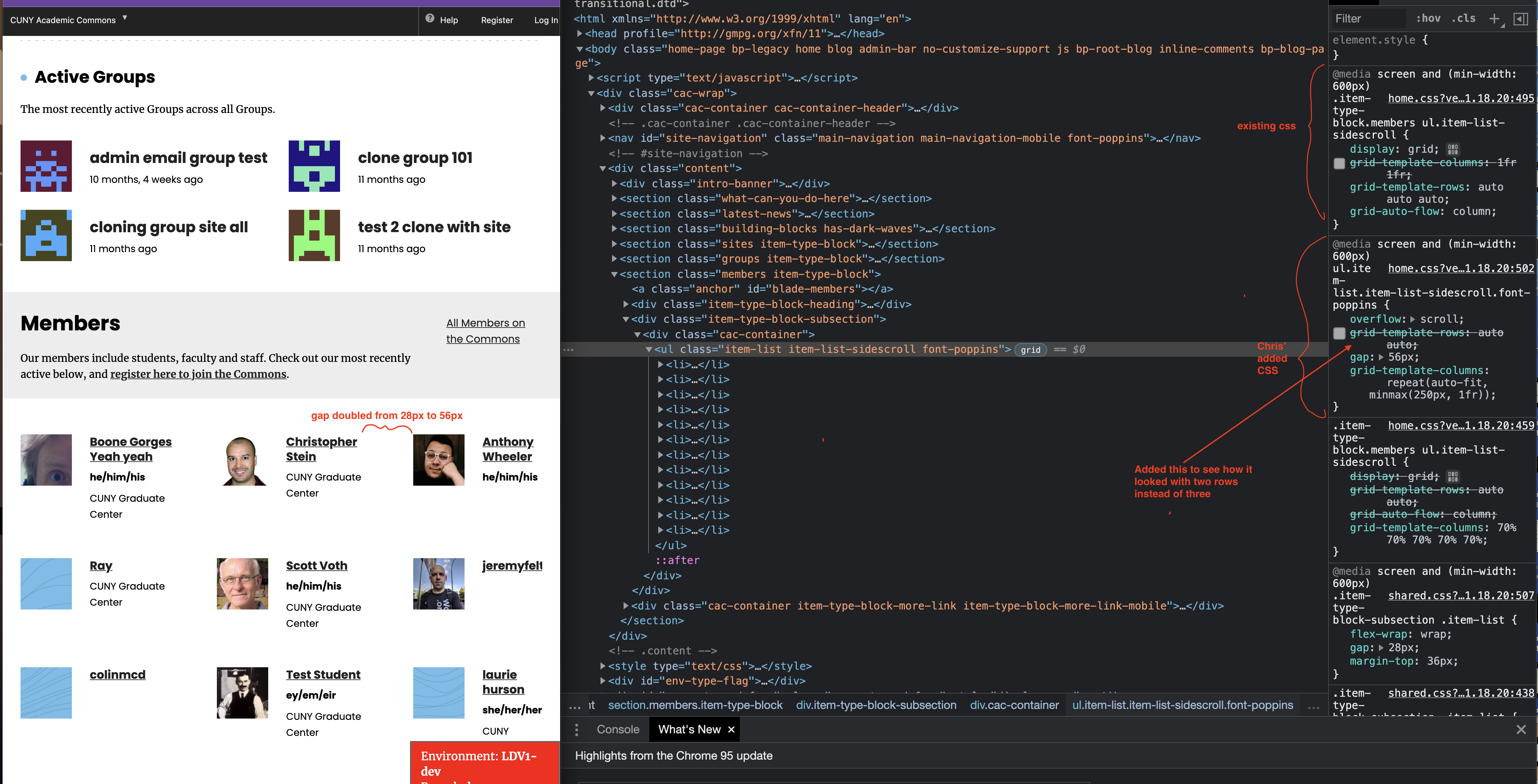
2. Members list. On screens over 600px it's not scrolling for me and so depending on screen size some of the info is cut off on the right. Also because the gap between the avatar and between members is the same, it can be hard to tell at a glance which image goes with which text. see members-display-issue.png
I have some adjustments that allow for the scroll, use a repeat with auto and min-max to let the number of columns adjust responsively and doubles the gap between the members. see members-display-fix.png
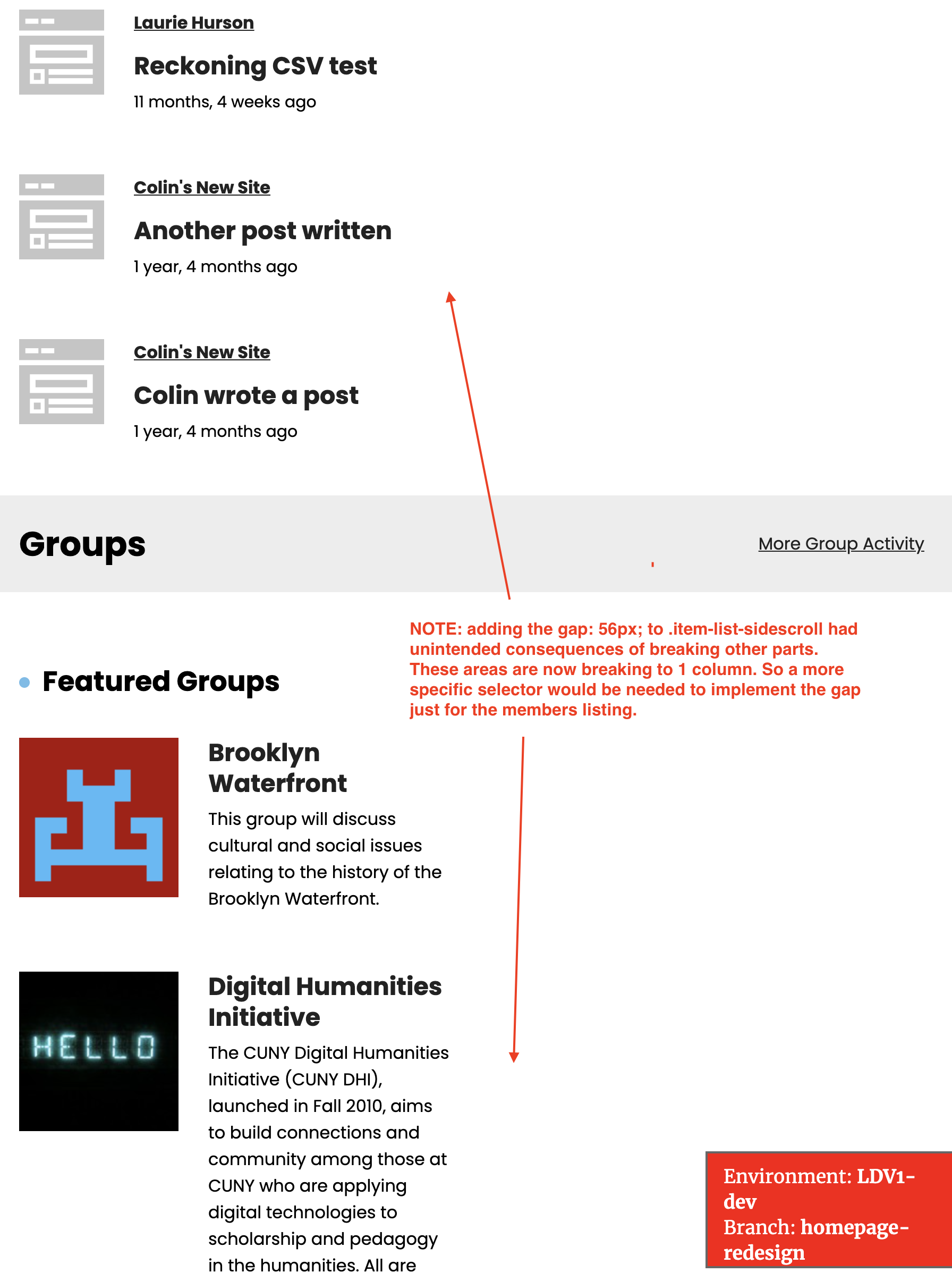
2a. I found that if I applied the grid gap to a selector that also applied to other grids on the page it caused them to break (see unintended-gap-issue.png) so if that grid gap is changed for the members it should be scoped to just that grid.
A final thought is whether we want to implement any kind of visual cue that an area is scrollable. Already some info is cut off which is a kind of indication but we may want something else like: https://codepen.io/chris22smith/pen/OJMrWgb
Again, great overall, thanks.
Updated by Boone Gorges over 4 years ago
Thanks, Chris.
1. Sara's comp has the bullet points vertically aligned with each other.
2. Thanks for pointing this out. It was a bug that you ever saw six columns. The comps have four columns, and they collapse to two at 1024px. I've fixed this, and also adjusted some spacing to better match the comps (addressing your point about distinguishing between cards)
I'm grateful for your inspector screenshots, but don't feel like you have to dive into the nitty-gritty if it's inconvenient.
I'll leave it up to Sara whether we want to add any additional indicators of "scrollability". In the absence of real evidence that there's confusion, I'd suggest against it.
Updated by Sara Cannon over 4 years ago
Hello, The pages are looking awesome! Here is a first light pass:
Desktop full width:
- Searchbar outline color #CECECE
- Arial font in the footer is fine if that’s what we need to roll with
- Can we make the min-height of the header 370?
- The grid you have is slightly wider than the comps and that is great. I would however adjust the initial hero text so that “and” is on the same line as “more” so we don’t have a dangling word at the end of a sentence :)
- The featured images on the latest news are very narrow. Lets see what they look like with a height of 220px
- Change the font to Merriweather for the paragraph in the featured groups
- Side note: Do we have any constraints in place for the
- Can we change the 6 people across to four? The information is getting squeezed into multiple lines https://share.getcloudapp.com/yAu0Zjz5
- Remove dotted line divider after members section
- Desktop background color under sites, groups, & members #F5F5F5 (This is different on mobile)
Mobile:
- Members “cards” seem to all run together and there’s no division https://share.getcloudapp.com/z8u145XA vs https://share.getcloudapp.com/ApuEGnrg
- Change the hamburger menu icon to an X when it’s open
- Login and Learn More should be the same size
more to come tomorrow! cheers!
Updated by Boone Gorges over 4 years ago
Thanks, Sara! Most of these fixes were straightforward and are now in place. Be sure to do a hard refresh or flush your browser cache to see them.
I couldn't reproduce a couple of your items, which could be related to your browser caching old stylesheets for things that I've since fixed. Please confirm the following:
- Dotted line after Members section
- Merriweather for Featured Groups paragraph
- Four-wide Members instead of six
Updated by Raymond Hoh over 4 years ago
I couldn't reproduce a couple of your items, which could be related to your browser caching old stylesheets for things that I've since fixed. Please confirm the following:
- Dotted line after Members section
- Four-wide Members instead of six
I fixed these two during implementation for the logged-in homepage suggestions (#14181).
See https://github.com/cuny-academic-commons/cac/commit/8fd62fad70e26b9968e1cae761163e069c8bab26#diff-22904f70f13e46b8ae38b9e9447fed251c6e4e0cad3b96f563b93c28bc4a9f51 for the commit.
Updated by Sara Cannon over 4 years ago
Thanks for your hard work Boone and Ray!
- Can we get the dark blue #367BA3 on some hover states? https://share.getcloudapp.com/Jrun1bPk
- For the featured groups/sites:
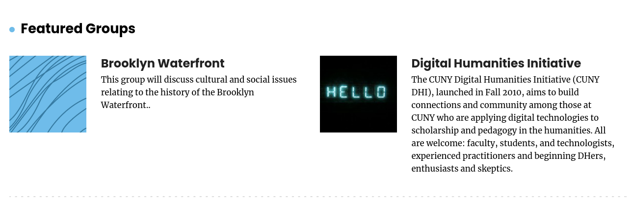
- * Make the excerpt be Merriweather instead of Poppins
- * How long can that excerpt be? Are there any constraints (can there be?)
- * For tablet breakpoints can we put the featured excerpt under the image? current: https://share.getcloudapp.com/X6ub9Oo4 desired: https://share.getcloudapp.com/NQu7JDmK
Updated by Sara Cannon over 4 years ago
The default Merriweather font seems to be slightly thicker than the comps (on my mac). I did some googling and applying some smoothing made it seem more normal:
-webkit-font-smoothing: antialiased;
-moz-osx-font-smoothing: grayscale;
Spot the difference on chrome on mac - top is with the smoothing, bottom is without:
https://share.getcloudapp.com/nOu5l2Xm
Updated by Boone Gorges over 4 years ago
- File Screenshot_2021-11-02_13-36-50.png Screenshot_2021-11-02_13-36-50.png added
- File Screenshot_2021-11-02_13-36-38.png Screenshot_2021-11-02_13-36-38.png added
- File Screenshot_2021-11-02_13-36-11.png Screenshot_2021-11-02_13-36-11.png added
Thanks, Sara! I've made the following changes:
- Font mods as requested
- Implemented hover styles (sorry I missed this first time around)
- New tablet-width view for Featured Sites and Featured Groups
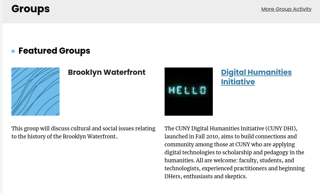
- Auto-excerpting for Featured Group descriptions. I take sentence-size chunks of the description up until it exceeds 250 characters, which might give us an excerpt up to ~400 characters at the longest. The currently featured groups on cdev are a good indicator of how this works - the Digital Humanities Initiative description gets cut down to two pretty long sentences, but I think it looks OK at our various breakpoints. See attached screenshots.
Updated by Matt Gold over 4 years ago
Looking good! I think the four blue-colored default avatars look sharp and have the benefit of keeping the color palette limited.
Updated by Boone Gorges over 4 years ago
Ray, because we've gotten preliminary signoff, I'd like to merge the homepage-redesign branch into 1.19.x. This will make it easier to do some other feature development that I'm working on for the release. Can you let me know if this sounds OK to you, so that I can pull the trigger? I don't want to do the merge if you're in the middle of something.
Updated by Boone Gorges over 4 years ago
Thanks, Ray! I've done the merge. Let's use 1.19.x for ongoing development on the homepage redesign.
Updated by Sara Cannon over 4 years ago
Logged-in Bug on the dev site?
- When I go to the logged-in homepage, my "sites" and "groups" are empty. https://share.getcloudapp.com/rRuWGYg2
- I created a dummy site just in case that is what was needed to see something show in that section, but it is still blank.
- I am trying to test out that section but can't seem to get it to show for me. Thanks!
also:
- is there an easy way for me to test the homepage on an ios device? Do I have to edit the host file? (not sure how to do it...)
Updated by Boone Gorges over 4 years ago
Hm, the section is working OK for me. I've just manually added you to a couple of groups and sites on cdev - maybe that will make a difference. (It could be that your dummy site is not showing up because it hasn't been active yet.)
- is there an easy way for me to test the homepage on an ios device? Do I have to edit the host file? (not sure how to do it...)
Not really an easy way. You could set up a local DNS server https://stackoverflow.com/questions/7473939/iphone-add-entry-to-etc-hosts-without-jailbreaking I've done this before, but for the purposes of design testing I usually just use the device emulation built into OSX Safari.
Updated by Sara Cannon over 4 years ago
Thanks, I have sites showing up now: https://share.getcloudapp.com/lluk5KdR
This does bring up a question: Should we consider newly-created sites/groups as "active" on the date of their creation and should show up in that list?
Thanks for the article. I'll see what I can set up. I want to test swiping through the content with actual fingers :)
Updated by Colin McDonald over 4 years ago
I don't see why we wouldn't consider group/site creation as "being active" in the same way we would publishing a post, unless on the tech side there is some issue with simultaneously tracking the timestamps of these different items chronologically.
Updated by Boone Gorges over 4 years ago
- Assignee changed from Sara Cannon to Colin McDonald
Colin, I've cleaned up the issues that I recorded during today's calls. Consider this the handoff for you to run through links, copy, etc, before passing to the rest of the team.
Updated by Colin McDonald over 4 years ago
Thanks Boone, here's my links/copy run-through:
Public homepage:
- Learn More in top blade should link: https://help.commons.gc.cuny.edu/
- More Site Activity in Sites blade should link: https://commons.gc.cuny.edu/sites/
- More Group Activity in Groups blade should link: https://commons.gc.cuny.edu/groups/
Logged-In homepage:
- Profile settings up top should link (URL construction is off): https://commons.gc.cuny.edu/members/colinmcd/profile/edit/
- Just noticing this, but perhaps we might as well link the avatar image up top here? https://commons.gc.cuny.edu/members/colinmcd/profile/change-avatar/
- In Shortcuts blade, the "profile role" link worked by maybe double check, as I wasn't sure about the // in the URL: https://commons.gc.cuny.edu/members/colinmcd//profile/edit/
- Right under Shortcuts blade, More Site Activity should probably say More CUNY-Wide Activity
- Same idea next column over, Browse Activity Across CUNY change to More Activity From Your Campus
Updated by Colin McDonald over 4 years ago
Thanks, Boone. Keep me posted on your breakdown of what needs tested for this first round by the wider team, as opposed to items we'll limit more to me, Laurie, etc. I'm happy to help wherever needed.
Updated by Colin McDonald over 4 years ago
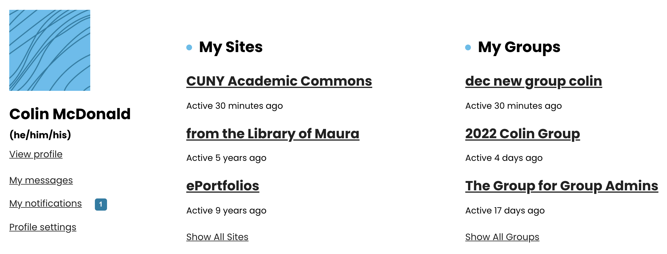
- File my-blade.png my-blade.png added
Here is the general testing feedback from Scott and I so far. I've put some other points in specific tickets, some of which I've also noted below so we have a central list.
Sitewide:
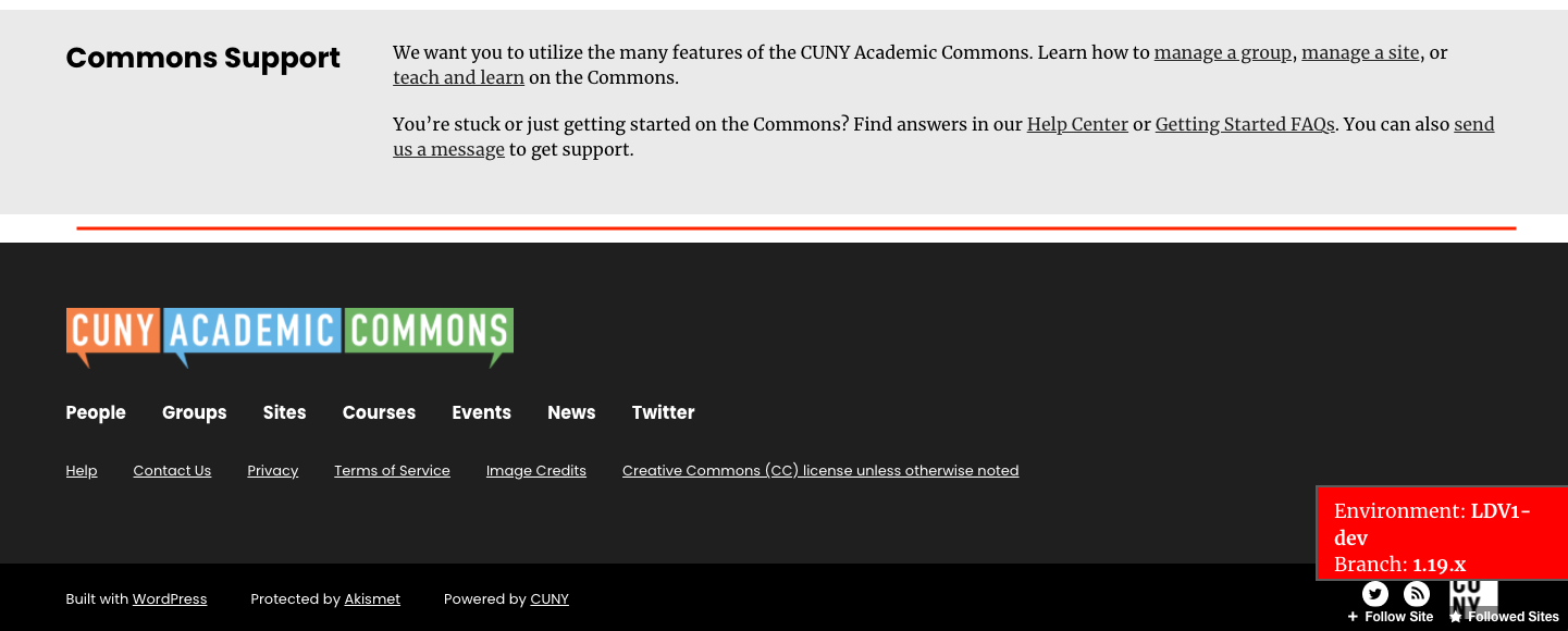
- At the very bottom, the “Commons Support” section is missing hyperlinks. These links are in the Figma dev handoff file.
Logged-in homepage:
- The second (“My Sites”) and third (“My Groups”) columns could be displayed one line up (line up with the top of the avatar image) and perhaps fit in a fourth item in My Sites and My Groups. But perhaps this is intended to allow for more white space up top.
- Newly created sites (even when added to host file) don't seem to appear under My Sites. Also, CUNY Academic Commons is my top site for some reason and just links to the homepage. New groups are appearing. See my-blade screenshot.
- Change "View profile" under name at the top to "View/edit profile" and change "Profile settings" lower in the link list to "Create a new space" and link to /create portal.
- Issues with complete activity display for sites, groups, members on the campus(es) side (more in #14181)
Public homepage:
- Probably a CDEV issue, but Latest News images sometimes don’t display. I changed my hosts file to not include news.commons.cuny.edu and that seemed to help. But still sometimes they don’t display. Also, they come from the prod site.
- Search bar is good, but underlying search results not so good. Should it display “page not found”? This too, probably due to CDEV.
- Text for Sites, Groups, and Group + Site is repeated. Please use the below copy.
Groups
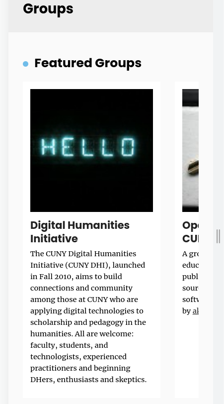
Groups are public or private community spaces featuring a discussion forum, shared files, and an email listserv. They’re ideal for class or other collaborations.
Sites
Sites are flexible websites with several privacy options. Collect student writing, build a portfolio, showcase an event—give any project an online home.
Group + Site
Connecting a Group and a Site creates a public presence for your initiative or class alongside a private collaborative space and discussion.
Updated by Boone Gorges over 4 years ago
- At the very bottom, the “Commons Support” section is missing hyperlinks. These links are in the Figma dev handoff file.
Colin, I don't see these in the Figma file. Can you either point me directly to where they are, or paste theme here?
- The second (“My Sites”) and third (“My Groups”) columns could be displayed one line up (line up with the top of the avatar image) and perhaps fit in a fourth item in My Sites and My Groups. But perhaps this is intended to allow for more white space up top.
I've moved them up in https://github.com/cuny-academic-commons/cac/commit/db156558f08a62ee35d4f684a80e79cbe09db741. Seems to me that four will not easily fit in the allotted space, so I haven't made any changes there.
- Newly created sites (even when added to host file) don't seem to appear under My Sites. Also, CUNY Academic Commons is my top site for some reason and just links to the homepage. New groups are appearing. See my-blade screenshot.
This was a bug that should be fixed by https://github.com/cuny-academic-commons/cac/commit/cf2dd996d813bf8c6b35335849f75b323dc1c9ca
- Change "View profile" under name at the top to "View/edit profile" and change "Profile settings" lower in the link list to "Create a new space" and link to /create portal.
https://github.com/cuny-academic-commons/cac/commit/2038070f2e25913b28906d22a32e364fc5735b6e
- Issues with complete activity display for sites, groups, members on the campus(es) side (more in #14181)
Let's look at that in the other ticket.
- Probably a CDEV issue, but Latest News images sometimes don’t display. I changed my hosts file to not include news.commons.cuny.edu and that seemed to help. But still sometimes they don’t display. Also, they come from the prod site.
This is indeed an issue specific to cdev and can safely be ignored. In production, it will pull from production as expected.
- Search bar is good, but underlying search results not so good. Should it display “page not found”? This too, probably due to CDEV.
This was due to a couple config issues and should be fixed by https://github.com/cuny-academic-commons/cac/commit/ff5482a24a11b6b197862f95ad07a80b7952f383
- Text for Sites, Groups, and Group + Site is repeated. Please use the below copy.
Updated in https://github.com/cuny-academic-commons/cac/commit/680d28ec377d1a3a303deaf5fb05294b86392028
Updated by Colin McDonald over 4 years ago
We seem to be in good shape on all of these items, just need to add the links to the support text in the footer, along with a couple of text edits there. Here's the current text again, followed by the phrases and their links:
We want you to utilize the many features of the CUNY Academic Commons. Learn how to manage a group, manage a site, create a portfolio, or teach and learn on the Commons.
You’re stuck or just getting started on the Commons? Find answers in our Help Center or Getting Started FAQs. You can also send us a message to get support.
manage a group
https://help.commons.gc.cuny.edu/manage-a-group/
manage a site
https://help.commons.gc.cuny.edu/manage-a-site/
create a portfolio,
remove this text completely
teach and learn**
https://help.commons.gc.cuny.edu/teaching-and-learning-faq/
**I also shortened this text from "learn how to teach and learn"
Help Center
https://help.commons.gc.cuny.edu/
Getting Started FAQs
https://help.commons.gc.cuny.edu/frequently-asked-questions-when-getting-started-with-the-commons/
send us a message
mailto:support@cunycommons.zendesk.com
Updated by Boone Gorges over 4 years ago
Thanks, Colin. Changes applied in https://github.com/cuny-academic-commons/cac/commit/ed5db234e956fe898e485f90dde2dd2bf700f7af
Updated by Colin McDonald over 4 years ago
- File footer-space.png footer-space.png added
Looks great. One last minor thing, but I think that the white space between that gray Commons Support box and the black footer box can be eliminated. That's what I see in the Figma file. Basically the space that the red line runs across in the attached goes away.
Updated by Boone Gorges over 4 years ago
This space is caused by the cookies-for-comment pixel image. I've positioned it in such a way that it should no longer change the layout. https://github.com/cuny-academic-commons/cac/commit/993abcea48ad25f05898649e8b5d270d2dbc67a2
Updated by Colin McDonald over 4 years ago
Thanks, Boone. For some reason I'm still seeing the space, but I assume that's caching on either end.
Updated by Boone Gorges over 4 years ago
There was a difference between my local environment and cdev that caused my previous fix to be not enough. I've expanded it in https://github.com/cuny-academic-commons/cac/commit/0b7f7388a44065d57ac1fbe2fb8c669dbde2593e and it now seems to be OK
Updated by Colin McDonald over 4 years ago
Appreciate it, Boone. The black footer below the gray support footer box isn't formatting for me now, but could easily be on my end.
Updated by Boone Gorges over 4 years ago
Colin, could you please give some additional information on which "black footer" you mean, and what you mean by "isn't formatting"? Here's a screenshot of what I see: https://imgur.com/fYAXerA.png
Updated by Colin McDonald over 4 years ago
Hi Boone, please disregard. Today I'm seeing the same as your screenshot, so I must have been lagging on my end.
Updated by Colin McDonald over 4 years ago
I just thought of one thing I haven't been able to test, which is what one sees in the My Sites and My Groups columns at the top when logged in but without having created any Sites and/or Groups yet. Boone or Ray, can you confirm that we have this use case covered? I'd probably need a fresh cdev account to test this on my own, rather than emptying out my current one, but that might be overkill just for this.
I wrote this copy a little while back for each one, which would show in place of the list of Sites or Groups:
My Sites
You don’t have any sites yet - create one in just a few steps!
"create one" links to https://commons.gc.cuny.edu/create/
My Groups
You haven’t joined any groups yet. Browse the directory or create your own!
"directory" links to https://commons.gc.cuny.edu/groups/
"create" links to https://commons.gc.cuny.edu/create/
Updated by Raymond Hoh over 4 years ago
I just thought of one thing I haven't been able to test, which is what one sees in the My Sites and My Groups columns at the top when logged in but without having created any Sites and/or Groups yet.
My Groups was displaying the correct copy, but My Sites always had the main site in the block even for an empty account.
I've just adjusted the My Sites block to omit the main site. Also the create links were pointing to /blogs/create/ and /groups/create/ respectively instead of the main /create/ page, so I just fixed that. See https://github.com/cuny-academic-commons/cac/compare/4bb4e3d...e309556.
I'd probably need a fresh cdev account to test this on my own, rather than emptying out my current one, but that might be overkill just for this.
To test on cdev with an empty account, login as newuser. Password is the same.
Updated by Colin McDonald over 4 years ago
Thanks Ray, this looks good to me. I'll mention this on the dev call tomorrow, but logging in as a new user I saw the dismissable banners appear. We'll want to set up some banner linking to the launch announcement news post/survey once it's all live. I can generate the link and copy something like the day before, if that sounds good, unless there's a way to populate it earlier.
Updated by Colin McDonald over 4 years ago
For the launch banner, I'm thinking this copy:
The Commons redesign is live! Read all about it, and tell us what you think!
"Read all about it" links to https://news.commons.gc.cuny.edu/2022/01/04/new-year-new-commons/
"tell us what you think" links to https://forms.gle/adFbJ7ksSTwkLR8E6
Boone, can you estimate what time the release will be live? Scott and I will be ready to grab updated screenshots for the posts and documentation, and I'll loop in Anthony for updating social.
Updated by Boone Gorges over 4 years ago
Here's a screenshot of what the announcement would look like, using the existing tools I've got (cac-sitewide-announcements; see #3501): https://imgur.com/sRrF8nG.png Some notes on it:
- The notice appears only for logged-in users
- The notice appears for every logged-in user, until they've clicked 'Dismiss'. This includes users who haven't logged in in a long time, or whatever. As such, I'd recommend setting a reminder that we should remove the notice after a month or two, so that it no longer shows up for dormant users who come back in the future
- As configured, the notice will show on every page on the main site, but on no subsites
Let me know if any of this behavior/appearance needs a change before launch.
Boone, can you estimate what time the release will be live? Scott and I will be ready to grab updated screenshots for the posts and documentation, and I'll loop in Anthony for updating social.
Around 11am EST.
Updated by Colin McDonald over 4 years ago
Perhaps this isn't possible with the existing tool specs, but I think it would be good to show this bar to the public, i.e those not logged in, so they're aware up top of the redesign information too. But given the late hour, if this isn't possible at least we'll have the news post sitting relatively high up on the public homepage.
Less important, and maybe Sara can weight in, but to my eye the message and Dismiss link might work best right next to each other, rather than justified to each corner, and then have the whole text line be centered.
Updated by Boone Gorges over 4 years ago
It's not really feasible to show the notice to logged-out users at the moment. If this is critical, we'll have to roll it out later.
I've made some quick and dirty changes to the styling of the notice. Here's a screenshot: https://imgur.com/ZfI1PG8.png Speak now or forever hold your peace (until 1.19.1).
Updated by Colin McDonald over 4 years ago
All looks/sounds good to me Boone, many thanks!
Updated by Boone Gorges over 4 years ago
- Status changed from New to Staged for Production Release
Updated by Boone Gorges over 4 years ago
- Status changed from Staged for Production Release to Assigned
Updated by Boone Gorges over 4 years ago
- Status changed from Assigned to Resolved
Updated by Raymond Hoh over 3 years ago
- Related to Support #17310: Connected group site - site does not appear in site list added